
This project started from my interest in extracting color palettes from scenes of everyday life—I like to take pictures of what is all around me and extract the colors to keep my creativity up. For this project, I wanted to go deeper into this habit of mine by exploring the color palettes of a TV series, as a way to challenge myself to use more (and more complex) data.
I was curious about the series “Bridgerton” because of its fame in that moment. As it turned out, it was also a good example of the relationship between colors and storytelling.
The television series Bridgerton is based on Julia Quinn’s Bridgerton novels, which are set in the competitive world of Regency era London during the matchmaking season, when debutantes are presented at court to find suitors. The first season centers around Daphne Bridgerton, the eldest daughter of the Bridgerton family, her search for true love, and her suitor, the Duke of Hastings. The story follows Daphne and the Duke as they struggle with their feelings for each other and the expectations that upper-class society has forced upon them.
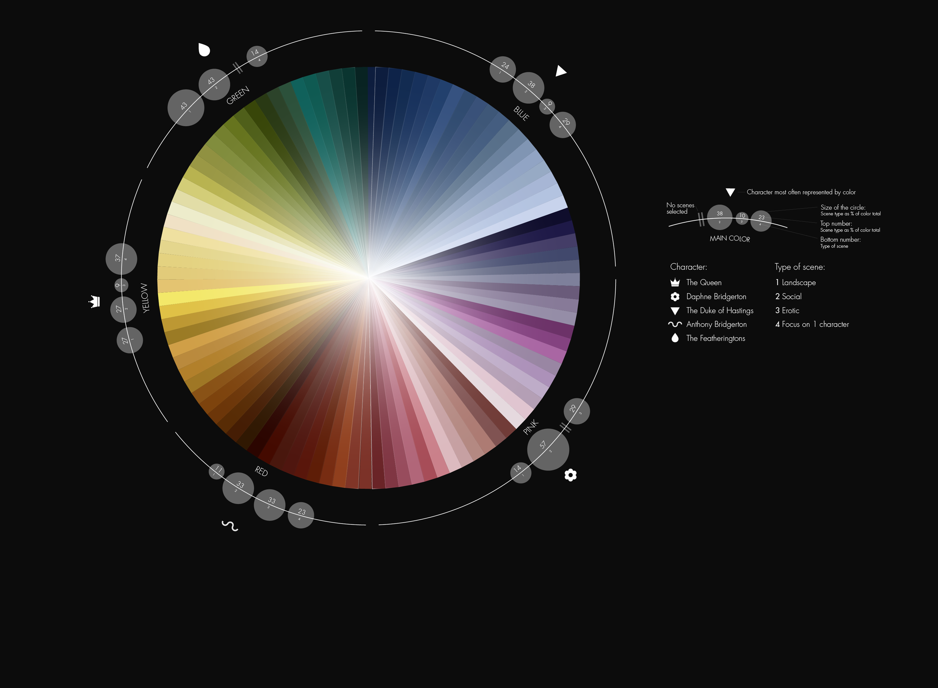
To visualize the show, I focused on the relationship between the colors, characters, and type of scene.

As shown by the visualization, some characters are tied to a specific color palette, which helps visually emphasize the values that character embodies. For example: Daphne is young, enthusiastic, and a bit naive. She represents youth and the discovery of adult reality and close relationships. Most of her scenes are characterized by a pastel palette with colors like pink, lilac, and light blue.
I selected 100 colors that give a general impression of Bridgerton’s world.
To identify these colors, I selected key frames from every episode (78 in total), recorded the frame with a screenshot, and extracted a palette of 30 colors from each using Procreate. Sometimes I chose a frame because it was visually interesting for the color palette or the type of framing, and sometimes because it represented an important moment in the story.
After extracting the colors with Procreate (with some manual adjustments to ensure that they accurately matched the original frame), I organised all the shades into color blocks (blue, yellow, green, violet, red), deleted duplicates, and created one color palette of 20 shades for every color block.
I had 100 colors of Bridgerton!
But I wanted to go deeper, to make the visualization more engaging and more informative about the characters’ relationships. I decided to categorize each of the selected scenes into one of four types: landscape, social, erotic, or scenes focused on one character. I also categorized each scene according to the main character: The Duke of Hastings, The Queen, Daphne Bridgerton, Anthony Bridgerton, or The Featheringtons. Lastly, I investigated how many times each type of scene occurred and which character was most often represented by each color section.
It turns out there is a relationship between these three elements—for example, Daphne is the character most represented in the pink section.
This work is all about data, but there are nearly no numbers. I think data are all around us, in every “countable” thing that happens. I wanted to play with colors and data, to make something engaging not only for people who watched Bridgerton, but for everyone who is interested in complexity, to give them a different point of view on something as common as a TV series.
(And I also wanted to watch a TV series without feeling like I was wasting time, haha!)

Martina Zunica is a visual and information designer. She works both in a company and as a freelancer, challenging herself in complex infographics. She has just started her first bullet journal where she tracks daily data. In her free time she cooks, travels and collects pictures of beautiful doors around the world. You can connect with her on Instagram.
-
Martina Zunicahttps://nightingaledvs.com/author/martinazunica/


