
A few months ago, a longtime client asked if my data communication consultancy could build out a dashboard display for health collaboratives in California doing community-level work. The goal was to help them communicate local progress on a particular health condition, such as heart disease or drug overdoses, and enable these coalitions to persuade their stakeholders to take an action (e.g., implement a policy, provide funding).
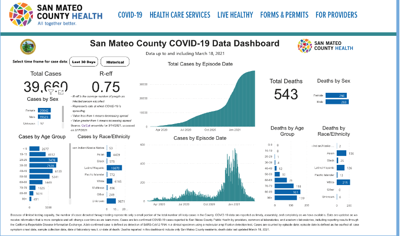
I found myself focusing deeply on the word “dashboard,” wondering if that’s indeed what my client had in mind and whether that type of display would truly be persuasive. You see, when someone says dashboard, I think of COVID dashboards like the one above that we’ve all become accustomed to seeing (and, admittedly for some of us, to nervously checking at regular intervals).
In addition, there are the modular-looking dashboard displays used for internal monitoring purposes – for example, a business dashboard to summarize KPIs (key performance indicators) for senior management.
In the health field, in particular, dashboards have become commonplace. This very journal, for example, featured a post by Tricia Aung on the “The Global Health Dashboard Epidemic” – and that blog post was published about a year before the pandemic brought to us the proliferation of COVID dashboards.
So, you may ask: What’s my issue with dashboards? Some may point out that dashboards are a terrific way to display findings, certainly better than showing a singular graph to summarize a complex topic.
I agree that dashboards have their place, but here are a few things that I find problematic with a typical dashboard display:
- Dashboards prioritize the graphs, meaning there’s typically no room for context or explanation about the significance of the overall findings.
- Dashboards don’t often have enough space to explain the meaning of individual visualizations. It’s as if we’re supposed to be familiar with what each indicator is conveying, including its acronyms and other inside-baseball terminology.
- There’s often no sense of hierarchy with dashboards. All visualizations are given equal prominence.
- And some common elements that we leverage in data storytelling to help readers better absorb and find meaning in the information – narratives about individuals, quotes, photos – are foreign to most dashboard displays.
That’s not to say that all dashboards should be banished. With COVID, for example, the use of dashboards is appropriate, given that we all quickly became familiar with the pandemic’s data terminology. For that same reason, a car dashboard works well; we collectively understand what a fuel gauge or speedometer is communicating.

The same reasoning applies to dashboards used internally in business settings – for example, at the start of monthly meetings to help a division of a company know where to focus efforts. After all, when everyone on the team is well-acquainted with the measures, context isn’t necessary, so dashboards work well.

But what about that new employee who needs to be onboarded? It would be helpful to educate them about the significance of the measures on the company’s dashboard.
You see, in so many instances, our work as data visualization practitioners require us to explain concepts that are not as familiar as a car’s speed or COVID hospitalizations. In other words, much of the time when we communicate data, we don’t have the luxury of the user knowing what we know, because we’re talking about a topic our audiences don’t understand. There are many occasions, too, when we won’t always be able to control where, or how, our data is shared.
The bottom line is that we want to be able to compel people to take an action with the information we’re sharing, even if we’re not there in the room or on the Zoom call to describe the data, and that means that we need to explain and unpack the concepts for the visualizations we’re sharing.
It’s in these settings that it would be helpful for us to realize that dashboards may not be the best display format. In fact, I’d go one step further:
Dashboards ≠ Data Stories
The sooner we recognize that dashboards don’t adequately address the assignment we’re often given as visualization specialists – “create a story from the data” – the more willing we’ll be to consider formats beyond the dashboard. Sure, our colleagues not steeped in dataviz may say they want a dashboard – as my client above did – but that’s often because dashboards have become shorthand for data display these days.
It’s our job as data practitioners to find the right format by interviewing end-users and lifting up the actions our clients want audiences to take with the data. If we always fall back to the familiar dashboard display, our efforts may fail. The end user won’t understand the significance of the findings and won’t be persuaded to take an action, which means our work to find, analyze, and visualize the data will have been for nought.
Fortunately, we have many options for how to display data. To assist with this work of expanding beyond dashboards, I recently catalogued other display formats for a continuing education course I’m teaching through George Washington University, “From Spreadsheet to Story: A Step-by-Step Guide to Communicating Data.”
Here are some data story formats I highlighted for that course that can be more helpful than a dashboard can at driving towards action:
The Fact Sheet: Often geared for print consumption, this one-pager highlights – and explains – some key findings that can be shared as a print handout or attached to an email.

A Slideshow: The emphasis here is on chunking out data findings into snack-size bites of information, so that you’re providing helpful context without describing too much at once.

An infographic: Sometimes cartoon-like in its presentation of information, an infographic often will dive into a specific topic by providing an abbreviated summary of key data findings.

The Persuasive Narrative: In my mind, the purest form of data storytelling is when you relate a story about an individual and use data to describe how this issue impacts more than just this one person. A persuasive narrative is one such way to humanize the data, telling an individual’s story from problem to potential solution.

A Q&A: I particularly appreciate how the story linked below uses a combination of questions, then small blurbs + data, to answer them. The questions provide a useful cadence that leads the reader through the material.

A List: People engage with lists, such as the ‘top five things to know’ about a topic. Perhaps when we know the end point (e.g., you are on fact, seven out of 10), we’re more likely to digest the findings by reading a paragraph of explanation.

A Data Game: When we transform data into an intellectual exercise or quiz, it’s more likely that our information will be remembered and shared. Simply put, people like participating; it’s often far better than just talking at people with data.

Long-Form Scrollytell or Data Movie: Sometimes we have a lot to say, and need digital space to let the data breathe. There are some wonderful examples of long-form data stories, including “The Desperate Journeys of Rohingya Refugees.” By leveraging a combination of photos, artwork, audio clips, data maps, and graphs, this data story from kontinentalist educates us about the plight of 2,400 Rohingya who have fled Myanmar and Bangladesh.
Another one of my favorites is this poignant data movie about World War II.

I’m sure this is an incomplete list. Know of any other data storytelling formats? Please share. I’d love to see what other forms of data stories exist out there in the wild.
The good news for those of us attached to our dashboards is that it actually doesn’t need to be an either/or choice between data stories like the examples above and dashboards. I often advise my clients that they can start with a data story to educate and explain. Then, you can let readers explore the findings on their own through an interactive dashboard that allows them to find their own narrative.
So rather than:
Dashboards ≠ Data Stories
Let’s think of it as:
Dashboards & Data Stories
What did I end up doing for that community health collaborative project, you may ask? Well, the project is still very much in progress, but the template is taking shape as a fact sheet, one that leaves space for quotes, poignant photos, and other forms of content that help paint the data on a broader canvas than a dashboard can and help steer audiences to take an action that’s important to the health collaboratives.

Andy Krackov runs a data storytelling consultancy, Hillcrest Advisory, that works with social sector organizations – foundations, universities, nonprofits and government agencies – to help them understand audience use cases and communicate their data findings in engaging and persuasive ways. Prior to establishing Hillcrest Advisory, Andy worked at two California-based health foundations where he funded data communication initiatives to raise awareness of pressing issues and ensure local communities have access to the information they need for decision-making. Andy recently has been developing data storytelling training content, including a continuing education course for health professionals on communicating with data that’s offered through George Washington University (https://www.innovationhorizons.net/from-spreadsheet-to-story/).
-
Andy Krackovhttps://nightingaledvs.com/author/andy_krackov/

-
Andy Krackovhttps://nightingaledvs.com/author/andy_krackov/

-
Andy Krackovhttps://nightingaledvs.com/author/andy_krackov/


