
For many of us, the pandemic has merged the two worlds of “home” and “office.” On the rare occasions that I used to work from home, my kids knew to stay out of my way while their Abbu (our word for “Dad”) was working. Now that I’m working from home all the time, however, I am afforded no such luxury. My kids are regulars in my home office, often crashing my meetings or crying in the other room for help.
The other day, for example, I was engrossed in building a word tree visualization when I heard my 4-year-old exclaim over my shoulder.
“Abbu!” he yelped. “This looks like the dome of a Mosque!
I turned around, thinking he was talking about a LEGO creation. Not seeing anything in his hand, I had to ask, “What does?”
“This,” he said, pointing towards the visualization on my Dell monitor.

I looked at my diagram more closely. He was absolutely right! What I thought of as a word tree did resemble the structure of a Mosque.

I’ve always been amazed by the creativity of the kids and the fresh eyes through which they look at things. Having been blessed with three children (a 9-year-old daughter, 4-year-old son, and almost 2-year-old daughter), I get to witness this creativity on a regular basis. I only wish that as parents we could do a better job at preserving their creativity.
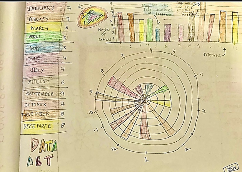
Teaching my daughter data visualization
To foster creativity in my own three children, I’ve established a routine of drawing together as a family every weekend. Now, seeing their interest in data and my own passion for it, I’ve started adapting this routine to introduce them to dataviz. I call these new activities “DDWK,” for Drawing Data with Kids.
While my 4-year-old and 2-year-old are still too little for me to corrupt their minds with dataviz, I have introduced DDWK to my 9-year-old daughter, Pariza. The biggest challenge I’ve seen for people trying to learn data science or machine learning is understanding the data. For Pariza, to keep the dataset simple and ensure it would be interesting to her, I chose to start with the spellings of simple words and nursery rhymes.

To create the image shown above, I asked Pariza to write the name of each month and count the number of letters in each. Then, I asked her to draw a bar graph based on that data. This was fairly easy for her as the dataset was familiar and interesting to her. After drawing the chart above, even she noticed that the month of May has the fewest number of letters! (Given that billions of people write the name of the month in the date every day, how much ink would we save if all the months were just three letters long? ?)
Next, my daughter and I explored scatter plots, line graphs, and stacked bar graphs—all with a dataset of spellings and rhymes.
Since we started these DDWK activities, I have seen Pariza become less intimidated by data. She loves to show her work to friends and family and even comes up with new visualizations on her own. However, I think the biggest benefit of DDWK has been how I have changed my approach to engaging with her. Initially, I would shoo her away when I was working, but now I try to explain what I am working on and why I am visualizing the data that way. She then provides her commentary on my work, trying to understand the problems I am trying to solve and to relate my work to what she is doing in school. Just as she learns from me, there is so much we can learn from our kids.
DDWK has been lots of fun for us so far, and I’ve had others reaching out to ask how to do something similar with their kids. I am working on crafting a DDWK workshop for adults and kids 8 years old and up. If you’re interested, feel free to sign up for the session by filling in this form, and I will keep you informed of the date.


Now it’s your turn to draw data!
Below are some DDWK templates you can use to introduce your kids to data visualization. We would love to see your creations! Share them on Twitter with the hashtag #DDWK and tag @datavizzdom and @DataVizSociety.
Activity 1 – Connect the dots to build a line chart
- List out a few words that are related to each other. For example, make a list of colors, family members, favorite foods, or funny animals. Try to limit the list to 4 or 5 words so that you can follow the lines easily after you are done drawing.
- Using the graph template below, spell out the words letter by letter. For example, the word “apple” starts with A. Starting at Position 1, move your pencil up to the letter A. Draw a dot. The second letter is P, so start at Position 2 and move your pencil up to the P line. Draw another dot. Do this for the whole word, and then connect the dots!
- Make each word in your list a different color. You can fill in the legend with the colors you’ve used and which word they represent by coloring in the circles and writing the word on the line.
Ta-da! You’ve just made a line chart!


Activity 2 – Create a bar graph by spelling
- List out a few words that are related to each other. For example, make a list of colors, family members, favorite foods, or funny animals. Try to limit the list to 4 or 5 so that you can follow them easily after you are done drawing. In this example, I am using the numbers 1-10.
- Create a table with two columns.
- In the first column, write each word.
- In the second column, write the number of letters in each word. For example, the word “ONE” has 3 letters, so you would write 3; “TWO” also has 3 letters, so you would write 3; and so on. Your table would look something like this:
| Number | Letters |
| ONE | 3 |
| TWO | 3 |
| THREE | 5 |
| FOUR | 4 |
| FIVE | 4 |
| SIX | 3 |
| SEVEN | 5 |
| EIGHT | 5 |
| NINE | 4 |
| TEN | 3 |
- Now that you are done preparing your data, create a bar graph similar to the template below. What would it look like if you do similar activity for even numbers or odd numbers only?

Activity 3 – Build a scatter plot of numbers
- Create a table with three columns.
- In the first column, spell out the numbers from one to 10, like “ONE,” “TWO,” etc.
- In the second column, write the number of letters in each number. For example, the word “ONE” has 3 letters so you would write 3; “TWO” also has 3 letter so you would write 3; and so on.
- In the third column, write the value of the number. For example, the value of the word “ONE” would be 1; TWO would be 2; and so on. Your table would look something like this:
| Number | Letters | Value |
| ONE | 3 | 1 |
| TWO | 3 | 2 |
| THREE | 5 | 3 |
| FOUR | 4 | 4 |
| FIVE | 4 | 5 |
| SIX | 3 | 6 |
| SEVEN | 5 | 7 |
| EIGHT | 5 | 8 |
| NINE | 4 | 9 |
| TEN | 3 | 10 |
- Now that you have prepared the data in the table, start plotting it by making the x axis and y axis and plotting the numbers, as shown below. Below you can see the example of how I have plotted ONE. Once you are done plotting all your numbers, you will have a scatter plot!

I hope this gives you a starting point to introduce a new generation to data visualization. As you use these templates or do similar activities with your kids, please share your creations on Twitter with the hashtag #DDWK and tag @datavizzdom and @DataVizSociety. And for more information on my DDWK workshop, fill in this form.
I’d love to give a shout out to Nancy Organ for her amazing support in creating this post. ?

Gulrez Khan is a Lead Data Scientist at PayPal. He champions Data Visualization & Storytelling with data and has been giving talks, workshops, speaking at conferences to democratize data. Outside his day job, he loves playing with public datasets.
-
Gulrez Khanhttps://nightingaledvs.com/author/gulrezkhan/


