
This post is a review of From Data to Stories, a book from Richie Lionell and Ramya Mylavarapu of Gramener, described on its front page as, “an end to end guide to Storytelling with Data Comics for the absolute beginner.” In a tagline–which I suspect highlights a unique niche in the world of data visualisation books–it is described as “for storytellers, data visualisation enthusiasts, cricket fans, and anyone who just loves a good comic story.”
As someone who considers himself all of the above, I looked forward to reading From Data to Stories, and I certainly wasn’t disappointed. The book is a delightful read, split into two parts. The first section, described as a graphic novel, interweaves data and visualisation with an ongoing story in comic form, documenting the ups and downs of a few days in the life of Ringo and Priya, living in London, along with their friends, Dey and Dev, in Bengaluru, and other characters we are introduced to along the way.
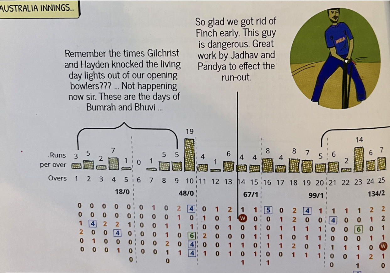
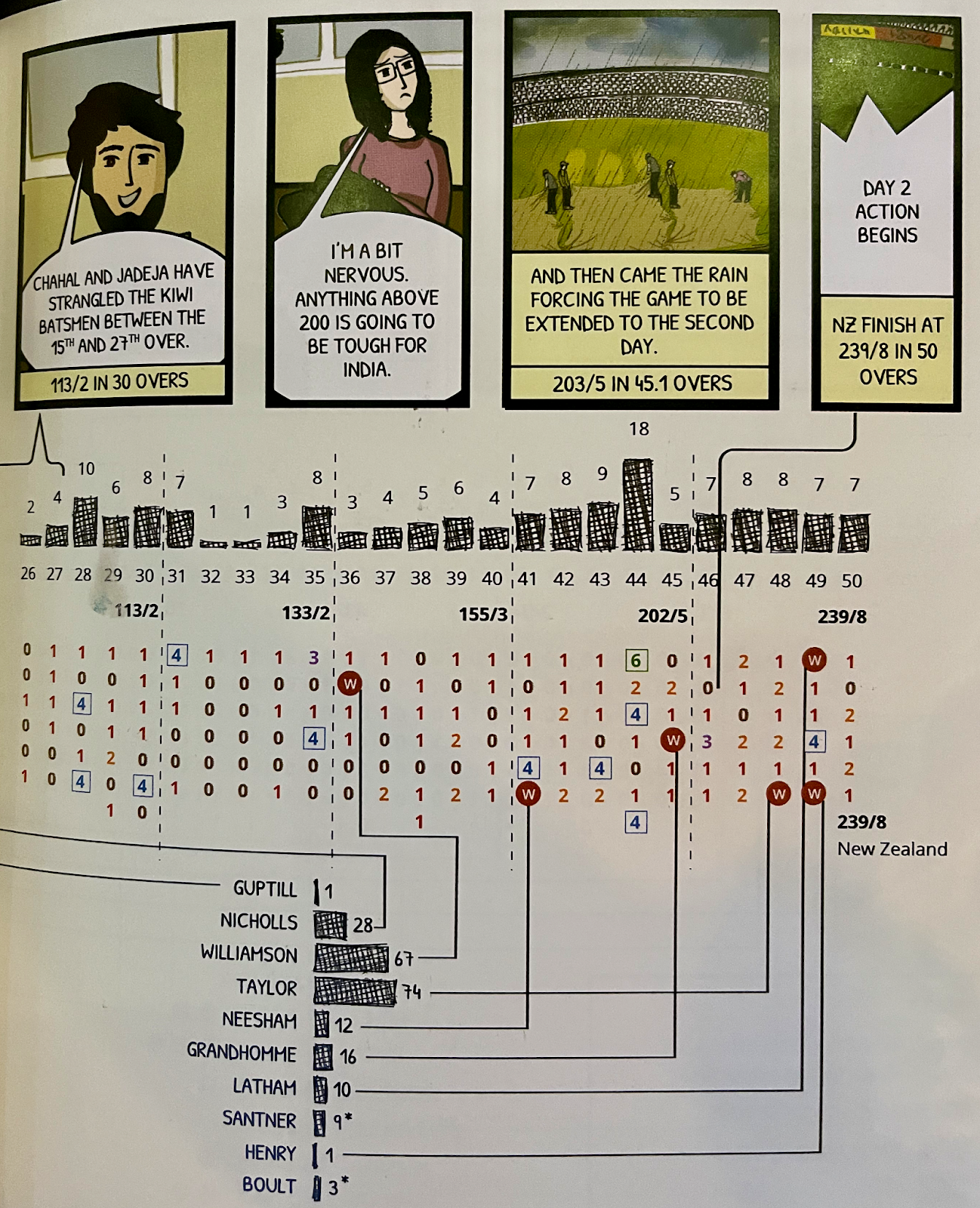
And there’s no getting away from the fact that the subject of the comic is cricket–specifically the 2019 T20 World Cup in England. Cricket is a strong theme to the book, since the human comic story and the data-heavy tournament story run concurrently. If, like me, you know, understand, and enjoy cricket, then I think you will enjoy the book tremendously. Cricket, like baseball and other similar sports, is exceptionally data heavy, with statistics available on every ball, shot, catch, wicket, player, match, and team. The longer nature of individual matches, not to mention the tournament as a whole, offers the opportunity to tell a full and detailed story with data over the course of every game.
This first section is in the form of a comic in several chapters. Each chapter represents the timing on and around the day of one particular match, which offers an ideal opportunity to tell a story broken down into bite-sized parts. The comic book style allows each chapter to begin with the latest update in the tale of the comic characters, while then moving on to the story of the specific match, accompanied by visual scorecards and other charts to complement and enhance the narrative. A brief data comic tip starts each chapter, with advice on topics such as connecting tables to visualisations with arrows, or showing emotion on characters’ faces aligned to time series graphs to accentuate findings in the data.
Each chapter contains visualised scorecards, and it’s the ball-by-ball nature of the scorecards, forming the bulk of the data visualisation, which allows the story to be told in detail, almost as if you were at the match!
The book itself demonstrates of how gently and seamlessly mixing visual and storytelling techniques can produce a successful data visualisation. Of course, this approach doesn’t have to be restricted to cricket. Although I mentioned above how likely you are to enjoy the book if you enjoy cricket, if you can see past this sport to other potential uses, then it provides the inspiration to create your own data comic on a different theme. I see no reason why it wouldn’t be possible to visualise similar sport tournaments (FIFA World Cup, Olympics, or Paralympics) or a data-heavy TV series, for example. One scenario in the book even shows comic figures reacting to monthly business sales figures. I’m sure there could be a case for introducing data and data visualisation to children, too, if the comic elements were pitched appropriately.
The first section illustrates firsthand the ability of data comics to communicate insight. Regardless of how you feel about the term “storytelling,” the fact remains that it is a method of presenting and communicating the data that adds value, understanding, and even character to the nature of the data itself. After all, who but the most die-hard of cricket nerds (OK, I think I might just have described myself there) would gain the same level of insight purely from a staid, black-and-white scorecard full of numbers?
The second section is the practical section of the book, offering advice and instruction on how to obtain and use data in Excel. Aimed at beginner level, it’s full of step-by-step screenshots on how to collect, question, clean, and analyse the data in Excel before taking the step to convert to comic form. The data used in the book itself is available for download, allowing you to work through the process hands on.
Ending with information and advice on story structure, you are then ready to try the ComicGen open source comic maker library (from Gramener) to generate your own data comic. I was drawn to this book, and this review, as a fan of data, storytelling, and cricket, but remain a complete non-artist with limited experience of comics. But the book gives you enough grounding to potentially persuade even the least artistically inclined to consider a data comic for a future project. I haven’t personally tried the ComicGen comic maker yet, but with more international sports competitions always just around the corner, watch this space!
As Andy Kirk puts it, more evocatively, in the foreword: “Through the charming visual treatment, it transforms potentially dry statistical facts into a visceral form that stirs the emotions of joy and excitement, hope and despair.” If you ignore all of my review with all that stuff about cricket and comics, and focus only on Andy’s comment, you’ll get a great synopsis and understanding of why this book is recommended.

-
Neil Richardshttps://nightingaledvs.com/author/neil-richards/

-
Neil Richardshttps://nightingaledvs.com/author/neil-richards/

-
Neil Richardshttps://nightingaledvs.com/author/neil-richards/

-
Neil Richardshttps://nightingaledvs.com/author/neil-richards/


