
Large-scale graph visualizations are tricky. The more nodes and edges you have in your network, the more difficult it is to compute the layout for it. Graph layout defines where on a canvas the nodes will be placed. No layout, no visualization!
Rendering a large number of nodes and edges is also a challenge. For example, if you try to animate more than a few thousand objects with Scalable Vector Graphics (SVG), it’ll fail and you’ll need to find another technique to do that. Can you take advantage of a Graphic Processing Unit (GPU) to help draw so many data points? Of course! Using WebGL to render complex visualizations is becoming more common nowadays. But is it possible to use that GPU power to calculate the layout for your graph as well? The answer is also yes, with Cosmograph!
GPU-accelerated Force Layout
One of the key techniques used in network graph visualizations is Force Layout. It is a type of physical simulation that defines several forces affecting the nodes of your graph. For example, a spring force between connected nodes will pull them together, a many-body repulsion force will pushe nodes away from each other, and a gravity force brings non-connected parts of the graph together in the simulation space. You can find numerous libraries that implement various kinds of Force Layout simulations. Almost all of them use CPU to do the calculations, and they get slower as the number of nodes increase, usually choking at around 100,000 nodes.
GPU-based force layout algorithms are much less common; they are more difficult to write. Using the traditional approach of implementing the Many-Body force (which is the most complex force in the simulation) won’t make the calculations noticeably faster, because random memory access operations (reading or writing data from computer’s memory) on GPUs are slow and you’ll need a lot of them (i.e. when you need to get information about two different nodes to calculate the forces, and their data is stored far away from each other in memory).
Usually, when you need to visualize a big network, you have to use a desktop visualization tool, like Gephi, that will calculate the layout first using an optimized CPU algorithm, and then visualize the result. You can also use more sophisticated tools like Graphistry, which will calculate the layout on their server and then render your graph in the browser using WebGL. Or a sophisticated and powerful command line tool called GraphViz.
However, we came up with a much more user-friendly solution. We developed a technique that allowed us to fully implement Force Graph simulation on the GPU. It is amazingly fast and it works on the Web!

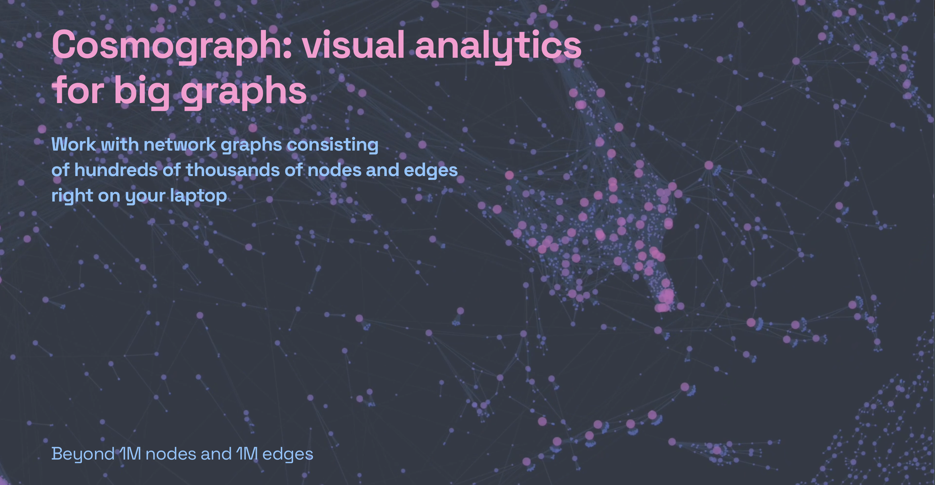
that has 133K nodes and 321K edges
Cosmograph and how it works
Meet Cosmograph — the fastest network graph visualization tool that works in the browser. It’s capable of visualizing networks that have a million nodes and edges, and that’s not the limit! It’s free to use, everyone can go to https://cosmograph.app, upload a CSV and get it visualized!
Cosmograph’s user interface (UI) is pretty minimal. When you open it you’ll find hints and data examples right away. Let’s briefly go over the basics here so you don’t get lost when you run it for the first time.

Your graph data will need to be stored in a CSV file that has at least two columns, one for source nodes and another for target nodes. Such graph representation is usually called an edge list since every line represents a connection between two nodes, for example:
source, target
node1, node2
node1, node3
…
That’s it! This is enough to draw your graph. But let’s imagine you work with transactions, and node1 has sent something to node2. You can add a couple of extra columns to your data file, one for the time of the transaction and another for its value.
time, source, target, value
2/4/2022, node1, node2, 2
2/5/2022, node1, node3, 10
…
Cosmograph will automatically recognize the time column and display a timeline at the bottom. The value column will be available as the link color and the thickness option.
The edge list data file only contains information about connections in your graph. What if you also have information about the nodes and would like to use it in your visualization? You can do that by providing a metadata file, where every line corresponds to a specific node:
id, color, size
node1, red, 10
node2, green, 20
node3, blue, 30
…
If you do so, you will be able to use that information to set the color and size of the nodes in the user interface.
After choosing your data and optional metadata files on the Cosmograph launch screen, you can simply click “Launch” and enjoy looking at your graph being rendered in real-time.
A few words about limitations
The technique we’ve developed to make the layout algorithm work on GPU and be blazingly fast, of course, has limitations. One of them is the Force Layout simulation Space Size limit. Our algorithm runs on a square grid. It’s like a giant chessboard, and when you have multiple nodes trying to fit inside one square, there will be computational artifacts making the layout more noisy. You can choose your Space Size before starting the simulation. The smaller it is, the faster the visualization works. However, large graphs might not fit into smaller spaces. If your graph has several millions of nodes, they might not fit at all, even if you choose the largest available Space Size.
Controlling the look and feel
There’s also a handful of force layout parameters that can be changed while the simulation is in progress. They can be found in the Simulation section of the UI. You’ll be able to control the gravity, repulsion, friction, link strength, and other force layout properties. We encourage you to play with the sliders to get a better layout for your graph, and also it’s quite enjoyable to see the graph changing in front of your eyes.

You can change the appearance of the graph in the Node and Link Appearance sections of the UI. Namely, you can choose what data and metadata columns will be used to define the size and color of the nodes, and the width and color of the links.
Exploring the graph
When the force graph simulation has slowed down and found an equilibrium, you can explore the graph by clicking on any node to see its name and other nodes it’s connected to. Alternatively, you can go to the Info tab and search for a specific node by name.
You can also select a portion of the graph by using the Rectangular Selection tool to see the stats and export the underlying sub-graph data. Just search for the Export Selected Data section on the left.
If your graph has temporal data, you can select a range on the timeline and press play to see the animation. It comes in handy when you’re exploring transactions and want to see which parts of the graph were more active or less active during certain periods of time.

Another important thing that you might want to do is to export the layout, i.e. the coordinates of each node, which is a feature that is thankfully also available in Cosmograph. When you select a portion of or the whole graph with the Rectangular Selection tool, you’ll see the Save Current Layout switch under the Export Selected Data section. Turn it on, click on the Metadata button, and voila, the downloaded file will have additional x and y columns with the coordinates of each node.
Library for developers
If you’re a programmer and you want to use the power of Cosmograph to visualize big graphs in your own project, we have a library for you! It’s called Cosmos and it’s available as an NPM package called @cosmograph/cosmos. Cosmos is way faster than other front-end graph visualization libraries. The source code is written in TypeScript, we use Regl to deal with WebGL and D3 to help with color parsing and zooming. If you want to learn more, check out the Cosmos repository on GitHub!
Conclusion
Network visualizations are fascinating, especially when you’re dealing with large graphs. We hope you’ll find Cosmograph useful and it’ll help you with your next project. We can’t wait to see what you’ll build with it! If you like Cosmograph, please share it with your friends and colleagues, and give us your feedback!
We would like to end this article by sharing a brief collection of beautiful synthetic graphs that are fun to explore. Click on links to open them in Cosmograph.


Nikita Rokotyan is a data visualization engineer with a background in atmospheric physics and creative technologies.
In 2014 he founded Interacta (https://interacta.io), a team of scientists, designers and engineers building beautiful tools for visual analytics, which won the World Data Visualization Prize by Information is Beautiful and World Government Summit in 2019. Nikita also runs a data visualization team at F5, creating data visualization components for F5’s Distributed Cloud platform and NGINX Controller. Recently, he has co-authored Cosmograph — the fastest web-based tool for big graph visualization.


