
tl;dr: After having explained how to read box plots to thousands of workshop participants, I now believe that they’re poorly conceived (box plots, not workshop participants 😉 ), which makes this classic chart type unnecessarily unintuitive, hard to grasp, and prone to misinterpretation. This has caused innumerable distribution-based insights to fail to land with audiences who weren’t willing or able to grasp them. Alternative chart types are virtually always easier to learn how to read, more informative, or both.
Not sure what a box plot (a.k.a., a “box-and-whisker plot”) is or how to read one? If so, you should watch this explanatory video before continuing.
I used to use box plots often, but I rarely use them now. In fact, virtually never. Why not? Well, if you watched the explanatory video linked above, you saw that it took me over four minutes to explain how to read a box plot. If a chart type requires that much time to explain, it had better deliver a huge “epiphany payoff,” as data storytelling expert Brent Dykes calls it, i.e., it had better deliver valuable insights that can’t be communicated using simpler, more familiar chart types that require less time and effort for the audience to understand.
In my experience, though, virtually all the types of insights that chart creators try to communicate using box plots can be communicated using simpler, more familiar, and, frankly, better-designed chart types that don’t require audiences to slog through a multi-minute comprehension process beforehand.
“I have no idea what you’re talking about. I can read box plots just fine and so can the audiences for my charts.”
Let me share a few observations from my experiences explaining how to read box plots to thousands of workshop participants over the years:
- Most people don’t know how to read box plots. Among participants in my workshops—who generally have above-average graphicacy levels to begin with—typically less than 20 percent already know how to read box plots.
- People struggle to grasp box plots much more than other “fundamental” chart types, and more even than “complex” chart types like scatterplots or histograms.
- Even when audiences are familiar with box plots, they still require excessive, unnecessary cognitive gymnastics to interpret compared with alternative chart types such as strip plots and distribution heatmaps (see examples below), and are prone to misinterpretation.
These issues arise from what I see as flaws in the traditional box plot design, which was first proposed by Mary Spear in 1952 and refined by dataviz legend John Tukey in 1969 (I can feel the flames licking at my heels already). What, exactly, are those flaws? I see three significant ones, which I’ll examine in detail:
- The design of traditional box plots doesn’t make ‘visual sense,’ which makes them unnecessarily hard to learn how to read and prone to misinterpretation.
- Box plots require audiences to grasp complex concepts that they don’t need to understand in most cases.
- Box plots conceal information that’s usually crucial to see.
Let’s have a closer look at each of these problems in turn:
The design of traditional box plots doesn’t make ‘visual sense.’
Box plots are needlessly hard to grasp because their visual design doesn’t align well with how the human visual system works, i.e., they don’t make ‘visual sense.’ Specifically, I see three problems with the visual design of traditional box plots:
- If you’re a human with normal vision, you intuitively perceive thick, wide shapes as representing greater quantities (of whatever) than thin, narrow shapes. The ‘box’ segments in each box-and-whisker shape, then, look like they represent more of something than the ‘whisker’ segments, leading to the faulty interpretation that they contain more values, or perhaps have more importance. All four box and whisker segments contain the same number of values, however, and all four segments are equally important (unless the chart author wants to draw attention to the middle two segments for a specific reason). The concept of quartiles is hard enough for most people to grasp (more on that in a moment) and making the second and third quartiles look ‘bigger’ than the first and fourth quartiles really, really doesn’t aid comprehension. I was unsurprised to recently discover that research has shown that this design flaw throws off even experienced box plot readers.
- The two middle ‘box’ segments (i.e., the second and third quartiles) look like one, single shape with a dividing line in it (i.e., the median). This visually suggests that there are three parts in each box-and-whisker shape (a top whisker, a middle box, and a bottom whisker), not four. The middle box isn’t a single group that’s divided in two, though, it’s two distinct groups (i.e., two distinct quartiles). The middle two ‘box’ segments aren’t related to each other any more or less closely than, say, the top two segments, or the bottom two segments. (Yes, I know, the middle two segments are the ‘interquartile range,’ but I don’t see a reason to always visually emphasize that fact.) Similarly, the two ‘whisker’ segments look like they may be more closely related in some way because, well, they’re both whiskers. But there’s no inherently special relationship between the first and fourth quartiles, either.
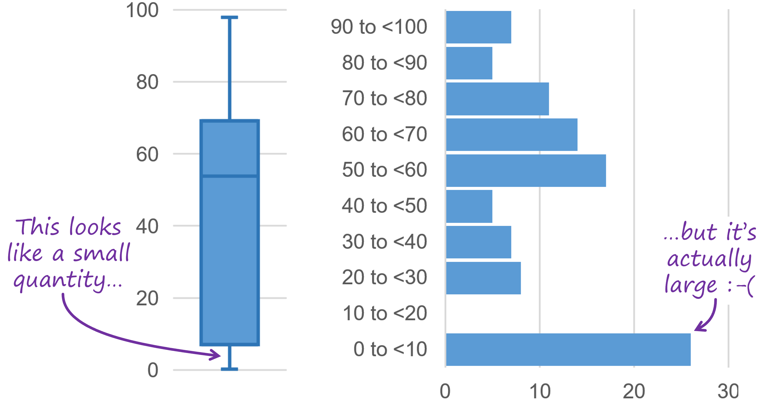
- People associate longer shapes with greater quantity, which is why we find bar charts and other chart types that are based on that principle to be intuitive. In a box plot, however, longer box or whisker segments don’t represent greater quantities. The four segments in a box plot each represent the same quantity, i.e., they each contain the same number of values, regardless of how long or short they are. In fact, shorter segments in box plots actually represent higher densities of values, so there’s a “mismatch” between what our eyes are telling us and the underlying data. This is why, to many people, the box plot in the example below doesn’t look like it’s showing the same data as the histogram beside it, even though it is.

Yes, I know. Shorter segments in a box plot do represent less quantity because the ‘quantity’ in a box plot is the range spanned by each quartile. That requires a big, counter-intuitive (and unnecessary) leap for most audiences, though.
Design concepts such as the ones below make more ‘visual sense’ than box plots:

While these alternative designs would still require a certain amount of explanation, they’d probably be easier to grasp than box plots:
- They make it clearer that shorter segments contain higher concentrations of values.
- They don’t draw unwarranted attention to the middle two segments.
- They look like four shapes instead of three.
If you find these design concepts to be less intuitive than box plots, ask yourself if that’s because they’re actually less intuitive, or if it’s because you’ve just gotten used to reading box plots over time.
Despite making more visual sense than box plots, I still wouldn’t recommend these design concepts or box plots in most situations because…
For most types of insights, audiences don’t need to understand complex, abstract concepts like quartiles.
Box plots require audiences to understand the concept of dividing a sorted set of values into ranges such that an equal number of values fall within each range, resulting in ranges of different sizes, i.e., the concept of quantiles and, specifically, quartiles. Yes, many people who are likely to read this article will be familiar with these concepts, but most audiences are not. Most audiences require multi-minute explanations to grasp them (ideally, with visual aids and examples, as in the explanatory video linked at the beginning of this article), and audiences need to grasp those concepts fully before they can even begin to interpret a box plot correctly. As we’ll see in a moment, though, there are other chart types that can be used to communicate a wide variety of useful, distribution-based insights, but that don’t require audiences to understand quantiles, quartiles, or any other abstract, complex concepts.
“But I don’t find box plots hard to understand.”
I hear you. I don’t find them hard to understand, either. That’s because you and I have been looking at box plots for years and our brains have learned to “think around” their design flaws. It doesn’t mean that they’re a well-designed chart type. People encountering box plots for the first time do get tripped up by these design flaws and, while you might have forgotten it, you almost certainly got tripped up by them the first time that you encountered a box plot, as well.
And the design problems with box plots continue to cause needless grief in organizations, when well-meaning analysts try to use them to communicate important insights to decision makers, but then get shot down because the decision makers aren’t willing to figure out how to read them. After experiencing these negative outcomes, analysts often assume that decision-makers don’t “get” distribution charts of any kind, which is unfortunate because visualizing distributions can yield invaluable insights. Analysts often just give up, though, because they don’t realize that the problem isn’t that their audience doesn’t grasp distribution charts in general, it’s that they don’t grasp box plots in particular. Using more intuitive distribution chart types (see below) would almost certainly yield more positive outcomes.
Regardless of how comfortable you are reading box plots, though, there’s also the minor detail that …
Box plots often misrepresent distributions.
Have a look at the box plot on the left, then compare it to the jittered strip plot of the same data on the right:

The box plot on the left makes the distribution of ages of study participants in the “Test group” look almost identical to that of the “Control group”. As we can see in the jittered strip plot on the right, though, the two groups are quite different (which might substantially impact the results of our study). I’m not the first to point out that box plots always make distributions look ‘bell shaped,’ i.e., like the values are clustered around the median and gradually trail off away from the median. If a set of values isn’t bell shaped (like the “Control group” above), though, box plots make them look bell shaped anyway.
This is almost always a real problem because, even if all the sets of values in a box plot do have bell-shaped distributions, readers can’t know that, and so, at best, they’ll be left wondering if all distributions are actually bell shaped or not. There are other important limitations of box plots, such as hiding gaps in distributions and concealing the number of values in each group, but let’s leave it at that for now because this article is already pretty long.
Dataviz experts have proposed modifications to box plots and more sophisticated chart types that represent distributions more accurately to mitigate this misrepresentation issue. I want to clarify, though, that the main point that I want to make in this article isn’t that box plots can misrepresent distributions (although that is an issue), it’s that box plots are needlessly hard to learn how to read in the first place. More sophisticated chart types don’t help with that problem since they can be even harder for audiences to learn how to read. In any event, more sophisticated chart types aren’t needed for most day-to-day decision-making in most organizations, which can be fully supported by simpler distribution chart types, speaking of which…
“What are these more intuitive/useful distribution chart types of which you speak?”
The box plot alternative that I use most often is a strip plot:

Strip plots can be grasped by most audiences in a few seconds and can be explained with a single sentence, such as, “Each dot is the age of a study participant.” Despite their simplicity, strip plots can communicate most of the insights for which chart creators often use box plots, such as showing whether distributions are higher or lower, concentrated or dispersed, normal or skewed, have outliers, etc. They can even communicate important types of insights that box plots can’t show, such as gaps in distributions, multimodal (“clumpy”) distributions, or insights that require seeing roughly how many values are in each set.
If there are more than a few dozen dots/values, though, strip plots tend to turn into solid lines of overlapping dots. In those cases, a jittered strip plot can be a good choice since it can accommodate more dots/values, but has all the same advantages of a regular strip plot:

If there are hundreds (or millions) of values, though, jittered strip plots can also turn into solid blocks of overlapping dots, in which case you could move to what I call a distribution heatmap, which can handle any number of values:

Yes, a distribution heatmap ups the complexity a bit since it introduces the concept of bins (a.k.a. intervals), but bins are still considerably easier to grasp than quartiles. You also lose the ability to see how many values are in each group and there are a few other limitations, but box plots have all those same limitations (plus several others).
These alternatives to box plots can be used to communicate a wide variety of useful insights, don’t require the audience to understand complex concepts like quartiles, and show distribution shapes clearly (i.e., they don’t make everything look bell shaped). More to the point, they make more visual sense than box plots, so audiences grasp them in seconds instead of minutes, and they’re less prone to misinterpretation. Ultimately, this means that using these chart types instead of box plots substantially improves the odds that your audience will understand and act on your distribution-based insights.
There are other distribution chart types that can be useful in specific situations, such as frequency polygons, violin plots, cumulative distribution plots, and bee swarm plots, but the three types that I described above are the easiest ones to grasp, and are able to communicate most of the insights that are needed for day-to-day decision-making in most organizations. (I’m not mentioning histograms here because they’re generally only useful for visualizing a single set of values, whereas box plots and their alternatives are for visualizing multiple sets of values, which is a different use case.)
“Do box plots have any actual strengths compared with alternative chart types? Are there any situations in which a box plot would be the best choice?”
Well, as far as I can tell, the only advantage of box plots is that they show quartile ranges. The obvious next question, of course, is how often it’s necessary to show quartile ranges in order to say what you need to say about the data. In my experience, it’s not nearly as often as a lot of chart creators seem to think. Most of the time, you’re pointing out that distributions are higher or lower than one another, more concentrated or more dispersed than one another, have outliers, etc. None of these types of insights require showing quartile ranges and all can be communicated using simpler chart types. Some types of insights might require showing medians, but those can be easily added to simpler chart types:

So, no, I can’t think of any situations when a box plot would be the truly best choice, other than those in which the audience demands box plots because that’s what they’re used to seeing. If you can think of any such situations, though, please let me know on LinkedIn or Twitter.
“Why are box plots so ubiquitous in certain fields, then, especially in research?”
Honestly, I’m not sure. Before the advent of PCs, box plots were easier to create (i.e., draw by hand) than other distribution chart types, so perhaps that’s why they caught on initially, and now that’s just what researchers are used to seeing? Let me know if you have any insight, though.
“What now?”
Some reviewers of an early draft of this article suggested that the conclusion should be that box plots were a good chart type in the past, but technology has advanced and now allows better chart types to be created easily, making box plots “obsolete.” I’m going a step further, though. I don’t think box plots were ever a well-designed chart type (although, of course, I say this with the benefit of modern research findings that the original designers didn’t have access to). Their design flaws have forced millions of hapless students, executives and others to slog through an unnecessarily cumbersome comprehension process, which could have been avoided if box plots had been better designed in the first place or if other distribution chart types had become more popular than box plots. Moving away from box plots today, then, would spare tomorrow’s chart readers that unnecessary cognitive slog.
Other reviewers suggested that the conclusion should be that box plots are a useful chart type, but only for statistically savvy audiences. Again, I’m going a step further, suggesting that even those audiences would be better served by other chart types in virtually all situations.
Do I expect that people who already use box plots will stop using them after reading this article? Probably not (inertia is a powerful thing…) Why did I write it, then? A few reasons:
- To encourage practitioners to consider alternative chart types, especially if their target audience isn’t familiar with box plots already (or, perhaps, even if they are…).
- To acknowledge that, while this classic chart type has been a valuable tool in innumerable analyses during the last 70 years, it has design flaws that make it needlessly hard to grasp and prone to misinterpretation.
- To find out if I’m wrong. I realize that I’m making some bold claims here, and it’s certainly possible that I’ve missed something. If you can describe a plausible scenario in which a box plot would be the truly best choice (for reasons other than “that’s what this audience is used to seeing”), please do let me know!

As an independent educator and author, Nick Desbarats has taught data visualization and information dashboard design to thousands of professionals in over a dozen countries at organizations such as NASA, Bloomberg, The Central Bank of Tanzania, Visa, The United Nations, Yale University, Shopify, and the IRS, among many others. Nick is the first and only educator to be authorized by Stephen Few to teach his foundational data visualization and dashboard design courses, which he taught from 2014 until launching his own courses in 2019. His first book, Practical Charts, was published in 2023 and is an Amazon #1 Top New Release.
Information on Nick’s upcoming training workshops and books can be found at https://www.practicalreporting.com/
-
Nick Desbaratshttps://nightingaledvs.com/author/nick-desbarats/

-
Nick Desbaratshttps://nightingaledvs.com/author/nick-desbarats/

-
Nick Desbaratshttps://nightingaledvs.com/author/nick-desbarats/

-
Nick Desbaratshttps://nightingaledvs.com/author/nick-desbarats/


