
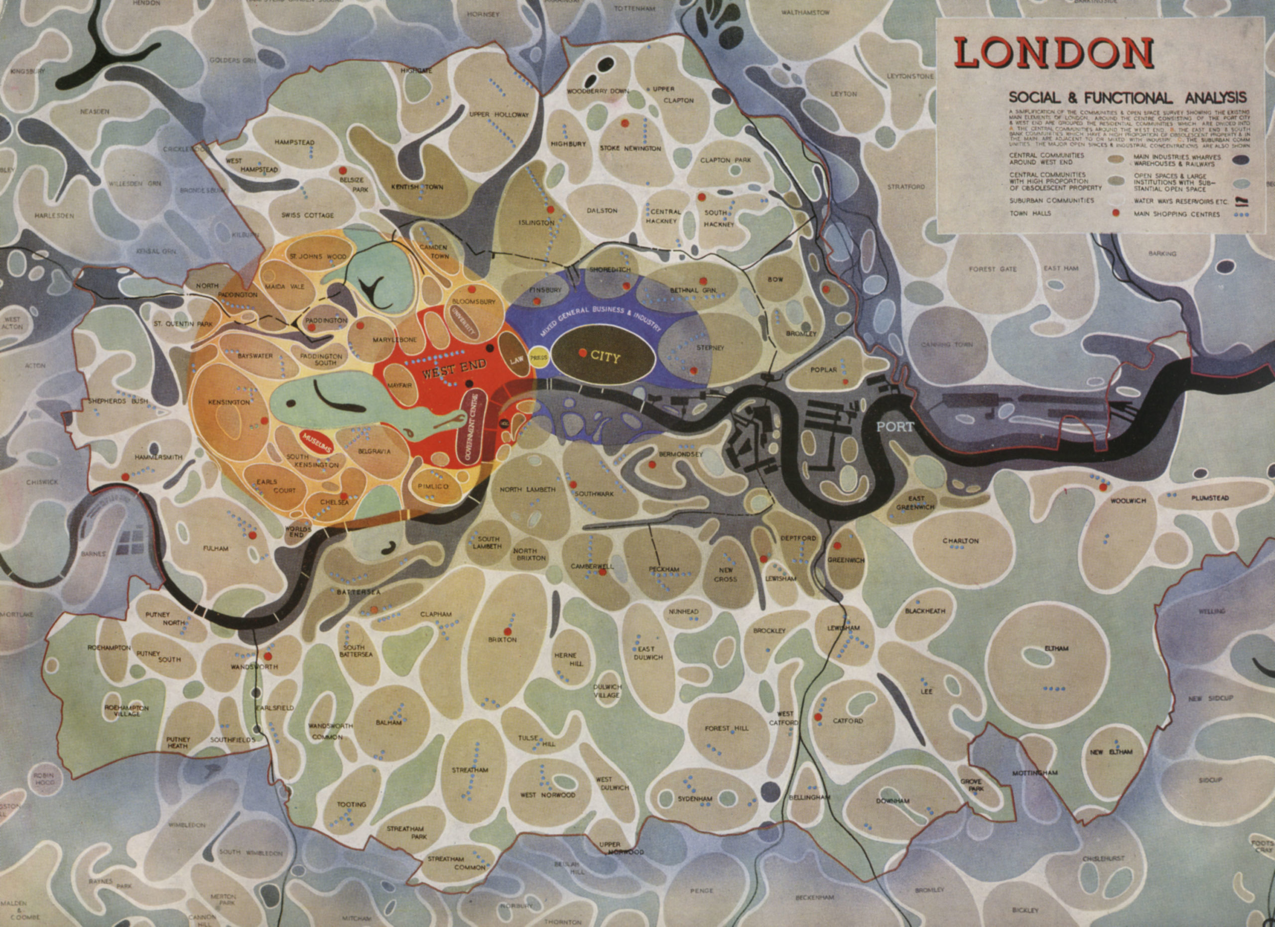
One of my favorite works of data visualization is a map from “The Greater London Plan” in 1944. This semi-abstract map by Patrick Abercrombie and J.H. Forshaw was a plan for recreating London after the bombing blitz of WWII, but it was also an attempt to reenvision the footprint of the city after unplanned 19th-century industrial development.
Each district appears as a simplified “blob” representing specific use types. Blue dots mark out the main shopping streets with town halls marked with larger red dots. The only recognizable feature is the River Thames and associated waterways which snake horizontally across the map. Let’s take a closer look.

Seeing the bigger picture
London is an ancient city, established in 43 AD as “Londinium.” As the city outgrew its original Roman walls circa 950 AD, it rapidly expanded until it was the largest town in England by the 11th century. By 1605 London had 225,000 people–growing ultimately to its largest population of 8.6 million in 1939 .
Then came WWII. England was systematically bombed by the Luftwaffe starting on September 7th, 1940 for 56 out of the following 57 days and nights. The German airforce dropped more than 18,000 tons of bombs on London, killing more than 40,000 English civilians, almost half of them in the capital city. More than two million houses in London were destroyed or damaged in what was to be called “the Blitz.” The trauma would cast a shadow over the character of the British people for generations.
“The broad plan is complete, it must be translated into action”
London was never truly planned. Its growth was organic and its 18th-century streets were cramped. The rapid industrialization of the 18th and 19th centuries created some of the worst living conditions ever recorded.
The Blitz worked counter to German plans and galvanized the British public to endure, fight, and overcome. It was in this spirit that Abercrombie’s Great London Plan was hatched to address five main issues at the time:
- Population growth
- Housing
- Employment and industry
- Recreation
- Transport
Author Sam Hind remarks, “… at varying scales, Abercrombie’s plans designed to foster a new type of urbanism. One borne out of the ensuing post-war virtues of order and dignity. As the map shows, Abercrombie’s vision was centered around new towns. These multiple city blobs, resembling spores on a petri dish, were designed to redistribute meaningful, livable space in and around the fringes of the densely built ‘City’ and West End areas.”
To support their plan, both Abercrombie and JH Forshaw described their ideas in a film produced in 1946 by the Ministry of Information called The Proud City (A Plan for London). The film itself is a polished introduction to the plan with plenty of optimistically montaged shots of everyday life, paired with urban planners, architects, and designers in white lab coats fervently drafting the future. The film must have been quite progressive for the time by using stop-motion animation techniques to show the history of the city and proposed interventions.
About halfway through the film, as the various talking heads walk through the plan, Ambercrombie shifts his attention from the various architectural models to a huge version of this map. (Personal aside – OMG, where is the original? Does anyone know?) He uses it as a way to show the relationship of all the communities as they relate to the overall plan. Ambercrombie explains that this map helps to integrate the Greater London Plan as a whole in order to “make life better and pleasanter for all of us.”

You can watch the newly restored film here:
“All things are ready if our minds be so”
This quote from the bard graces the introduction to the 1944 version of the Greater London Plan, and with it, the best mindset for all great dataviz experiences.
The Greater London Plan was only partially adopted in the end, as the complexities of the reconstruction outflanked Abercrombie and the best urban planners in England. While developers were not convinced (or required) to enact the plan, the project was popular enough to help define post-war optimism. Opportunities to provide better communication and transportation systems for the city center were not acted upon, but the groundwork for urban renewal (especially by the river) and suburban development helped create the London of today.
But why do I love the map? Well, I’m a sucker for complex systems on a vast scale. This map is a perfect blend of optimism, diagrammatic speculation, and utopian idealism. It is unusual enough to demand your attention and friendly enough to help you see the bigger message. What’s not to like?
Here are some images from the book version.


Jason Forrest is a data visualization designer and writer living in New York City. He is the director of the Data Visualization Lab for McKinsey and Company. In addition to being on the board of directors of the Data Visualization Society, he is also the editor-in-chief of Nightingale: The Journal of the Data Visualization Society. He writes about the intersection of culture and information design and is currently working on a book about pictorial statistics.
-
Jason Forresthttps://nightingaledvs.com/author/editor-in-chief/

-
Jason Forresthttps://nightingaledvs.com/author/editor-in-chief/

-
Jason Forresthttps://nightingaledvs.com/author/editor-in-chief/

-
Jason Forresthttps://nightingaledvs.com/author/editor-in-chief/


