
This article is part III in a series on data exploration, and the common struggles that we all face when trying to learn something new. The previous articles can be found here and here. I’m exploring the tools data from the State of the Industry Survey, to illustrate both how I approach a new project, and the fact that no “expert” is immune from the challenges and setbacks of learning. In addition to working with a new dataset, I am also using this project to take my first steps toward learning R. Let’s see where this journey takes us!
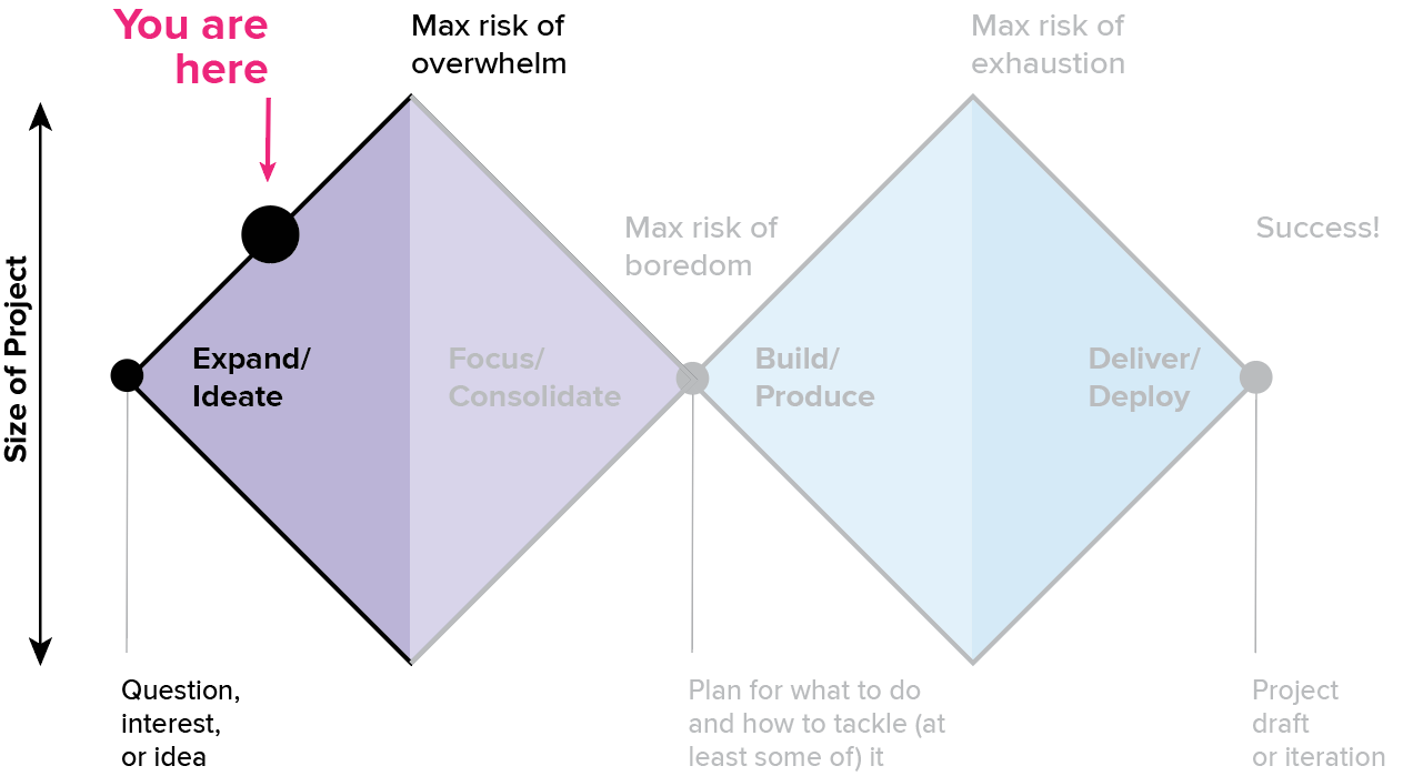
The last article focused on the process of getting oriented; that first, heady discovery stage where everything is new and it’s easy to skim through the simple questions to find something interesting. It’s a high-potential space where everything seems possible, in part because you have not really begun to engage with the reality of the data. But good visualization leads to deeper questions, and deeper analysis takes more consistent effort. Let’s take a closer look at where we are on the double diamond.

At this point, we’re starting to enter the higher-effort engagement stage. This often requires you to push edges and explore new space, and it’s where you’ll need to stretch your skills and abilities. If the first phase of the journey was a gentle stroll across an open field, this is where you start to climb your first major hill. You’ll need to pay a bit more attention to your energy levels here, and you can expect to start feeling the workout.
The engagement stage is also where the potential that felt so exciting in the discovery period starts to feel heavy. If you’re not careful, the weight of your own expectations can really start to slow you down, and unmanaged fatigue can create an opening for imposter syndrome to slip in. Staying deep in the engagement phase for too long or not pacing your work properly can lead to burnout or failure to complete your project.
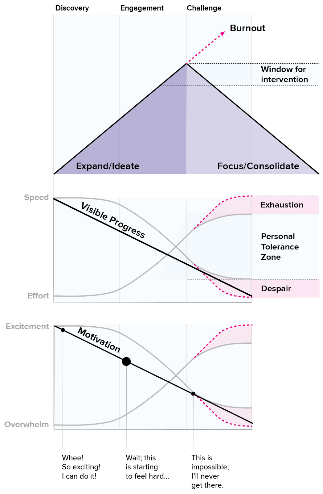
Fortunately, there are several ways to prevent that from happening. There’s always a window of time where you have an opportunity to intervene before things go off the rails. Experts have more experience recognizing and managing their energy to prevent injury; they probably respond sooner and may not even notice that they’re skirting on the edge of fatigue, because they’re doing what they need to do to care for themselves along the way. Developing experience is about learning to recognize when you’re getting tired and to take that as an opportunity to adapt rather than pushing until you just can’t go on. Remember that energy management is a symptom of intelligence, not weakness: experts do this constantly, because it reduces the likelihood of injury and increases your chances of success.
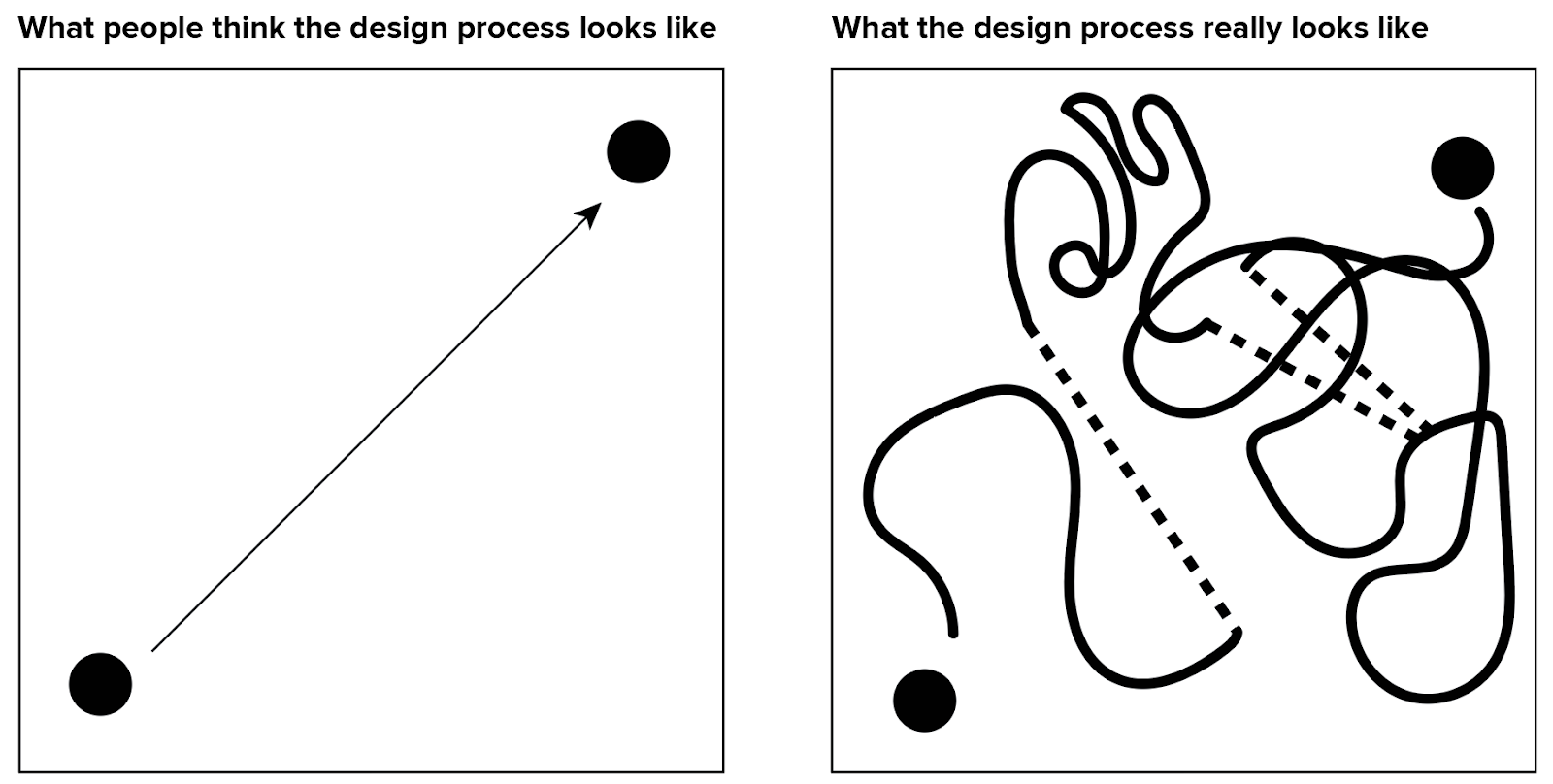
We’ve looked at this image before. As a beginner, it can be tempting to shoot straight for your destination and to take the most direct path to get to your goal. It seems like that must be the fastest way, and that the real process is inefficient and undesirable. Like measuring the crow’s flight distance on a map, this approach assumes there are no obstacles and fails to account for the real terrain of the problem. The two-dimensional picture of the design process is really just a simplistic projection of a much bigger, multidimensional space.
If you think about your task in the context of climbing a mountain, you can immediately see why someone might turn back or loop around to get where they’re going. The squiggly-line drawing isn’t nearly as senseless and inefficient as it might seem. People outside of the process may not be able to see the challenges of the terrain, but an expert knows enough to account for them if they want to reach their destination in one piece.
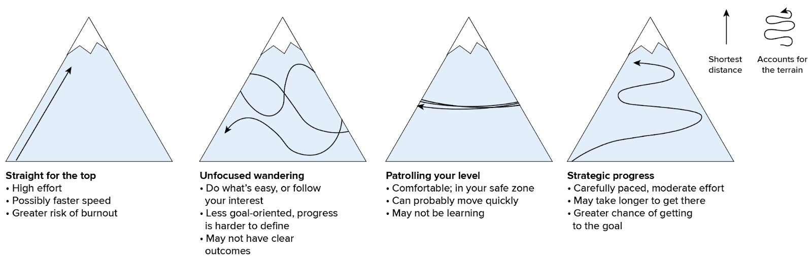
From this perspective, success becomes a matter of energy management: your job is to balance your effort and reward curves in ways that allow you to stay deep in the engagement phase for the longest period of time, and to make sure that you’re continuing to make strategic progress toward your goal. Ignoring fatigue is usually not helpful: if your brain can’t count on you to rest when you need to, it will simply make the choice for you, and without your consent. This often comes in the form of distraction, loss of motivation, or imposter syndrome. In my experience, those are usually signs of poor energy management rather than weakness or lack of commitment.
One way to rest is to simply stop and do something else, but there are nearly infinite ways to stay engaged with a project while taking a break. Getting overwhelmed? Step into the focus and consolidation phase to simplify and regroup, before you burn out (timing is key here). Feeling like you’re not making any progress? Step back into discovery for a while and figure out some quick wins. Are you getting tired but not quite ready to stop? Level off and work at something straightforward for a while to maintain your pace, rather than trying to sprint straight uphill.
Tips for energy management
Here are a few guidelines that help me to stay productive during the harder work of the engagement phase.
- Stop before you’re tired. The best way to avoid getting slowed down by an injury is to prevent it. Don’t wait until you’re exhausted to act.
- Pay attention to how you’re feeling about a project. If your motivation is slipping or you’re starting to feel overwhelmed, that’s a sign that you need to back off and do things differently for a while.
- Switch tasks often, even within the same project. Every sub-task requires different strengths. Switching them up is like cross-training for your brain. You may need to manage this to make sure you’re still making progress, but switching gears can be a very healthy thing. If distraction is a challenge for you, make a game of seeing how long you can stay happily excited about working on the same thing by focusing on different pieces or tasks. The key word there is “game.” If it stops being fun, see the first bullet.
- Don’t beat yourself up. I’ve never seen someone become less tired because someone yells at them. If you’ve missed the signals and things have devolved into exhaustion, the best you can do is to treat the problem at its source. Self-flagellation is counterproductive and a waste of time: don’t do it. Learn not to abuse yourself. Try something to make your exhausted brain feel safe and cared for, instead. You are responsible for setting realistic expectations and managing frustration in healthy ways. There’s no need to take it out on your creative self if you’re disappointed or frustrated with how much you can do.
- If you get stuck, step back and try a different direction. You’ll likely end up circling back around to the same underlying questions again and again: that’s ok. In fact, that’s useful information. Running into the same roadblocks is often good confirmation that there’s a core piece of the puzzle here that you need to solve. It may be that there’s a limitation in your data or that you need to change your method, but banging up against the same dead ends in different ways is often an indicator that your most interesting insight lies behind those stubborn walls. I often imagine myself pacing around the perimeter of the problem, trying to find a way in from different angles: the more times I end up back in the same place, the more likely it is that it’s the key to figuring out where I want to go (or to changing my mindset, so that I can see a better way). Pay attention to those centers of gravity that pull you back in, and then get very clear on what’s blocking you from reaching them: those hints are usually the ones that point to what you need to see.
Back to the survey data:
So, what does this look like in practice? Let’s get back to our exploration of the survey tools data and take a look.
Last time, I made a list of all the interesting questions that were relatively easy to look at, and took notes about all of the more complicated things that I’d return to later. In reality, I do a mix of simple and complex analyses in almost all stages of a project (task switching!). I don’t want to spend too much time on side tangents, though, so I’m always monitoring to see if I’m getting in too deep, and I will pull out if an analysis is starting to bog me down. In one sense, the discovery phase is unlike just about any other area of my life: I will almost always err on the side of impatience to keep things moving along.
As I worked through the simple questions list from last time, there were several side analyses that diverted my attention. These were slightly more complex pivot tables or required more steps to massage the data into shape. This is the time to dig deeper into a few of those problems. I worked on this project over multiple weeks, so I might have spent a few hours on a harder task, switched gears and played with an easier one, and then come back to focus later in the day, or whenever the next session happened to be.
Ultimately, though, what I’m looking to do in this stage is to get deeper into the details and start looking at more complex relationships. Instead of individual values or individual columns, I’m starting to look for correlations between columns, or derivative data that might help to give me some insight into the problem at hand.
A deeper look at the data
For this stage of the project, I wanted to understand more about the tools that people use together. This is moving toward my initial instinct that I’d need a clustering analysis of some kind, but I wanted to see what I could manage with simple methods first. I used this set of explorations to experiment with simple group-by functions in R, and then shifted back into Excel to get a better understanding of the results. As we’ll discover, it turned out that the R analysis was actually counterproductive when working with pivot tables, so I switched back to the flat dataset halfway through and tried again. I understood from the beginning that there was an awkwardness with how the original table was formatted, but hadn’t yet figured out how I wanted to structure the data. Seeing precisely why the group-by approach couldn’t work was part of figuring out what I needed to do next. Sometimes the missteps are a necessary part of seeing how to move on.
In terms of the more focused questions that I was asking during this phase, I picked up where we left off in the previous article. Rather than analyzing for one tool at a time, I started with simple pairwise analysis (comparing counts of X tool vs. Y), and then moved toward a more complicated row-level analysis to look at groups of tools for individual people in the dataset.
Before we look at the charts, I want to emphasize again that I’m in the “expand” stage of this project. I am putting up with a lot of manual work right now to avoid getting tangled up in learning R and exploring at the same time. If you know how to use more advanced analysis tools, my repetitive bumbling here will probably put your teeth on edge. I know there’s a more efficient way: I’m simply not there yet. And that’s okay with me! I’m simply laying the groundwork so that I can move faster when I do start working with the new tool. Also, please remember that the data in this analysis is intentionally incomplete. None of these charts contain reliable values and there is no useful information to interpret from them; these are all just sketches to help me think through the analysis that I want to do. As such, I rely heavily on screenshots and notes, and am not concerned with axis labels, specific data values, or other details, because I know them to be meaningless. With that, let’s explore some questions!
What tools are paired with X, and how often?
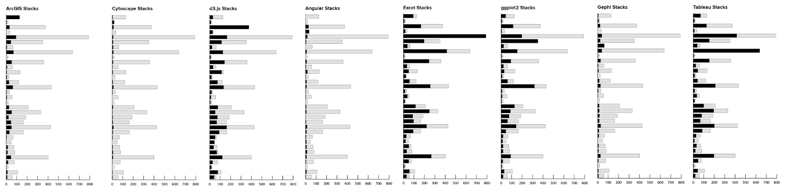
Because the responses for each tool are stored in a separate column, it is relatively easy to count up the number of people who use X, and the number of people who also use Y. Looking at the results in a stacked bar gave me a solid bar for the reference tool (each of the ~125 users who uses ArcGIS uses ArcGIS), and then a pair of bars for each other tool in the group (10 percent of people who use Excel also use ArcGIS).
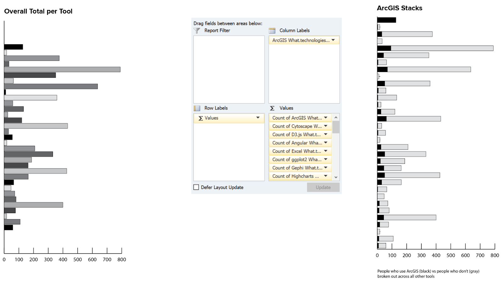
Because I’m using the overall response counts as the total for each stack, it’s easy to see which tools are more popular. It does look like there might be some interesting patterns to tease out of the tool pairs, but it doesn’t make sense to get too detailed with those before firming up the data. (Remember from the last article that we don’t even have all of the tools in here yet!)
Looking at this as a correlation grid helps me to see hotspots that might indicate interesting pairs, though this will also be convoluted with the relative population of users for each tool. For instance, (I’m making this example up) you might not see that 90 percent of QGIS users also use ArcGIS, because the population for both of those tools is completely swamped by Excel.
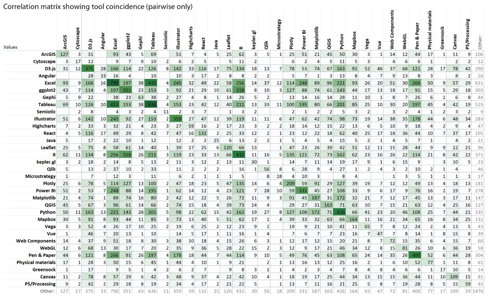
I could change the picture by using percentages, but that adds other complications. It does seem like there are some groupings within the data, and some pairings are particularly strong. I also see strong variation in popularity (counts) for the different tools reflected in the correlation pattern. For now, it’s enough to sketch this out. I’ll come back to it later to refine and develop different views, if this analysis makes the final list. No sense in over-optimizing yet, since I’m not even sure that this is where I want to go.
How often are tools X and Y paired together?
Next, I wanted to get a sense of frequency for the different tool pairs. This analysis was more complicated in Excel, and required a lot of manual rearrangement that I knew would be easier in R. I was still struggling with basic R manipulations and didn’t want to get bogged down with that just yet, and I didn’t want to spend a lot of time developing custom charts to reflect incomplete data values. For now, I decided to stick with just sketching out the concepts, instead.
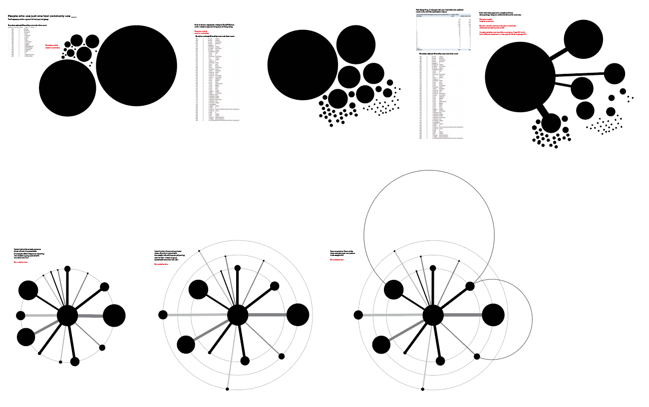
- The first sketch looks at tool frequency within a particular overall tool count: of the people who use only one tool, how many use Excel? Tableau? Of the people who use two tools, how many use Excel?, etc.
- The next sketch selects a single reference tool (Excel), and looks at what other tools people use. How many people use Excel and Tableau, Excel and PowerBI, etc.?
- The third sketch looks at the overall popularity of the different tools, and uses lines to show how often they are paired. It’s drawn with Excel as a reference point, as if it is the center of an interaction. The only difference between this and the previous version is that I’m explicitly encoding the connections between the reference tool and others in the group (in the previous version, the reference tool implicitly sets the context, but is not drawn).
- If we assume there will always be a reference tool, we can move that into the center, and show other tools around the edge. We could scale their size by frequency of pairing, if we want to emphasize that aspect here.
- I’m also interested in how this intersects with the number of tools people use overall. Adding radial groups to represent the total number of tools could help to tease apart how closely related two tools are. Here, the inner ring is Excel and one other tool, second is Excel and two other tools, etc.
- As soon as we get to more than two tools, we might need to start including loops to show where those categories overlap. If a person uses Excel and Tableau and Power BI, we might want to connect them with someone who uses that same group plus D3. Or, we might want to connect the Excel and Tableau group to anyone who also uses Tableau, regardless of what other tools are in the mix. There are lots of ways to define the connections, but the key thing to keep in mind is that we might want to see them.
I’m pretty sure that none of these will become the final form for my project, but they were quick to draw, a fun break from the spreadsheets, and these sketches are enough to capture the basic ideas. This is an example of pacing in action; I’d run into a roadblock on the pivot table analysis, I didn’t want to put the energy and time into the harder R work, and so I did something quick and fun within my existing skill set instead. I can always come back to this later, and it gave me a short break before getting back to wrestling with the core problem that I was trying to solve.
Which tools are used alone, versus in sets?
By adding in a calculated column that counts the total number of tools per person, I can start to compare how much a tool is used overall, and how often it is the only tool or one of a small group. This doesn’t tell me about the importance of the tool within that group, but I would expect that core tools would be represented more often in small groups (and more broadly across all groups), where peripheral or more specialized tools would tend to show up only in larger groups.
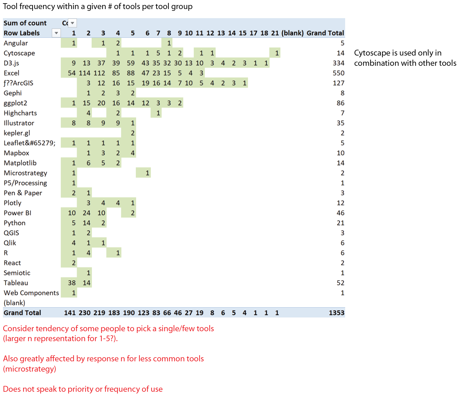
You can see that I’m also keeping notes on the limitations of the analysis and details to follow up on, if I come back to this piece of the problem again later. I’ve had to rely on these notes multiple times when writing this article, which I’m composing more than three months after the initial exploration was done. You’ll never see things as clearly from the screenshot as you do when you’re in the thick of things, so make sure you leave a trail!
Once I have a good thing going in the sketching phase, I like to push it until it breaks, just to see what happens. For this version, I broke the pivot out again, to look at the list of second tools and their groupings as well. Essentially, this pivot attempts to answer this question: for groups of two tools containing D3, what other tools are most often represented in that pair?
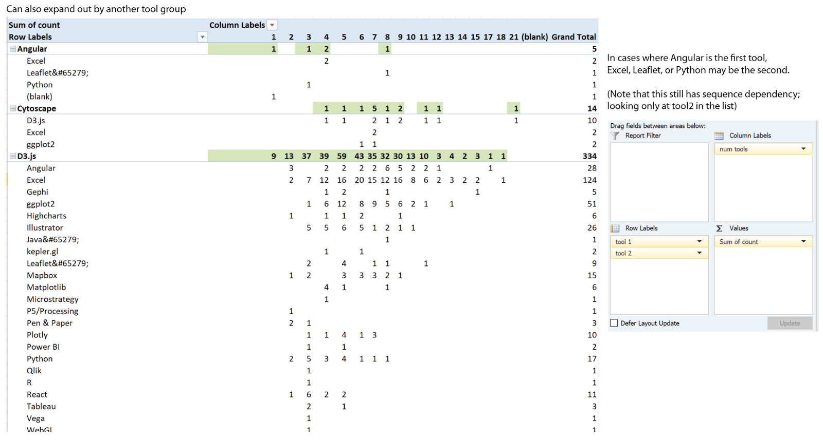
That’s an interesting question, but unfortunately, I had another set of assumptions in this data that I didn’t catch right away. When I found it later, it completely invalidated these results. It was only a few minutes of experimentation with a pivot table, though, so no harm done.
How many people use each lineage of tools?
The problem came from an intermediate step that I took hoping to start doing row-wise comparisons in the data. The initial data table had one column per tool, as I mentioned before. That’s great if you just want to count totals per column, but I really wanted to understand groups of tools per person. It’s a lot easier to read that information in the spreadsheet if you collapse out the empty cells. By reducing out the blanks, I had a much more readable list of first tool, second tool, etc.
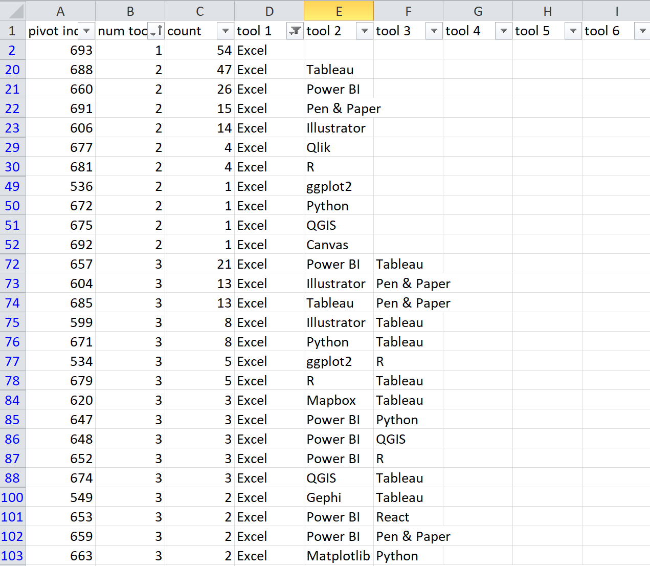
This approach has one major drawback, which is that it imposes a ranked order when there is none in the dataset. This is a multiselect question that accepts unordered responses, which means that my “tool1”, “tool 2” designation is based on whatever order the original columns happen to be in. I really want the first column to be the most important or most frequently-used tool, but that information simply isn’t available. I understood that limitation when I made the table, but didn’t think through all of the implications until a few steps further on.
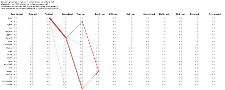
This is an instance where a different visual form can be helpful. I knew that the sequencing could cause me problems, but I was interested in creating some kind of attenuating tree diagram focused on the different tool groups, where longer branches would represent larger groups of tools, and the size and number of branching points would indicate popularity and diversity within groups. After aggregating up the common “branches” (shared tool sets), I started sketching them out in a multiple y plot. I wanted to look at the first tool, second tool, etc., in the list, so those are the individual y axes, and the tool list is on the left. My first two branches share Excel as the first tool and PowerBI as the second, but then they diverge for the third tool in the list.
The problem with this data aggregation method became clear pretty quickly: if the third tool in the list happens to be mismatched, I end up splitting a branch that will rejoin in the fourth tool. Since I know the sequence is meaningless, I would prefer to consolidate these branching points so that there are no loops in my network. These two branches should share tools 1, 2, and 4 and diverge at tool 3, but I don’t currently have any good way of sorting to make that happen. Again, it’s the artificial sequence that causes this problem, and there’s no simple way around it in my reduced-branches version. I am pretty sure that this analysis will be trivial to do with a more sophisticated method, so it was time to put this one aside.
It took me a couple of weeks of project time to play around with this to my satisfaction and discover that this particular method leads to a pretty firm dead end. It’s not impossible to get this data to work, but it’s going to take more effort and thought to do it well. The question is still interesting and I will probably return to this analysis in a different form later, but it’s not going to get me where I want to go from here. The same restriction applies to my pivot tables above. The designation of first, second, and third tool doesn’t make a lot of sense in an unordered dataset, and so a simple clustering model would probably be a better match. An unordered, network approach would not impose the same hierarchy that’s implicit in the sequenced, hierarchical approach required for branches. This little diversion also raised a question that I would consider adding to next year’s survey: if we asked users to rank tools on preference or frequency of use, then we’d have the data attribute we need to make the branches work.
By now, certain inner voices might be starting to shout that this entire effort was wasted, this was all completely obvious from the beginning, and that I’d spent more than two weeks learning absolutely nothing. I disagree with those voices: discovering a dead end is still information, and if you understand why it’s a dead end it’s taught you an important property of the dataset. Whether it’s something you saw and didn’t recognize or something that you simply failed to notice, making a mistake like this will reinforce that connection in ways that you’re unlikely to forget. If you find yourself in need of additional consolation, remember that it’s a lot less painful to cut your losses while you’re still in the sketching phase than to get caught wrong-footed later. The problem isn’t being wrong; it’s staying wrong.
Whether or not this detour was successful, it helped me to clarify what I was going for, simplified my approach to the analysis by removing the row-level aggregation, and gave me an opportunity to think through alternative displays to show this same kind of information in a non-sequenced way. I contented myself with adding some notes (in red, to be sure I didn’t forget), sketching out a few ideas for extensions or other approaches that could reduce the impression of ordering, and moved on.

How many people use this specific tool group?
To regroup, I did what I always do when I hit a dead end: I circled back to something simpler, and started moving forward again. The branching detour did validate my interest in being able to drill down deeper into more complex combinations of tools. I seldom use treemaps, but that was one of the first visualizations that I sketched out for this dataset, and I had that sense of subsectioning in the back of my mind for several of these iterations. There is no reasonable way to build what I wanted manually in Excel, but I could at least do enough to peer inside and get a sense of what’s in there. To do that, I created an individual branch browser that let me specify relationships between different tools.
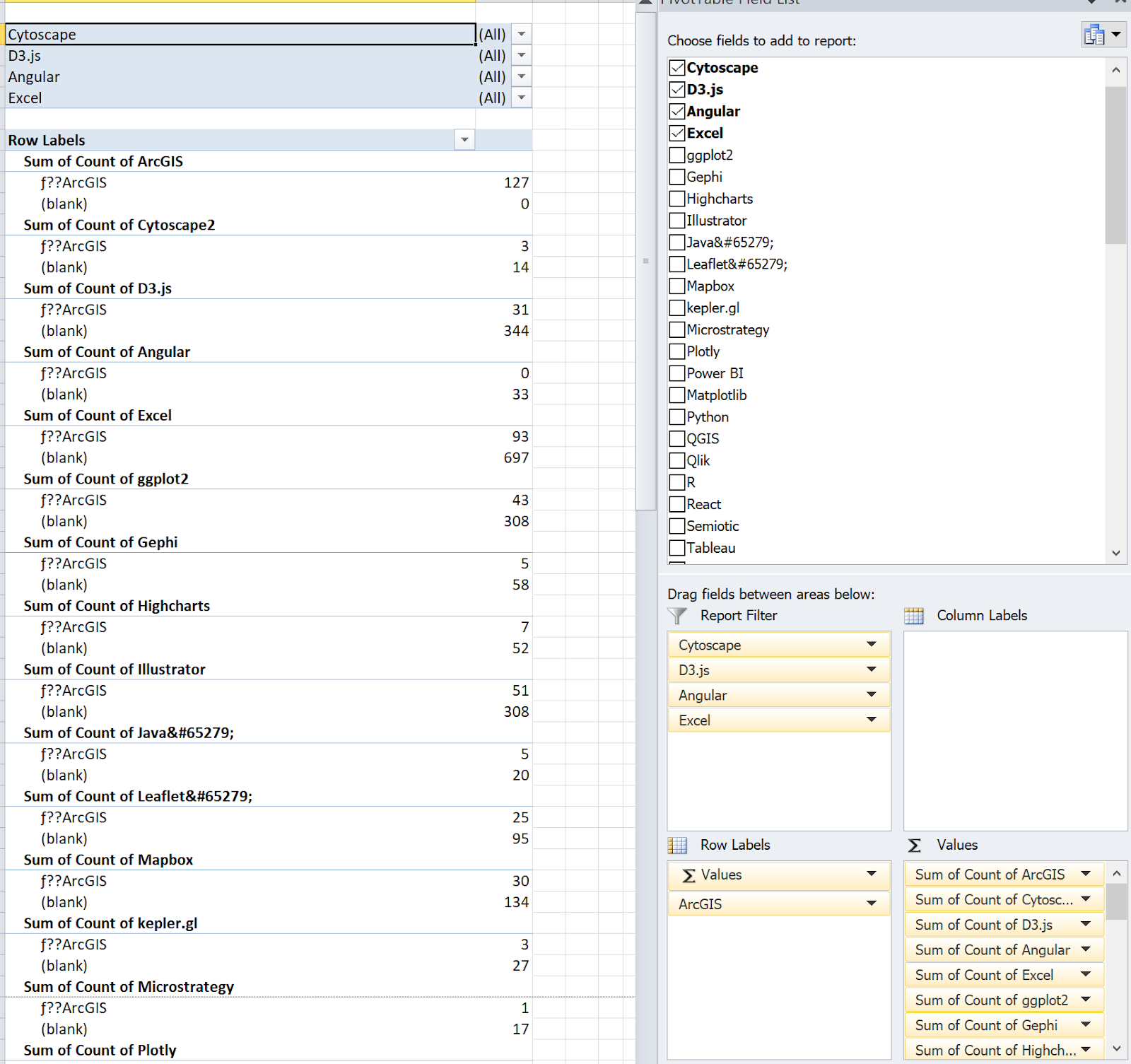
This pivot allowed me to specify my branches one node at a time, and to see the count of tools that fall within a particular branch. By putting one reference tool in the row labels category, I was able to see the count of users who do (and don’t) use the reference tool, broken out across each of the other tools. I started out with ArcGIS as my reference, and then looked at the count of people who use Cytoscape who also use ArcGIS, who use D3 and also use ArcGIS, etc. In a sense, this is coming back to my stacked bar charts example from the beginning, and just doing the whole comparison at once.
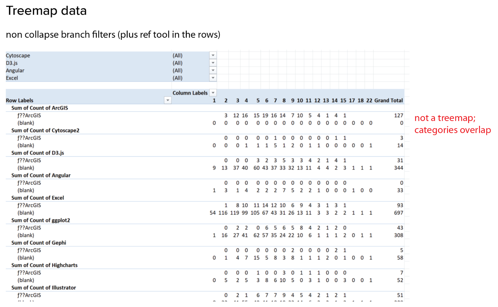
Unfortunately, as you can see from my next red note, this pivot is (sadly) still not a treemap. It’s always a good idea to keep an eye on your totals row when doing this kind of analysis: if your counts add up to something much bigger than your dataset, you know you’re in trouble! This is easiest to think about in terms of an example. Let’s say that I am looking at the group of all ArcGIS users who also use Cytoscape. In a group of two tools, this browser works just fine. The problem comes in with groups of three or more tools. The third tool could be anything! Let’s look at what happens if the third tool is D3. Those people get counted in the group of three for ArcGIS and Cytoscape and D3, but they’re also counted in other groups of three containing Cytoscape, and in the groups containing ArcGIS and D3. All of a sudden, my counts blow up, because I’m cross-counting everything. That’s okay for some questions and visual forms, but overlapping categories are simply not compatible with a treemap. If I redefine my task as simply mapping out branches, I could sort of make this work by manually toggling filter values for each and every combination, but that’s way too much work to make sense at this stage. Much better to wait and automate this one, if this ends up being an interesting path.
Ok, so what have we learned?
This part of the project was more involved and took a lot more manual, tedious work than the previous stage. In some ways, you could say that I wasted several weeks bumbling around in the dark and heading off down rabbit holes and dead ends. Welcome to data exploration! I am very aware that someone who knows more about analysis or is fluent in R could have run rings around me and my manual pivot tables in Excel. It would be nice if I could just magically know everything I need and be good at that already, but I’m not, and that’s ok. This is what it means to learn, and no magic piece of software is going to get me out of the real work involved in understanding the data. True, I didn’t come out of this with everything figured out, but I did get a lot out of this foray. Here are some of the things that I learned:
- Ordered vs. non-ordered data is a key consideration for this dataset, and it will affect both the aggregation and the visual form in important ways. We don’t want to imply a ranking that doesn’t exist. Implied ordering can also cause mistakes in the analysis.
- I need to be sure that my method prevents double-counting across columns, so that I can be sure that my branching categories are unique. A good basic check is to be sure that my pivot table column totals are no larger than the original dataset.
- Pairwise analysis is interesting, but clustering or branch analysis across the full toolset for an individual user creates much richer and more interesting information.
- The number of unique combinations makes the branching analysis difficult to manage, and may cause problems with scaling for some visual displays. It might be necessary to remove branches/tool combinations with only a single user, or to consolidate them in some way to avoid creating hairballs or value displays that need to show tens of thousands of individual pixels.
- The branch navigator was interesting because it allowed me to interactively query the data. If possible, it seems likely that interaction in support of exploration will be a key piece of presenting the information. This has implications for both the data structure and aggregation, as well as the medium in which the final result will be displayed.
- Drilldown is useful, but I really want an overview of the full dataset first. That piece is going to take some work, but I think it will be worthwhile. Whether it’s a treemap, a dendrogram, or some other visualization, I want to be able to see the relative size and fragmentation of the different tool sets.
- I am much better prepared to approach the hard work of learning R and doing these more complicated analyses now that I know more about where I’m going. This gives me at least some (clunky and painful, but functional) approaches to sense-check my results along the way.
Lots of effort for a bit more progress is pretty typical in the steeper uphill climb of the engagement stage. We’ve learned some interesting things, gotten more focused on what we need to do, and identified some important mistakes to avoid. The next question is how long you stay in this stage, and how far you wander before pulling back in and switching into focus/consolidate mode. I had one more set of things to explore before making that transition, but we’ll cover those in the next article.
Coming up at the DVS:
- One thing we haven’t talked about in these articles is how to collect the data that supports an analysis like this. If you’re interested in better understanding and participating in the data collection process, the 2022 State of the Industry Survey Committee will be launching toward the end of May! Fill out an application here.
- Join us for an informal roundtable on May 28 at 10 am to talk about how we build and analyze the survey data, and to meet some of the people who have been working on this project. It’s listed on the DVS Events calendar, or you can register here!

Erica Gunn is a data visualization designer at one of the largest clinical trial data companies in the world. She creates information ecosystems that help clients to understand their data better and to access it in more intuitive and useful ways. She received her MFA in information design from Northeastern University in 2017. In a previous life, Erica was a research scientist and college chemistry professor. You can connect with her on Twitter @EricaGunn.
-
Erica Gunnhttps://nightingaledvs.com/author/erica-gunn/

-
Erica Gunnhttps://nightingaledvs.com/author/erica-gunn/

-
Erica Gunnhttps://nightingaledvs.com/author/erica-gunn/

-
Erica Gunnhttps://nightingaledvs.com/author/erica-gunn/


