
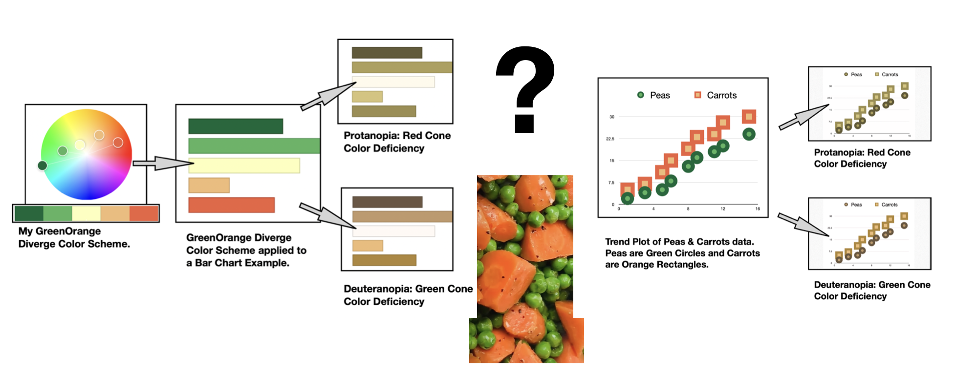
In this writing, I discuss the challenge of working with a green and orange color scheme in data visualization. Unfortunately, 99 percent of people with color deficiencies cannot see the color difference between green peas and orange carrots. These individuals can distinguish the shape and likely the taste of the two vegetables.
In data visualization, building a color scheme where green and orange oppose each other with a yellow midpoint is problematic. In general, a diverging color scheme is where the quantitative data progresses outward from a central neutral midpoint to two different color extremes. With a green and orange diverging scheme, individuals with red-green color deficiencies are likely to see two yellowish color schemes fused together. To resolve this difficulty, I propose two possible purple approaches with white midpoints. I suggest using either green and purple as the contrasting color scheme or pairing purple and orange as a potential diverging color scheme.
For the situation of green and orange scatter plots and bubble charts, I build on the concept of green peas and orange carrots. I consider and suggest representing each of the data variables with different geometric shapes. For the example of “peas and carrots,” the green peas would be represented by circles while the orange carrots would be shown as squares. Individuals with red-green color deficiencies distinguish the data elements by shape rather than by color.
Building a green and orange color scheme
Let’s start exploring the pairing of green and orange by first building a green and orange diverging color scheme with a yellow midpoint. I use the free online Adobe Color to create my five-element color scheme and name it “GreenOrange Diverge.” The “Custom” option under “Apply Color Harmony Rule” allows me to easily select the five colors. I show my results below.

with a yellow midpoint.
The five colors in green orange diverge include the two greens of (#006839) and (#55B460); the two oranges of (#F2BB77) and (#EE613F) with a yellow midpoint of (#FCFFBC). These colors are specified with Hex codes. For those unfamiliar with the concept, a color Hex code is a hexadecimal way to represent a color in RGB format by combining amounts of red, green, and blue to note that specific color. I will use these Hex codes later to examine Green Orange Diverge in data visualization contexts.
An initial check for color deficiency with Adobe Color
In humans there are three types of photoreceptors or cones where each is sensitive to different parts of the visual spectrum of light to facilitate rich color vision. If one or more of the set of cones does not perform properly, a color deficiency results. A red cone deficiency is classified as Protanopia. A green cone deficiency is classified as Deuteranopia. A blue cone deficiency is classified as Tritanopia. As noted previously, 99 percent of people with color deficiencies are in the red-green categories. Software is available that simulates color deficiencies.
Adobe Color provides an “Accessibility Tools” function that includes Protanopia, Deuteranopia, and Tritanopia evaluations of its color themes. This allows for conducting preliminary color deficiency tests before actual visualizations are created. To find the “Color Blind Safe Tools,” click on the “Accessibility Tools” option in the upper left-hand corner of the Adobe Color app. The next step is to select the “Color Blind Safe” option. I show the results for my Green Orange Diverge scheme below.

Upon more careful review of the Deuteranopia and Protanopia simulations, both green and orange appear as shades or tones of Yellow with very small distinguishable differences between the two simulations. It does not seem that my Green Orange Diverge really passes color deficiency tests.
Using Viz Palette with my green orange diverging color scheme
To get a clearer concept of how Green Orange Diverge might appear in data visualization contexts, I decide to use the Viz Palette app. Elijah Meeks and Susie Lu built their freely available online app for this purpose. The Viz Palette can also quickly be used for Protanopia and Deuteranopia color deficiency evaluations. The results of entering the corresponding GreenOrange Diverging Hex codes into Viz Palette are shown below.

with Viz Palette color deficiency checks shown (Protanopia and Deuteranopia).
The results from Viz Palette’s Protanopia and Deuteranopia simulations indicate that individuals with these deficiencies will have trouble distinguishing between green and orange graphical elements in data visualizations. Let’s look more closely at Viz Palette’s bar chart example. I show these results with my Green Orange Diverge color scheme below.

Correcting the unsuccessful diverging color scheme
Unfortunately, my Green Orange Diverge color scheme does not pass color deficiency tests. Here, I show two alternatives that do pass color deficiency evaluations. One option uses green and contrasts it with purple while a second option builds a diverging scheme with orange and purple.
If the labeling or representation of your data requires maintaining a green color for one particular variable, I recommend using a purple and green diverging scheme. Here I use the purple green solution noted in the ColorBrewer tool. ColorBrewer is a free online “color advice for cartography” system that can also be used for designing data visualization color schemes.
Next, I insert the purple green Hex codes provided by ColorBrewer into Viz Palette to simulate data visualization examples. Below I show the bar chart example with Viz Palette’s Protanopia and Deuteranopia simulations. The evaluations indicate that individuals with Protanopia and Deuteranopia will have trouble viewing the original purple green color scheme as designed. However, they can distinguish between the colors in the five segments of the data visualization. The visualization thus passes color deficiency checks.

If the symbolism or representation of your data includes maintaining an orange hue for one of the variables, I suggest using a purple and orange diverging color scheme. Below, I show the results of using ColorBrewer’s purple orange color scheme and inserting the resulting Hex codes into Viz Palette. A detailed look at the Viz Palette bar chart example with corresponding Protanopia and Deuteranopia simulations is provided.

There are also additional diverging color schemes that will pass color deficiency evaluations. For example, in a previous Nightingale writing on Blue and Yellow: A Matter of Complements, I showed how the blue and yellow diverging color scheme passes Protanopia and Deuteranopia checks. In your practice of visualization, you may prefer other diverging color scheme combinations.
Another approach to green and orange data visualization plots
As noted at the start of my writing, there is another approach that combines Green and Orange variables in data plotting that also passes color deficiency tests. This solution involves using different geometric shapes for each quantity. Returning to my example of “peas and carrots”, the Green peas are depicted as circles while the Orange carrots are represented as squares. Individuals with Red-Green color deficiencies distinguish the data elements by shape rather than by color. Below, I show a trend plot that applies this concept with the corresponding Protanopia and Deuteranopia color deficiency checks. The Color Deficiency tests were performed with the free and online Color Blindness Simulator (Coblis) software.

Concluding remarks

In this writing, I have presented the dilemma of using a green and orange color scheme in data visualization. I have demonstrated that individuals with red-green color deficiencies are likely to view a green-yellow-orange diverging color scheme as two Yellowish color schemes fused together. Two suggestions for alternative diverging color schemes that also pass color deficiency tests are provided. One is a purple and green diverging scheme if there is a need to keep one variable as a green hue. The second solution is a purple orange diverging scheme if it is desired to maintain a set of orange colors in the data visualization. There are also other diverging color schemes that will pass color deficiency tests that might also meet your needs.
I also show another approach to combining green and orange variables in data plotting that also passes color deficiency tests. This solution involves using different geometric shapes for each quantity. For the example of “peas and carrots,” the green peas are depicted as circles while the orange carrots are represented as squares.
The process of colorizing data visualizations and graphic designs can yield surprising results. You might make your own unique discoveries while building color schemes for your projects. I have shown one of the challenges you may encounter while designing your own data visualizations. For additional discussions on my approaches with various color suggestion tools, please see my 2016 book on Applying Color Theory to Digital Media and Visualization published by CRC Press.

Theresa-Marie Rhyne is a Visualization Consultant with extensive experience in producing and colorizing digital media and visualizations. She has consulted with the Stanford University Visualization Group on a Color Suggestion Prototype System, the Center for Visualization at the University of California at Davis and the Scientific Computing and Imaging Institute at the University of Utah on applying color theory to Ensemble Data Visualization. Prior to her consulting work, she founded two visualization centers: (a) the United States Environmental Protection Agency’s Scientific Visualization Center and (b) the Center for Visualization and Analytics at North Carolina State University.
-
Theresa-Marie Rhynehttps://nightingaledvs.com/author/theresa-marie-rhyne/

-
Theresa-Marie Rhynehttps://nightingaledvs.com/author/theresa-marie-rhyne/

-
Theresa-Marie Rhynehttps://nightingaledvs.com/author/theresa-marie-rhyne/

-
Theresa-Marie Rhynehttps://nightingaledvs.com/author/theresa-marie-rhyne/


