
Happy New Year to all! As January ticks on, I think we are all familiar with the contestable tradition of the New Year Resolution. But a similarly contestable tradition at the end of year is that of the yearly report, or the look back. Generally, the two are totally separate events, but this year, I began to wonder…can the two be combined? Should they be? Let’s begin with a quick trip back in time to December, 2021.
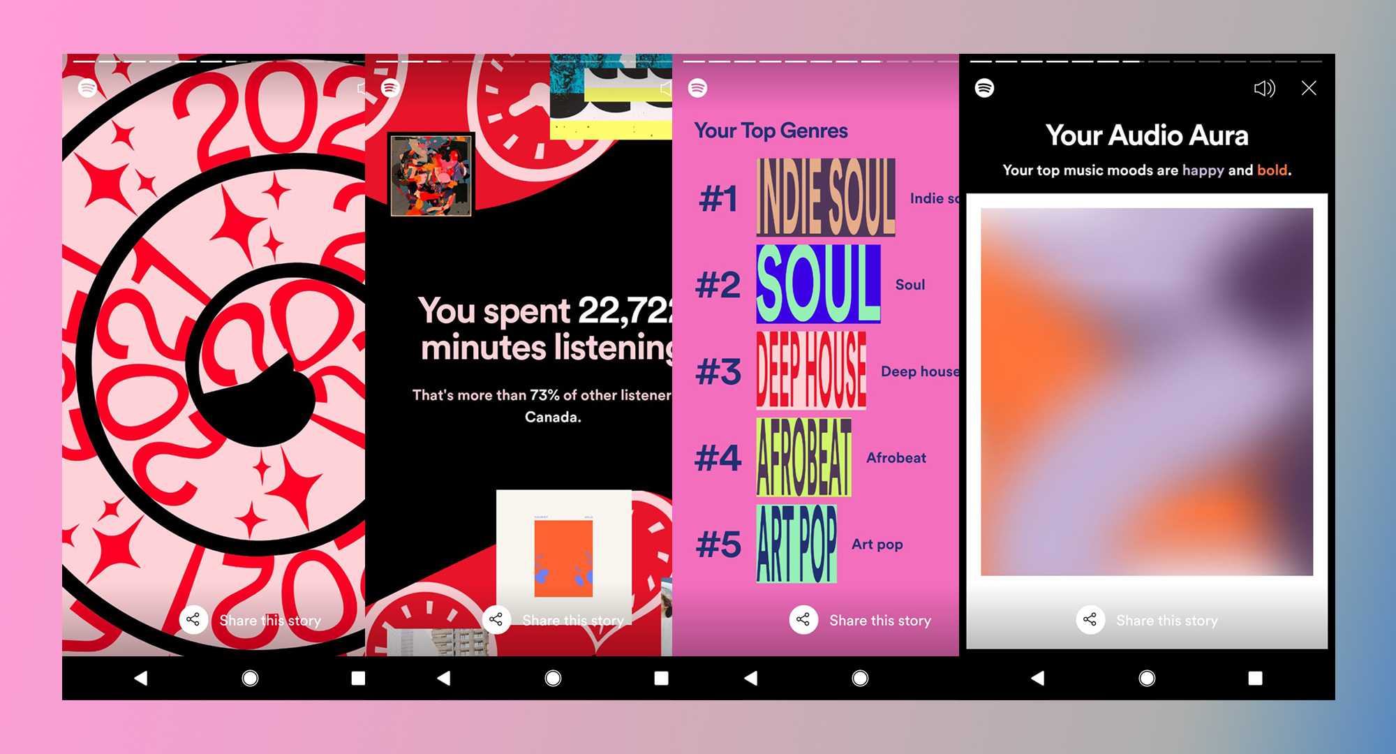
December was the month we got our long-hyped Spotify Wrapped, and for a few brief days, maybe as long as a week, our feeds were sprinkled with all our friends’ and acquaintances’ musical preferences, soundtracks, and musical auras.
Spotify is just one of the many companies that collect and use their users’ data to lead an extremely successful platform, feeding the data into AI systems that then cater to each of our individual, eclectic tastes to keep us coming back for more. Spotify’s Wrapped, the yearly “personalised annual report,” says to some,
“Heeey! Look here, we have your data, and it’s making us millions, but never mind that, look how cute it is. You have great taste.”
I enjoy Spotify Wrapped. It’s fun and engaging and a bit different every year. Told like a story, it feels less like an annual report than a chat with a particularly attentive friend. The hype it garnered on Instagram and other platforms is a testament to its popularity and the fact that people do genuinely look forward to some types of aggregation. They clearly find value in it. Whether that’s just to flex on their good taste in music, or to compare notes with friends, there’s no denying that Spotify is on to something. But what?
This format has considerable potential to be applied beyond just this dataset.
Interestingly, Spotify’s Wrapped was not the only annual report I received last year. As an avid user of two other apps, Duolingo and Strava, I was graced with a performance report from them as well.
In contrast to Spotify, I found myself wanting more from Duolingo. It was the least insightful wrap up that could have been so much more. It told me things I can already access on my own, like how many friends I have or which languages I’ve been learning. What if this was more like a redesigned report card that could show me how I did in a year of learning? Duolingo has published on their blog the use of a machine-learning algorithm called Birdbrain which creates customised lesson plans for each user. Could the data used for Birdbrain be returned in a more insightful way, à la Wrapped? On the one hand this is a great exercise in data transparency, and on the other, it is an opportunity to create great hype around the platform. In Duolingo’s case, this is a missed opportunity.

Strava is great, and although I am not a paying user – meaning I don’t have access to certain in-depth stats – the overview was quite beautifully done. It was not the most insightful however. Like Duolingo, it just aggregated all the stats I already have access to throughout the year. It was nice to see everything in one place, with trendy infographics, but Strava’s biggest data bank is my location data – where I went and how fast. I would love to see more of an overview of my movements rather than just minutes spent biking. A year-to-year comparison in particular sports, a regional leaderboard, or perhaps a comparative distance scale, e.g., “The distance you biked is 1/10 the distance to the moon,” would be much more engaging than it was.

Looking through all the personalised reports at the end of the year, I often wondered what value do these reports provide to me?
All my data – my performance statistics, activities I engaged in over the course of a whole year – this information is scattered across various companies in various places generating value to those companies. What would the power of this data be in our own hands? Of course, we could monetize it for ourselves, and this seems to be a possibility on the horizon of Web 3.0 via the use of blockchain or “personalised data pods.” But, how else could this data be more valuable in contexts other than monetary?
I was a big fan of Nicolas Felton’s yearly personal annual reports in the early 2000s. I came from a design background rather than data analysis and, as such, these projects heavily influenced my interest in data visualisation. I loved the idea of a personal annual report and the potential for self reflection that it offered. Felton’s 2010 report was intensely personal–after losing his father he spent the year creating a data portrait of him using calendars, passports, slides, and mementos. His effort demonstrated perfectly that data can be immensely reflective.

Similarly for Dear Data, the now-famous postcard project by Giorgia Lupi and Stefanie Posavec, the data collected by the two designers served a dual, reflective role. In picking the topics, they controlled what they wished to explore, and even then, the outcomes often surprised them. In various interviews, both Lupi and Posavec mention how the collection and visualisation of this data had an interesting therapeutic effect.
“Spending time with your data is spending time with yourself.”
giorgia lupi
Both of the above examples make use of data that was actively collected by the creator. What about data that is passively collected, like in the cases of Spotify, Duolingo, Strava, and others (especially Google)? Unfortunately, the first step would be for us to have access to the raw data ourselves, rather than through cute, superficial year-end aggregations. But after that, it’s a blank canvas. How else might we make use of this data? I suppose it all depends on individual interests, as well as technical skills, which are not sufficiently common.
Being fresh into 2022, still in the dawn of the new year, quietly contemplating my goals and resolutions, I thought back to these reports and reflected on the portrait they painted. Is it me? A bike-riding, French-practising, Indie-Soul listener? This is definitely not the whole picture–the online version of me is a manufactured dual-personality aware that my every click and play further shapes this persona (which is why I don’t share my Spotify password with *anyone*). But what I click on and listen to, and am comfortable being seen on Wrapped listening to, is not the whole story. What is the data missing, or what is it really showing? And can I fill in those gaps this year, creatively and confidently, for myself?
Although the reports I receive at the end of the year show little slices of what I did and what my accumulative interests were, I feel quite left out of the process of their creation. For the digital companies mentioned above, and others, this may be just the beginning of an ongoing conversation between them and their users that is conducted in the language of data visualisation. I can imagine that in the coming years the demand on the part of the consumer for data transparency and a more egalitarian application of personal data will continue to grow, and visualisations such as those of the year-end reports can serve as one tool. What shape will this take? Or what shape would we like it to take? In order to know what I want, to have agency, I feel I have to pay a little more attention to what I am getting in the first place. Otherwise another year will pass and I’ll still be just a French-practising, bike-riding, Indie-Soul listener, which is a convenient, marketable, oversimplification of myself I do not want to become IRL.
This year I am going to try to create my own annual report using some of the data collected by my apps, but mostly using data I collect myself, inspired by the apps. This is an experimental exercise in stretching the limits of my marketable persona. Perhaps I will discover some flaws in there to reflect on. Perhaps I will find a neat combination in my datasets that becomes greater than the sum of its parts, for example, my location data + my language data, or my music listening + my spending data. I am not sure what I will find, as I do not know what I want, but I feel in my bones that the first step in finding out is to play around with the data I can get my hands on.
I have selected sustainability as my overarching theme. Like many others, climate change is on my mind, so this year I will track my ability to live sustainably as seen through my non-essential purchasing habits (everything but food). I will track, record, and use any passive data source (like apps, ads, public records) to paint a picture for myself of my consumption habits for 2022. Still vague, I know, but let’s play!

Anda is a designer on the go. She has lived and worked in North America, South Asia and now Europe. This transience is central to her work and her take on the world around her. She is currently completing an MA in Information Design at the Design Academy in Eindhoven, the Netherlands.
- Anda Lupascu


