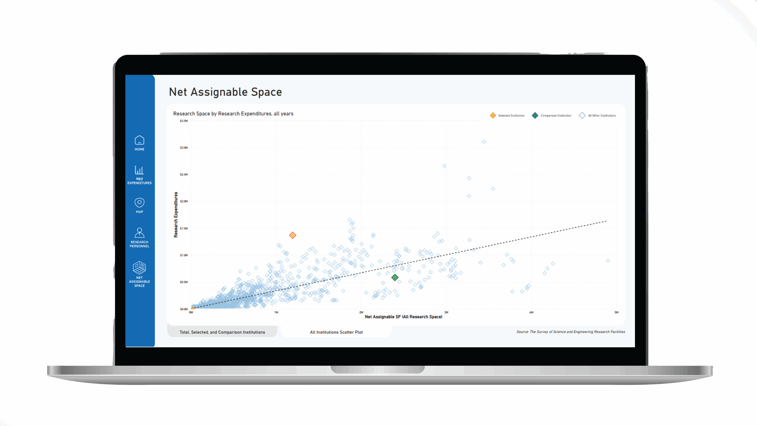
In the ever-evolving field of data visualization, no-code/low-code tools like Tableau and Power BI have become indispensable for quickly transforming data into accessible, actionable insights. My team at Blue Cottage of CannonDesign uses these platforms regularly in our client work as tools to explore data, uncover insights, and share them with decision makers and stakeholders in meetings and final reports.
In the past few years, I’ve noticed a pattern that I find both flattering and a bit bittersweet. In the final project meetings, as we are wrapping up the last presentations and reviewing our final actions for project completion, one of our client stakeholders will refer to a data viz slide originally created in PowerBI or Tableau and ask, “Can we have that?” And of course the answer is yes, we can share the .pbix or the. twb with you. However, if we had known there was interest in an interactive deliverable, we could have shaped our approach to make the most of that opportunity.
That kind of late-stage enthusiasm is always welcome. But it also reveals something important. Without early alignment on interactive deliverables, we miss the chance to define the audience and understand their needs upfront. Here are a few ways that misalignment and under-scoping may negatively impact your data viz project.
Neglecting audience definition and user interviews
One of the first casualties of under-scoping interactive deliverables is the detailed understanding of the intended audience. Data visualizations are most effective when tailored to the specific needs and preferences of their users. By failing to scope digital deliverables early on, we miss the opportunity to conduct thorough audience definition and user interviews. These activities are crucial for gathering insights into what the end-users need and expect from the visualization, ensuring that the final product is both relevant and impactful. Without this foundational understanding, an interactive product may fall short in terms of usability and engagement.
Inadequate interaction design and platform selection
Another significant consequence of under-scoping digital deliverables is the potential for inadequate interaction design and poor platform selection. Effective data visualizations often require thoughtful design interactions, such as filtering, drilling down, and dynamic updates. These interactions need to be planned from the outset, with careful consideration of the most suitable platform—be it Tableau, Power BI, or another tool. When these elements are not scoped early, the project may suffer from suboptimal user experiences and the inability to leverage the full capabilities of the chosen platform, ultimately diminishing the value of the visualization.
Challenges in data engineering and ETL processes
Data engineering and ETL (Extract, Transform, Load) processes are the backbone of any robust data visualization project. These processes ensure that data is clean, reliable, and ready for visualization. When interactive delivery is not scoped from the beginning, critical data engineering tasks may be overlooked or rushed, leading to issues with data quality and integrity. For example, how does the ETL query respond to novel data, poorly formatted data, or the dreaded null values. This can result in visualizations that are not only inaccurate but also potentially misleading, undermining the trust and confidence of stakeholders in the insights provided.
Strategic alignment and project scope
From a strategic perspective, the under-scoping of interactive deliverables can lead to misalignment between project objectives and deliverables. When interactivity is an afterthought, there is often a disconnect between what the client expects and what the project team delivers. This misalignment can cause delays, budget overruns, and a general sense of dissatisfaction among stakeholders. Proper scoping from the outset ensures that all parties have a clear understanding of the project’s goals, timelines, and resource requirements, facilitating smoother execution and better outcomes. It also ensures the right team members are included in the project, including a UI/UX designer.
Here are a few ways to ensure alignment and proper scoping from the outset.
1. Include data visualization in your kickoff agenda. Make space during the initial project meeting to ask questions like: “How do you expect to use data throughout this process?” and “Who needs to see what, and in what format?”. Even five minutes of conversation can surface expectations around interactivity, platforms, and deliverables.
2. Define the users and audience early. Ask for clarity on who the end users will be: not just project sponsors, but operational staff, leadership, or the public. Document their roles, needs, and familiarity with tools like Tableau or Power BI to inform design decisions later.
3. Use examples to prompt discussion. Clients don’t always know what to ask for. Sharing sample dashboards or visualizations can spark ideas and clarify preferences for interactivity, aesthetics, and functionality.
4. Co-author the scope. Rather than assuming a one-size-fits-all model, collaborate with the client to define what level of interactivity or access (such as viewer licenses, source files, embedded links) they need. This also helps define data availability and backend needs early on.
5. Treat data visualization as its own workstream. When an interactive deliverable is part of the project scope, it should be managed as a distinct workstream with clear milestones, dedicated stakeholders, and time for iteration. Like any design or technical component, it benefits from structured feedback cycles, coordinated handoffs, and defined success criteria. Expand your client stakeholder group to include those who will ultimately receive and maintain the work.
The (often unintentional) practice of under-scoping digital deliverables in data projects can have far-reaching consequences. By neglecting essential activities such as audience definition, user interviews, interaction design, platform selection, and data engineering, we risk delivering subpar visualizations that fail to meet user needs and project objectives. As data visualization experts, it is imperative to advocate for comprehensive scoping at the project’s inception. This approach not only enhances the quality and impact of the final deliverables but also ensures alignment with client expectations, ultimately leading to more successful and satisfying project outcomes.
Melissa is a creative professional who hovers at the intersection of design, technology, data, urbanism, and visualization.


