
This article is a continuation of Information in the Margins.
During a visit to the Venice Biennale in November 2023, a series of reviews of selected installations and presentations were created. The selection represents the range of visual and scenographic approaches that focus on the handling of data and visualizations. The reviews were written by students from the Hochschule für Gestaltung (HfG) Offenbach, Lucerne University of Applied Sciences and Arts (HSLU), and the Berlin University of the Arts (UdK). All students are majoring in Information Design or Data Design and formed interdisciplinary working groups for this excursion.
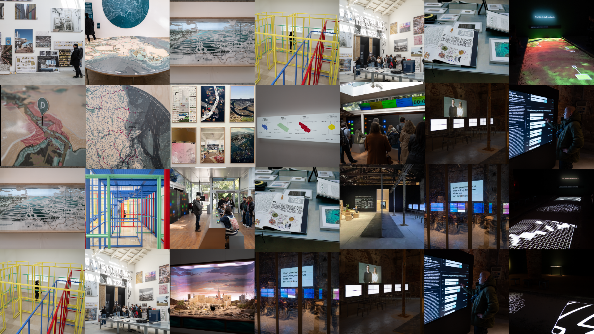
Coastal Imaginaries – Danish Pavilion
Reviewed by Sina Joller and Nour Al Safadi


The Danish Pavilion at the Venice Biennale 2023 focuses on climate change, particularly the pressing issue of rising sea levels and their impact on Denmark and other coastal cities. Curated by Josephine Michau, the pavilion showcases a range of projects exploring possible solutions. In her interview with Parametric Architecture, Michau emphasizes nature-based designs as an effective way to address these challenges. The exhibition aims to provide insights into such solutions, illustrating how Copenhagen could benefit from working in harmony with nature.The exhibition features architectural and technical perspectives, maps, data visualizations, videos, and a 3D installation. It utilizes recycled materials from past exhibitions, reflecting an environmentally conscious approach.
Central to the exhibition is the “Nature-Based Solutions” section. Here, cartography is a key medium for conveying information. A prominent map of Copenhagen at the entrance draws immediate attention. This part of the exhibition proposes a plan for a “Greater Copenhagen,” focusing on nature-based climate solutions. This plan contrasts with the existing 1947 Finger Plan, which faces threats from rising sea levels. The new proposal suggests shifting focus from urban centers to natural environments and urban margins, advocating collaboration with natural forces, terrain, and hydrology.
Infographics in the exhibition simplify complex ideas, while a series of 3D boxes add an element of speculation. These boxes, interspersed among maps and photographs, serve as visual representations of possible future scenarios. They introduce a speculative aspect to the exhibition, encouraging visitors to consider various future possibilities.
Another notable feature is the presence of small maps of Copenhagen printed on wood. These maps highlight different city activities and are designed to provoke thought. This section demonstrates an effective visual system, using the same base map of Copenhagen with added layers of colors, shapes, and text to represent different data sets. This approach shows a cohesive design system where various elements work together to deliver a clear message.
The “Mermaid Bay” installation, located in a separate room, offers a different experience within the pavilion. This 3D art installation adds a storytelling element to the exhibition, providing an alternative way for visitors to engage with the themes presented.
Overall, the Danish Pavilion at the Venice Biennale 2023 presents a range of ideas and solutions to address the challenge of climate change and rising sea levels. Through its exhibits, it explores how cities like Copenhagen can adapt and respond to these environmental issues by integrating nature-based solutions and sustainable practices into urban planning. The exhibition aims to not only inform but also stimulate discussion and thought about the future of urban landscapes in the face of climate challenges.
Foodscapes – Architectures that feed the world in the Spanish Pavilion
Reviewed by Finn Weber and Nadine Ehrenberg


“Foodscapes”, showcased at the Spanish Pavilion, explores the intricate relationship between architecture and food. It redefines architecture, not as mere physical structures, but as a complex system governing how we source and distribute our food. This system, a vast network, influences much more than our diet. The exhibition, curated by Eduardo Castillo Vinuesa and Manuel Ocaña, delves into this theme.
The focus of Foodscapes is on Spain’s ‘agro-architecture,’ a crucial aspect given many countries’ reliance on Spanish agricultural products. As Spain grapples with the climate crisis, its current agricultural practices, significantly contributing to the situation, are brought under scrutiny. The curators aim to link these factors, challenge the existing system, and promote research into sustainable global nourishment.
Entering the pavilion, visitors are greeted by bold typography. Large, black letters in diverse fonts impart an innovative, modern aesthetic. Inside, photographs and visualizations of varying sizes adorn the walls or are casually propped against them. Visitors can reposition these photographs to form new compositions, fostering an interactive environment. The photographs portray food production facilities like laboratories, factories, and ports, characterized by symmetry and a distinct color scheme that evoke the ambiance of a factory setting. The photographs are complemented by various visualizations: drawings from multiple perspectives, 3D models, and maps. Some of these are ingeniously printed on plates, layered to represent different data sets. The focus here is predominantly on agriculture, detailing production processes and machinery functionality through visual aids. A prominent feature is a long metal table in the center, displaying a screen with snippets of food-related videos and photographs. This central area also serves as a visual archive for ten “total recipes” of typical Spanish dishes, elaborated in a recipe book on the same table. These recipes provide a tangible connection to Spain’s culinary heritage, intertwined with its agricultural practices.
The venue’s design includes five narrow corridors leading to darkened rooms where short films are shown. These films represent various stages of the food cycle: production and consumption, land use, resource allocation, ecological balance, and the exploitation of human and non-human labor. They provide a comprehensive understanding of the food system’s complexity.
Foodscapes employs diverse media, amalgamating contributions from various creators to forge new perspectives and encourage dialogue and collaboration. The exhibition’s design, engaging multiple senses, creates an immersive atmosphere that elicits emotional responses.
One notable aspect of visitor interaction is the ability to rearrange the photographs and visualizations. This hands-on element not only engages but also inspires visitors to conceive new ideas and solutions. However, some guidance in this interactive process might be beneficial, as it can initially be overwhelming. This, perhaps, is a deliberate design choice, mirroring the exhibition’s objective to question the status quo and rethink existing structures.
In conclusion, Foodscapes offers a platform to reconsider our relationship with food and nature. It encourages visitors to reflect on the coexistence of humanity and the environment, initiating a discourse that, while starting here, is set to continue beyond the confines of the exhibition.
Datament – Processing Data in the Polish Pavilion
Reviewed by Ju-Eun Lee and Florian Schimanski


The exhibition in the Polish pavilion focuses on the human relationship to digital data and the influence it can have on real life. Together, visual artist Anna Barlik, architect Marcin Strzała and curator Jacek Sosnowski present the concept “Datament”. The neologism stands for the idea of an omnipresent data institution that has a major influence on the reality in which we live. Three levels of the exhibition are of great importance from the perspective of information design: In terms of content, the exhibition refers to the handling of large amounts of data, diagrams and drawings serve to illustrate the concept graphically and, finally, a walk-in infographic allows visitors to experience the results spatially. On the content level, the exhibition addresses the growing reliance on statistical data analyses and algorithms in decision-making processes related to architecture, urban development, and spatial planning. It critiques not the handling of data per se but the automation of both data collection and evaluation, leading to decisions based on a potentially distorted digital illusion. The exhibition exposes the pitfalls of such automated processes through a flawed algorithmic experiment using publicly available data to calculate apartment models in four different countries. The goal is to highlight the importance of transparency in data processing and to prompt critical questions about data sources and comparability.
The graphic elements only take up a small area in the exhibition space. Not only the use, but also the design itself is kept minimalist. Four light boxes serve to explain the concept of the exhibition. An infographic illustrates the algorithm described above, the apartment models are drawn isometrically, each with its own color and brief information about the respective country. Small symbols indicate the function of each room. The panels are an essential part of the exhibition and give a better understanding of what is actually being shown in the pavilion.
The spatial level of the exhibition introduces a visually striking element – a colorful metal construction, offering a tangible representation of the calculated models in a 1:1 scale. Although the floor plans are only shown as abstract outlines of metal struts, the familiar dimensions make it clear that these are representations of apartments. They are nested inside each other and appear chaotic from some angles, revealing a clear grid from others; however, you need to have read all the texts to understand that the construction says little about apartments in the respective countries. And even though the walk-through diagram doesn’t serve as an infographic, it makes processes spatially tangible that are otherwise invisible.
We see great relevance for information designers in the exhibition at the Polish pavilion. By believing in the infallibility of data, algorithms make real-world decisions. The example of spatial and urban planning can be applied to many other areas in which digitally processed data is used – including information design. The exhibition has left a lasting impression on us and has already led to a different, more conscious approach to data in our projects.
The Office for a Non-Precarious Future – Czech Pavillon
Reviewed by Sophie Pischel, Laura Gäckle Martínez and Quan Minh Ha


The Office for a Non-Precarious Future, organized by the National Gallery Prague, is set in the Arsenale exhibition space. With the use of multimedia data visualization and graphic design, the Czech Pavilion aims to communicate the precarious working conditions of young professional architects. The two spaces, a Factory and a Laboratory, are divided by a transparent plastic curtain. Stated by Eliška Havla, co-author of the exhibition: “The Factory symbolizes negative stereotypes and the status quo of the industry, while the Laboratory embodies inclusivity, fostering collaboration”. Dimly lit, the Factory presents several monitors, standing on strict steel grid structure and almost unusable furniture, while the largest one displaying video interviews of the architects, detailing their working conditions. The unique curtain serves as a filter, as bar charts made visible from the seemingly blank monitors, revealing the data supporting the interviews on the main display. Contrary to the previous space, The Laboratory is a welcoming atmosphere with compressed wooden seats and tables, illuminated by bright and warm light. The non-fancy materiality, basic geometrical shapes, and flexibility of the comprehensible space opens the opportunity for activity and fostering dialogue, thereby supporting the idea of creating a decent working condition. Attached on one wall, the “Why Board” presents research data through various types of charts in regards to a multitude of issues such as toxic working conditions, gender diversity, authorship as well as economy. The “Solution Board” on the opposite wall contains overwhelming references for further research to projects and initiatives that also deal with the topic.
Nevertheless, we found that the solution-finding part of the exhibition was placed in a decentralized way, although it carries very important content. It would have been exciting to learn more about future visions and the opportunity to network and exchange ideas. While the visual language in the room layout and media is coherent, it leans towards solving individual problems rather than addressing the institutional challenges that require systematic and political solutions. The DIY aesthetic, in its workshop-oriented approach, may not fully capture the political message.
Raising awareness about poor working conditions is crucial, acknowledged in graphic design and architectural discussions. The prevailing DIY ethos often emphasizes self-reliance, prompting a retreat into personal or collective havens. This narrative creates an imbalance by not clearly addressing political dimensions and institutional responsibility. While the authors demonstrate a comprehensive understanding of this topic, we wish for a more prominent role for these aspects within the exhibition. There’s a concern that an emphasis on personal utopias might undermine collaboration and shared experiences. The interplay between personal agency and communal engagement emerges as a complex dynamic in this narrative. In conclusion The Office for a Non-Precarious Future excels in information design with innovative visual communication and spatial concepts. The thoughtful curation by spatial designers goes beyond conventional expectations, showcasing an intricate spatial arrangement rooted in architectural expertise. Beyond design, the exhibition stimulates critical reflections on the architecture profession, precarity, and the role of platforms like the Architecture Biennale in driving industry change.
The Nebelivka Hypothesis – Forensic Architecture
Reviewed by Olivia Fischer and Niklas Thran


The Forensic Architecture project, led by Eyal Weizman and David Wengrow, an archaeologist and professor at University College London, UK, presents exciting spatial investigation methods and archaeological comparisons to challenge perspectives on and relations between architecture, cities, and culture. It premiered at the 18th Venice Biennale of Architecture: The Laboratory of the Future.
The downward-projected video is placed in the center of a gloomy space, onto a soil-filled excavation. It stretches away from the entrance towards the opposing wall, adorned with the words “The Nebelivka Hypothesis.” A permeating, occasionally noise-disrupted voice, supported by subtitles on a separate screen, accompanies the story.
Offering a bird’s-eye view, the video mimics an archaeological dig. Organized on layers of depth, it is a visual step-by-step derivation of the ancient city’s discovery and characterization, based on satellite images, geomagnetic signal data and data from analyzing soil samples.
The use of subtle contouring, e.g. to mark the city’s special shape, frames around important indicators, or thin text elements pointing out details in an image, preserve prominence of the shown pictures, diagrams and visualizations, while providing contrast and a sense of precision. Some details were challenging to discern due to the projector’s coarse resolution and the distortion caused by the irregular projection surface.
Clearly structured compositions enable Forensic Architecture to visually explain complex methods, techniques and processes while avoiding a chaotic impression and sensory overload. Animations make the process of digitally remodeled archeological remains based on mapping gray values to locally measured geomagnetic signals, or generally discoveries that can only be made over a period of time, such as growth patterns of different kinds of crop, well comprehensible.
The video was additionally accompanied by a printed magazine presented on a table on the left side of the exhibition space. It presented the video and infographic elements prepared as stills, allowing a closer look at the work and providing further details about the image material. The magazine allowed us to browse through the information once again, at our own pace, giving the time to connect the dots of the presented data to fully trace the story of the discovery. Sadly the magazine could not be purchased, because we definitely would have.
Forensic Architecture’s work and the unusual staging merges and relinks a multitude of perspectives onto a single time-based layer, extracting and communicating a landscapes’ memories of a long gone place. Can it inspire us to build cities radically differently today and in the future?
See for yourself and watch the entire video on forensic-architecture.org.
Inside the Korean Pavilion: Dystopian Information Design?
Reviewed by Dain Park and Nick Alker


In the intriguing landscape of the 2086 Venice Biennale for Architecture, the South Korean Pavilion presents its imaginative project, “2086: Together How?,” curated by Soik Jung and Kyong Park. This exhibition is not only showing interesting architectural design; it serves as a catalyst for profound introspection, challenging visitors to confront pressing global issues. This exhibition emerges from various research conducted within small communities, each serving as a part of the complex intersection between urbanization and globalization.
The epicenter of the Pavilions narrative and its exhibition, is an interactive game, a collaborative effort involving architects and community leaders in South Korea. The Pavilion is urging visitors to contemplate their role in the unfolding drama of environmental crises. It prompts a reflective journey, transcending temporal boundaries, inviting introspection on past choices, scrutinizing present actions, and contemplating the trajectory of future decisions. The underlying theme revolves around the crisis of human civilization, a potent reminder that the environmental challenges we face are reflections of our collective faults and successes.
However, amidst the profound concepts and thought-provoking ideas, a noticeable absence is felt—the Pavilion lacks a distinctive visual language. A missing map further compounds this void, leaving visitors navigating the exhibition’s diverse topics without a clear guide. Yet, from an information design standpoint, the interactive game compensates for this deficiency by collecting valuable data. The visualized scoreboards, adorned with colors symbolizing economic and social ideologies, offer a fascinating insight into the diverse perspectives shaping the participants’ choices. The game’s mechanics are intricate, involving participants using paper cards as their entry ticket. Beyond this functional role, these cards hold untapped potential—they could be transformed into lasting personas, tangible reminders of visitors’ engagement with the Pavilion. Such artifacts could serve as a bridge between the immersive experience within the Pavilion and the world beyond, fostering a deeper connection with the exhibited concepts. One standout in the series of ideas is the work titled “Migrating Futures.” This segment delves into the spatiotemporal landscapes of foreign migrants in South Korea, weaving personal narratives through blueprints and typography. The human stories presented evoke emotional reflections, providing a strong contrast to more technical works within the exhibition and the biennale itself. Despite the richness of diverse works and mediums, there’s a potential pitfall—the sheer abundance might overwhelm visitors. The initial viewing may present a challenge in connecting the dots between the various mediums—ranging from cartography to visual installations—and the overarching theme of the exhibition.
In the wide spectrum of the biennale, the Korean Pavilion stands out for its emotional resonance and human connection. The interactive game becomes a medium through which visitors actively participate in the design and coding of their environmental space, emphasizing emotion and opinion as foundational elements. While leaving a lasting impression, the exhibition could elevate its impact by providing visitors with concrete artifacts, ensuring a lasting reminder of their individual contribution to the Pavilion’s narrative.

David Skopec is an information designer from Berlin. He is a professor at the Berlin University of the Arts, where he heads the department of information design. He oversees the programs in both the bachelor's and master's degrees, especially the Visual Society Program (VISOP) at the intersection of information design and social sciences. Additionally, he is the founder of the Berlin design studio 'kognito gestaltung,' which specializes in information design for scientific and public institutions.
- David Skopec

- David Skopec


