
In a meeting about student experience for STEM students at the University of Portsmouth UK, we, the lecturers, were exploring how teaching practices have changed after the interruption due to the pandemic lockdowns. As new students from the pandemic era were incoming, we were not sure how to evaluate them. These students have been used to different teaching and assessment methods; they even had their university entry exams assessed online. And although lecturers usually know through experience what works, we wanted to ask the students this time. So as the resident expert in data vis, I ran a data physicalization exercise to get their input.
The survey questions included, “What would our students want from their courses? How can we help them perform their best? How can we keep them engaged and promote a sense of community?” While the university’s learning and education committee learned through experience which teaching and evaluation styles work for students both individually and collectively, we wanted to know the students’ thoughts and what they want. In particular, we asked what would be the best way(s) to assess the students?
Some lecturers in UK universities would argue that students usually prefer evaluation styles that they are familiar with. In our case, we thought that the pandemic-era students may want to be assessed differently. For example, when I was doing my A level equivalent in Greece, we had in-person exams, but these pandemic-era students were assessed using essentially multiple choice questions or online oral examination. All my current students, for instance, have no experience with written, pen and paper, in-person exams. When we asked them to attend such an exam, they were visibly distressed. Therefore, we felt we did not precisely know how these students would like to be assessed.
“How would you like to be assessed?”
As the expert in data visualisation and data analytics among my fellow lecturers, I took on the task to ask our committee’s questions not only to the students but also to the lecturers. I started by looking into the methods the lecturers are currently using to assess students. I used already available data from the course descriptions and when not sure, I directly asked my colleagues who were teaching those courses.

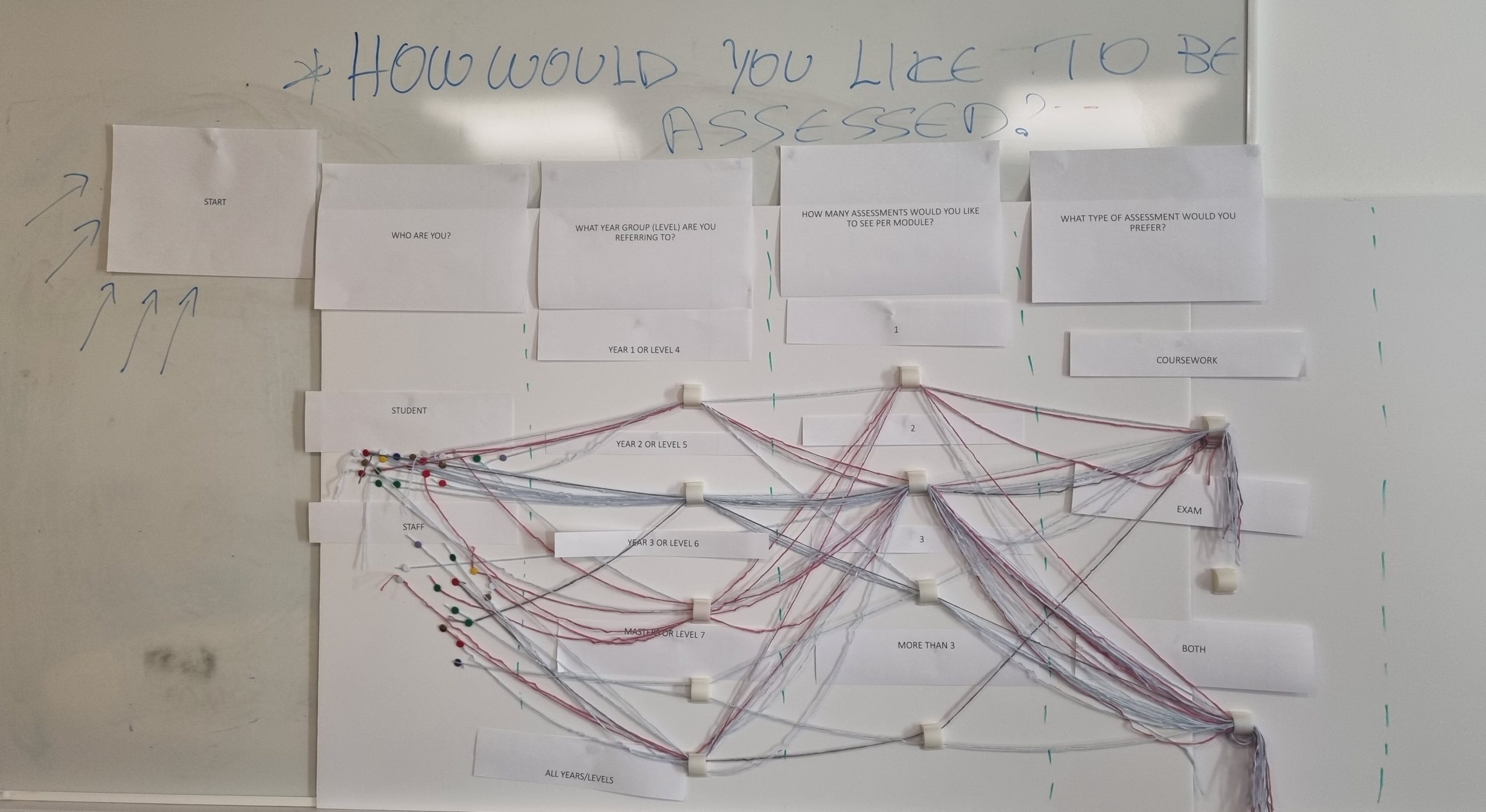
I chose data physicalization to engage my study participants in the questionnaire about how they would like to be assessed. The exercise was inspired by the work of Matteo Moretti on providing information about cancer to a large and diverse audience. But instead of merely informing my students, I wanted to collect data about their opinions. I wanted to show the students that we care and that we take them seriously, and that we want to act on their opinions. With data physicalization, you act before you analyse as by touching the data you are acting upon them.
“With data physicalization you act before you analyse as by touching the data you are acting upon them.”

Students at the University of Portsmouth are very diverse. One will find people from different educational backgrounds, beliefs and literacy levels. So, instead of creating yet another boring survey, I invited them to actually touch and play with the data. This would also cater to anyone who is unable to take an online survey and it would boost engagement via play or gamification. After all, we don’t want to merely educate our students, but also to inspire them to think outside the box.
Physicalization to engage students in the survey
The exercise included two physical elements, three types of colour coded threads (blue for male, pink for female and grey for non-binary or do not want to be identified), and three types of colour coded stickers (pink for female, blue for male and orange for anyone who is non-binary or did not want to identify). The threading started from a separate area for staff and a separate area for students and each participant had to thread their preferences, until they reached the end point.
One could participate multiple times if they wanted to provide more than one threaded answer, for example if their answers changed based on the age or in other words educational level of students they were answering for. The threading had the following questions:
- Who are you? (Staff, Student)
- What year group are you referring to? (1, 2, 3, 4, all)
- How many assessments would you like to see per module? (1, 2, 3, more than 3)
- What type of assessment would you prefer? (exam, coursework, both)
The stickers had the following questions:
- What type of exam would you prefer? (There were three options to choose multiples: pen and paper exam, online written exam, and online multiple choice test.)
- What type of coursework would you prefer? (There were 10 options to choose, and participants could choose multiple answers: lab report, written portfolio, written portfolio and presentation, lab report and presentation, oral presentation, offline tests, written report, written report and presentation, poster, and video)
- Would you like to create an artifact as part of your coursework? (Yes, No, I don’t know)
- Would you like to collaborate with the industry as part of your coursework? (Yes, No, I don’t know)

As the study designer, the most interesting thing for me was creating the material and imagining how the final visualisation would look like. I was able to see the trends developing in real time, along with the encouraging and supportive feedback from my colleagues. The students also liked the exercise and participated happily. The exercise ran during a research showcase of the final year undergraduate students, and we had 56 participants in total.
The key points from the feedback we collected were:
- Very original data collection method. Many students appreciated the feeling of being invited to express themselves. Especially the new ones, who were visibly still adjusting to new in-person learning experience, expressed that they enjoyed stepping up to the board and physicalizing their own data
- The data analysis and collection took place immediately at the same time, we could see what people wanted even before analysing the data on the computer
- Engagement was huge for the scale of the event
- Low literacy audiences could hugely benefit from touching the data, instead of answering questions on a complicated survey

Throughout this data physicalization, I learned that passion is a great drive for any experiment or exercise to work. Students felt heard and staff had fun “playing at work.”
The initial impact of this exercise was the realisation that most of our students don’t like poster exams, in which a student will make an oral presentation, presenting their poster. This is surprising to us since poster sessions have usually appeared to be the least stressful, interactive, and even ‘playful’ examination practices.
There are also more students who liked exams than we thought. However, the exams that they like are computer-based ones rather than with traditional pen and paper!
Many staff members were not surprised by the results, but for some, this exercise was eye opening. Its in-person nature especially promoted staff collaboration, and discussions about how to improve their assessment methods.
Will we run this again? Sure thing! Is it data visualisation? Well yes, as we visualised data a different way—by physicalizing them—and we learned something new by doing it!

Elisavet Andrikopoulou
Dr. Elisavet Andrikopoulou is a Senior Lecturer at the School of Computing, University of Portsmouth, United Kingdom (UK). Elisavet holds a PhD in health informatics. She has won several awards including the HDR UK Collaborathon 2020. Elisavet has a computer science and law background as well as a master’s degree in research in simulation modelling. Elisavet has worked in Greece, Germany, Belgium, and the UK in a number of positions varying from law apprentice to database administrator and IT consultant. Her current research interests involve healthcare decision making support and improving the quality of life of people with long-term conditions using technology specialising on personal health records. Elisavet is the events and communications lead of the health and care executive group of BCS and a member of IET, and her teaching focuses mainly on data visualisation and data analytics.
- Elisavet Andrikopoulou


