
Let me start by saying: I love data storytelling.
For me, that means finding creative ways to weave together numbers, charts, and context in a meaningful narrative to help someone understand or communicate a complex topic.
But I don’t think we all mean the same thing when we use the phrase “data storytelling” — particularly across data visualization creators and our clients, whether we’re in formal consulting roles or supporting an internal team. There’s a demand for data stories even when the team’s analytical needs aren’t demanding narratives.
Over the past year, I’ve observed a spike in blog posts, eLearning courses, workshops, and more, all promising to teach you the secrets of great data storytelling. These are absolutely worthwhile skills to learn. I’ve also seen an increase in demands from clients in my own work around more data storytelling — using those specific words.
How did we get to this peak demand for data storytelling? Why might we want to probe a bit deeper around what someone means when they talk about doing MORE data storytelling, where perhaps the analytical goals are more around story-finding than storytelling? And how might a more nuanced shared language about our analytical products help designers and users alike?
This article is for the dashboard designers tasked with more data storytelling (even when the goal is exploration), the language enthusiasts who are curious how words and phrases evolve, and the data visualization experts who love to get in the weeds of “how we got here.”
Let’s dive in, and meander towards the questions to ask when we start a new project in this era of excitement for data storytelling.
A decade+ of data storytelling
The enthusiasm for data storytelling isn’t new.
Go back a decade, and there’s a rich discussion and debate among people recognized as leading voices in the field (Robert Kosara, Lynn Cherny, Moritz Stefaner, Alberto Cairo, and others) about the role of storytelling, narrative, and “punchlines” in data visualization. Dated April 6, 2013, Mortiz Stefaner writes: “Storytelling has been one of the big buzzwords in data visualization the last year.”
One of the most commonly mentioned “storytelling” books in analytics is Cole Nussbaumer Knaflic’s Storytelling With Data, first released in 2015. Five years later, Brent Dykes authored a masterclass on blending data and narrative in “Effective Data Storytelling” published in 2020.
But numbers don’t lie: Data storytelling is popping up across social posts, blogs, and client requests today at a frequency unmatched in previous years — and you can see the climb in the Google search trends over the last decade both in the US and worldwide.

Industry analysts also agree that data storytelling is having a moment. Let’s take a peek into reports from a leader in creating reports in the world of analytics: Gartner.
If you know Gartner and work in data viz and business intelligence, you likely know the Magic Quadrant reports, which position different tools based on completeness of vision and ability to execute. A second group of reports worth your time are the hype cycles for different segments of the tech industry including analytics and business intelligence. Hype cycle graphics (and their very lengthy associated reports, which you can access through a partner vendor or as a paying Gartner subscriber) have five key phases over the long arc of time, as shown below. Importantly, they’re written with Gartner clients (often not technologists by trade) who want to make informed decisions on where to invest resources.

In the early climb up the curve, early adopters in the industry begin to experiment with a technology or practice. Then, at the “peak of inflated expectations,” there’s all-out fervor about the new approach, after which it slides into the “trough of disillusionment” before leveling out in the “plateau of productivity” with stable adoption and use of the technology or tactic.
For Gartner, data storytelling “combines interactive data visualization with narrative techniques to deliver insights in compelling, easily assimilated forms. Analytic data stories aim to prompt discussion and collaborative decision making.” Since 2019, data storytelling has moved through the “peak of inflated expectations,” with an estimated plateau of productivity in two to five years. In 2022, the topic was coasting towards the “trough of disillusionment” (which is perhaps where I am personally in my relationship with the phrase!).
The rise in interest has come with increased client demands for data storytelling, which brings us back to our original question: Do we all mean the same thing when we ask analysts and designers to do more data storytelling?
Aligning on what we mean by “data storytelling”
In the world of data visualization, we often conceptualize the graphics we create along continuums. Static or interactive. Conceptual or quantitative. Digital or physical. And perhaps most often: designed to enable the user to explore or to explain an analysis finding.

Having a shared language to talk about the kinds of analytical and communication products we’re creating is powerful, and plays out across other kinds of data visualizations. What is a set of interactive charts displayed on one page and designed to explore data? Many people would call that a dashboard.
Having a term to describe that deliverable helps us envision the same end when we create workplans, collaborate on teams, or hire consultants to build something. While your more narrow requirements for a dashboard may vary, if I ask a group of data visualization designers to sketch a picture of a data dashboard, I’d expect some consistency.

Data storytelling can take many paths and present across many analytical products. Some stories may be more expository in nature, stating facts, while others take a clear narrative arc. Given these different interpretations, we have to be careful and explicit when we use the words “data storytelling.”
Robert Kosara’s definition of a data story from those conversations nearly a decade ago is still one of my favorites and most succinct. A data story…
- ties facts together: there is a reason why this particular collection of facts is in this story, and the story gives you that reason
- provides a narrative path through those facts: guides the viewer/reader through the world, rather than just throwing them in there
- presents a particular interpretation of those facts: a story is always a particular path through a world, so it favors one way of seeing things over all others
The three-pronged definition allow for space to craft both short and long stories. And it’s the last point that aligns so clearly with the declutter-and-focus recommendations of modern data visualization and data journalism.
If we’re tasked with data storytelling, we also have to think about scale. The demand could be for very short stories. We can take the same data (here, sample data on cervical cancer screening coverage), and shape the story with the headline and our design decisions:

Being enthusiastic about sharing a more complete picture, we can also seek out additional context, research, and data to tell a more complete story.
In the below example, additional text annotations and highlighted timeframes clue the reader into the narrative. Between the descriptive title, the helpful callouts with key bolded words, and design choices including the background color and marked data points, there’s a natural progression—or short story arc—for the reader to follow. (I’ll note that these strategies run counter to my public health training where we titled charts with the indicator, location, period, etc. represented in the data).

But is your analytical product really a ‘data story’?
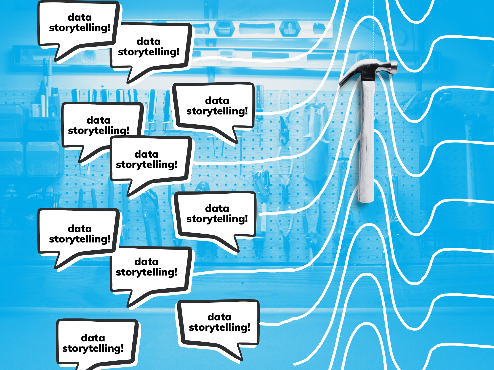
Words and phrases, like “data storytelling” create opportunities for alignment between clients/users/readers and data visualization designers. When the world is demanding and promoting data storytelling in all cases, it can feel a bit like having a hammer and seeing every data communication challenge as a nail.

I don’t want to squash the enthusiasm for data storytelling. Well crafted data stories can encourage and spark excitement for engaging with data in amazing ways. But I’m also perpetually frustrated by the insistence that every analytical product be designed for data storytelling and the seemingly-endless loop of realigning expectations.
Josh Smith, a folklorist-turned-UXer and former Tableau Visionary, won a spot on the Iron Viz stage with a long format scrollytelling dashboard on farming. Storytelling was on the judging matrix, but Smith argued in an introspective piece, “Is Your Data Story Actually a Story?”, that his submission wasn’t an excellent piece of storytelling: no cast of characters, no clear narrative.
Instead, he points out that “storytelling is often used as a blanket statement to describe how well the information is presented in an interpretable presentation with a logical flow.” Storytelling isn’t always the goal, especially on dashboards designed more for exploration, rather than explanation. Or, designed more for story-finding than storytelling.
Thinking back to our cervical cancer screening data, the single chart with its headline and annotations give me a snapshot of the data. But what if we want to explore and slice the data by location, age, race, or other meaningful disaggregate? What if we want to know which groups saw the biggest drop in screenings during the pandemic?
Then we need a different tool — something interactive to drill into the available data. That’s where a dashboard can help, enabling you to explore and find the stories in the data. The often data dense displays that we see on highly effective dashboards aren’t designed to export beautifully into a slide deck, but they can be great for identifying trends, outliers, causes for celebration, and data points of concern.

The role of data storytelling in modern analytics
Gartner’s advice: “Task members of your analytics team with investigating data storytelling as an extension to their use of interactive visual exploration and analytic dashboarding. This will provide a richer delivery of information by adding narrative and context.”
As data visualization creators, aligning with our clients and end users at the requirements stage or when you’re setting up your design brief is a critical part of the creation process. Next time a conversation opens with, “We need to do more data storytelling!” probe to understand more:
- Why does the client want to do more storytelling with data?
- Who are they looking to develop analytical products for?
- What is their vision for delivering on data storytelling, and is “storytelling” really their catch-all word for a well-structured analysis product?
- Should the product you build be designed for storytelling or is the goal exploration and story-finding, as a first step on the path towards more data storytelling?
Data storytelling is here to stay. In fact, it probably predates many of our careers and will outlive any of us (perhaps with a bit of AI enablement added on). The conversation around data storytelling extends beyond our niche data viz community and is a fun and seemingly simple concept to get excited about, expanding the enthusiasm and the (inflated) expectations.
Let’s make sure we’re crafting a shared language and set of intentions, particularly with our clients and end users, rather than jumping on the storytelling bandwagon. Because not every piece of data needs to be communicated as a story—sometimes we need to start with story-finding or just a well structured chart, rather than a full narrative arc.
This essay was adapted from the discussion on Chart Chat (July 2023), a monthly livestream hosted by Steve Wexler, Jeff Shaffer, Andy Cotgreave, and Amanda Makulec. You can find past episodes on chartchat.live.

Amanda Makulec is a health data visualization designer, teachers, and speaker based in Washington D.C. who volunteers as the Executive Director for the Data Visualization Society. She holds a Masters of Public Health from the Boston University School of Public Health, and worked in more than a dozen countries leading teams and developing user-centered data visualization products for federal, non-profit, and private sector clients.
- Amanda Makulec

- Amanda Makulec

- Amanda Makulec

- Amanda Makulec


