
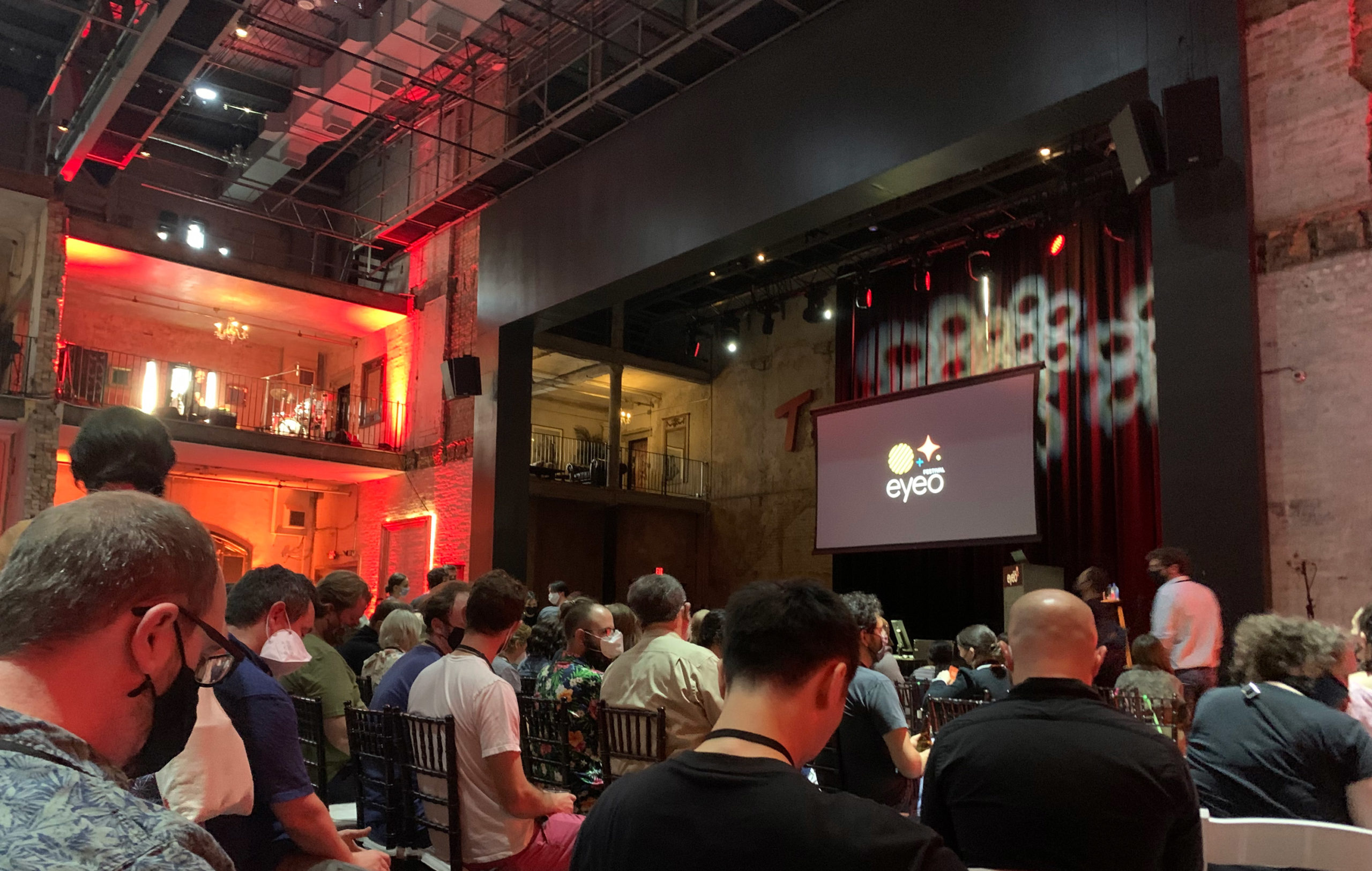
The Eyeo festival has always held an interesting place in the community as, I’m told, it never really focused on any specific subject matter. At the 2019 edition, co-founder Jer Thorpe said Eyeo started as a sort of “front-end conference,” but it has held a unique place between disciplines, technologies, and mindsets since 2011. Since everything was on hold for the past two years, this was a doubly special edition of the festival as it would be both the first conference since 2019 and also the 10-year anniversary. It turns out that it might also be the last one.
The conference started with co-founder Dave Schroeder casually introducing the sort of ground rules for the event and sharing some amusing anecdotes before dropping the bomb that most of the founders will not continue Eyeo in the future. While it is unclear if this means Eyeo is ending or if the conference will continue under new management, it was an announcement that set a certain introspective tone across the four-day event.
The dual-track conference is a wild ride as one never knows if they are in the “right” talk or not. This is very much the point of Eyeo, as the chance encounters with speakers and attendees can really be surprising and pleasantly challenging. Actually, the whole damn thing is interesting – from the venues, like the Walker Museum, and evening hang-out spots to the speakers spanning from dataviz to fine art to social justice, to the people you casually strike up a conversation with while standing in line for a coffee. Everything at Eyeo is interesting.
Like we did in 2019, Nightingale offers a collective review of the conference from various attendees to cover a broad overview of experiences. This year the conference also featured a number of dataviz luminaries so we’ll cover those first as each lecture provided some important concepts for the field to chew on.
Jason Forrest
Alberto Cairo, Data Visualization: Reasons, Not Rules
The day before Alberto spoke, he shared a slide on Twitter that tipped us off that this was going to be a wild ride. A leader in the dataviz industry for years, Cairo has helped to define what contemporary dataviz looks like and how it should be evaluated through books like How Charts Lie (2019), The Truthful Art (2016). Imagine the surprise when he opened his talk, not only taking aim at the supposed rules of dataviz, but also attacking the very foundations of the practice by walking us through a series of musings like “why should bar charts start at zero?”

These surprising provocations come at a completely expected time. With dataviz moving into prominence in the media, and many aspects of dataviz embracing more illustrative and story-driven attributes (and also just more design/decoration in general) this stance is away from measuring the “effectiveness” of a chart based on business or scientific perspectives needs to change. Dataviz how-to books have long defaulted to a set of rules for charts as personified by Edward Tufte and Steven Few but then praised visually beautiful works for their ability to capture the public’s imagination and create change.
Many of these same books end up defaulting to an “it depends” stance when asked if a chart or dashboard is effective. Moving away from rules and toward reasons for design choices is actually a far better way to scale and sustain our field and build on the momentum. That is why the closing diagram from Cairo’s talk is so important, as it outlines different perspectives in visual communication from Exploratory to Explanatory to Affective. It’s a diagram that feels almost a bit obvious to those of us in the field, but it is significant, as it places the oft-used phrase, “What is your dataviz trying to accomplish?” onto a spectrum for evaluation. If rules are downgraded to best practices for use cases, then the “It depends” diagram becomes the new gold standard. Gone are the rigid proclamations of pseudo-scientific ratios, and in their place is a far more pragmatic – and inclusive – stance on communication and design objectives. Cairo’s ideas on the subject feel like a seismic shift that we have all seen coming and it is a large shot across the bow to the rigidity upheld in the name of Tufte.
He kindly shared his slides online, which you can see here.
Stefanie Posavec, You’re Doing it Wrong
One of our favorite talks, Stefanie Posavec’s “You’re Doing it wrong” built flawlessly on Alberto Cairo’s the day before (even though it was unplanned). Her introspective portfolio review painted an image of a perennial rule-breaker, a responsibly irreverent design-punk, and thoroughly fun person. In doing so, Posavec laid out a case that designers working in dataviz have been unfairly singled out for not playing by the rules – which she was never interested in from the beginning.
The language of data design should span more than the dogmatic. In order to be interesting (a dangerous term that means everything and nothing), the graphic designer almost has to subvert the rules – so why wouldn’t the same be true for the data designer? It’s a compelling idea. Subversion is a doctrine in more artistic fields but somehow doesn’t have a voice in the dataviz community. If, in a new world, our objectives span from the scientific to the emotional – then why can’t we have more punk dataviz? Of course, we can.


Nadja Popovich, Visualizing Climate Change
Rounding out the dataviz-specific speakers was Nadja Popovich, a data and graphics reporter on the Climate desk at The New York Times. Our field should understand just how important the NYT has been in elevating public interest in data visualization, and Popovich is among their top practitioners.
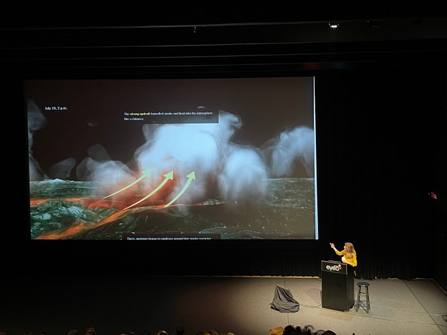
Popovich walked through her work with various talented collaborators over the past several years. Each striking project showed how NYT is ripping apart our conception of data visualization into multi-media reporting. While their team creates accurate charts that display all the best practices, they also use photos, videos, animations, interactivity, and diagrammatic illustrations to tell a compelling story day after day. Basically, they use any tool they can to tell a story, demand attention, and make a point.
Popovich’s stories are understandably linked thematically, but together as a body of work, they are among the strongest and most compelling data journalism that is shaping our understanding of the world today.
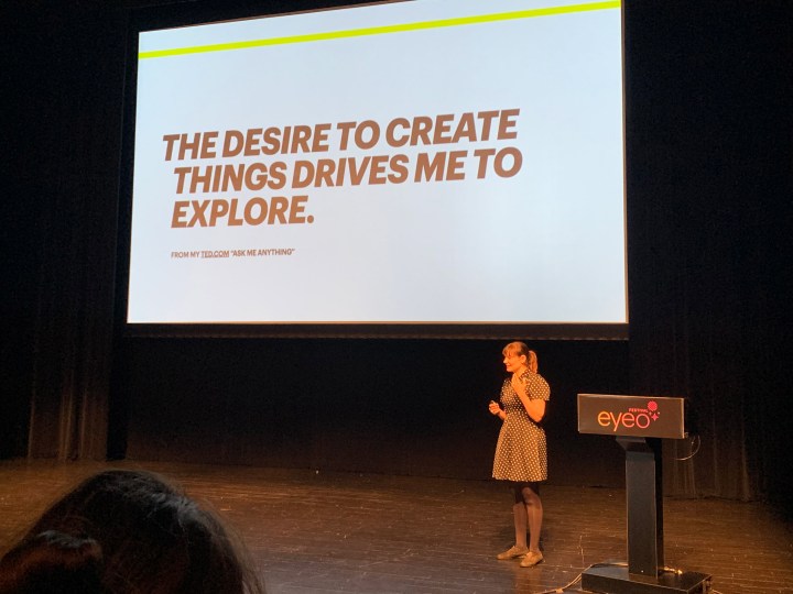
Giorgia Lupi, Data? It’s Complicated.
Lastly, one of the celebrities of the dataviz scene and also the speaker who has presented at Eyeo the most times, Giorgia Lupi, was characteristically funny, brilliant, and humble. You likely already know about Giorgia’s work, but this talk continued to push her data humanism with an introspective look into how the data designer has used data to help her through the last years of lock-down and personal upheaval.

One of the most significant quotes of the festival was something that I’m not even sure Lupi had scripted as it seemed to be an adlib between statements. She said, “…of course, In the end, all data visualization ends up with a conversation.” I find this to be an especially powerful idea as it positions that power not in our designs, but in the people who view, discuss, share, and critique the work. Dataviz is the conduit for the conversation that results from our work, and the power is not in our ability to conjure magic, but in our audience to live with and discuss the information experience with others.
In summation, Eyeo 2022 was a wonderful way to continue our collective processing of the drama of the past two years. Nearly every talk showed how creative people needed to use their talents in unique ways to process the events of the pandemic and social upheaval. It is, in many ways, a jumping-off point, signaling a new way to work and live, in a world that has changed and probably needed to change – just like the festival itself.
Shirley Wu, Transition: Work In Progress
Wrapping up the last talks from the Walker was one of the most surprising talks of the conference and one of the most personal. Shirley Wu is a friend of Nightingale and one of the more popular dataviz practitioners as she has a special skill in designing and coding her unique perspective.

In a week of reflection, Wu’s talk was more like a one-woman off-broadway telling of her story. At once funny, gripping, and moving; Wu presented her story as a child of immigrants to developer to dataviz celebrity to perennial student. It is the kind of engrossing story that had people cheering from the audience and we can only hope that she’ll present it at other conferences too!
Eli Holder
A.M. Darke, Who needs Black Virtuality???
@prettydarke’s talk was low-key hilarious and wildly insightful. She points out that Black culture is everywhere, but it’s typically stripped from the context of Black people. For example, in Fortnite, @EpicGames lets players do a “Swipe It” dance. Darke points out that this is actually the “Milly Rock,” an iconic dance from Black artist 2 Milly. So 350 million Fortnite players can press A or X to do the Milly Rock, but very few appreciate the Black artist or communities behind it. Meanwhile, “Black Bodies” and “Black Identity” are nearly non-existent in virtual spaces. She offers 3Dmodeling marketplaces as an example: Assets featuring Black characters (or Black hair) are sparse, and the ones that exist are often aggressively racist.
Darke highlights and characterizes Black Virtuality by way of Twitter memes… she covers about 10,000 of them (“no plan, just vibes”)… and groups them into key themes (humor/play, remix/sampling, dynamism, clever/accessible, selective legibility). Black Virtuality, she says, is expansive. Meanwhile, White Virtuality constrains. These constraints benefit advertisers, but ultimately create environments with all the vibrant energy of a dinner party with “human thumbs,” like Bezos / Zuckerberg / Musk.
To support Black Virtuality, Darke’s work involves directly funding Black artists through projects like the Open Source Afro Hair Library and, in her talk, she offers all of us something of a “Simple Sabotage Field Manual” to participate in (problematic) virtual environments without reinforcing their harmful b.s. (e.g., “Gatekeep → Caretake”, “Be anti-algorithmic”, “Reject White Virtuality”, “Be inappropriable by being inappropriate”).
Jessica Nordell, Simulating the Unseeable
@jessnordell disputes a wantonly stupid argument from Antonin Scalia in Wal-Mart vs Dukes. Scalia’s argle-bargle asserts that outcome disparities couldn’t possibly exist in corporate environments unless they were somehow top-down and explicitly incentivized…. because managers are rational, goal-oriented actors. This is silly on many levels, but mostly it shows Scalia’s inability to reason about emergent behaviors of complex ecosystems. Nordell’s simulation shows that even if people in the workplace are just a little bit biased against women (3%), this influences enough micro-decisions and behaviors over time to drastically reduce womens’ representation in upper management (and often lock them out of the C-suite entirely).
From a geekery perspective, using simulation / agent-based modeling to visualize how real-world outcomes can emerge from simple agent rules is a highly compelling and, I think, still under-used way to understand and communicate how complex systems work.
Grace Boyle: Sensory Architecture
Grace Boyle of @TheFeelies started her talk with a casual mind-exploder: Humans don’t have 5 senses. That’s dated thinking leftover from Aristotle. By her count, we’re closer to 30+ different channels for perceiving the world around us. She offered a few equally surprising examples of this: The Ise Jingu shrine in Japan is surrounded by Hinoki trees and structures, whose smells have documented calming effects on passers-by. Similarly, the occluded horizon and white noise generated from walking along winding gravel paths toward the shrine induce a meditative state. Occasional tree cover offers increased humidity and decreased temperatures, which lower cortisol levels and heart rates while boosting activity in our immune and parasympathetic nervous systems. By the time visitors reach the shrine itself, these sensory experiences have fully primed them for transcendence.
Part of her process is, obviously, getting out into the environments she’s hoping to convey to her audiences. One profound anecdote: While working on “Munduruku,” a project intended to (virtually) transport city-dwellers into the depths of the Brazilian Amazon, she brought a renowned perfumer along for the field study, to capture the smells. Despite his reputation for identifying and reproducing scents, Boyle says he was so surprised and moved by the experience in the field that he was embarrassed to share his prior work with locals. He said it failed to capture the richness of the actual environment. This is a familiar experience for me and a reminder about the importance of field research: There’s no faster way to dispel illusions about our work than experiencing the gap between what we think we know, and what we experience in the real world.
Jill Brown
As a product of the academic and research world, my schema for conferences is fairly narrow: three days of at least half a dozen simultaneous talks every hour, poster sessions that are both too long and go by too quickly, exhibit halls with vendors trying to convince you to change textbooks or try out a software your institution would never pay for, chilled but somehow stale deli sandwiches, and more networking, self-presentation, choice paralysis, and FOMO that only the most exuberant extravert can muster. When it was suggested to me that I attend Eyeo, I was skeptical, I figured it would just be more of the same. However, I quickly learned why Eyeo is called a festival – it is a celebration of the intersection between art and design, science and technology. A jubilee to lift up the contributions of individual and collective creative practice in this space.
What struck me about Eyeo, in particular, was the camaraderie. There was no competition or fear that someone would scoop your work, but instead, the air trilled with the potential for finding new ways to foster connection, collaboration, and creativity. The presentations were reflective, which is unsurprising after the whole world has been sitting on the pause button for more than two years. It’s humbling to share the same space with creative leaders so willing to be open and vulnerable. Even some of our favorite names in data visualization, including Alberto Cairo, Giorgia Lupi, Stefanie Posavec, Nadja Popovich, and Shirley Wu, shared where they’ve been and what they’re inspired by, what they’re pondering, and what they’re creating now. In addition to hearing about what they’ve learned, both about the field of dataviz and about their own practices, I was able to connect with other seasoned, emerging, and aspiring data visualizers. We discussed topics ranging from the DVS Mentorship Program, challenges in shifting from test- and table-heavy reports to visual techniques, the importance of pausing to reflect, and how to foster connection in a virtual space, among many other topics. The company you find at Eyeo is inherently enriching, I left each session with at least one gem, one nugget to consider, explore, or implement. Though this delightful festival may not continue in this format moving forward, I absolutely believe the community will continue to celebrate and recognize the power of creative practice.
Jeff Harrison
I saw Stefanie Posavec speak about her work at Eyeo in 2012. She stuck out amid the presentations that year, several of which gave us glimpses of actual code. At the time she sounded a little sheepish about her lack of coding skills and referred to it as something she’d been meaning to get to. It was a treat to see her again, ten years later. In that time she has become a more confident presenter and has had plenty of practice unapologetically describing her process, but I was also struck by how her hand-drawn data art no longer felt like an outlier. This says as much about how the conference has grown up as it does about her. (I also attended her data life-drawing workshop and got my hands dirty using charcoal as a medium for expressing data, which was both challenging and fun.)

The other talk that has stayed with me over the past week was Gene Kogan’s, in which he talked about AI image generation (and the images used to train it) as a window into our collective unconscious. I have no idea whether AI tools will take over as quickly or completely as Kogan predicts, but they’re fun to explore! I had been playing with the DALL-E mini generator (now available at craiyon.com) in the days before seeing him speak, and I was blown away when he made his own project, Abraham.ai, available at the conference Discord. The images are in turn weird, beautiful, disturbing, and a little too on-the-nose. Here are a few that it created in response to my prompts:


Nate Coursey
For context, my background is in mathematics and statistics, with a career that’s been largely focused on hard analytics. In many ways, I’ve been left with limited room for any professional artistic endeavors. After learning about Eyeo through a colleague (Jason Forrest), I was immediately intrigued by the conference. Each day focused on a variety of creative tech topics being presented by speakers who are experts in their field. My hypothesis, going into Eyeo, was that I’d be inspired to tap into my own creative side, and the conference did not disappoint! On day one they kicked off with rapid-fire presentations from attendees, called IGNITE!, which instantly got the creative juices flowing. I moved into the proceeding days craving more and eager for the discussions to come.
Throughout the week, speakers delivered on a range of fascinating topics, including AI/ML (Gene Kogan’s “Collective Imagination”), explorations of Antarctica (Ariel Waldman), and ideas that make you question the status quo in data visualization (Alberto Cairo’s “Data Visualization: Reasons, not Rules”). It’s difficult to synthesize every presentation in a couple of paragraphs, and in fairness to the speakers, they deserve more than that. So instead, I’ll leave you with my thoughts following the conference, with hopes that you’ll be inspired to go to the next Eyeo:
· Educational – the breadth and depth of talent and experience from both speakers and attendees was astonishing. You’ll undoubtedly learn something new or have a new perspective on something known.
· Mingling [Socializing] – everyone was more than happy to have dialogue and discuss what they’ve been working on – plenty of opportunities to make connections.
· Inspiring – left me with the overwhelming urge to do or create “something” (particularly with a creative mindset)
· Momentous – it’s possible that at some future date I’ll reflect on my career, and it will be naturally divided into two periods: pre-and post-Eyeo.
Tristan Guillevin
Never meet your heroes, they say. Well, I haven’t. And that’s a good thing.
Here are some personal thoughts of one week at #eyeo2022 and why I was wrong to not be “wrong” sooner.
I flew all the way from the Netherlands to the Eyeo Festival mostly to hear from Alberto Cairo, Giorgia Lupi, Shirley Wu, and Stefanie Posavec. Their books have helped me tremendously during my data visualization journey, so it was a great opportunity to “meet my heroes.”
But they are not heroes. They are talented and hard-working people with doubts, questions, and fears. A recurring theme in their four talks was that they were not sure of anything. What they liked, thought was right, or wanted to do was changing over time. And to this day, it’s still changing, or as Shirley put it, “a work in progress.”
I never felt that I was lectured by someone better, superior, or from a place of authority. No one was teaching, but I was learning so much. During my years in the field, I was often afraid to do things the wrong way and not to follow the rules enough. I was scared of not knowing exactly what I was doing and what path to choose.
But after listening to them, I learned it is OK to do things my way. It’s OK to be wrong and experiment; it’s OK to not know and figure things out in the way. It’s OK not always to follow the rules. One week passed, and I headed home with many new ideas and things to try.
A few photos to round out the review:


photos credits: Monika Tuchowska & Jason Forrest

Jason Forrest is a data visualization designer and writer living in New York City. He is the director of the Data Visualization Lab for McKinsey and Company. In addition to being on the board of directors of the Data Visualization Society, he is also the editor-in-chief of Nightingale: The Journal of the Data Visualization Society. He writes about the intersection of culture and information design and is currently working on a book about pictorial statistics.

Jill is a research and evaluation scientist with a passion for developing and executing intuitive methodologies and communication techniques that inspire change in individuals and organizations. She has experience working on public health in a military setting and on psychology topics including decision making, placebo expectations, and personality. Jill now works for an independent nonprofit research institute dedicated to improving the human condition.
Nate Coursey
Tristan Guillevin
User researcher at consultfathom.com. Communicator of data. Promoter of fun and useful things.

Eli Holder is the founder of 3iap. 3iap (3 is a pattern) is a data, design and analytics consulting firm, specializing in data visualization, product design and custom data product development.
-
Eli Holderhttps://nightingaledvs.com/author/eli-holder/


