
April marked the second anniversary of publishing the interactive data visualization project that changed my career trajectory. To commemorate the occasion (and launch “The Data Diaries” series), I wanted to share the story behind the visual essay “Who’s in Your Wallet?” and how it took me from being a podcast producer to working full-time as a data visualization developer.
From observation to pitch
It was July 2021 and I had just heard of The Pudding ![]() , a digital publication that publishes data-driven visual essays on everything from Air Jordans
, a digital publication that publishes data-driven visual essays on everything from Air Jordans ![]() to the world population
to the world population ![]() .
.
The same month I found The Pudding, my home country of Peru announced some unexpected news: The country was changing its banknotes—and would now feature more women than men on its currency. Living in the U.S., where no women are represented on legal tender, I was curious how common—or rare—it was for women to be featured on money. I shared my initial curiosity with who would become my co-author, Eric Hausken, and we came up with more questions to explore. What does someone need to do to be on a banknote? Is there a common professional background or shared characteristic among them? Does the bill’s value correlate with the person’s historical importance?
While we found several sources of information about the people on banknotes, there was no up-to-date comprehensive dataset. We began gathering data from dozens of central banks to create a dataset that included 200+ banknotes in circulation (which was later featured in the “Data is Plural” newsletter).

Meanwhile, we looked for articles on worldwide banknote design to see what was out there. We found three articles that served as reference points: one by Vox Media, another by National Geographic, and a third by money.co.uk. None included interactive elements, relying mostly on text and static visuals to tell their stories. This showed us that making an interactive visual essay could be appealing and provide something new for audiences.
Could this be a pitch for The Pudding? Turns out, their team had also been thinking about banknotes so they were happy to accept our idea.
From pitch to interactive essay
The process lasted around eight months, mostly because this was a side project to our full-time jobs. That was good though. This extended timeline encouraged us to verify the data and make multiple iterations.
During our data collection process, we also created static data visualizations that could serve as references for interactive ones. One of the most challenging was visualizing the time between the character’s death and their appearance on a banknote. The R graphic had two vertical axes, one showing the death date and the other showing the banknote issue date. It’s not evident in the screenshot because it only includes a few characters, but when we added all the characters, it looked like a spider web. That’s when interactive design came in handy. We used scrolling triggers so that different parts of the data would zoom in when a user scrolled through. In that way, all those messy lines could finally convey meaning.

Initially, we planned to focus on the data analysis and writing. However, following unplanned circumstances, I ended up designing it, too. While I had experience with graphic design and no-code web development, I had never used Figma or collaborated with a developer. I took the Google UX Design certificate to learn the basics of building low- and high-fidelity prototypes while making them for this project.
From concept to visual identity
A fun aspect of Pudding essays is that they all look aesthetically different. Each has a unique visual identity that supports the topic. That’s also a challenge because the designer has to create a design system from scratch. Our essay had an educational purpose so with that in mind, we opted for fonts and colors that made the project look academic without looking stiff.
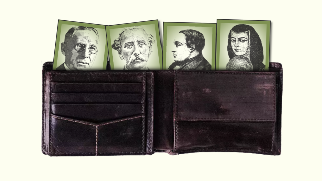
During the design phase, we learned there were legal constraints to having pictures of banknotes on our site. Some countries mandate images can only be reproduced at a reduced resolution and size while others require a watermark saying “sample” or “void.” These rules limited our banknote image use and pushed us in a new direction with our visual elements. We opted for headshots of banknote characters from Wikimedia. Some were in color and others weren’t, so we turned them all black-and-white and added a texture filter to make them look like banknote illustrations. After defining all the design guidelines, I created prototypes using Figma. As soon as our developer Jeff MacInnes finished building the first version, we shared it with prospective users and the Pudding editorial team to get feedback.


User testing highlighted the importance of having a specific color for men and women that would remain the same throughout the story. In that way, the reader could identify at first glance how many men and women were represented in the different graphs. The feedback also helped us rethink some elements that weren’t as user-friendly.
Initial design idea: Adding a sidebar character (Frida Kahlo) who would guide the user throughout the reading, with bubble texts sharing interaction instructions and additional relevant fun facts.
Feedback: The character took away virtual real estate that could be used to enlarge the graphs.
Final design decision: Add the interaction instructions below each graph title.

Final thoughts
After several months of work and multiple versions, we published the essay in April 2022. The project got overwhelming support: it was featured on Morning Brew and the Global Investigative Journalism Network and was long-listed in the Information is Beautiful Awards.
Now that I have more coding and design knowledge, there are many changes I would consider. I would use a scrapper to get the data from Wikipedia’s list of people on banknotes. Even if it doesn’t include all the categories we had in our dataset, it would make it easier to do regular updates. I would also add more visualizations, including a map to show the geographic distribution of the trends we found.

By the time we finished the project, I realized data visualization was a viable career path so I pivoted from podcasting to data. I was drawn to interactive data visualization because of its power to engage readers and showcase complex datasets in a digestible way.
For the next six months, I shifted all my energy toward improving my data analysis and design skills while learning front-end development (shout out to my local library for free Coursera access). Today, I have the pleasure of coding graphics for a living and using data and interactive storytelling to elevate local journalism across the U.S.
Have you made an interactive data project you’re proud of? Share your “Data Diary” with Nightingale! Read our submission guidelines here

Alejandra Arevalo is a Peruvian multimedia journalist and engineer based in San Francisco. She is currently a developer fellow at Hearst Newspapers where she focuses on data visualization and interactive storytelling. She previously ran the music data analysis publication "How Music Charts at Chartmetric". Her analysis about banknotes around the world with The Pudding was long-listed for the 2022 Information is Beautiful awards.


