
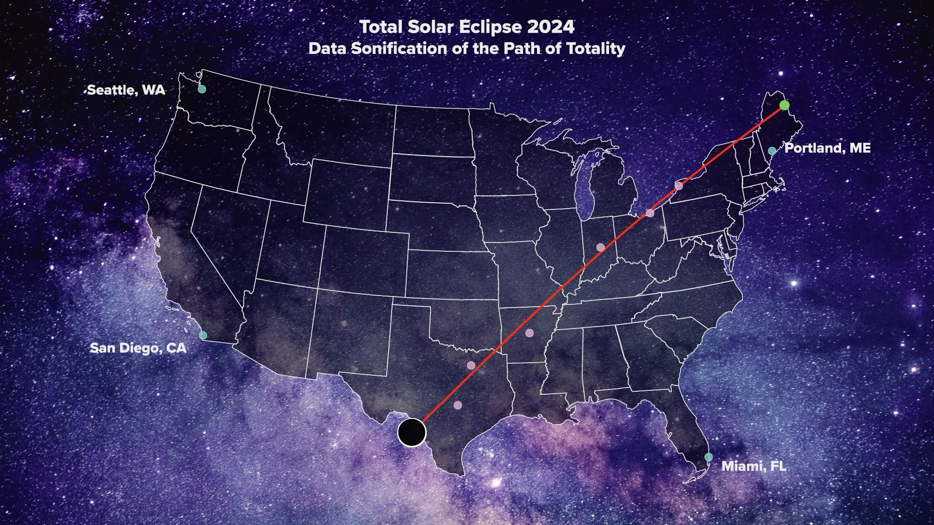
April 8th, 2024 marked an exciting astronomical event—a total solar eclipse in North America. Viewers of this rare phenomenon could experience a darkening of the sky and a quieting of the environment caused by the moon obstructing the sun’s light. The full expression of the eclipse could be witnessed along the path of totality, which ran across North America from Texas to Maine. But how might those unable to view it experience this cultural moment?
I created an audio-visual map containing a guided data sonification of the eclipse’s path of totality. Data sonification is the practice of representing data through sound. As a data scientist, information designer, and audio enthusiast, I have found data sonification to be an exciting realm for representing data engagingly and creatively. This project was in support of the Georgia Tech Sonification Lab’s endeavor to create accessibility resources for the total solar eclipse.
The benefits of data sonification
Data sonification has enormous potential in information communication and is especially beneficial to the data viz community in two significant ways. First, expressing data in the form of audio makes data accessible to people who are visually impaired or blind. There is a heavy reliance on visualization in data analysis and educational storytelling, but by integrating sonification into these realms, data can be consumed without reliance on sight. Second, data sonification is beneficial for engagement, sparking curiosity, and stirring emotion within someone. A sound composition may have the power to activate a poignant reaction more than a static data visualization can, just as hearing a powerful speech may stir more emotion than reading it on a page.
The process
This project involved several phases and allowed me to practice an iterative design process. I was able to explore how I wanted to convey the geographical movement of the eclipse’s presence through sound and visualization. I brainstormed with hand-drawn sketches; I used R to wrangle the data; I worked on the sound design in Logic Pro X; and I created the visual animation components with Adobe Illustrator and Adobe After Effects. This project definitely challenged me creatively and technically!
Mapping geography to sound
How do you convey geographical movement in the form of audio? One way is to associate latitude with pitch, and longitude with stereo image. As a data point moves south to north, the listener will hear a change from low-frequency to high-frequency notes. As a data point moves west to east, the listener will hear a “panning” effect from left to right in their speakers or headphones. I felt that this would be an intuitive approach to expressing the path of totality through sound.
To determine the range of notes I would use, I began with the minimum and maximum note values. I imagined the United States framed by a bounding rectangle, with “extreme coordinates” in each corner. Then, I mapped binned groups of latitude values to notes in the G major scale, where the northernmost coordinate matched with the highest note and the southernmost coordinate matched with the lowest note. I also wanted to sonically capture major cities along the route of totality with brief audio flourishes, as well as a quietly spoken announcement of the city name.
The next step would be to explore how to layer these sonic components together into a single composition.
Exploring musicality
To make a data sonification pleasant and engaging, it can be helpful to bring forth a sense of musicality. I decided to limit the pitch mapping to a G major scale and use a piano software instrument to create a sense of auditory harmony. While this limited selection of notes would reduce the precision with which I could express the data, I wanted to avoid additional notes that might create dissonance.
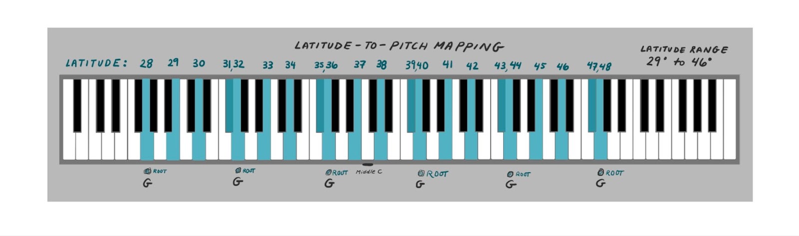
To improve musicality, I thought it would be nice to represent the path of totality with a series of arpeggios (notes played in sequence), with each starting note increasing in pitch and latitude. These layered arpeggios could create a feeling of ascension and northern movement along the eclipse’s path.
To represent major cities along the path, I integrated brief musical flourishes (groupings of a few notes in the key of G) that would accompany the arpeggios. To create an underlying musical foundation and sense of wholeness, I implemented two chordal violin expressions also in the key of G. The first of these is a deep, resounding chord in the lower register of the scale, fading out at the halfway point of the path of totality. The second chord is in the higher register, fading in at the halfway point and ending with the completion of the sonification.
Presentation through guided narration
The presentation of a data sonification is particularly important, to ensure that the listener can successfully understand the sonification. Even if a sonification sounds interesting, listeners will only be able to walk away with an informed perspective if they are first introduced to the meaning behind each audio parameter. Providing a “sonic vocabulary” to listeners will help them recognize individual sonic features and derive meaning from the composition as a whole.
Jordan Wirfs-Brock, an avid practitioner of data sonification with whom I’ve had the opportunity to collaborate, has greatly influenced me in this regard. She emphasizes the importance of training a listener to provide more familiarity with the data sonification and ensure an educational experience.
Beyond the presentation of the sonic vocabulary, I wanted the audio-visual map to have a narrative, storylike characteristic. I wrote a script I could follow to guide the listener through the context and framework for this data sonification project. For example, this is how I introduced the extreme coordinates:
By providing this chronological guidance, I hoped to prepare the listener for the final macro sonification.
Reflections, limitations, and what’s next
There are innumerable ways to approach data sonification; this is just one way. From the audio parameters chosen to the degree of musicality to the interpretation of the data, and every design choice in between, data sonification can be a truly creative practice with vast possibilities.
Another feature I would have liked to explore with this project is interactivity. A map with interactive sonification elements could allow users to explore and learn at their own pace. In future projects, I’d also like to explore the use of different audio parameters. While I think longitude to stereo field mapping is intuitive as a means of “hearing” west to east, it is limited in that the effect is best experienced with quality headphones or speakers (and might be lost on typical laptop or phone speakers). I’d also be interested in branching out from the limited major scale; I think the notes progressed too predictably to be intriguing.
I hope this project inspires fellow data viz practitioners and audio enthusiasts to try their hand at data sonification. What would you create?

Aura Walmer is a data scientist, researcher, audio enthusiast, and budding data visualization designer. She is interested in combining data, art, and audio to create unique multimedia projects that educate and inspire others. When she’s not wrangling data, she loves creating digital illustrations, reading fantasy fiction, taking improv classes, or traveling to places she’s never been.
- Aura Walmer


