
For the last few years, I’ve been interested in how interactive digital tools can foster a sense of community while being enjoyable. My latest project, the Communal Plot, tries to capture this idea by allowing people to share their opinions and see how they align with others in real time. Here is how the Communal Plot evolved from a simple idea inspired by a tradition at my old job into a fully-fledged interactive platform.
Inspiration
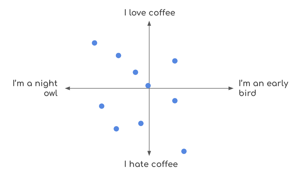
The inspiration for the Communal Plot comes from a whiteboard in an office where I used to work. Every so often, somebody would post a question, and people would respond by marking where on the scatterplot they belonged. I enjoyed seeing how my responses compared to others and guessing who might have responded where. I wanted to recreate this experience digitally, allowing a broader audience to participate and enjoy the same sense of community.
The Initial Build
To start, I needed a way to collect and visualize responses in real time. I chose p5.js for rendering the scatterplot and Vue for the overall page structure. Although p5.js is more popular in the generative art community, I believe it has significant potential for data visualization, especially in highly interactive and bespoke use cases.
I used Supabase for the backend, which has real-time features that allow me to update the plot dynamically as new responses come in.
The initial version of the Communal Plot was simple: users could answer a pair of questions and see their responses on a scatterplot alongside others. This basic functionality captured the essence of the office whiteboard experience and brought it online.
The digital approach offers some advantages over the whiteboard analog. For example, I could hide recorded responses until a user taps on the plot, keeping the interface cleaner and eliminating potential bias.
Enhancements and Features
As the project has evolved, I’ve added lots of features to make the experience more engaging and provide deeper insights:
Interaction Design
Designing the fundamental interaction pattern was crucial to making the Communal Plot engaging and intuitive. My general approach to design is to imagine the best user experience possible, and then work backwards to figure out downstream requirements from there.
The guiding UX tenet for this project is ease of use. It was important that the user could click on the plot to place their response, and the plot would update in real-time. The interface needed to be snappy and have minimal friction to keep users engaged.
This “north star” naturally informed some functional decisions about this project. For instance, we chose not to require a login. We implemented optimistic UI patterns to ensure that the chart updates instantly during user interactions, avoiding the disruption of a loading spinner after each plot click.
Challenges and Solutions
One of the main challenges was protecting users’ privacy while storing and processing their data. By storing a user’s responses locally in their browser and aggregating data on the backend, I ensured good data hygiene without sacrificing the richness of the data.
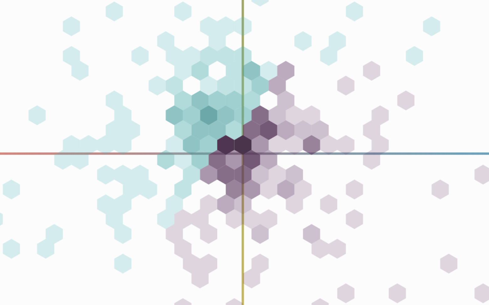
There’s always a tradeoff, though. By aggregating responses, the ability to have rich analytics around time and geography is lost. Instead of having a row for each response, tagged with a timestamp and location data, aggregation simply tells us how many responses there were in a particular location on the plot.
I landed on a compromise where I would aggregate responses only after the next day’s plot went live. This allowed me to provide the most engaging experience possible for the day while also maintaining a high level of privacy.
Since I was aggregating data, I had a few choices for how to reflect that on the interface. I ultimately decided to use hexagonal bins over square bins. Hexagons are quirky and non-symmetrical, perhaps not ideal for robust analysis, but this is a low-stakes project, and they were much more visually appealing to me than square bins.
Another challenge continues to be engagement. Unlike other visualizations I’ve built, this project depends on user participation. The sharing options and guess links have helped, and I’m continuously thinking of ways to make this project as interesting as possible.
Reflections and Future Directions
Since launching, the Communal Plot has received positive feedback from users who enjoy seeing their opinions visualized in real time and comparing their responses with others. The tool has fostered a sense of community and sparked interesting conversations around the daily questions.
There are a few potential improvements I’m considering:
- Expanding Analytics: Adding more detailed analytics, such as a historical analysis of how your responses have compared to the community’s.
- More Social Features: Letting people see their friend’s responses on the plot directly without having to message each other in a different app.
Overall, working on the Communal Plot has been a rewarding experience. It’s exciting to see how a simple idea inspired by a whiteboard can grow into a tool that connects people and sparks meaningful conversations.
If you have any feedback, or suggestions, or notice any issues, please feel free to reach out to shri@perthirtysix.com.

Shri Khalpada is a full-stack software engineer and creative coder based in the DC area. He began his career in big tech and is currently the first full-time hire for a small but disruptive sports analytics company called Cleaning the Glass. Shri also enjoys working on creative coding and data visualization projects, which have collectively been viewed millions of times. Away from the keyboard, he loves strumming the guitar, trying to keep up with his cat, being in coffee shops, and playing chess poorly.
- Shri Khalpada

- Shri Khalpada


