
Learning to read academic papers is a considerable challenge for many college students. Take, for instance, the task of reading a research paper for an upcoming class discussion. Students who opt to read the piece from start to end will, at best, encounter unfamiliar technical terms and ideas in an unusual formal writing style. Students who instead want to approach the paper-reading by looking for specific areas of interest face an additional challenge — figuring out where to find the information they’re looking for. For instance, while knowing that authors often summarize their contributions in the abstract, introduction, and discussion might seem obvious to those with practice reading papers, these patterns of what goes where are learned and highly area-specific. As Adam Ruben wrote in his satirical piece about the difficulties of reading academic papers: “Nothing makes you feel stupid quite like reading a scientific journal article.”
So when I taught a new Human-Computer Interaction (HCI) course where many students would be engaging with the field’s literature for the first time, I knew I needed to get creative. I teach Computer Science at Mount Holyoke College, a small, private, predominantly undergraduate liberal-arts college in Western Massachusetts. When I set about the task of designing the new course (an intermediate-level elective for undergraduate Computer Science majors), I set an objective to expose students to the broad assortment of areas in HCI through engaging with exciting new literature — the final weeks of the course would be at the same time as the largest HCI conference in the world (ACM CHI), after all! However, I knew that, while students would be familiar with reading academic texts generally, this might be their first time engaging with Computer Science literature (broadly) and almost certainly their first time reading HCI literature (more specifically). Therefore, I wanted to design an activity which would help students get more comfortable navigating new texts in a way that felt fun and approachable, but would build strong skills they could apply to future readings.
I ultimately designed an activity in which students create data comics as a means to better understand the structure and content of research papers containing human-subject studies. Inspired by past work about how creating data comics (data-driven stories in a comic strip-like form) might benefit researchers, I designed this activity to use the process of creating data comics to benefit readers’ skills. The big idea is this: in order to create a data comic, a student must both find the pertinent information they need to tell the story of that paper and understand enough of what they’ve found in order to summarize it. Further, because creating a data comic may feel more fun, creative, and low-stakes than other deliverable formats that students are familiar with (e.g., reports or presentations), students may be able to engage with this difficult work with less fear and stress.
In this short report, I will provide an introduction to data comics generally, explain the activity I designed involving them, and reflect on the opportunities and challenges of conducting this kind of activity.

What are data comics?
Data comics are a type of narrative data visualization which present a data-driven story in a comic strip-like form. While data comics may look like any other comic strip at first glance, they incorporate visualizations into their data-based narratives, using different combinations of visualizations, (narrative) flow, narration, and words and pictures (see above Figure for examples).
Data comics can be a particularly powerful tool in educational contexts because they leverage, break down, and communicate potentially complex information in an approachable format. Authors have written about the potentially helpful role of data comics in a variety of contexts including helping people make sense of their personal data and better understanding how to approach unfamiliar visualizations through reading and creating explanatory comics (for a comprehensive survey of data comics in education, see Boucher et al.’s 2023 survey). Further, creating data comics provides students an opportunity to practice both high- and low-order cognitive tasks (e.g., finding and summarizing) in a creative, low-stress context — ingredients which Psychology and Education research tell us contribute to long-term learning.
The application of data comics which most inspired the activity I designed was Wang et al.’s work on data comics as a means to report controlled user studies. In their paper, Wang et al. describe how authors of scientific papers could use data comics as a means to report information about their user studies in a format that might be more accessible to both experts and non-expert readers. While my students aren’t (often) authors of scientific papers, they were readers of them, so I wondered: could making data comics help student readers understand the structure and content of papers? To try this out, I modified Wang et al.’s workshop procedure (described in their publication and the workshop website) into the following activity for students which would be possible to accomplish within a limited class time.
The activity
In this activity, students created a data comic for an existing research paper containing a human-subject study during one 75-minute class session plus a 10-minute pre-class preparatory discussion. While I hoped that students would come out with a good understanding of the paper that they’d read, the primary objective of this activity was to build students’ confidence in finding and summarizing key pieces of information in an academic paper so that they could apply those skills to future reading tasks. To make the initial paper navigation smoother, we spent 10 minutes in the prior class session discussing the sections of a “typical”’ research paper and their high-level purposes. For instance, we talked about how abstracts are a summary of the work as a whole (and thus serve as great overviews), but often do not contain critical details about methods, results, and impacts which can be found elsewhere. The purpose of this discussion was to provide a general road-map for students to recall, apply, and expand in the following class, while they were actually creating their comics.
At the start of the main class session, I introduced the concept of data comics and students explored examples of existing data comics. The goal of this introduction is to help students get an idea of what data comics can feel and look like. We used Bach et al.’s data comic gallery as a starting place, combined with other examples students found elsewhere online.
Then, I divided students into small groups of two or three and asked each group to pick a paper to convert into data comic form. In the inaugural version of this activity, I selected three short papers from ACM CHI for groups to choose from. Each paper incorporated a human-subject user-study of some kind to connect the exercise to topics students had seen earlier in the course related to human-centered design methods. Although I selected the papers in this iteration, the search process could alternatively have been student-driven with students either independently proposing papers or consulting proceedings together, depending on the goals and time constraints.
Each group was then given several sheets of plain paper and a set of colored markers to create their data comics. While there are lots of great tools for creating digital data comics, I intentionally chose to have students create comics with paper and markers to reduce the friction that comes with learning a new tool and the perceived pressure to try to make something that “looks nice.” This philosophy is consistent with substantial existing work on the benefits of creating paper-based, lo-fi prototypes of visualizations to facilitate idea generation and divergent thinking. Further, I wanted to focus students’ attention on the “fun” of being creative — I’ve learned that college students often don’t get to play with markers in class as much as they might like!
Then, it was time to dive into comic making, focusing on creating comics with a simplified 3-part structure. Given the amount of time students had to create their comics, I asked students to focus on finding the information required to tell a story with the following 3-part structure:
- Motivation & Question: Explain the researchers’ central research question(s) and why they matter
- Methodology: Explain what the researchers did to try to answer their research question(s)
- Results: Explain what the researchers learned from their experiment(s), focusing on the most important outcomes
For each part, students were asked to find the information in the paper in the relevant section(s), summarize the most important pieces of information together as a group, and decide the best way to communicate that summarized information in their comic through a combination of images, text, and visualizations.
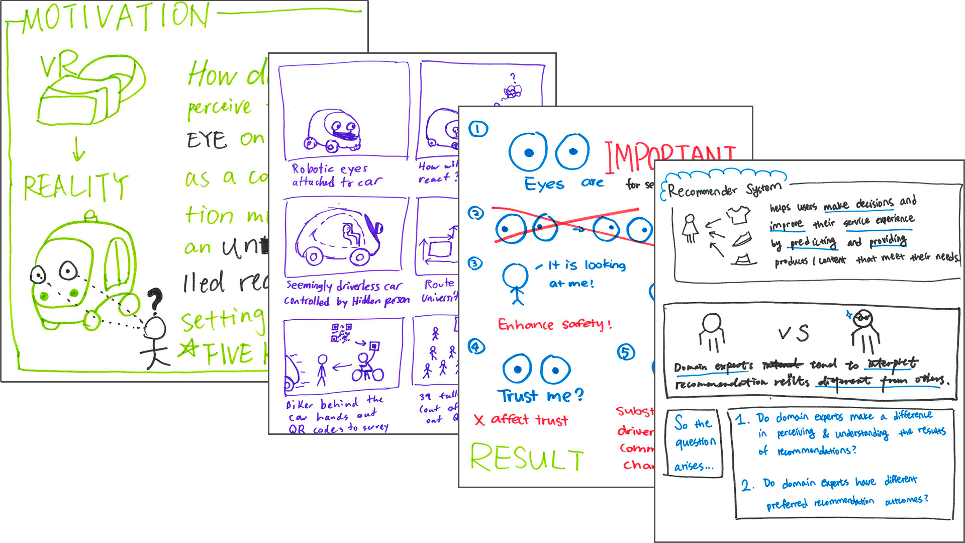
At the end of class, each group shared their creations with their classmates. Of the comics created in that inaugural class, several focused on Gui et al.’s paper “A Field Study on Pedestrians’ Thoughts toward a Car with Gazing Eyes” (perhaps because of its cute “self-driving car with eyes” concept!). You can see components of three different groups’ comics for this paper in the Figure below.

Possibilities and challenges
Overall, I found the first version of this activity to be quite successful, in terms of both positive student reception and accomplishing learning goals. While most groups did not produce complete, polished comics in the 75 minute session, they all engaged with their chosen paper deeply over the session and wrestled both with the format and content in productive ways.
Additionally, students reported that they loved this activity: in their end-of-week reflections, they repeatedly described the activity as the highlight of their week. Students’ comments indicated that they found it both fun and extremely helpful for furthering their understanding of how to approach and read papers in the future, emphasizing that the act of creating something new based on the reading was particularly impactful. While these initial impressions were volunteered as a part of a broader weekly reflection assignment for the course (and thus may not reflect all student reactions or reflections), they indicate that this activity was a positive experience overall for many. I plan to collect more systematic feedback from students regarding what precisely worked (and didn’t work) when I repeat this activity again.
Despite my students’ generally positive reaction, there are certainly challenges to conducting this kind of activity which I’d suggest readers think about if they are considering doing something similar in their own context.
Allocating the Right Amount of Time
First, selecting the right amount of time for this activity can be a challenge. In the initial version of this activity, my students made their data comics over the course of one 75-minute class session, supplemented with a short 10-minute introductory lesson in the prior class. Though I do think students accomplished enough deep work in this time to ultimately improve their reading skills, few of them came away with a fully complete comic. Additionally, while students shared their comics with their classmates, we did not have time for students to give each other feedback on their comics or for students to refine their comics based on that feedback. As discussed by Boucher et al., engaging in these kinds of feedback loops is critical to both developing more polished, effective comics as well as cementing learning.
One approach to picking the “right’” amount of time for this activity may be to think about how complex the main learning objective is for the session and allot an amount of time to match it.For instance, an implementation of this activity which mainly aims to build students’ skills for finding information may require less time than versions that focus on the summarization and presentation aspects, because finding information is a less complex task than summarizing it (according to Bloom’s “Taxonomy of educational objectives”). In situations where the activity time is fixed, it may also be possible to incorporate pre- or post-activity work to support in-class activity time. For example, Boucher et al. had workshop participants identify a visualization to explain in a data comics before beginning their workshop session and Wang et al. asked participants to identify a dataset to use between the first and second session in their 3-session sequence.
Considering Existing Familiarity With & Orientation Toward Key Ideas
Second, while comics are enjoyed by a diverse group of people throughout the world, they are not universally understood. Instead, readers must learn how to decode the visual and linguistic conventions in comics, like any other form of narrative. One impact of this reality is that students who are less familiar with comics may face an extra barrier to their learning. Therefore, educators who are considering this activity should consider students’ existing familiarity with comics and allot additional time and practice to account for familiarization (e.g., by allotting additional time to analyze the format or work with existing comics prior to asking students to make their own).
In addition to comics, it is important to consider students’ familiarity and comfort with visualizations. As previously observed by Wang et al., it can sometimes be a challenge to get students to integrate visualizations into their comics, depending on their existing experiences with the topic. During this iteration of the activity, I observed that some, but not all, of the groups incorporated visualizations into their comics, though it is unclear whether this was because they were uncomfortable with using visualizations or just ran out of time (see Figure below for an example of one group’s use of a timeline and pair of pie charts to summarize the methods and results). Educators whose students are less familiar or comfortable with making and using visualizations may find tools like Boucher et al.’s “Comic Construction Kit” or Bach et al.’s data comic design patterns cards helpful to scaffold this challenge and re-direct students’ energy toward learning objectives.
Further, convincing students that creating comics is a worthwhile learning activity may be difficult depending on their existing orientations toward this kind of activity. While work in Educational Psychology has shown that creative activities like drawing can be beneficial to learning in STEM fields, students may not view it this way, depending on their existing beliefs about these activities. For instance, while my students were enthusiastic about creating comics as a component of a Computer Science course, my institution is a liberal-arts college which highly emphasizes interdisciplinarity and takes a pretty broad view of what Computer Science is and how it can be taught. However, educators at institutions which take a more traditional view of what the “work” of their field is, the acceptable pedagogies used to teach it, or which abide by a stronger science/art divide may need to do additional work in order to get student buy-in.

Selecting the Right Comic Format for Your Paper Type
Third, while it may be possible to create a data comic for any academic paper, the 3-part format described in this article may need to be modified for papers without experimental studies. When I initially designed this activity, I knew that students would be working with papers containing human-subject studies because we had covered related methods earlier in the course. Therefore, the 3-part Question/Methodology/Result narrative structure used by my students was picked with these kinds of papers in mind. However, these three sections may not meaningfully encapsulate other types of papers which do not use experiments as the basis of their claims (e.g., theoretical or position papers). Educators who want students to create comics for non-study papers should consider their main components and select a structure with that in mind. For instance, data comics for theoretical or position papers could instead map out the steps or pillars of the argument being made and how they relate to each other.
Conclusion
In conclusion, creating a data comic based on an existing research paper may be an effective learning activity because it forces students to practice both finding pieces of information of interest within the paper’s unfamiliar structure and digest the information they find in order to transform it into a new form — two stumbling blocks for those new to reading academic papers. I am planning to bring similar activities to my other courses and I hope that this article inspires other educators to bring data comic creation activities into their work as well.

Alyxander Burns
Alyxander Burns is an Assistant Professor of Computer Science at Mount Holyoke College. His research explores how people make sense of communicative visualizations in everyday life and novel ways to expand and improve research methodologies.


