
After doing data visualization work for eleven years, in 2021 I decided to go back to school to gain the skills and tools for creating physical work.
I’d already been fascinated with—and then obsessed with—data physicalizations and installations for almost a decade. My interest in them grew over time as I became dissatisfied with creating work for the screen; I was frustrated that no matter how much love I put into a work, I was ultimately vying for a few minutes of attention amongst dozens of other tabs. I wanted to create a whole world, but designing for a screen meant I could only share that world via tiny windows. I wanted people to step into my works with their full bodies, where I could monopolize all of their attention.
At New York University’s Interactive Telecommunications Program (ITP), I learned how to control Arduinos (a.k.a. microcontrollers, tiny computers capable of simple operations for devices that interact with the real world), LEDs, motors, extract sensor readings, and design circuits. I laser cut and 3D printed, I proudly overcame my fear of band saws and miter saws (a.k.a. big motorized blades), and I became comfortable in hardware stores.
But what I hadn’t expected was the luxury that two years away from client work afforded me, and grad school became a safe space for me to experiment. I went in with a singular goal: I wanted to see what my data stories could look like off the screen and into the physical world.
What I found, instead, was myself.
◇◆◇
It’s a funny thing: When we create for the screen, we can go so fast. For years, I’d churn out projects in a matter of weeks, at most a few months. There’s a sort of satisfaction to that, being able to write a few lines of code, hit refresh, and see something appear on the screen. But it also means that I have no time to think about the why. I mean, I know why I’m designing a visualization a certain way, how the design choices support the data, the story I’m trying to tell. But I never have the time to question: Why am I doing this? What does this dataset, this story, mean to me?
One of the unexpected things for me working on these physical pieces was the amount of time between ideation and realization, and how that wait time demanded introspection. I could no longer hit refresh and get a result in a few seconds. I had to get on 40-minute train rides for fabric samples, wait half a day for a 3D print to finish, or a week for electronic components to arrive. That wait time forced me to be intentional with every material choice and design decision, until I pared down the piece to its core. It also gave me a lot of time to get existential and think about why I was doing what I was doing.
This was especially true when I created my thesis project that took four months working on and off, in between classes and exhibitions, to complete. The piece, “Untitled (we still land, home)” (2023) is introspective and deeply emotional for me. The final exhibit is a physical data installation featuring Chinese calligraphy ink that drips onto billowing fabric at different rates based on a dataset of Chinese immigration into America. The dataset itself is simple and small, only 17 rows and two columns, but the stories behind each number—including my own, as an immigrant—are anything but.
My thesis started when I first discovered a deeply rooted rage, and traced it back to my childhood and the quiet trauma I inherited from my immigrant parents who, by the time I was 10 years old, had made four life-changing moves to three foreign countries—taking me on all but the first. In my research into Asian-American and Chinese-American history I came across a common refrain: one of setting out to a new country filled with hope and expectation and finding a reality vastly different. I became fascinated with that tension.
I latched on to Chinese calligraphy ink as a symbolic representation of the immigrants and a scroll as the US land where they arrived. But I added a twist: To acknowledge the challenges of settling into a new country, I wanted the ink to land on a wildly billowing scroll—a literally difficult terrain—that would make it hard for the ink drops to land where they intended and cause them to splatter and scatter messily. Traditional calligraphy paper, beautiful but delicate, wouldn’t hold up to the large movements or quantities of ink I had in mind. So I spent weeks performing material tests with different swatches of fabric, taking into consideration their weight (lightweight enough for my fans to move them), their absorbency (just absorbent enough so that the ink makes interesting, messy patterns on landing), and their historical context.
I knew I wanted a visual metaphor of droplets being displaced, not being able to land where they intended. So I installed fans to move the fabric, and over time, the fans became symbolic of the anti-Chinese sentiments within and across American history. When people first entered the room with the installation, they couldn’t see the fans underneath the fabric, but they could hear their whir and, more importantly, they could feel the wind. It sounded like this:
I loved that metaphor for systemic racism: something intangible (and artificially created) that we often can’t see, but can feel.


The wind also carried the smell of Chinese calligraphy ink—a scent that is deeply nostalgic for anyone who had to learn calligraphy growing up. I loved that as a subtle, shared sense of community and belonging.
In the space between iterations, I [cried bucketloads, like seriously my husband would just randomly find me crying behind my computer every other week] realized that I was asking the piece questions I could never bring myself to ask my parents. And with each drop of ink I tested on each piece of fabric, I found my answers: Even if we don’t land where we intend, we still land and we make homes for ourselves. And that resilience is so beautiful.
The slowness of the process gave me space to take the first step towards finding closure, a way to know myself.
◇◆◇
My thesis wasn’t the only place where I used human senses to conjure an emotional response. In total, I made four projects with “the drip drips,” as my classmate called it (lol).
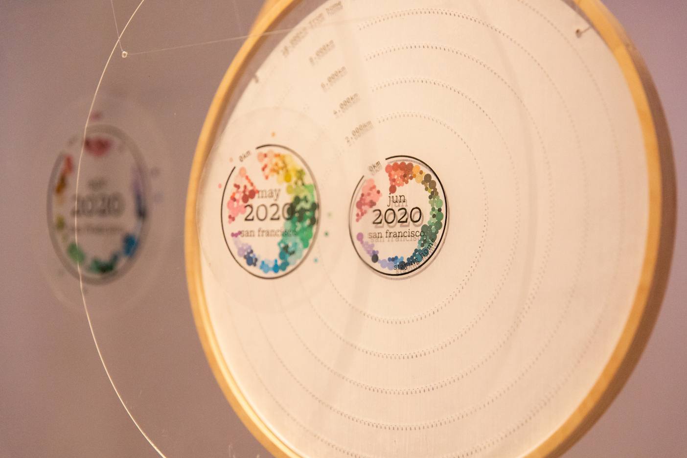
In my piece “wonder” (2022), I project an animated visualization of all the photos I took between 2018 and 2022 onto a bowl of water. And for the pandemic years, I drip water according to the number of anti-Asian hate crimes reported to the New York police department in that same timespan. When I originally designed it, I imagined the water drips distorting the projection as the visual metaphor for how distorted reality felt during that time.


In data visualization, we pay attention to visual metaphors—colors and shapes that could hint at what the underlying data and story is about. But working in the physical, there were so many dimensions to play with, so many layers of meaning I could imbue in each of my material choices. And oftentimes, I’d find unexpected, unintended manifestations that only helped enhance the piece.
What I hadn’t expected was for the mechanism I’d chosen to programmatically control the water dripping—a solenoid valve—to have a mechanical clicking noise every time it opened and closed. At first, I considered covering up the sound, fearing it would be distracting. Then, as I sat with the piece for hours (to make sure that the solenoid valve would hold up after many hours of continuous use), I realized that the continuous, staccato-ed clicking was a perfect audio complement to the piece. It sounded like this:
I was told again and again by visitors on the night I exhibited the piece, that even though there was no explanation for what the water drips represented, they internalized the subtle noise; it stirred in them an almost subconscious anxiety.
◇◆◇
Another drip drip piece followed the same pattern.
“Though a patriarchy would privilege the changelessness of the sun over the inconstancy of the moon and you” (2022) is a data physicalization where red ink drips according to my 2020 menstrual data. The ink lands on watercolor paper printed with the 31 days of a month, marking the days I had my period. It is inspired by the shame I used to feel in my teenage years that somehow my body was abnormal because my periods never came on the same days of the month, until I realized that what was actually irregular was the solar calendar, which shifts from 31 days to 30 to 28 and sometimes even 29 days. By the end of the 30-minute performance, almost all of the days are marked red.


In this piece, the topic is emotionally charged for me, and for anyone watching it. It is imbued with a deep-rooted rage, a little rebellion, a f*ck the patriarchy. The experience of seeing it is visceral: The red ink is messy, it doesn’t land neatly within date boundaries, it splatters in between and all around, it bleeds into the next and pools together. It demands conversation.
It also acknowledges that there are some datasets and topics that are too emotional for the pixel perfection of a computer screen (because how do we even begin to quantify an emotion?). But we try to force them into numbers and discrete rows of data anyway, then try to acknowledge that loss of fidelity by injecting pseudo-randomness and pseudo-noise into our code. It strikes me as ironic that when we do that, we’re trying to force a computer to do the very opposite of what it’s good at—which is to be precise and pixel perfect—when the physical world is already random and noisy all by itself.
“We’re trying to force a computer to do the very opposite of what it’s good at—which is to be precise and pixel perfect—when the physical world is already random and noisy all by itself.“
And I am convinced that there is a whole category of data stories that belong in the physical realm—sensory and messy visualizations that urge us to engage with them not as precise manifestations of a dataset, but instead prioritize an emotional connection and understanding.
◇◆◇
When all of these projects were done, my husband made a mind-blowing observation: I design precise systems that manifest imprecisely, messily. And he further observes: The precise systems I’ve designed in my installations are much like the rigid boxes—screens, constraints, social identities—I’ve worked in for much of my career. But, the way that they manifest—messily, imprecisely—that’s me breaking out of those boundaries and finding freedom.
That’s me finding myself.

Shirley is a Chinese-American artist, software engineer, data visualization designer, keynote speaker, and co-author of Data Sketches. (Headshot credit: Sasha Israel)
- Shirley Wu

- Shirley Wu


