
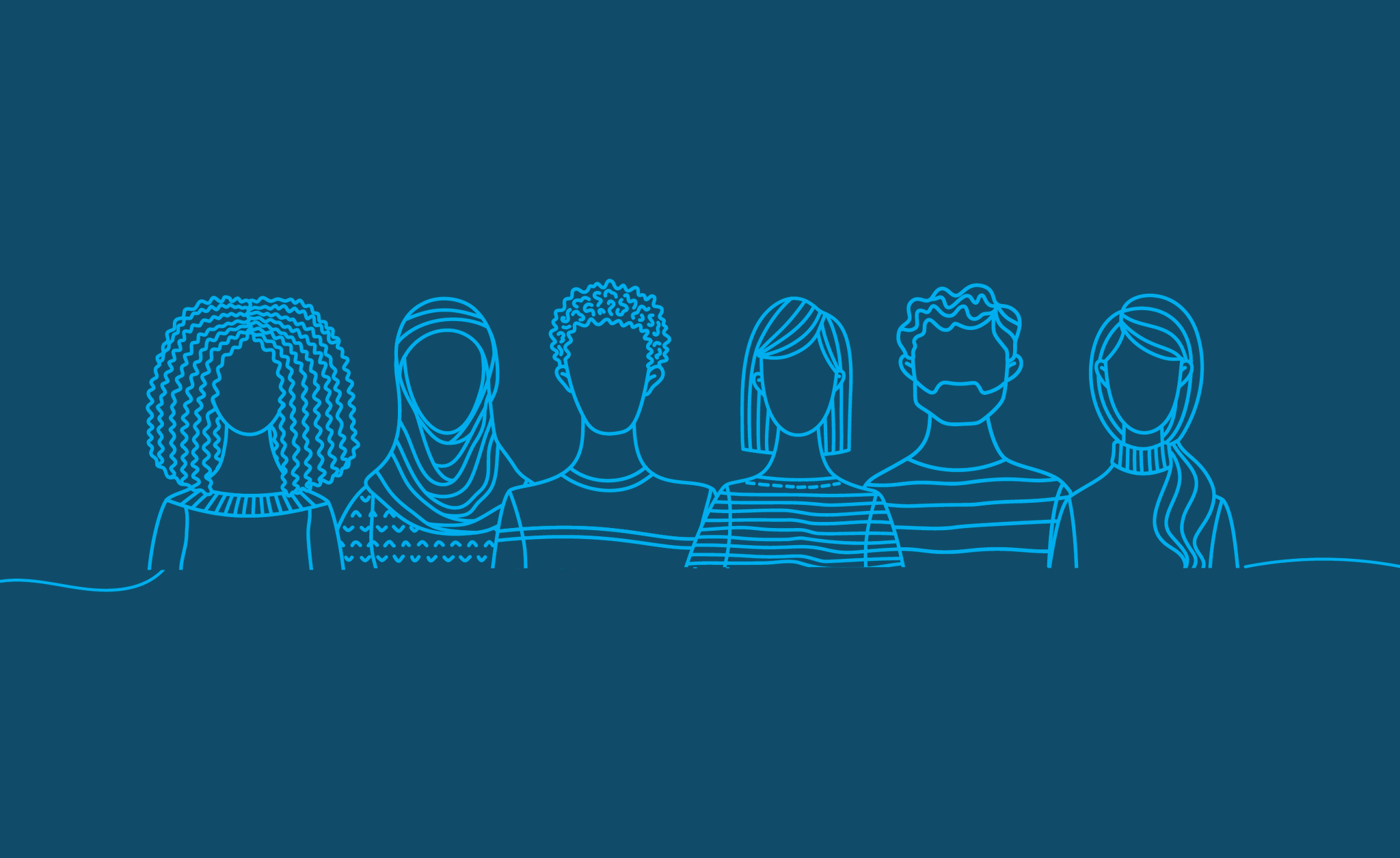
One of the big challenges in visualizing data, and quantitative research in general, is helping readers connect with the content. Connecting directly with people and communities, and trying to better understand their lived experiences, can help content producers create visualizations and tell stories that better reflect the true experiences of different people. Our recent report on taking a racial equity awareness in how you and your organization work with and communicate your data and research focuses on this important aspect.
Embracing empathy in data and data visualization is a key dimension for people working with data to help put their work into the hands of policymakers, stakeholders, and community members who can use it to affect change. Inclusive and thoughtful data visualization that respectfully reflects the people and communities of focus can also help researchers build trust with those communities.
We think of empathy as it applies to communicating data across six main themes:
1. Put people first. First and foremost, we need to remember and communicate that the data shown reflect the lives and experiences of real people. Data communicators must help readers understand and recognize the people behind the data.
2. Use personal stories to help readers and users better connect with the material. Pairing data-driven charts with personal stories centered on individual experiences can help readers understand and identify with the people represented in the research and data visualizations. Techniques that can be used in tandem with data visualizations to help lift up personal stories include photography, illustrations, pull quotes, and oral histories.
3. Use a mix of quantitative and qualitative approaches to telling a story. Most charts and graphs are built on top of spreadsheets or databases of quantitative data. However, focusing on numbers alone without any context can overlook important aspects of a story including the “why” and the “how.”
4. Create a platform for engagement. This can take the form of interactivity in which users are able to manipulate buttons, sliders, tooltips, and other elements to make selections, filter the dataset, or create customized views of a chart. Such engagement can be leveraged as a way to allow users to find themselves in the data or discover the stories that most interest them. Another form of engagement is offering audiences a means of providing feedback about a data tool or visualization.
5. Consider how your framing of an issue can create a biased emotional response. Carefully consider how the data you visualize presents a particular perspective on the content. Take the examples ProPublica journalist Lena Groeger discusses in this post on different ways to visualize the impact of crime on local communities. Maps that show the locations of where crimes occurred versus maps that show the percentage of residents in a neighborhood who were in prisons are two different ways to visualize data related to the criminal justice system. What data we choose to focus on and what we choose to ignore can bias our audiences’ perceptions of the issues about which we are communicating.
6. Recognize the needs of your audience. Taking an empathetic view of the readers’ needs as they read or perceive information is an important step to better data communication. This kind of empathy can also be couched in terms of producing visualizations that are accessible by people with vision, physical, or intellectual impairments; reducing overly technical or jargon-laden language; and translating your work into languages most used by your target audiences.
Being empathetic to the people and communities of focus does not imply sacrificing the data and methods used in responsible, in-depth, sophisticated research. In fact, the opposite is true: high-quality research and empathy for people and communities can be complementary. Effective research necessarily means understanding someone else’s point of view nonjudgmentally and recording that perspective as accurately and truthfully as possible. Empathy underlies research and data visualizations that uphold diversity, equity, and inclusion, so data communicators should seek to find ways to help their audiences understand and connect with the people that the data represent.
Read the full Do No Harm guide here.

Jonathan Schwabish is an economist and data visualization specialist at the Urban Institute in Washington, DC.
Alice Feng is a data visualization developer in the Washington, DC area who is passionate about finding ways to do good with data and dataviz.


