
University students in science and engineering are increasingly aware of the importance of data visualization and communication skills. For one thing, they understand they live in a data-driven world, so regardless of their future career choices, data skills are key. What’s more, they also know our world is increasingly fast-paced, so transferable skills like communication, data analysis, storytelling, and design would be valuable even if they transition in their studies or careers later on.
And yet, few STEM majors actually have data visualization in their curricula at all (with perhaps the exception of those pursuing degrees in computer science). Higher education typically only offers these students seminars on how to design a good research poster; students are, for the most part, left to pick up data visualization skills here and there along their academic careers.
Grad students, in particular, who generate their own data, really lack curricular support in data visualization and communication skills. Grad students also tend to perform more advanced data analysis and have complex stories to tell with their data. Often they are working with datasets that hold many dimensions, lots of nuance, uncertainty, etc. Learning about data visualization at that level is as much about design as it is about science communication: distilling the key messages of one’s research, and making difficult decisions about what content should be sacrificed at the altar of good design and a clear message. (In contrast, most researchers are typically taught to try and fit as much as possible in the space given, be it a poster or a scientific paper they’re working on.)
Designing a syllabus to establish data visualization foundations
Personally, data visualization and visual communication in general has become increasingly important in my work. At Penn State University, I study climate impacts on water resources and planning for the future, which often requires the exploration of large simulation modeling experiments and large datasets with many dimensions. This has pushed me to be more inventive and thoughtful with how I communicate my scientific results. I have seen direct benefits from becoming a better visual communicator in my conference posters or talks. These are skills I want my own graduate students to pick up, but also, as an educator, I felt it important that new crops of students get some formal training on this.
Enter the Data Viz class for Scientists and Engineers, which is an attempt to give undergrad and graduate students in the College of Earth and Mineral Sciences at Penn State a design and communication foundation. Though I have no formal design training, I spent more than a year conceptualizing this class, which I taught for the first time this spring semester. My vision from the beginning was to teach all I would want someone else to teach me when I was in college:
- Some of it was very fundamental to design in general, like use of color and how some color scales match different types of data better than others.
- Some of it was very practical to what STEM jobs entail—in academia or industry. For example, how to save Python figures into scalable vector images instead of rasters, or how to guide your audience through a complex graphic using animations and annotations in Powerpoint.
- Some of it was just about getting them to be visually creative even if we don’t know how to get there yet with coding or software skills.

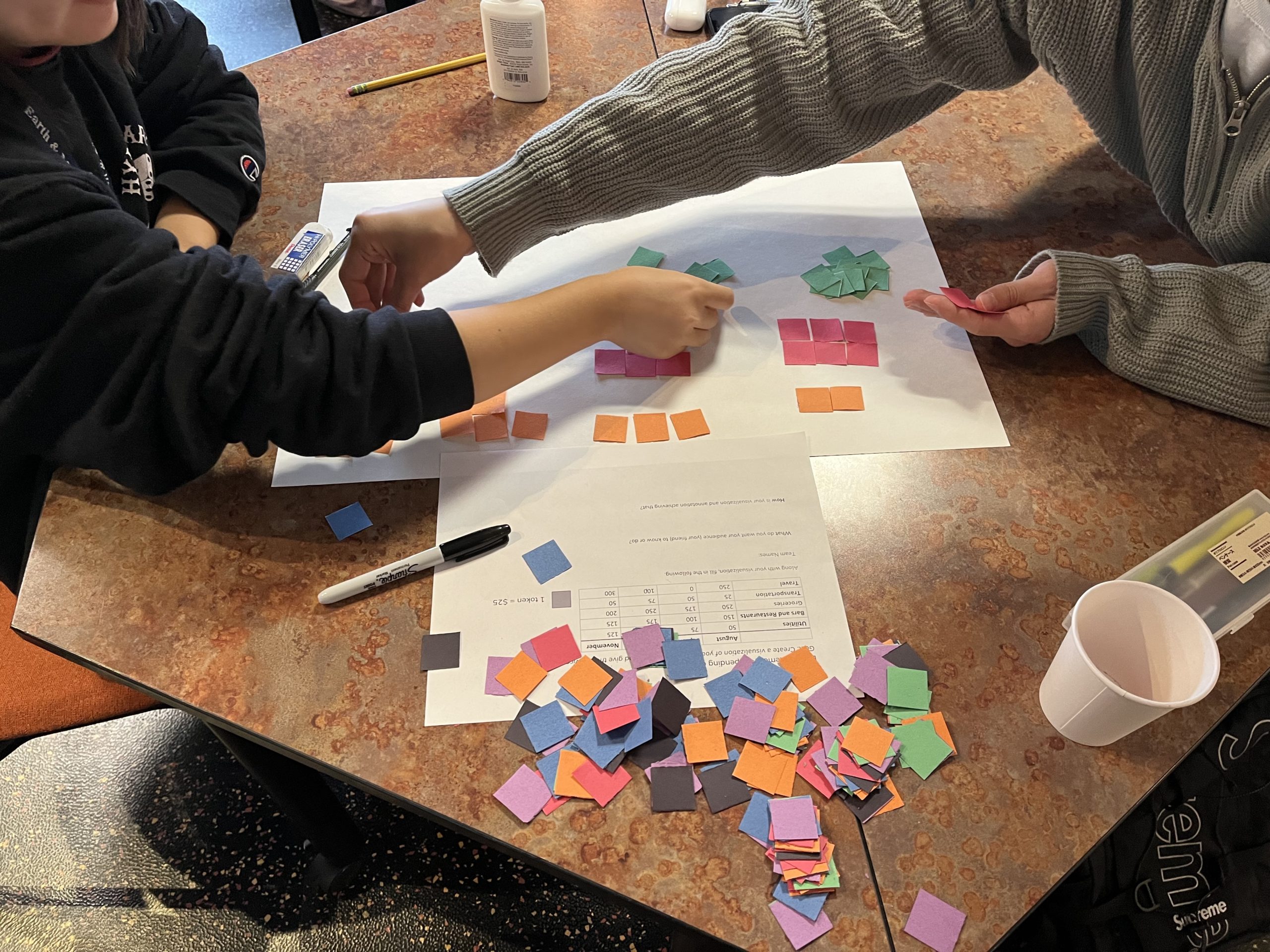
In designing the syllabus, I relied heavily on books (for example, Storytelling with Data by Cole Nussbaumer Knaflic, The Functional Art by Alberto Cairo, and Better data visualizations by Jonathan Schwabish) as well as other teaching materials I could find online. For example, Tamara Munzner, who teaches Information Visualization at the University of British Columbia, and Amelia McNamara, who teaches Data Communication and Visualization at the University of St Thomas, both share their syllabi online. I leaned on both to structure mine. I also picked up some fun activities from the Data Visualization Society’s Slack channel on teaching, including activities like the one shown below, which gives students a dataset and physical materials to depict it.

Evaluating and grading the coursework, using a feedback loop model
The 12 students who enrolled were in the physical sciences so most had no prior background on design or aesthetics, nor did they have advanced coding skills to make interactive dashboards or fancy web interfaces. They also didn’t actually want to learn these skills in great depth (that’s why they’re physical scientists!), but wanted to know just enough to be better visual communicators.
While my students’ backgrounds made planning the course more challenging, it kept the course focused on just the key skills that are most directly useful to scientists and engineers: coding simple analysis and charts in Python and creating more complex visualizations and infographics in Adobe Illustrator. The goal was to stretch them a little on Python and also introduce them to some practical aspects of using software like Illustrator.

The main assignments were to develop three “mini-projects,” such as infographics or research posters. The course challenged them to try to present a certain number of variables in their graphics. For example, in their last mini project they had to figure out creative ways to show at least eight different dimensions of a dataset. Even though data visualization mastery is not strictly about how much information one can squeeze into it, trying to balance informational complexity with good design is a very pertinent challenge for our students and graduates.
Students were provided openly available datasets (like the Gapminder data), but they were also free to use some of their own—particularly if they were already working on research projects as part of their other coursework.

Another dimension that strongly shaped the class was constructive criticism and feedback during the process of making the visuals. In most of STEM education, students deliver an assignment and receive back a grade, with some instructor comments on what was wrong. There’s little space for just exploring weird ideas or being creative in a way that’s not formulaic. So I wanted to emphasize a growth mindset and give the students a space to explore and try out design ideas in a low-stakes environment before they submitted their finals.
To accomplish this, students submitted a sketch or draft of the current stage of their infographic on a weekly basis. They also had to give critical and constructive feedback to their classmates to get marks for the assignment. We provided training early on on how to give constructive feedback and be a good peer mentor, utilizing the RISE model. For example, oftentimes when students are asked to give each other feedback, they’re tempted to just say “this is good!” but that’s terrible feedback! The recipient cannot use it in any way and nothing really improves. Specific and detailed feedback, even when negative, is much more effective in elevating the classroom community.

The project prompt was to develop an infographic and the students had several weeks to iterate on it, starting with a hand-drawn sketch. This is a project by Karen Van-Thu Pham. (Continue through the photo gallery to see progress.) 
After the initial ideation, students developed their Python figures. 
Then they created the infographic in Illustrator. Throughout this iterative process elements might come and go; for example, the global map in Karen’s original sketch dropped out along the way and didn’t make it to the final submission.
This process turned the classroom into a learning community where every student came to understand that the creative process is messy and iterative—and it is through this iteration that we learn from our audience about what works. Even though the final products were graded on having applied design principles from the class, all other homework was assessed on the basis of showing growth instead of perfection (i.e., demonstrating how they used feedback) and on the quality of feedback they gave their peers.
This classroom environment was a great introduction to real-life situations, where data visualization practitioners lean on a supportive community as they practice and refine their skills. In other (future) contexts, these students may find that showcasing designs, justifying design choices, and communicating with data, are all part of the visualization process. On several occasions throughout the semester we held “show-and-tell” sessions where all students presented their work to an audience of their peers as well as visitors from the department.

Another example of a student’s sketches and progression to a final product. This project was by Claire Hines. 
At this stage, working in Python and iterating on the visualizations to find the most important findings. 
The final infographic included many elements, including a map that wasn’t in the original sketches.
Takeaways from the semester
From conversations with the students, they saw the feedback element of this class as essential to their growth and success. Some said they valued the process because it exposes the stuff we often don’t see in published products: the scrapped ideas and the not-quite-right color schemes that don’t make it through the final cut.
When reflecting on this experience, I felt that this course design approach allowed for deeper and more meaningful learning, through building a sense of community and belonging. I viewed my course as a tiny learning community, in that we are all in charge of the success of others. This shifts the traditional power dynamic of teacher and student and democratizes it through having a leader with active members. We truly established a learning community that held a shared vision and goals for 15 weeks.

The biggest success, I personally believe, was the grading system. As opposed to grading on quality of their designs, this course specifically rewarded a growth mindset and supporting one another through constructive criticisms and suggestions. This format not only helped students practice using design vocabulary, but also created an intentional environment that gave them permission to fail and to keep refining until they fully implemented all the feedback in their final copies.
In the end, it felt like we all got really close to one another. I loved how open and comfortable students were to express their thoughts (even if critical) about the designs and how they appreciated the importance of self improvement and helping others.

Antonia Hadjimichael
Antonia Hadjimichael is an Assistant Professor at the Department of Geosciences at Penn State University. Along with her research team, she works on climate change impacts on water resources and planning under uncertainty. At Penn State University she teaches about climate risks, water and society issues, and data visualization.
- Antonia Hadjimichael


