
Interactive data-driven stories are an increasingly common way to communicate complex information—climate change, election outcomes, etc. Often, however, they are built for a broad audience. But do interactive data-driven stories engage all audiences’ age groups similarly? An international team of researchers performed a large experiment with 2,400 participants to find out. For authors crafting interactive data stories, this study reveals how age influences engagement and provides a series of design recommendations to create inclusive, impactful interactive data stories.
The experiment
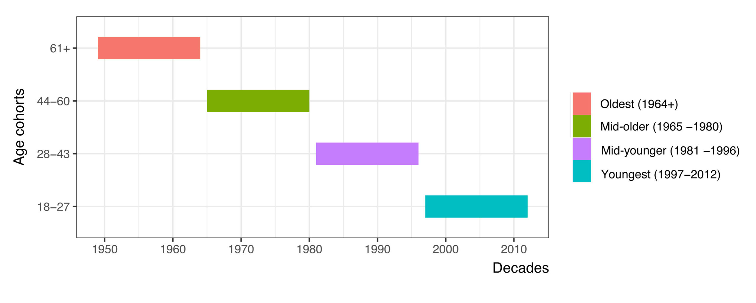
The goal of the experiment was to find out if age impacts engagement in interactive data stories. We recruited 2,400 participants from the UK and split them into four age cohorts. We did not use names typically connotated with generations to avoid stereotypes. Instead, we called each age cohort by their age range: 18 – 27, 28 – 43, 44 – 59, and 60+.

Three interactive designs
The researchers tested three interactive data story examples, each inspired by award-winning publishers:
- “Make a Guess” (Design One): this design asked users to guess an answer to a question and then surprised the user when revealing the correct response. Inspired by the New York Times ‘You Draw It: How Family Income Predicts Children’s College Chances’
- “Breaking the Fourth Wall” (Design Two): this visualization personalized the experience by asking users to input their name and then integrating their name into the narrative. Inspired by ABC Story Lab ‘See how global warming has changed the world since your childhood’
- “Exploration” (Design Three): this reader-driven design lets users click through interactive cards, encouraging free exploration to create their own narrative. Inspired by The Pudding ‘A Visual Guide to the Aztec Pantheon’
Participants interacted with one randomly-allocated design, answered a 22-question engagement survey, and provided optional qualitative feedback.

Key findings
The study’s quantitative analysis confirmed a statistically significant difference in engagement scores (p = 0.03), with the 18 – 27 cohort (mean score: 112) more engaged than the 60+ cohort (mean: 109).
- Younger Audiences (18 – 27): As digital natives, they noticed interactivity, mentioning it multiple times in their feedback. They comprehended the intent of engagement inside the data story where, for example, they observed that Design Three allowed for data discovery through exploration. Aesthetics also mattered; criticism of “dated” colors or “cluttered” layouts was common, with 12 instances for Design One alone. They preferred concise, gradually revealed text, making information digestible and intuitive.
- Older Audiences (60+): This group faced usability challenges, reporting confusion or distraction from interactive elements like scrolling. They desired more contextual text to fill knowledge gaps, with multiple instances requesting additional information. Their lower engagement scores reflect these barriers. Furthermore, this age cohort mostly did not observe the intent of the data story author to use interactivity to engage. There was comparatively little mention of interactivity with this age group.


Design recommendations
For authors, these findings translate into practical strategies to create inclusive interactive data stories that resonate across age groups:
For Younger Audiences
- Embrace Bold Interactivity: Leverage narrative design patterns like “Make a Guess” or “Exploration” to engage tech-savvy users. Explicit interactive elements align with their expectations, boosting engagement by making them active participants.
- Prioritize Aesthetics: Clean, modern interfaces with vibrant color palettes and minimal clutter are critical. Avoid outdated or busy designs, as younger users are quick to disengage when aesthetics fall short.
For Older Audiences
- Simplify Usability: Ensure interactive elements, like scrolling or buttons, are intuitive and clearly marked. Complex interactions can lead to missed data, undermining the narrative’s message.
Provide Context: Offer optional detailed text to provide background information, addressing potential knowledge gaps without overwhelming the primary narrative.
Why this is important for authors of interactive data stories
This study empowers authors to move beyond one-size-fits-all designs. By understanding age-related preferences, you can craft data stories that resonate with your target audience. For younger users, it’s about creating visually appealing experiences that leverage their digital fluency. For older users, it’s about reducing barriers and providing context to ensure accessibility. The study’s emphasis on inclusivity aligns with the broader push for universal design in visualization, ensuring no audience is left behind.
Moreover, the findings challenge assumptions. Younger users don’t just “crave” multimedia—they engage deeply when interactivity is purposeful. Older users aren’t inherently tech-averse; they simply need designs that prioritize usability. By applying these insights, authors can create visualizations that not only inform but also inspire, fostering engagement across generations.
N. Errey et al., “An Age-based Study into Interactive Narrative Visualization Engagement,” in IEEE Computer Graphics and Applications, doi: 10.1109/MCG.2025.3591817. Read a preprint available here: https://arxiv.org/html/2507.12734v2

Nina Errey
Hi my name is Nina Errey. This study is the final chapter in my long PhD journey. I have a PhD from the school of computer science at the University of Technology Sydney. My thesis topic is data storytelling and more broadly data communication. I have found out through my research that communicating data is a craft that is ever evolving and I find it absolutely fascinating. My first research project saw me interview some of the finest data storytellers in the business. I found them through the Data Visualization Society. To DVS I will be forever grateful.


