
Preparing the soil
Recently, I had the chance to participate in the World Data Visualization Prize, which was part of the 2023 World Government Summit. I would like to share my experience with you.
As a Power BI developer, I used to face limitations with Power BI’s visualization capabilities. To create better visuals, I had to resort to workarounds, which took time and didn’t always deliver the desired results. Then I discovered Deneb, a custom visual for Power BI that uses the Vega language grammar. It gave me full control over chart elements and their attributes and a lot of inspiration.
Over the past few months, I’ve spent a lot of time creating Vega visualizations and publishing them on my website. I replicated some great visualizations created by others and also created a bunch of my own designs. But I was ready for a new challenge.
Planting the seeds
When I found out about the World Data Visualization Prize in my Twitter feed, I knew I had to participate. I usually work with confidential client data, and this seemed like a great opportunity to create a visualization based on open data and share it with a broader audience. With only two weeks until the final submission deadline, I quickly reviewed the data provided by the organizers.
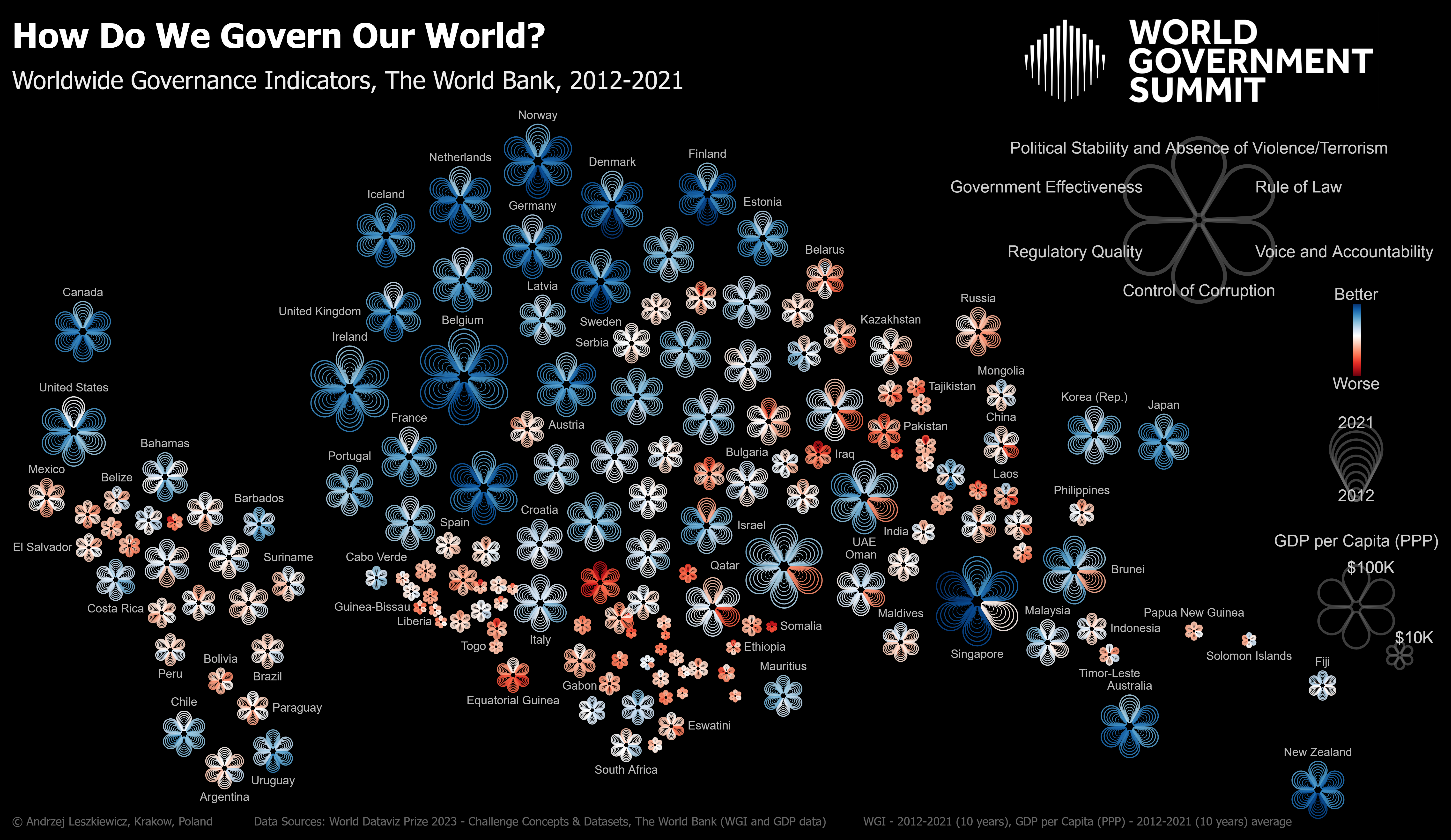
The data included multiple metrics, but I was particularly drawn to the World Governance Indicators (WGI). The WGI project reports governance indicators for over 200 countries and territories, for six dimensions of governance: voice and accountability, political stability and absence of violence/terrorism, government effectiveness, regulatory quality, rule of law, and control of corruption. I decided to use a data-driven floral diagram to show the six different indicators using a single visual element—a flower with six petals. I also encoded multiple years of data by using multiple lines to draw each petal.

The bloom
I created my first flowers, which looked great, but the layout was too simple: almost 200 flowers (each representing a country) in a simple grid design. I wanted to create something more visually appealing and I wanted to add a GDP-per-capita dimension. So I resized the flowers depending on GDP per capita and used a “force” transformation in the Vega grammar. This brought all the flowers as close together as possible without overlapping. This was an improvement, but now it looked like a flower cloud and the positions of the flowers didn’t hold any particular meaning.
To solve this, I used each country’s latitude and longitude to place it on its geographical location (using a simple equirectangular projection). Then, I reapplied the “force” transformation. This added spatial dimension and created a “floral cartogram.” I also changed the background to black as I knew from previous experience that bright colors and many lines look better on a black background.
The rest of the process was mainly technical. How to make my floral cartogram perfect? I had to add a legend, adjust spacing, font sizes, label positioning, and other parameters to create the best-looking visualization. I also printed the cartogram to check its appearance on paper, but printing a black background quickly used up a printer cartridge.
These small adjustments took a considerable amount of time and prompted a lot of emotionally charged questions. Is it good enough already? Should I seek a second opinion? (I asked my wife’s opinion and she was very helpful.) Is it a work of art or science? Did I make the chart more visually appealing, but less functional? Well, there is not a single answer to all the questions, good data visualization is always a compromise between multiple choices and finally I had to stop asking questions.

From flowers to fruits
After I was satisfied with the result, I submitted my visualization to the organizers of the World Data Visualization Prize. I was not lucky enough to win the prize, but my visualization made it onto the long list of best visualizations. Regardless, I am pleased with the outcome, and the creative process was inspiring in and of itself.
Reading Nightingale magazine at the time that I was working on this project, I realized that it would be great to have my visualization and story available to others who may find inspiration in the work process and the final result. And here I am, with my article in Nightingale. I am thrilled, and it’s time for me to start looking for new data visualization challenges.
I hope my experience will inspire Nightingale readers, especially those who feel limited by the technical possibilities of their primary data visualization tool, to experiment with alternative ways to visualize data, be more creative, and cultivate their own data visualization gardens to make the world of data visualization more beautiful.

Andrzej Leszkiewicz
Andrzej Leszkiewicz is a freelance Power BI developer and consultant with experience in different parts of Power BI report development, including data transformation and data modeling. He particularly enjoys exploring different ways to enhance data visualization in Power BI, utilizing tricks and workarounds with native visuals, as well as custom visuals like Deneb and the Vega visualization grammar.
- Andrzej Leszkiewicz


