
Many thinkers, especially those with an inkling of analytic idealism, lament how we have “taken the map for the terrain.” The map is a metaphor. It need not literally refer to a geographical summary of places’ locations on a piece of paper. Imagine trying to lift a heavy load. Our first-person experience of that exercise of lifting – that it’s a tough job – remains more or less the same no matter what number—20 lbs. or what else—we choose to attach to that load. The 20 lbs.—the map—is a convenient fiction we have developed to talk efficiently about the load—the terrain. We, ultimately, lift the load. Not the number 20. Scholars like Bernardo Kastrup and others have documented the many troubles that arise if we wrongly believe we associate and interact—or more crucially, identify ourselves—with the map, not the terrain. An unending fight between materialism and idealism ensues. The first mainly deals with the map, the next, the terrain.
All this is vital since through this essay too, we are going to skirt similar issues. Our chief goal would be to develop certain kinds of maps. Maps that show how hard it is to climb certain mountains. Whatever these maps look like, the first-person experience of climbing will evolve independent of these shapes. The map will help one plan and prepare oneself mentally for the hardships that await. It will, one hopes, even correlate with the challenges confronted during the climb. But it will never quite replace the climb. Just as many lifters (or even the same lifter, on different days) will have different experiences—some easy, some difficult—of lifting the same 20 lbs. load, different climbers could have potentially different subjective experiences of climbing the same mountains that are joined through these maps.
Gender and efficiency in a climbing context
Numbers and mountaineering never stay too far away from each other. Using Liz Hawley’s extensive The Himalayan Database, Bhaduri deployed machine learning techniques to unearth factors that correlate with success on Mount Everest. Julie Rak’s book False Summit: Gender in Mountaineering Nonfiction documents—through anecdotes, interviews, and recollections—how women climbers could potentially face stiffer non-mountaineering challenges (cultural norms, pressure to get involved in the family etc.) than their male counterparts. While interesting—and while the maps this essay will produce should instigate investigations along these lines—the effect of gender in certain types of mountains, in certain types of climbing (we truly do assign these aspects to some of our future work)—in keeping with the visual and graphic goals behind this piece, we, for now, content ourselves with supplying some easy-to-use maps.
The key ingredient behind our construction will be a new idea of efficiency. This, we define to be the difference between the rates of successful summit climbs and that of deaths. To be concrete, we note each climber can fall into one of four categories:
- the climber could not summit and did not perish.
- the climber could not summit and did perish.
- the climber did summit but perished (maybe on the way down).
- the climber did summit and did not perish.
We take (4) to be the efficient kind of climbing. Through information from the database mentioned above, we calculate this fraction for both men and women climbers on 30 peaks (the top 10 within the three categories: >8000 mts, 7000-8000 mts, 6000-7000 mts, across 15 epochs: periods of 5 years starting from 1959). There are two types of climbing: with and without bottled oxygen. The use of oxygen, as Bhaduri shows, correlated with a three-fold change in the log-odds of success, at least on Mount Everest. So it is a vital factor to condition on. As an example, during the last epoch 2020-2023 on Mount Everest, there were 676 (at the time of data collection) male climbers that were using oxygen. 574 of them climbed to the top, 10 of them perished. So, the efficiency of male climbers using oxygen on Everest this epoch was (574-10)/676 = 0.8343. The corresponding fraction for women climbers was 0.8806.


Temporal map constructions
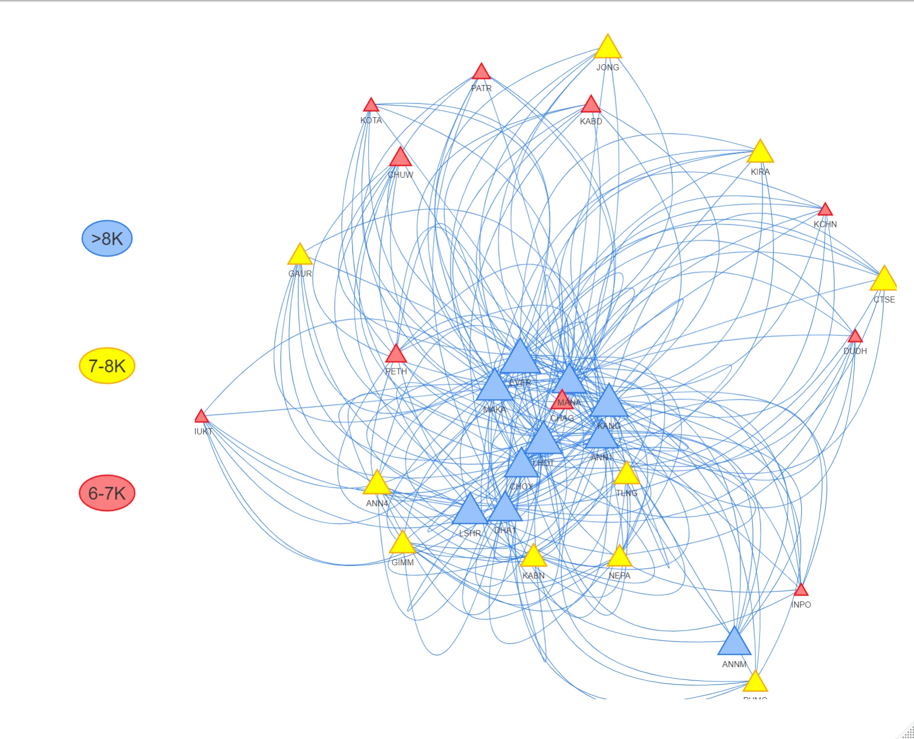
Constructing maps—even the geographical ones—is no mean feat. Charting and navigating a treacherous terrain saps up a ton of energy. For us, this charting will be done through the efficiency fractions. Once they are found, we seek a visual description of this kind: two peaks where the efficiency scores are similar will be joined through a short path. How short? Proportional to the difference of their efficiency intensities. The situation is much akin to roads joining cities. A road that joins New York and Boston—cities that are geographically close—is shorter than one that joins New York and Los Angeles—those that are geographically far apart. For us, these peaks are not located anywhere physical as such (non-Euclidean data), the difference in their efficiency scores (almost similar to a metric) generates a geography. A map, therefore, becomes an emergent or a generated property of landscape—a necessary and convenient secondary—just as the load was primary, not the number 20.
Take Mount Everest (EVER) and Annapurna Middle (ANNM), for example, on Figure 1 (showing the map for the last epoch for women climbers who climbed with oxygen). Their respective efficiency scores are 0.8806 (seen previously) and 0, generating a difference of 0.8806 a large number, larger than, say, 0.08492 generated through a difference of 0.8806 and 0.7957 between the efficiency scores of Everest and Makalu (MAKA). Mt. Everest and Makalu, therefore, are closer, connected through a shorter path than Everest and Annapurna Middle. We incorporate many useful cosmetics. The size of the peaks are proportional to their heights. For grouped, visual convenience, mountains above 8000 meters are colored blue, those between 7000 and 8000 mts, yellow, and those between 6000 and 7000 mts, red. We offer our codes and dashboards here and here, where, through varying parameters such as the gender of the climbers, the type of climbing (with or without oxygen), the time period etc., you may construct the map that’s relevant to you.
Utility and closing thoughts
Our maps, therefore, are distilled representations of relative climbing woes: peaks that promise similar climbing perils are placed nearby. What good are these maps? They are useful in many ways. First, with confirming what many climbers intuitively feel: the height of a mountain need not always convey the trouble it could give. Climbers know, for instance, that K2, despite its smaller height—smaller in comparison to Mount Everest—offer a much tougher challenge due to the lack of level ground on its slopes—grounds on which climbers could rest or camp on. Notice not all the large blue peaks are huddled close together on Figures 1 or 2. But it gets nuanced: you may explore whether this tendency of not staying together persists across gender, time, and climbing type categories. Secondly, these preliminary maps may provide the springboard from where subtler statistical inquiries could be propelled. We intend—in a different work—to check whether women perform substantially better than men despite the hardships we alluded to at the beginning. In case they do, then on what types of mountains, for what types of climbing, etc. This matter of significant differences may be explored for dimensions other than gender too.
Time, for instance. It may be worthwhile to ask whether the maps are (substantially) changing appearances with the passage of time (Figure 2 lays out some visuals of the evolution). That is, whether, for instance, peaks that used to be different in terms of hardships are now, probably due to innovations on climbing techniques, gear, etc., becoming similar in recent times. Tests for the similarity of two matrices (the weighted adjacencies, in this case) such as the ones introduced by Mantel may be conducted. Figure 3, summarising that test for male climbers using bottled oxygen, shows how the maps do change substantially, especially during recent times.

Folks may also treat these maps as recommendation systems. If you’re a woman who just survived and summited a peak where women’s efficiency scores are such and such, this one’s the next you can try out (that is climb successfully without perishing in the process): one that sits far away on the map in case your first climb was tough. Climbers (both men and women) nowadays plan to climb many peaks in one expedition to attract sponsorships and funders. Many perish, in the process, due to exhaustion and fatigue. These maps could offer welcome respites.
In addition, the often-overlooked challenges female climbers face—cultural norms, family pressure, etc., as brought out by Julie Rak, in her work False Summit: Gender in Mountaineering Nonfiction, could possibly be evidenced through these efficiency maps which show how edge lengths differ across the men vs women networks, over the years, for both types of climbing: with or without oxygen. Through their empirical basis supplied by Liz Hawley’s The Himalayan Database, these maps shed vital light on understanding climbing difficulties, illuminate gender disparities, enable informed decisions, and should enhance research and advocacy. Our efficiency maps provide a bridge between quantitative data and the rich, qualitative narratives and anecdotes presented in Julie Rak’s work, fostering a more comprehensive and inclusive understanding of the mountaineering experience.
References and further reading
- Kastrup, B. (2021). Science Ideated: The Fall Of Matter And The Contours Of The Next Mainstream Scientific Worldview. United Kingdom: Collective Ink.
- Richard Salisbury, Elizabeth Hawley & Billi Bierling, The Himalaya by the Numbers (1950-2019), 2021
- Moinak Bhaduri, Oxygen, crampons, data: Can statistics help us climb Everest?, Significance, Volume 20, Issue 5, October 2023, Pages 20–25, https://doi.org/10.1093/jrssig/qmad076
- RAK, J. (2021). False Summit: Gender in Mountaineering Nonfiction. McGill-Queen’s University Press. https://doi.org/10.2307/j.ctv1m0khgh
- Mantel, N. (1967) The detection of disease clustering and a generalized regression approach. Cancer Research, 27, 209–220.
- Codes at: https://github.com/moinakbhaduri/ModellingEverest/blob/master/MountainEfficiencyMap
- Dashboard at: https://moinak.shinyapps.io/MountainEfficiencyMaps/

Binbin (Alice) Zhang (alicezhang@falcon.bentley.edu) is currently a candidate for MBA (Business Analytics Minor) at Bentley University in Massachusetts. Her research interests are in understanding the intricate dynamics of gender differences in social behaviors and tendencies. She aims to explore the underlying causes and manifestations of gender-based prejudices and their far-reaching consequences. Alice and her team were recently placed third, ahead of 170 teams from other US universities at the Data Analytics for Good, a national case competition jointly sponsored by Purdue University, Microsoft, SIL International and INFORMS, an international association of analytics experts.

Moinak Bhaduri (mbhaduri@bentley.edu) is currently a tenure-line Assistant Professor at the Department of Mathematical Sciences, Bentley University in Massachusetts. His faculty page is https://faculty.bentley.edu/profile/mbhaduri Rooted in applied probability, he studies spatio-temporal Poisson processes and others such as the self-exciting Hawkes or log-Gaussian Cox processes that are natural generalisations. His primary interests include developing change-detection algorithms in systems modeled by these stochastic processes, especially through trend permutations. Moinak heads the editorial board of the NextGen column of the New England Journal of Statistics in Data Science.
-
Moinak Bhadurihttps://nightingaledvs.com/author/moinak-bhaduri/


