
In an ever-evolving landscape of data visualizations, the field of Data Humanism weaves together the realms of data and human experience. Based on the work’s of Giorgia Lupi and Stefanie Posavec, Data Humanism advocates for a more empathetic and humane approach to data representation, elevating it beyond the usual graphs and charts. It therefore connects data to what it truly represents including living organisms, behaviors, interactions, and so on.
I recently undertook my very first project in the field of Data Humanism some months back. I saw the workshop called Visualizing Complexity Science in the Data Visualization Society’s event calendar. After reading through the overview and going through the research projects at The Complexity Science Hub (CSH), I decided to apply. It felt like an opportunity that was in line with my quest to learn about this interesting field of Complexity Science and deep dive into the world of Data + Art. I was then selected and joined this five-day immersive workshop in the beautiful city of Vienna, Austria.
During the workshop, I worked on one of the presented research projects, Forests, which was based on the scientific paper Growth, Death, and Resource Competition in Sessile Organisms (Edward D. Lee et al., 2021). The dataset that I worked with was the Southeast Alaska (Schneider et al., 2020) forest dataset. Exploring the dataset, I thought, how could I convey this complex information about these trees in a simplified manner to a diverse audience that was not necessarily in my same profession? Yes, the workshop participants included artists, journalists, scientists, designers, and software developers; what connected us was that we shared the same passion — data visualization.
I had a eureka moment when the concept of Data Humanism came to my mind and I decided to put my knowledge to the test. The fractal patterns of trees and that of the human nervous system have striking similarities. The context of humanizing data therefore fits perfectly with nature — a living ecosystem and more specifically in our use-case here with trees.
Let’s now deep-dive into my work in four phases:
Brainstorming & Prototyping Phase
To convey to the audience the results of our data analysis, we have three contexts in data visualization namely, Presentation, Dissemination, and Exhibition. For the Southeast Alaska dataset, I decided to use Exhibition, which focuses on a visual installation to educate and engage a broad audience. Precisely, I thought of implementing this through an interactive artwork. I started by studying and exploring the dataset and learning about its features. This was followed by brainstorming, feature selection, and sketching my ideas.
Once I had the initial structure in mind, it was time to move to the implementation phase.

Implementation Phase
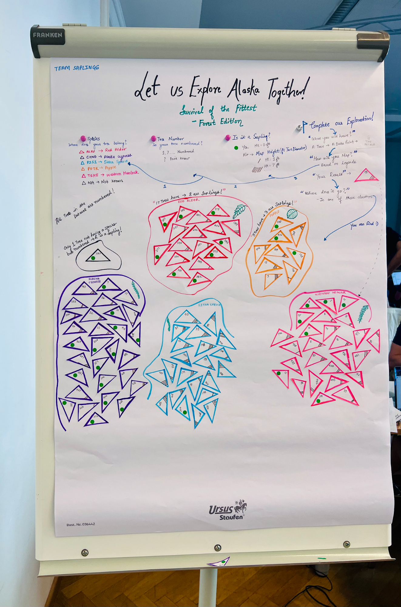
I selected three metrics from the dataset to visualize: the species, the tree number (which is a unique identifier present in the dataset for each tree being surveilled), and the tree height. Next, I laid out the poster with descriptive elements like the title and subtitle and then continued to define the context of how to read the data visualization as shown below:
- For species, I assigned each of the six species a different color
- For tree number, I used the assigned number in the dataset, or a “?” if none was present.
- For height, I assigned slanting lines to correspond to the height, or a green dot sticker to represent a sapling

I selected a triangle to denote each data point as it best represents the structure of a tree and started to cut out the shapes. This was the most time consuming process I must tell you! Luckily, the tips and tricks learned at arts and crafts classes in school came in handy to speed up the process!
I then started to map each of these triangles into rows with the selected features from the input dataset.
For example, consider an entry in the dataset where the tree had species TSHE (Western Hemlock), was number 15, and height of 4 feet. I would first create a pink triangle or a triangle with a pink border (the color for that species), then use black ink to write down number 15 for the tree number, and, finally, draw four slanting lines in brown to represent the height of 4 feet.
In the end, we have something like below:

I continued to map the remaining rows to the data points as triangles and pasted them on the poster. I clustered the trees belonging to the same species in groups, sketched the type of leaf of the particular species of tree, added data insights and other relevant information to aid user understanding. I purposefully did not complete the entire poster in order to add a layer of interactivity, where the audience could each pick a data point, transform it on their own based on the defined legends, and then map it to the relevant cluster on the artwork.
Isn’t this called enjoying the process of learning?


Once completed, we can see how Data Humanism:
- Goes beyond the technical approach of representing data.
- Personalizes design and display of complex intertwined data in a user-friendly way.
The result was a complete transformation of raw data into a well-presented and interactive artwork depicting data insights that can be understood by all.
Before:

After:

Presentation Phase
I presented the idea and concept behind the poster, explained to the workshop audience how to read and interact with the data visualization artwork, and encouraged audience members to try it out and map the data points on their own. Finally, I also explained to them the visible data insights, including the following:
- Southeast Alaska has five identified species of trees including Red Alder, Alaska Cypress, Sitka Spruce, Popple, and Western Hemlock and one species is unknown.
- All the trees are surveyed and hence have a unique number assigned to them.
- All are not fully grown trees but there are also saplings present in the forest.
- All the trees/saplings belonging to a species are clustered for easy analysis. For example, the species Red Alder has a total of 17 trees out of which eight are saplings, and the species Popple has a total of nine trees out of which three are saplings, and so on
- The unknown species has only one member which is numbered and is a sapling
These results provided the audience with an initial analysis and overview of the dataset and at the same time paved the way for further deep dives and questions like: Can the unknown species be mapped with the existing species, or is it completely new? Did this species exist before? Is this species on the verge of extinction? Given that there is only one sapling in the species, should further measures be taken to safeguard it from extinction? and many more!

Feedback Phase
During and after the presentation, the feedback from the audience was very positive. They enjoyed learning about the process and conceptualization, and interacting with the artwork.
Below is a snapshot of some of the feedback provided by the audience, coupled with the feedback about the other artifacts developed by my team members. Reflecting on the feedback, I found the audience appreciated the interactivity and the fact that they could touch the data; they liked this physical representation of the data simplifying complex datasets for all. Additionally, they felt that the illustrations chosen on the poster were full of character, and they also believed this artwork to be a great fit for a museum setting!

This article was edited by Catherine Ramsdell.

Rutuja Pawar
Rutuja Pawar has a Computer Science background with a specialization in Data Science through her Masters. She has a perfectly balanced skillset of Technology, Strategy & Consulting as she brings several years of experience working with multicultural teams in IT and Business. Currently, she works as a VIS Consultant with topics focussed on Data & Design, helping clients to understand their critical business data through the creation of user-centric Dashboards. Being a Design Thinking Coach, Tech Trainer, #IAmRemarkable Facilitator, Mentor, and a Proud Toastmaster are some of the other aspects of her skillset.
- Rutuja Pawar


