
In every field of human endeavour, the impulse to generalise—the urge to find parallels—never goes away fully. Regardless of the urgency of the time or the overwhelm of the present, the tendency to transcend the immediate is always there. This—if you would care to notice—has little to do with the complexity of the world we inhabit, or the intricacies of the society we form. Human beings are naturally adept at finding commonalities, attuned to detecting underlying structures. Efficiency, often, is the chief motivator. Efficiency, often. But not always. Sometimes, the thrill of sheer curiosity is propulsion enough. Whatever insights were had from one context—the hope is—may be transferred to the other that sits in parallel. Through this essay, we discover such an instance. But the visuals we propose go beyond mere reportage. They improve—through statistical metrics—the structure they are similar to. And offer ways to connect many similar such structures. Even when tracked over time—when internal and external variations threaten to muddle clarity—the commonalities implied through these visuals will be self-registering, no matter how ancient, recent, or brief.
The backdrop and the context
Maslow’s triangle is the shape ours is going to be similar to. A typical such triangle is shown in Figure 1. Sweeping certain subtleties aside that experts never quite agree on, the main message from the triangle is human beings have many pressing (such as food and shelter, those under Immediate Physiological Needs) and some not-so-pressing (such as intellectual stimulation, those under Self Actualisation) needs. Those at the bottom of the triangle need to be met more often or more commonly than those at the top that need to be met less often or less commonly, in comparison. A hierarchy often becomes unavoidable: it is only when the lower needs are met that one has the luxury to think about the higher needs. In America, with the election season heating up, the time is apt to query whether, across political aisles or age or gender demographics, that hierarchy translates to opinions. Opinions towards how businesses function, or ought to function. Whether, say, for young Democrat-leaning men, making sure businesses make money in ethical ways is more pressing than trying to reduce the wage gap between executives and workers. Whether, for elderly, Republican-leaning women, the hierarchy alters substantially.
A 2022-23 survey done by Gallup, in collaboration with Bentley University, thrusts us into luck. Likert scale responses (1: not a lot to 4: very much) on questions related to many issues were collected from 5757 individuals and made available to students and faculty. Two such series of questions are shown in Table 1. Touchy topics, to some. In the tense current political climate, a charged moment is almost always charged in the same way: hovering, tentative, incipient. We have tended to treat the social world as a depleted and exhausted metaphor: ancient associations, continuity of discourse and agreement, like other emblems of hope, seem poignantly remote. The triangles we develop offer a scaffolding using which, the extent of these disagreements may be displayed for comparison and analysis— through sensitivities the current society has painstakingly developed and enshrined.
The tools
Our triangle, in a spirit similar to Maslow’s, will be composed of several blocks, one on top of the other. The size of each revealing the importance that people of a certain demographic attach to that issue. To work out the bases for these blocks, we deploy a technical notion from Market Basket analysis called support. In a buying-and-selling context, for instance, the “support” of an item shows how commonly that item is bought, either on its own or in conjunction with other items. Imagine peeping into the receipts of ten independent buyers coming out of a supermarket and finding seven of them bought apples (again, maybe only apples or apples plus something else).


The support for apples would then be 7/10 = 0.7. Popular items (or less expensive ones) therefore, we’ll have higher support, less popular (or more expensive items) will have lower support. Support, therefore, is a fraction that shows the rate at which an item is bought.
In our business survey context, nothing is being literally bought or sold. But one may imagine higher—say 3 or 4 scores—towards a question—revealing stronger feelings towards that issue—as being synonymous with “buying”. So, say, if a young, male, Republican-leaning respondent answers with a 4 on question 11A, he, in a way, bought into the idea that increasing profits each year is vital. If he answers with a 1, he has not. More on support—including something that support leads to called basket complementarity can be had from here. The support values across all the 11 and 12 series of questions for those (across age groups, gender, educational background, etc.) leaning democrats are shown in Figure 2.

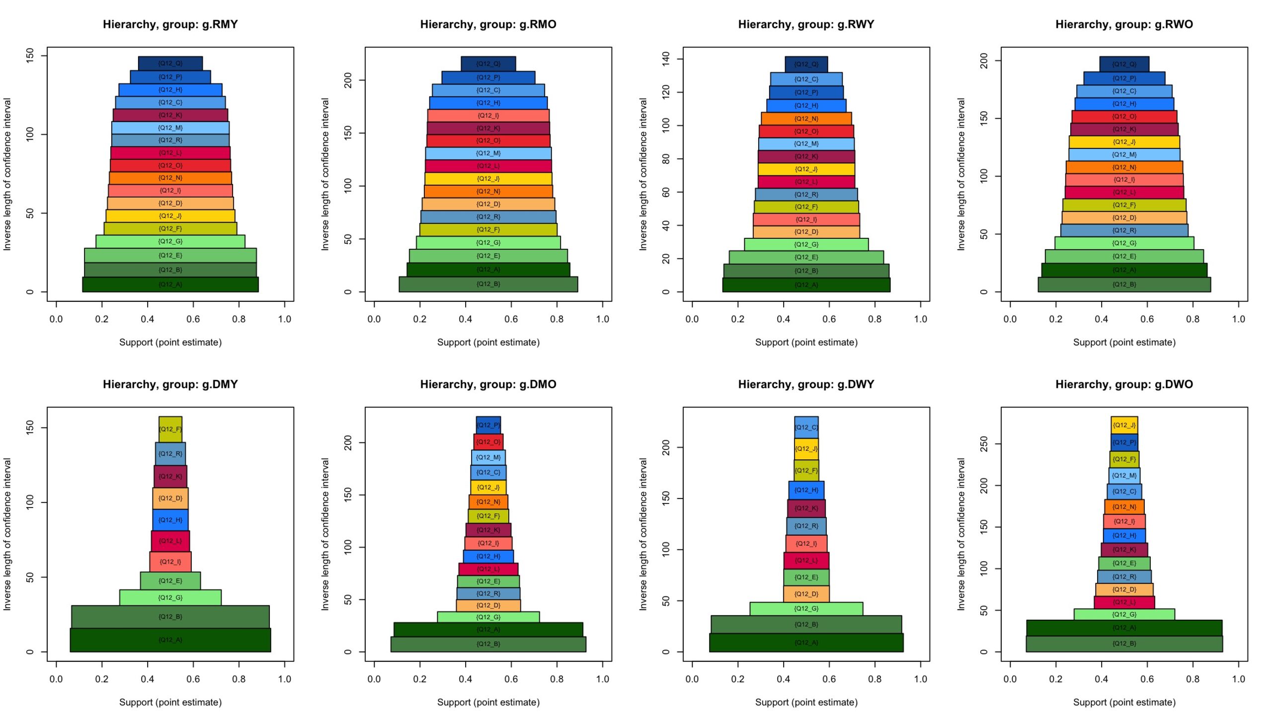
Among this crowd, for example, around 66% bought into the idea that increasing profits each year is crucial. That is how popular that issue is within this demographic. A quick way to upgrade from this bar diagram to a triangle like Figure 1 is through rotating the bar diagrams by 90°. While useful, a simple rotation is not enough. This is because of the problem of stability. Unless the large chunks are kept at the bottom, the resulting structure will not be in equilibrium. The situation is not unlike when we pile up a group of books on a table. We typically try to keep the wider books at the bottom to ensure the pile is able to withstand minor jolts or breezes. Shuffle the books in some other way—the smaller ones at the bottom and the bigger ones at the top—and the structure begins to wobble. A mild shake topples everything over. The stability crumbles and the solid equilibrium is no more. In our case, with each rotated support bar from Figure 2 representing a book, we need to find the optimal permutation (that is, a specific shuffling of the books) that achieves stability. And such a possibly non-unique stability-guaranteeing optimal permutation exists (argue why). These best shuffles are shown for several groups formed through combinations of gender, age and political affiliations in our main contribution: Figure 3.
We notice the bottom two layers of desire (Q11G and Q11D) are common across all the age and gender groups among Republican-leaning respondents while for Democrat-leaning ones, that agreement is lacking (the most common bottom layer of desire for them, Q11D—note how this is different from the Republican-leaning ones’: Q11G—would have been consistent, except for the elderly women (bottom-right panel on Figure 3) demographic). The young-old separation here is based on an age threshold of 50, the median age value found.
Complications and subtleties
We have, so far, stuck in spirit to Maslow’s triangle (Figure 1) through recording fractions that serve as proxies for how commonly an item is bought or an issue is deemed critical. And then, using these fractions as bases for the pieces to work our way up our triangle of priorities (Figure 3). At this point, however, we attempt to pack in more information through our triangles in Figure 3 without complicating the graphs too much. We notice the theoretical triangle in Figure 1 doesn’t fully exploit the power of the pieces’ heights: the sectors contributing to each broad level are equally tall. The heights are not quite taken to represent or signify anything concrete. This, to us, is a waste of precious cosmetic promise. An inferential possibility gone abegging. One might transmit crucial information through differing heights.
We choose to store the reliability of the support values through these heights. This prospect of reliability arises because the support fractions—the ones like the 66% seen above—are, fundamentally, statistics. Given a different set of (similar, that is with similar views of) respondents, this number could potentially have changed to 68%—an occurrence called sampling fluctuations. 95% confidence intervals store, in a way, the amount of such fluctuations. For that group, for instance, this interval is [0.639,0.679], generating a length of 0.04 which could be compared to others calculated similarly. So, in case someone were to draw respondents over and over, say hundred times, generating hundred sets, around 95 of those intervals of the type [0.639, 0.679] would contain the true “population” support parameter. The wider the interval, the more unsure we are in the 66% support guess, it having more wiggle-room to move about. The inverse of the lengths of these intervals, therefore, could serve as how dependable the 66% value is. The bigger the inverse of the length, the more dependable the point estimate is.


We make, in Figure 3a, the component slabs as tall as the corresponding inverses. The shorter the slab, the more volatile the corresponding support for the point estimate is.
Characteristically, among the general public, unfamiliar with statistical inference, casual graphs get quickly out of hand, the figurative taken too literally; even the slightest disagreement in slab shapes across political or age or gender divides could generate, in their discord, some flicker of dread. So, finally, you would notice there are some edges connecting the triangles across different demographics.
There’s a linking up of pieces from adjoining structures. They aid establish further firmness of inference. If two slabs are substantially similar (that is non-different or statistically insignificant) they’re joined through an edge. This is checked through whether the confidence intervals overlap—something that just the heights of the blocks, showing the lengths of these intervals—cannot do. Two intervals, say, [0.4, 0.6] and [0.7, 0.9]—though both of the same length, generating a visual impression of having similar shares on two triangles—are non-overlapping. Which means the support values that are coming out of the corresponding questions are substantially different.
These two slabs will not be joined through an edge. We point out—to avoid crowding—we have checked whether we could join, only across neighbouring triangles, these supports labs from question 11R: whether businesses should make money in ethical ways. This is for demonstrative purposes only. Other links—both within one triangle and across many triangles, neighbouring or not – are possible. Those interested are invited to visit our dashboards here and here. We find, at least on this ethical way of making money issue, most folks agree substantially. One group stands out: the elderly Republican-leaning women, whose interval on this question marginally missed an overlap with the one from similar people who are younger.
We note that the 11-series questions—which deal with expectations—could be more in tune with Maslow’s “needs” than the 12-series—which concern perceptions. This despite us taking “needs” as an inspiration, a metaphor, instead of something literal. A possibility, therefore, would be to separate (or tear away, since the support values won’t change) the 11-slabs from the combined triangles (Figure 3a) to form standalone 11-triangles (Figure 3b), with the slabs left out (Figure 3c) forming the 12-triangles. Through Figures 3b and 3c, we also document the power of colours: one question is assigned the same colour across all the demographic combinations possible. Notice how, for instance, 11D, across all the groups, is assigned the deepest green, and the position of this deepest green keeps fluctuating. This makes easier viewing.
In closing
The survey from a Bentley-Gallup partnership unearthed a treasure-trove of data feeling people’s pulses, their attitudes towards modern businesses. When we resort, at these times, to often-used diagrams like bar or pie charts, it becomes tragic to witness how much explanatory potential gets squandered. The chief intent behind this essay was to deliver dynamic information through inspiration from an instrument like Maslow’s triangle that readers are already familiar with or are prone to latch on to. Another crucial goal was to provide graphic innovations where possible. A finer aim was to make these innovations (discovering what should function as bases, or the differing heights and network-ed slabs) mainstream, so practitioners think of incorporating them even when there’s no survey on business attitudes, but a different kind of data (our dashboards and GitHub pages make these graphs reproducible are creatable in a different context).
Insights from our offerings hinge on three key pieces: support helps situate the structure. It decides which bricks to lay at the foundation and which ones at the top, how much floor space should the bricks occupy. As one ascends up the triangles, through a gradual erosion of support, the issues become less and less pressing. Their bite, their potency, demonstrably, erodes. A kind of scale is suggested and through this movement, this brand of scrambling up, a kind of comforting solidity results. To those familiar with Maslow’s hierarchy, these triangles, in that solidity, will seem pleasantly nostalgic. Structures through which priorities get filtered, prismatically.
Next, the height of the slabs reveal the confidence we have in those support values. The taller the slabs, the more reliable the support values. Lastly, there is connectivity: a flow through a network of slabs embracing sections that are substantially similar, no matter how higher up or lower down the structure these sections are located. Our triangle suggests variety through its concreteness, its presentness; it arranges and shuffles areas of priority which may otherwise continue to wander indefinitely, notwithstanding the triangle’s definite, and possibly inert, closure.
Several observations could be in order. The support threshold we set was 0.5 (which can be tweaked on our dashboards). We observed for republican-leaning participants, many issues—a combination of how certain things ought to be (the 11 series) and how businesses are doing on those issues (the 12 series) surpass this standard. That is, we have many slabs. On the democrat-leaning side, however, not many issues exceeded this bar. Those that did, mostly fell into the 11-category.
In contrast, however, the democrat support values are more reliable: note the range on the vertical axis for them are typically larger – despite the fewer number of slabs—than the Republican respondents. The Democrats feel nearly equally strongly on all the important issues that matter to them (the bricks near their bases are equally wide), while the Republicans do not (their triangles taper off more markedly towards the top). On many matters, as the world staggers towards uniformity, these fractures bring out how much (substantial) disagreement still persist. Through this essay, we offer a fresh and vibrant tribute to that variety. There is no need to restrict ourselves to the demographic details shown here. Our dashboards here and here explore subtleties across the axes of education, wealth, race etc. Ours aren’t just preferences for the temporal over the eternal, the momentary and fleeting over the fixed.
There is the next wave of survey being conducted now and an interesting exercise would be to check whether the shapes or the agreements vary over time. Tempting though these observations are, in keeping with the visual goals behind this essay highlighted in the previous paragraph, we remain devoted to the graphic exigency that prompted it. The point was far from passing judgement or adopting a moral stance. You’ll find no sense of advocacy. The point, equally, was neither to offer change suggestions nor probe into why these differences exist. We leave these to social science experts or to our own further methodological studies that these initial exploratory visuals could and should trigger.
References and further reading
- Maslow’s typical triangle taken from: Kenrick, D. T., Griskevicius, V., Neuberg, S. L., & Schaller, M. (2010). Renovating the Pyramid of Needs: Contemporary Extensions Built Upon Ancient Foundations. Perspectives on Psychological Science, 5(3), 292-314. https://doi.org/10.1177/1745691610369469
- Dashboard for details and subtleties: https://public.tableau.com/app/profile/bahareh.zahirodini/viz/Gallup-Bentley/Gallup-BentleyBusinessEthicsAnalysis and https://moinak.shinyapps.io/GallupShinyM/
- Dashboard for general support motivation: https://moinak.shinyapps.io/MarketBasketDashboard/
- More on market-basket ideas: Bhaduri, Moinak. 2023. “Using ‘basket complementarity’ to make product recommendations.” Real World Data Science, March 2, 2023. https://realworlddatascience.net/ideas/datasciencebites/posts/2023/03/02/basket-complementarity.html

Bahareh Zahirodini (bzahirodini@falcon.bentley.edu, zahirodiny@gmail.com) is currently a candidate for the Master of Science in Business Analytics at Bentley University in Massachusetts. Her research interests lie in financial modelling with an emphasis on social issues. Bahareh is serving as a research and teaching assistant and as a trading room analyst at the Hughey Center for Financial Services at Bentley. She was selected to participate in and chaired sessions at the 2023 Grace Hopper Celebration. Bahareh recently won the second place at the Annual NABA X Bentley Business Bowl and was chosen to join the Beta Gamma Sigma, an international business honor society (for business major students who are in the top 20% of graduates).

Moinak Bhaduri (mbhaduri@bentley.edu) is currently a tenure-line Assistant Professor at the Department of Mathematical Sciences, Bentley University in Massachusetts. His faculty page is https://faculty.bentley.edu/profile/mbhaduri Rooted in applied probability, he studies spatio-temporal Poisson processes and others such as the self-exciting Hawkes or log-Gaussian Cox processes that are natural generalisations. His primary interests include developing change-detection algorithms in systems modeled by these stochastic processes, especially through trend permutations. Moinak heads the editorial board of the NextGen column of the New England Journal of Statistics in Data Science.
-
Moinak Bhadurihttps://nightingaledvs.com/author/moinak-bhaduri/


