
The data visualization field is fascinating and I feel incredibly fortunate to be working in it, but, frankly, it’s also kind of a mess:
- It’s full of terms like “dashboard”, “infographic”, and “data storytelling” that different people use in different ways (heck, experts even disagree on what “data visualization” means…).
- It encompasses a dizzying variety of different types of visuals, from data art, to scientific visualizations, to exploratory analysis tools, to maps, to utilitarian bar and line charts.
- It can be used for an extraordinarily wide variety of purposes, from status monitoring, to persuasion, to humor, to education, to artistic expression, to exploratory data analysis, to awareness-raising and advertising.
- It includes hundreds of different software applications and code libraries, each of which is better or worse suited to creating different types of visuals.
- It includes a wide variety of courses and books, each of which covers different types of visualizations and purposes of data visualization.
So what?
IMHO, this messiness is causing some significant challenges in the field:
- Beginners struggle to figure out which software tools they should learn, which books they should read, or which courses they should take.
- Best practice discussions often devolve into endless debates because practitioners try to agree on universal best practices that apply to all data visualizations without fully appreciating the sheer variety of things that are called “data visualizations” and the completely different purposes that they can serve.
- Often, audiences who need data don’t know what to ask for. A dashboard? An infographic? An analysis report? A table? A graph?
- Practitioners get tasked with creating visualizations that don’t line up with their specific data visualization skills. A practitioner who created a successful viral marketing infographic gets assigned to design the CEO’s dashboard, but then everyone is perplexed when the results are disappointing.
Can we do something about it?
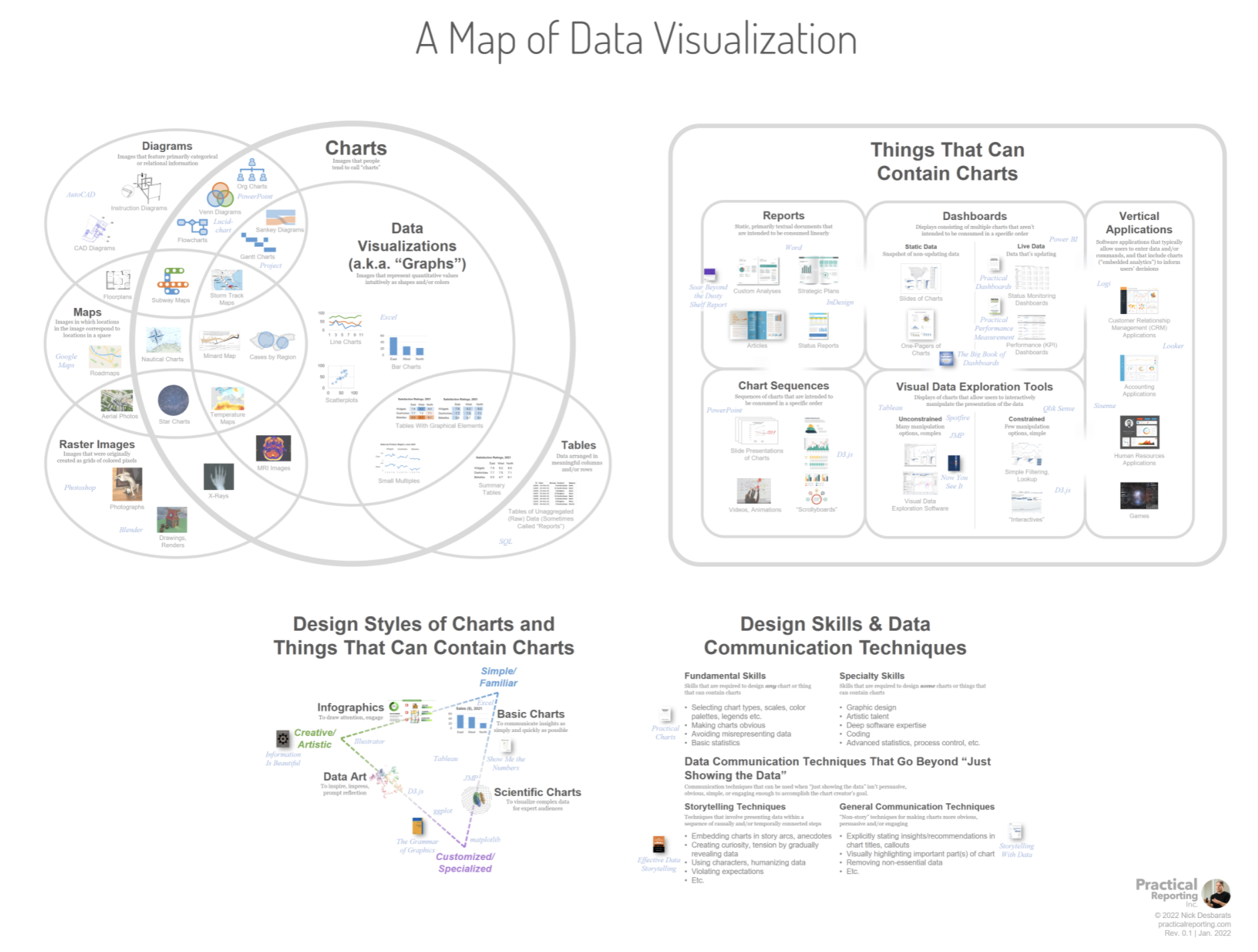
These are the types of challenges that prompted me to start thinking about a “map” of the data visualization field that attempts to bring a bit of order to the chaos; to bring together, in a single graphic…
- All of the terms that tend to come up in conversations about data visualization (“chart”, “dashboard”, “data storytelling”, “infographic”, etc.) and how those terms relate to one another.
- All of the different types of visuals that people call “data visualizations”.
- Examples of data visualization software products and code libraries that are better or worse suited to creating each of the different types of visuals.
- Examples of books and courses that cover each of the different types of visuals.
Yeah, good luck with that.
This is a tall order, I know. We’ll see how well or poorly I did when people start reacting to the first draft of the map on social media…
Most of the heavy lifting that’s required to create a map like this comes down to choosing definitions for terms like “data visualization”, “chart”, “dashboard”, “report”, “data storytelling”, etc. When I brought all of these terms together in a single graphic, though, I found that it was surprisingly clarifying when it came to settling on definitions for them. Most of the attempts to define these terms that I’ve come across in the past define them in isolation, without mentioning how they differ from, overlap with, or are synonymous with other, related terms. Putting all of these terms in the same graphic was very helpful in clarifying exactly how, for example, a “dashboard” differs from a “report” or a “visual data exploration tool” or an “infographic”.
My general approach to definitions has always been to hew as closely as possible to how people tend to use terms in everyday conversation, and this is the approach that I took when defining terms for the map. Many experts don’t use this approach (i.e., they come up with their own definitions that don’t consider how people use terms in everyday conversation), but I think it’s defensible for two reasons:
- If people tend to use a certain term in a certain way in everyday conversation, there are often (though not always) good reasons why, even though those same people may not be able to articulate those reasons, and they may not be obvious to those of us who spend a lot of time thinking about definitions. People tend to unconsciously gravitate toward whatever works for them and, while that’s not always the truly best solution, it often is—even if we don’t understand why at first. Wisdom of crowds, blah blah blah.
- It imposes less change onto fewer people. Asking a majority of people to stop using a familiar term in one way and to start using it in a different way introduces a lot of friction, and they’ll likely ignore the new definition anyway. Yes, inevitably, some people would have to change their usage in order to get everyone using a term in the same way, but the idea is to choose definitions that minimize the number of people who’d need to do that.
At least a few people are going to disagree with at least a few of these definitions or other aspects of the map, but I think that that’s unavoidable, regardless of which definitions are used. If you’re one of those people or if you have any suggestions on how to improve the map, please tag me on LinkedIn or Twitter and include the hashtag #mapofdataviz in your comment to make sure that it gets seen. I can’t guarantee that your views will be reflected in the map, but I’ll try. If you make a suggestion that gets incorporated into a future revision of the map, I’ll list you on the page where the map is hosted (see below).
Speaking of future revisions, I want to underscore that this version of the map is a draft. I’ve given it a version number of 0.1, and I hope and expect to update it based on reader feedback so please pipe up! In the future, the map will almost certainly evolve as technology and the field itself evolves.
Just show me the damn map!
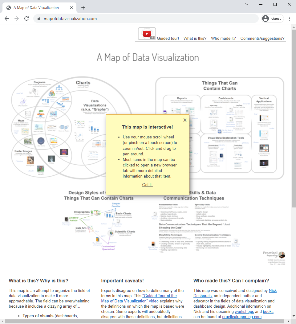
In order to fit everything into a single graphic, the map had to be a large, high-res image with a lot of small text labels, which means that only the big “region” labels are legible when it’s embedded as an image in a web page. To get around this and to enable readers to browse the map comfortably, I’ve published it on a dedicated site (https://www.mapofdatavisualization.com) with interactive zoom and pan controls:
I’ve also recorded a 36-minute “guided tour” video that provides an overview of the different terms and “regions” in the map. If you’re interested in the map, I strongly recommend that you watch this video, especially if you’re thinking of commenting on it or making suggestions:
Have at it!

As an independent educator and author, Nick Desbarats has taught data visualization and information dashboard design to thousands of professionals in over a dozen countries at organizations such as NASA, Bloomberg, The Central Bank of Tanzania, Visa, The United Nations, Yale University, Shopify, and the IRS, among many others. Nick is the first and only educator to be authorized by Stephen Few to teach his foundational data visualization and dashboard design courses, which he taught from 2014 until launching his own courses in 2019. His first book, Practical Charts, was published in 2023 and is an Amazon #1 Top New Release.
Information on Nick's upcoming training workshops and books can be found at https://www.practicalreporting.com/
- Nick Desbarats

- Nick Desbarats

- Nick Desbarats

- Nick Desbarats


