
This article is part of a larger effort to leverage the DVS Survey data to provide useful insights about data visualization to our members. Previous work in this area can be found in the 2021 State of the Industry Report, an article on our audience and educational strategy, and an ongoing series of articles on data exploration. We also recommend that you check out the 2021 Challenge entries for additional views of the data. Further analyses will also be published to expand on these results over the coming months. Interested to know more? Join us on July 9 for an informal discussion of the survey process and our analysis so far.
Key takeaways
This article presents sketches of four career portraits for analysts, designers, developers, and engineers working in data visualization, based on the State of the Industry survey conducted in 2021. We were able to compare respondents in these four roles across several survey questions to explore the similarities and differences between people working in these areas. Respondents in these four roles have similar career experiences, although there is some nuance within each role.
Here are key takeaways from the analysis:
- Across all four roles, most respondents have at least a Bachelor’s degree, more work experience than data visualization experience, and work full-time.
- All four roles have a large variety of job titles.
- Freelancers tend to spend more time on data visualization than employees as more of them indicate that data visualization is a primary or secondary focus of their job rather than one of many things they do.
- In all four roles, respondents are frustrated by a lack of time, but non-designers also commonly expressed frustration with a lack of design expertise.
- Many respondents in these four roles think that lack of data visualization literacy and lack of awareness of the impact of dataviz are key issues.
- The output produced by data visualizers in each of these four roles differs slightly with designers creating a more varied set of outputs than analysts, developers, and engineers.
About the data
The Data Visualization Society conducted the State of the Industry survey in September 2021. 2,165 people responded. Respondents self-selected into the survey and included both members and nonmembers of the Data Visualization Society. All respondents are included in these results, regardless of membership status.
In this analysis, we focus on the 557 analysts, 229 designers, 180 developers, and 98 engineers who responded. Together, these groups represent just under 50 percent of total respondents. A respondent’s role was determined by comparing responses to survey questions about a person’s role as employee, role as freelancer, and role as a data visualizer, so that each respondent is only assigned one role.
This initial analysis focuses on four out of the 11 roles listed in the survey (see chart below). This decision was based largely on data coverage, both in terms of general population size, and across the different questions analyzed. Analyst, designer, and developer represent three of the top four roles among survey respondents. Engineer was among the most frequent roles in the 2020 State of the Industry survey and has good data coverage in the 2021 survey. The engineer role was included to round out the other roles, because it seemed likely to provide an interesting comparison to developer roles. The leadership, “none,” and scientist categories overlap with some of the other role groups, and the academic roles have a different branching structure in the survey, so we chose to postpone those analyses for future work. Future analyses will focus on these and other roles left out of this analysis (e.g., Other, Journalist, Cartographer).

Our goal with this analysis is to explore the characteristics of the roles of analyst, designer, developer, and engineer in data visualization. We will explore the background experiences of these roles, what working in each of the roles looks like, the data visualization experiences in each role, and the outputs produced in the different roles.
Experience
More than half of the analyst and engineer respondents have a Master’s or similar graduate degree. In all roles, most people have either a Bachelor’s or Master’s degree. Some people in each role have a Doctoral degree. Note that degree field is not taken into account in this question, so respondents may not have a degree in their current area of work.

When it comes to work experience, many respondents are early-mid career, meaning many people have 1-10 years of work experience, which makes sense since data visualization is a relatively new field. In all roles, respondents tend to have more work experience than data visualization experience. This could be due to a few factors – people may learn data visualization on the job, they may come to data visualization after working in another career, or they may gain data visualization skills as part of professional development. In addition, up until recently there weren’t degrees in data visualization specifically, so it’s not surprising people have been in the workforce longer than in data visualization.

Among the analysts, designers, developers, and engineers, there are hundreds of different job titles. Analysts and engineers are mostly employees. Developers are mostly employees, too, although a portion are freelance. Designers are a mix of employees and freelancers.

Work time

Most people in these four roles work full-time. More than half of analysts and engineers work 40-49 hours per week and a little more than a quarter work 30-39 hours per week. The next largest group works 50-59 hours per week. A little more than 40 percent of designers and developers work 40-49 hours per week and about a third work 30-39 hours per week. For designers, the next largest group works fewer than 20 hours per week. For developers, the next largest group works 50-59 hours per week.
Freelancers generally focus more on data visualization than employees in these four roles. For 76 percent of analyst employees, data visualization is a secondary part of their job or one of several things they do. For 85 percent of designer employees and 78 percent of developer employees, data visualization is the primary or secondary focus of their job. Engineer employees are split between data visualization being a primary focus (32%), secondary focus (37%), or one of many things they do (31%). For 53 percent of freelance analysts, designers, developers, and engineers, data visualization is the primary secondary focus of their job; for 31 percent of freelancers in these four roles, data visualization is the secondary focus of their jobs.
In terms of data visualization tasks, analysts and developers tend to spend more hours on data preparation and analysis than designers and engineers. Designers and developers tend to spend more time on producing visualizations than analysts and engineers. Engineers tend to spend 10 or fewer hours on each task.
Frustrations and issues
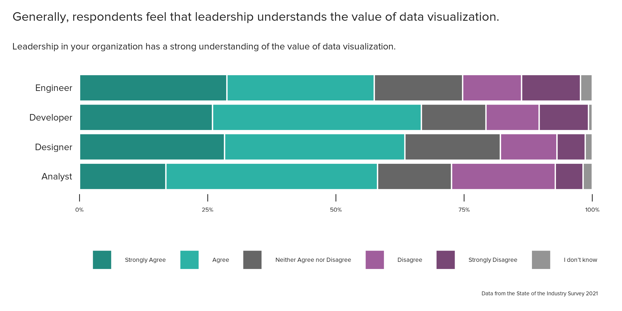
Designers and developers agree slightly more than engineers and analysts that leadership in their organizations has a strong understanding of the value of data visualization. Analysts had the highest level of disagreement with this sentiment.

Overall, respondents feel that leadership has a strong understanding of the value of data visualization. However, they also feel frustrated that there is not enough respect for data visualization and see issues with a lack of awareness of the impact of dataviz and data visualization not having a “seat at the table”. A recent #topics-in-data-viz conversation suggests that this might be due to a lack of respect and awareness at multiple levels of the organization, rather than just leadership. Or it could be that leadership has a strong understanding of the value of data visualization but data visualization professionals are not always included in discussions or high-level activities involving data visualization. In some cases, people in our discussion felt that leadership highly valued data visualization, but did not fully understand what went into it or why certain choices were important, indicating important intersections with challenges in data literacy.
The next two questions analyzed explore frustrations and issues in data visualization. It’s important to note that the values presented are percentages based on total counts, not priorities. The fact that more people indicate frustration or issue does not mean it’s the most important one. These two questions allowed respondents to select as many frustrations or issues they experience but did not ask for a ranking or prioritization.
There are some common frustrations across all roles such as lack of time, too much effort spent on non-viz activity, and accessing data (although accessing data is not as much of an issue for engineers). Everyone except designers expressed frustration in lacking design expertise. Designers expressed frustration over lack of technical skills.

When it comes to issues facing data visualization, everyone thinks that lack of data visualization literacy and lack of awareness of the impact of dataviz are two of the most common issues. Designers next selected designing for disabilities while analysts, developers, and engineers next selected data visualization not having a “seat at the table”.

Data visualization outputs

The most popular communication methods for analysts, developers, and engineers are dashboards and presentations. For analysts, the third most popular method is reports. For developers and engineers, the third most popular method is static web pages. The most popular communication methods for designers are presentations, reports, and static web pages. Designers communicated through a more varied set of methods compared to the other four roles. For example, social media, scrollytelling, physical methods, and newspapers or magazines are more common methods for designers than the other roles.
Employees tend to create data visualizations for colleagues and internal audiences such as executives, project managers, analysts, engineers, and researchers. Designer employees also create data visualizations for the general public. Freelancers tend to create visualizations for both internal audiences (analysts, executives, researchers, project managers) and external audiences (the general public, policymakers).
Next steps
In this analysis, we focused on analyses of individual questions to describe the four roles and the job experiences people have in them. We did not include salary information, the kinds of organizations people work in, or the tools people use to create data visualizations. In the future, we hope to analyze some of these areas. We also plan to include other careers, as time and data allow.
We also didn’t investigate the intersections of different questions, though these are likely to contain some of the most interesting information. For example, for people who disagreed that leadership in their organization has a strong understanding of the value of data visualization, what frustrations and issues did they identify in the industry? Or, does the audience and type of data visualizations a person makes depend on their level in the organization? We expect that analyzing across multiple questions will help us to understand some of the nuances within the dataset by better differentiating between overlapping or related roles and will give us a more detailed view of the different careers.
In addition, we did not consider differences between countries in respondents’ experiences. In future analyses, we might differentiate the findings by the respondent’s location to explore the varying experiences of data visualization professionals in different countries.
We are currently exploring the tools used by respondents for data visualization. We are interested in finding the connections between different toolsets and exploring how those toolsets differ across roles. We hope to illustrate which tools are used in combination and the connections between different tools.
We will also be pursuing some text analysis of the open-ended questions on the survey such as job titles and the many “other” options for questions such as other visualization tasks, issues, and frustrations, which were excluded from this analysis. We look forward to sharing more of our findings as we continue analyzing the 2021 State of the Industry survey data, and we plan to apply many of the same analysis techniques to the upcoming 2022 State of the Industry survey, which will occur this fall. Keep an eye out for an invite to participate in the fall survey and please participate because your responses give us helpful perspectives on the field!
Contributions
The 2021 survey was planned and administered by Amy Cesal and the DVS Programs committee. Special thanks to Jill Brown and Josephine Dru for their work cleaning and reporting on the data. Erica Gunn is leading the Career Portraits analysis effort for the DVS education committee and contributed to the data exploration, scope definition for the analysis, and the outline for this article. Jenn Schilling performed the data structuring and primary analysis in R, developed visualizations in R, and compiled the results presented in this article.
Technical notes
If a person is both an employee and a freelancer, their employee role is used to determine their single role. If a person is neither an employee nor a freelancer, then their role was identified as a student, academic/teacher, or “Other”. A person who did not fall into employee, freelancer, student, or academic/teacher is placed into the “Other” category, which includes data visualization hobbyists, passive income earners, people in an organization with some dataviz job responsibilities, and those who preferred not to answer the roles question.
The margin of error on the findings within each role in this article is 10 percent or less, based on a 95 percent confidence interval. The margin of error measures how much the results presented here, based on the survey data, differ from the whole population of data visualization professionals. This means that the percentages presented are expected to vary up to 10 percent above or below the values presented due to sampling error.

Jenn Schilling is the founder of Schilling Data Studio, a data visualization training and consulting agency. She has a decade of experience applying data science and data visualization in a variety of industries, including supply chain, market research, and higher education. Jenn loves telling compelling stories with data and teaching others how to create impactful visualizations.
- Jenn Schilling

- Jenn Schilling

- Jenn Schilling

- Jenn Schilling


