
Is there any difference in the amount of time we allocate to the different phases of a data visualization project, depending on our professional role? Who spends more time on data clean up, who on the analysis phases, and who on devising the visual?
The SOTI (State Of The Industry) survey conducted by the DVS on a yearly basis allows us not only to answer these questions, but also to explain aspects of the current landscape of data visualization, ranging from demographic to professional details.
The purpose of the survey is to help the Data Visualization Society and the broader data visualization community understand the state of data visualization, the people who make it, the challenges they face, what can help practitioners, and where the field is headed.
The dataset from the survey consists of more than 50 questions and 2,181 respondents. It provides a great opportunity for all dataviz practitioners to dive into real, freely accessible, and up-to-date data. This is why I decided to participate: contributing with a visualization of data that I’m very interested in – including input from me, first hand, as a survey participant – and at the same time creating something meaningful to the community. That’s also my favorite way of thinking about data visualization and what I look for when starting a new project. I like exploring topics that give me some sense of usefulness for a certain audience and convey messages to explain, or even suggest, how to address some social matters.
With the SOTI dataset, the first decision I had to make was figuring out which aspect of the data to focus on. Of course one could choose to report all – or almost all – the available information, but what I had in mind was a static visualization, in which only a given piece of information could be effectively told. After some time understanding the data and the relationships between its features, I decided to work on the Job Titles – Tasks Time dataset.
I read that time management is “the art of having the time to do everything that you need, without feeling stressed about it” – I honestly find that to be often so difficult to put into practice! Anyway, since time management topics have always fascinated me, I got excited to visualize this topic, and explore how different professionals manage their time in tackling projects. The Job Titles – Tasks Time dataset links 11 different job titles to five separate tasks involved in the completion of a data visualization project.

It consists of the following eight columns:
- RoleMultichoice_composite refers to job titles. It can take 11 different values: Academic/Teacher, Analyst, Cartographer, Designer, Developer, Engineer, Journalist, Leadership (Manager, Director, VP, etc.), Scientist, Student, Teacher, None of these describes my role.
- TimeWorked refers to the number of worked hours in the latest work week. It can take 7 different values: Fewer than 20 hours, 20–29 hours, 30–39 hours, 40–49 hours, 50–59 hours, 60–69 hours, 70 or more hours.
- Features about data visualization activities can all take one among 6 values: None, 5 hours or less, 6–10 hours, 11–20 hours, 21–30 hours, More than 30 hours. They are:
- TimeDataPrep: the amount of hours spent cleaning data in the latest work week.
- TimeDataAnalysis: the hours spent analyzing data.
- TimeIdeating: ideating and finding a story.
- TimeProducingViz: the actual time spent producing a data visualization.
- TimeOtherVizTasks: the time allocated to activities not listed above.
- OtherVizTasks_ is a free-text field where respondents can write the tasks they typically do in addition to the main ones.
I will unfold each of these points to explain the entire process behind the project, from data preparation to the final data visualization. The preliminary stages of the project (data preparation and analysis) were conducted in Python and are available in my GitHub repo, while the data visualization itself was mainly realised in Adobe Illustrator (AI) with the aid of RAWGraphs.
Data analysis
The SOTI dataset only required a minimal cleaning and preparation. All I needed to do was make small changes such as unifying the encoding for missing values.
The data analysis phase lays the groundwork for every possible next step in the project, whether it is to raise hypotheses or to make decisions. Most of the time, it already entails data visualization – especially when providing a visualization itself is the ultimate goal. Visualizing data is often the only way to summarize the datasets in fewer dimensions, find hidden relationships and insights that one would not get by looking at a long table of numbers.
To inspect the dataset at hand, I computed a number of aggregated results and concise charts that are helpful in providing a global understanding of the data – not intended to be comprehensive. Such statistics address the research questions below.
- How long do people work per week? Given the total amount of hours worked weekly, I’ve collected how many people work a given amount of hours separately for each role.
- How much time do they work for each activity in a data visualization project? Similarly, for the time devoted to different data visualization tasks, I’ve aggregated the number of people not just by role, but also per activity.


- How do different professionals compare in the way they distribute their time between different activities? The idea is to rank job titles in relation to the amount of time they spend on each task separately. To do so, I first transformed a categorical feature (the ranges of hours) into a quantitative one, assuming equally spaced values for the different hour ranges. I then computed a score for each role and task as the weighted average between such values and the relative number of people (‘percentage’) obtained in the previous step.


- What are the additional tasks not listed in the survey but specified by respondents in The Other Tasks field? After cleaning the raw texts using text analysis techniques, I ranked the single words by frequency and created clusters of similar words among those most meaningful for the analysis. A cluster of words behaves as a sort of tag so that a sentence is eligible to have from none to multiple tags. For instance, the cluster or tag coding consists of the keywords: ‘code’, ‘script’, ‘software’, ‘tool’, ‘library’, ‘development’. If a keyword is included in the text, then such text is associated with the tag the keyword is part of. This allowed me to figure out, at least approximately, which are the most frequent topics not directly covered by the survey, alone and in co-presence with others.

Ideating a data visualization
It’s way more straightforward to break down a work by the hours spent on the various activities once it is completed rather than over its course. Typically, when working on a project, all the different steps are not as sequential as I’m describing them here, yet they are strongly interconnected. In my data viz process, the ideation phase, for instance, goes hand in hand with the analysis part. As I analyze the data, I also begin to think about how they might be represented in the final visualization. And though initial ideas are often not the final ones, I find it a good exercise to think of many different solutions.

As I gathered the statistics above, I thought of displaying all of them as chapters of a single story: a set of different sections connected by one common path. It was then a matter of finding the right storyline from the analyses conducted earlier. And because I was clearly looking for a story to communicate to the readers, I also realized I would contribute to the explanatory section of the challenge rather than the exploratory one.
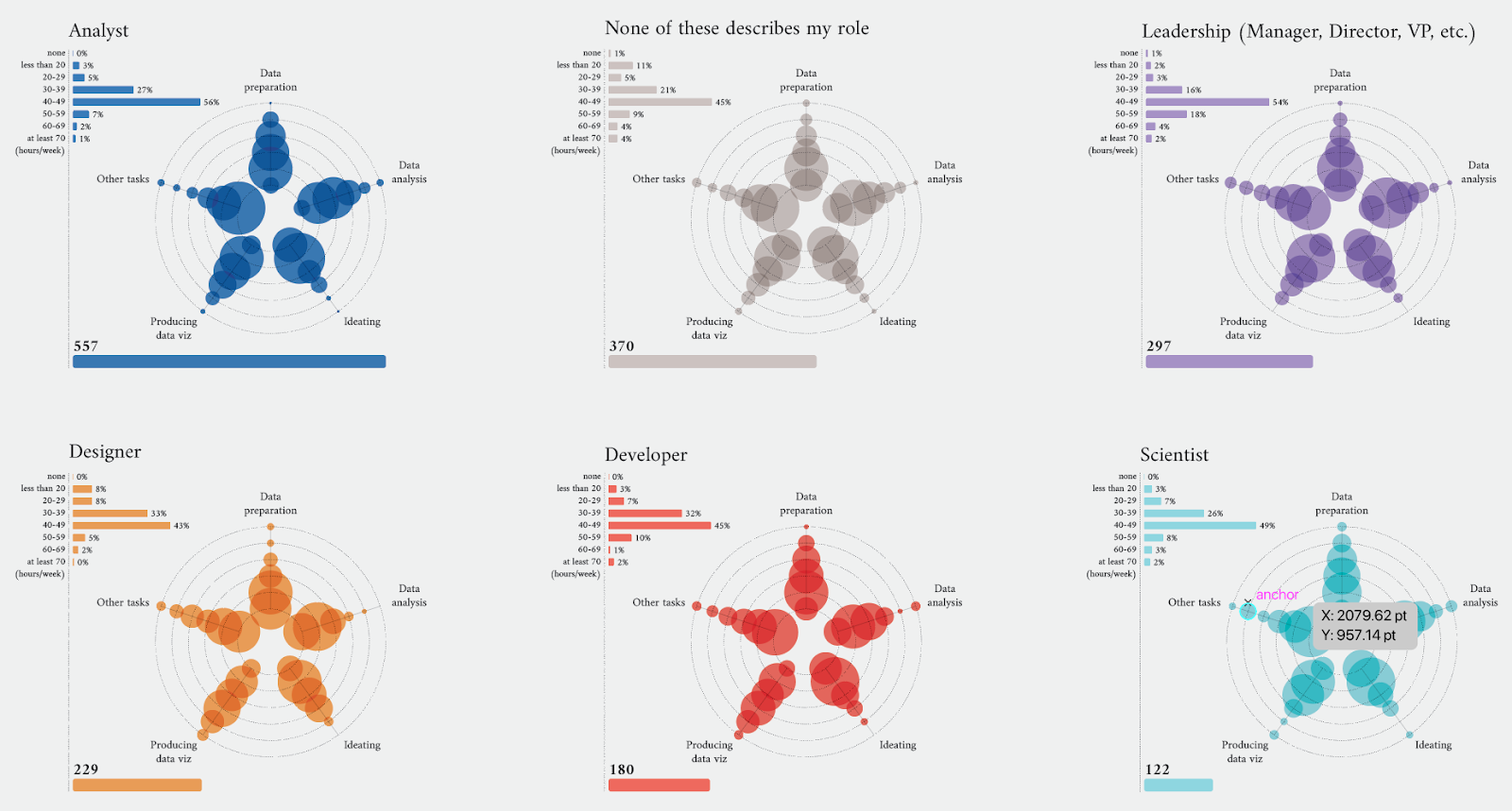
I wanted first to visualize information about the single job titles. My idea was to design some sort of ID cards for people in each job title, to identify them on the basis of the time spent overall working per week and on specific data viz activities. By doing so, I was implicitly saying that the unit of reference of my data visualization would have been the job title, which means more than 10 distinct colors or symbols to distinguish them – more on this in the next section.
To represent how job titles spend their time across data visualization activities, I was inspired by the radar plot. I imagined the different professional roles as players with their own skill sets, which here correspond to the amount of time devoted to each task.
The challenge was to represent a variable we’re used to thinking of as numerical (here the number of hours) in a qualitative shape expressed in terms of time ranges. Since in a radar chart each axis measures a quantitative variable, I couldn’t use it the way it is designed.
Taking inspiration from its shape and what it conveys, I designed a similar chart that encompassed qualitative values on the radial dividers. Each axis is a task with the same number of levels as the classes of the categorical feature, and the tick values within it refer to hour ranges.
On every level, a circle marks the percentage of people within that class. The area of the circle is proportional to the number of subjects represented. The values expressed by the circles on a given axis sum up to 100.
After the first sketches, I was happy to see the resulting shape resemble that of a flower. That’s the moment I started considering using different colors to distinguish job titles, to convey the image of a flowering field.


on the right, the modified version for categorical features.
After introducing the story of each professional role, I wanted to summarize and compare their overall time allocation per task. I was looking for something with a stronger visual impact, a chart to end the report both functionally and aesthetically. I wanted a portrait of all job titles together, moving from a first view where they appeared all distinct to a final synthesis. The bump chart looked ideal to show the evolution of time spent by the different roles from the beginning to the end of a data visualization project. Each flow is a job title, with a distinctive color, and all flows cross each other so that, for every task, job titles are sorted in decreasing order by the time spent in that task.
Beyond everyone’s specific title or expertise, we are all making data visualizations and it’s so nice to see how all of our paths fluctuate and intersect, suggesting the power of working in heterogeneous teams.

As for Other Tasks data, I experimented with a graph where each node represents a tag with a size proportional to the number of times that tag was mentioned, while the thickness of the arcs expresses how many times a pair of tags was cited together. I also thought about a way to visualize how many people per job title feel like there are other activities not explicitly stated in the survey, those who actually wrote something in the Other Tasks field, and ended up with a simple chart very similar to a slope chart that ranks job titles.

Producing a data visualization
Producing a data visualization, thus giving a shape to ideas and sketches, means taking many decisions: how to arrange the spaces and the size of charts, define colors and fonts, write clear legends and provide the readers with all the information needed to understand the charts. At this stage, feedback is crucial to ensure the story I’ve in mind emerges clearly from the visualization. I usually send many drafts to people close to me, especially to my family, asking for their opinion and impressions. Eventually, I may have to take a step back and rethink the shapes and graphs, start over from the ideation process, or even from the analysis phase if asked for additional information I had not foreseen. Again, this shows how all the various phases are closely interconnected.
While building the data visualization in AI, I extensively used RAWGraphs to get all the single building blocks of almost every chart. For instance, for the visualization of individual job titles, I used RAWGraphs to compute those proportional circles that indicate the percentage of professionals working a given amount of time for all the tasks. I’ve also integrated in each chart additional information such as the hours worked weekly and the number of interviewed people under that role (on the left part of each plot). All together, they look like small multiples that identify each group of people with different colors.


Similarly, I also created both the arc diagram and the bump chart with RAWGraphs before finalizing the work in AI.


The two figures on the top refer to the arc diagram, the two on the bottom to the bump chart. In both cases, the image on the left is from RAWGraphs, the one on the right is the final version in AI.

As for the choice of the colors, I did a lot of testing with online palette generators (such as https://coolors.co/), looking for soft tintes that would nonetheless stand out against a light background and enough distinct one from the other.
The font choice and the space distribution are also the results of many tests. I selected two different fonts from Google Fonts for the text body and the titles.
For the space distribution and chart allocation, I wanted the bump chart to be at the end of the page as a final summary. I explored several plot combinations to meet this condition and asked for feedback until the definitive representation. To finalize the work, I described the context and wrote the legends for every chart, trying not to take anything for granted.


Conclusion
This was a very interesting project in many ways: I visualized an unusual topic, using actual and unique survey data, of which I was a participant. I’d like to conclude with a summary of the aspects of this work that I found most compelling and will definitely take with me.
- ? Having to choose 12 different colors worried me at first: I was afraid of getting some messy results, but with some trial and error (and lots of patience) I managed to find a nice palette I was very much pleased with!
- ?️ I enjoyed thinking about how to adapt a spider chart to fit the specific type of data in the analysis and use the usually quantitative feature of its axes to represent an ordered qualitative variable.
- ? Although I restricted the analysis to one topic, the dataset was so informative it was a pleasure and a fortune to have the possibility to see the insights from all the other challenge participants!
- ? I love the final message conveyed by the bump chart: a data visualization project needs many different skills which each of us brings with our own background and job titles, yet all of our paths intersect. It suggests the best way to succeed on data viz projects is likely to collaborate in diverse teams.
- ? This was my very first data visualization challenge, so it has been a true honor emerging in the explanatory section!

Martina Dossi is a data scientist working at Prometeia, an Italian software, consultancy and research firm. She graduated in statistics and is interested in information design and data visualization as a way to explain complex information to a wider audience. Her favourite topics involve social issues and personal data collection. Review her portfolio at https://www.behance.net/martinadossi/projects and her Github repository at https://github.com/martidossi.
- Martina Dossi


