
As a community-taught dataviz designer, I love digging into the craft of turning data into narrative and finding new ways to combat the dataviz equivalent of a writer’s block. I’m always curious to know: How do different people approach data visualization? What is their design philosophy? How do they organize their workflow?
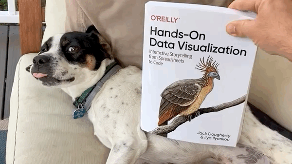
That is why it was a delight to stumble upon Hands-On Data Visualization: Interactive Storytelling from Spreadsheets to Code, which offers a take on the data visualization process by Jack Dougherty, an educational studies professor, and Ilya Ilyankou, a civic technologist. The book is available in print and online, and they have generously shared an open-access version at https://handsondataviz.org/.
First Impressions
What immediately caught my attention was the book’s approach. First, it had a broader objective of guiding readers to tell “true and meaningful stories with data.” This influenced how the book later gave tips on visualizing data, with careful explanation for why certain design choices may be preferred over others to avoid misimpressions or other unintended outcomes.
Second, it encouraged a hands-on experience but was tool-agnostic. How rare is that? I was impressed at the wide range of (mostly free) tools it introduced for creating interactive dataviz on the web, from code-free chart builders like Datawrapper to Javascript libraries.

Is This Book for You?
The authors wrote Hands-On Data Visualization to be accessible to newcomers to the field without shying away from more advanced concepts and tools. In fact, this is the book I wished I had when I was just starting out!
However, if you’re looking for guidance or inspiration on creative design in data visualization, this book is probably not for you. Instead, it is more focused on the overall data visualization workflow, including less obvious aspects such as future-proofing your visual works and working around problematic data like missing values and inconsistent data format. This book would also make an ideal read for those who felt intimidated by coding, but are curious to create their own interactive visual stories. It is packed with easy-to-follow tutorials.
More advanced practitioners can skip past chapters like “Strengthen Your Spreadsheet Skills” and still benefit from dipping into other parts of the book. If you know what you’re looking for, Hands-On Data Visualization provides a quick way to get acquainted with data visualization tools or methods you’ve never used. I personally found the book to be a handy guide for my first forays into using Leaflet.js and creating geospatial stories. In addition, the chapters “Choose Tools to Tell Your Story” and “Find and Question Your Data” are filled with useful prompts for reflecting on one’s workflow.
The Book Lets You Eat Cake First
There are a couple of things that stood out as I was going through Hands-On Data Visualization.
The book was all about hands-on learning as promised, and interestingly it also followed the pedagogical principle of “starting with cake.” I first came across this principle through Mine Çetinkaya-Rundel’s Data Science in a Box initiative. The main idea is that people learn best when they are shown the end result (the cake) and then step back and learn the necessary components (the baking ingredients, tools, and recipe).

Right off the bat, the book takes readers through interactive charts to demonstrate how singular design choices (e.g. color, binning data values) can create very different impressions. The book links to plenty of editable online examples and templates created by the authors; readers don’t have to get bogged down with setup issues and can go straight into practicing data visualization.

One small quibble I do have with the book was that some reminders and tips came across as repetitive. For example, the authors urged readers to interpret and represent data in an honest way at least nine times, sometimes using the exact same phrasing. This may be more of an editorial issue though, and it doesn’t detract from the overall value of the book.
Hands-On Data Visualization also credits and draws on the insights from Charlotte Lisa Rost’s Datawrapper blog, Catherine D’Ignazio and Lauren F. Klein’s Data Feminism, and Alberto Cairo’s How Charts Lie. If you’re a fan of those works, some parts of Hands-On Data Visualization may feel familiar, but in a good way.
Final Thoughts
I like that the book takes a step back and shows readers not just how to wield various dataviz tools, but also the less obvious aspects of creating data visualizations. For example, the book gave me pause to think more about what I may be emphasizing or de-emphasizing in my dataviz: Whose voices am I amplifying with the data I choose for my story? What associations might readers have with my color choice?
I also came away with ideas of how to overcome inertia when starting a dataviz project. The book recommended migrating whatever ideas I have from my head to paper, even if they are partially formed, and I find that approach helps me let go of perfectionism and break down the project into more manageable chunks. I started sketching things that I would have never thought to sketch, like pictures of how I would find data. As a bonus side-effect, this approach has sparked more creativity.
Like the authors identified, data visualization is “sometimes more art than science” with “somewhat fuzzy rules.” Hands-on Data Visualization is a friendly companion for the journey.

Alexandra is an analyst-designer who lives in Singapore. She creates stories and comics with data to help clarify the complex.
- Alexandra Khoo

- Alexandra Khoo

- Alexandra Khoo

- Alexandra Khoo


