
If you are reading Nightingale, there is a chance you have just discovered the world of data visualization and information design. If that is the case, “Data Visualization and Information Design: Create a Visual Model”, a Domestika course by Federica Fragapane could be a perfect course for you. This course might also be a good one if you, like me, keep reading and watching tutorials without actually starting (or finishing) a dataviz project.
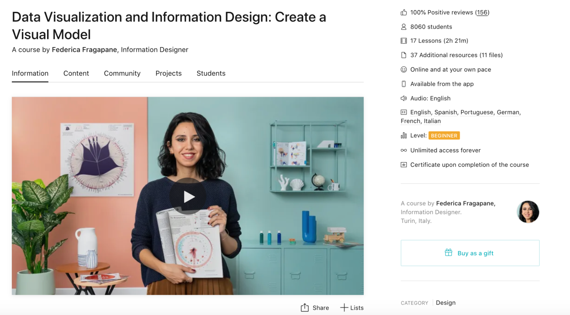
Federica Fragapane is a well-known Italian information designer who recently launched an introductory course on the process of creating a data visualization project from start to finish. The course is available on Domestika, a learning platform and community for creatives, and includes 17 lessons distributed across four modules:
- Introduction
- About data visualization
- Setting the project in motion
- Visualizing the data
The aim of the course is to help you create your own project: a data visualization piece that integrates multiple layers of information.
In order to do that, the course starts by explaining what data visualization is, how different fields can inspire projects, and the importance of collaboration. This was eye-opening for me; when I started my dataviz journey, I thought that I had to learn everything, which seemed quite daunting. It was refreshing to hear that Federica focuses on static dataviz, illustration, and design but usually works with someone else if she needs an interactive piece that requires coding.
In the course, Federica also introduces the concept of visual alphabets and explains how to discover your own style, as well as the importance of designing with your readers and/or users in mind. These are common refrains from dataviz professionals; however, it was helpful to see these tips applied to Federica’s own projects. It helped me to put these ideas in context and start making my own connections to my previous work and readings.
After completing the two initial modules, the fun began. I opted to follow exactly what Federica was doing instead of choosing my own datasets to avoid procrastination. (Maybe you are like me and get a tad overexcited with research.) In any case, numerous examples and additional resources are provided, so everyone is encouraged to choose whatever they’re more comfortable with.
In the two final modules, the course takes you through all the steps required to deliver a dataviz project:
- Finding the data
- Cleaning the data (in this case, we used Google Sheets)
- Finding inspiration for the design (in Pinterest)
- Sketching (using pen and paper)
- Designing the main structure (using RAWGraphs)

- Continuing the design with Adobe Illustrator (and discovering a new level of patience!)
- Finalizing the piece (e.g., creating legends, explanatory text, and tweaking design choices)
- Testing, getting feedback, and updating the visualization
- Sharing the project with the community

Overall, this course was a great experience that I definitely recommend to beginners. For me, it was helpful to put into practice some of the things I have been reading about.
Positive points:
- Federica’s passion and examples
- You can complete the course at your own pace and (re)watch the content whenever you like (there are 17 lessons lasting a total of 2 hours and 21 minutes)
- The audio is in English with subtitles available in English, Spanish, Portuguese, German, French, and Italian
- There is an active forum for participants where Federica also participates occasionally
- Domestika usually has discounts and promotions—at the moment of writing this review, the course costs 11,90 EUR, which is a great value for money (disclaimer: this post was not sponsored by Domestika)
Less positive points:
- Illustrator is a paid software, and this course requires some basic understanding of the tool. All the other tools used are free.

Marília is an international relations analyst and communication specialist.
She is the founder of Global Diplomacy, a collection of geopolitics and international relations resources for those who want to understand the world better.
Marília was the 2023 Outlier and Events Director and a Board Member of the Data Visualization Society (2022-2024).
- Marília Ferreira da Cunha

- Marília Ferreira da Cunha

- Marília Ferreira da Cunha

- Marília Ferreira da Cunha


