
During the first UK national lockdown in 2020, I documented and visualised my experience of living alone for 75 days from April to June 2020. In February 2021, Prime Minister Boris Johnson announced a ‘Roadmap to Freedom’ as part of a phased approach to ease out of lockdown. I thought this would be an excellent opportunity to once again visualise my experience with the COVID-19 pandemic and learn from my personal habits and social behaviours.
Collecting 160 days worth of personal data
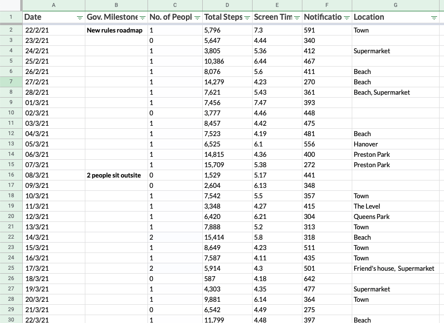
I started collecting a variety of data from the day Boris Johnson announced this plan, as I knew this would be an interesting personal analysis of the next phase of COVID-19. I didn’t know exactly what I was going to visualise when I began so I gathered a variety of data points as a starting point. I chose the following datasets as ones I thought the most likely candidates to be impacted when lockdown restrictions eased:
- The date
- Government milestones
- Distance and quantity of steps I walked
- People (outside of my household) with whom I interacted
- Time spent on my phone
- Phone notifications per day
- Location of my destination
I knew I wanted to analyse the number of people I was interacting with and the steps I took each day as this was the most prominent change in the restrictions. The change was quite drastic: from not being able to leave your home or see anyone back in February, to retail, clubs and pubs open as normal without requiring masks. I also thought that it would be interesting to see if the time spent on my phone would change – I expected to spend less time on my phone as the economy opened up.
I started to notice some trends within the raw data within my Google Sheets. Google Sheets is a useful tool for remote data collection, which I found extremely helpful as I was gathering six months’ worth of data and didn’t have my laptop with me all of the time. The app allowed for quick updates wherever I was. It was fascinating to try to spot patterns and connections by looking at the raw data only.
Starting with sketches
One of my favourite parts of the process is scribbling in a notebook. I often sketch as it gives me the freedom to imagine what is possible without the restrictions and limitations of my computer. It’s instructive to look back after your dataviz is complete to study your journey and thought process.

When the last phase of the roadmap was announced, and ‘Freedom Day’ was approaching, I started to think more about the datasets I collected and the story I wanted to tell.
Sketching goes hand in hand with cleaning and analysing the data. When you draw out and sketch, you realise which data you need. As I started to draw, I subconsciously and automatically started to populate my graphs with predictions for what I thought would happen at the end of the process:
- My step count would go down as my daily walks would get progressively less due to pubs, coffee shops, and restaurants opening up
- I would gradually see more people and rarely spend time in the house
- My screen time would lower as I’d be outside more
- My notifications would also decrease as I’d be doing things in person rather than online
Cleaning 160 days of raw data
After sketching out what I thought the dataviz would look like, I sorted the data into ‘must haves’ (data points that are necessary to include) and ‘nice to haves’ (data points that don’t have to be included, but can be if it works).
The final dataset changed only a little from what I was originally gathering. I included every data point other than the location of where I was going each day, and the distance I had walked, as I didn’t feel it was necessary for the narrative.
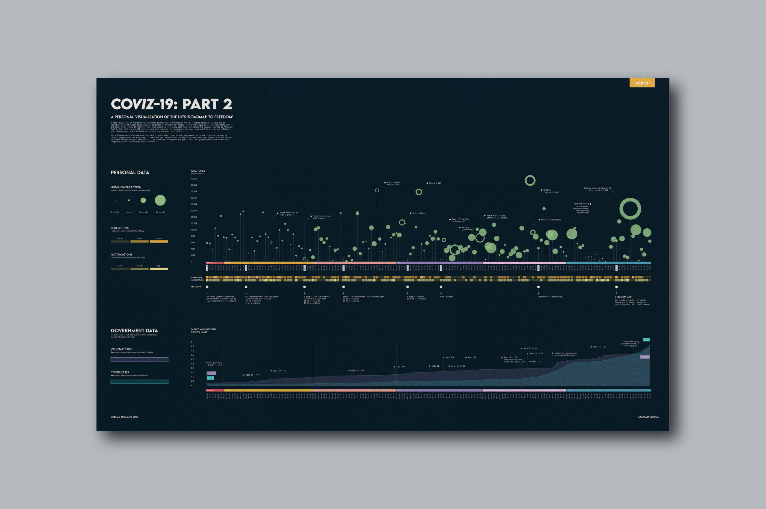
I realised that I needed to add in some more context around COVID-19 beyond my personal data, so I also added two more data points that I downloaded from the open source government website (refer to the images below).
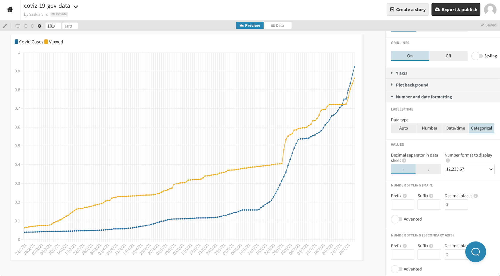
- Number of COVID cases
- Number of people vaccinated


Learning how to use Flourish
I created my previous CoViz-19 data visualisation completely by hand. I didn’t use any tools other than Adobe Illustrator. It was an extremely time-consuming, laborious process. This time I wanted (and needed) to learn how to use a data visualisation tool like Flourish or Tableau as I had six months worth of data,–double the amount on the last data visualisation.
After unsuccessfully browsing dataviz tool options (there are a lot out there!), I reached out to the Data Visualisation Society (DVS) community on Slack where I received the most helpful comments. (The DVS is a fantastic non-profit that supports the growth, refinement, and the expansion of data visualization knowledge regardless of expertise level.) After some fantastic tips and tricks from fellow data lovers, I landed on Flourish as I don’t have much coding experience. This seemed the most appropriate choice.
Coincidentally, I saw a perfectly-timed advertisement from Federica Fragapane and I soon completed her brilliant online course: “Data Visualization and Information Design: Create a Visual Model” on Domestika where she teaches how to use Flourish combined with Adobe Illustrator. Watching Federica’s workflow and process was so inspiring and supplied the knowledge I needed to further my skills.
Designing the final data visualisation
Using Flourish cut my work down by such a considerable amount, I can’t imagine doing any future work without it. It was such a quick process once my data was clean, and refining and designing the dataviz in illustrator made for such an enjoyable experience.
Once I’m happy with my designs, I will typically share them with close colleagues and friends to check if they make sense, are readable from a design and narrative perspective, and that the back end of the data is correct. This practice served me well on my CoViz project.
I was struggling to map four different variables onto one line graph. A fellow designer suggested expanding my current graph into two line graphs: one for personal data and one for government data. This adjustment not only reduced the density of the graphic, but it also allowed the reader to distinguish between the sources. Additionally, a helpful data analyst advised that I try formulating a seven day rolling average and scale my government data so both the COVID vaccinated number (in the thousands) and the COVID cases (in the millions) could be plotted using the same metric. This scaling technique is a step of data processing that is applied to independent variables or features of data. It helps to normalise the data within a particular range. I’m always grateful to chat with people of different perspectives, even if it is painful to revise what I thought was a finished piece of work–sharing with others affords a fresh outlook.
The final CoViz-19 data visualisations


Designing this infographic was both rewarding and satisfying creatively, and it enabled me the opportunity to look back on a historic moment to consider our progress as a nation. In February the future was so unknown. It was scary, intimidating, and overwhelming to face such a long road ahead, but on the other side of lockdown, I treasure the journey this visualization reveals. Though it contains a perspective personal to my social and technological habits, I suspect it’s a similar cadence to others. I hope that when others visualise my lockdown homestretch they can find hope and patience in their own live experiences.

Chesca Kirkland is an Information Designer at Set Reset, a design studio helping people reimagine how they see, experience and interact with data.
To see more of her work, follow her on Behance and Instagram.
- Chesca Kirkland

- Chesca Kirkland

- Chesca Kirkland

- Chesca Kirkland


