
This article goes behind the scenes of a visualisation created for Nightingale Magazine Issue 2. Did you know that Issue 3 is on sale now (shipping May 2023)? Subscribe or purchase a copy while supplies last!
If you received Issue 2 of Nightingale magazine then you would have seen “Inspiring a Movement,” an article by Claire Santoro, and the accompanying data visualisation, “The Growing Influence of the Warming Stripes,” which together tell the story of how Ed Hawkins’s Warming Stripes have grown into an international visual symbol of the climate movement. As we began researching the many ways that Hawkins’s visualisation has been used in the five years since he first displayed it at the Hay Festival, Claire and I found the story so interesting that we couldn’t wait to dive in and explore the Warming Stripes’ impact visually. What we uncovered was fascinating, starting with the Stripes’ origin story (it was inspired by a baby blanket, and came after another, similar visualisation on a scarf), through to its adoption as a symbol of the climate movement and appearance on a vast collection of items—from coats at London Fashion Week, to Greta Thunberg’s book cover, to Reading FC’s uniform, to multiple U.N. Framework Convention on Climate Change events.
In this article, you’ll be taken behind the scenes of how the data visualisation was created, the research behind the graphic, and my personal process when it comes to designing information. Here, the six steps of my design process, as used to create “The Growing Influence of the Warming Stripes.”
1. Choose a subject that intrigues you
The Warming Stripes is an unusual data visualisation. The graph has no numbers, no axis, no labels and no legend; instead, it consists solely of red and blue stripes that show a sharp increase in the average global temperature over the last century. And yet, it has become one of the most well known, most popular pieces of information design over the last couple of years.
Why is it a “good dataviz” if it breaks all the rules? Because it plays on what humans know already. We know that a timeline traditionally flows from left to right, and that blue colours imply cold, while red implies hot. Hawkins’ choice not to follow the traditional dataviz rules, in my opinion, probably helped create a graphic that people instantly relate to on an emotional level, which makes it more likely to spark change within the climate movement. I was excited to dive in and learn more about its impact.
2. Research your subject thoroughly (it might take a while!)
Our research into the Warming Stripes kicked off by interviewing Ed Hawkins himself (who, of course, wore a Warming Stripes shirt!) to learn how his visualisation came about, followed by a very long Googling session to find notable instances of the Warming Stripes being used on items.

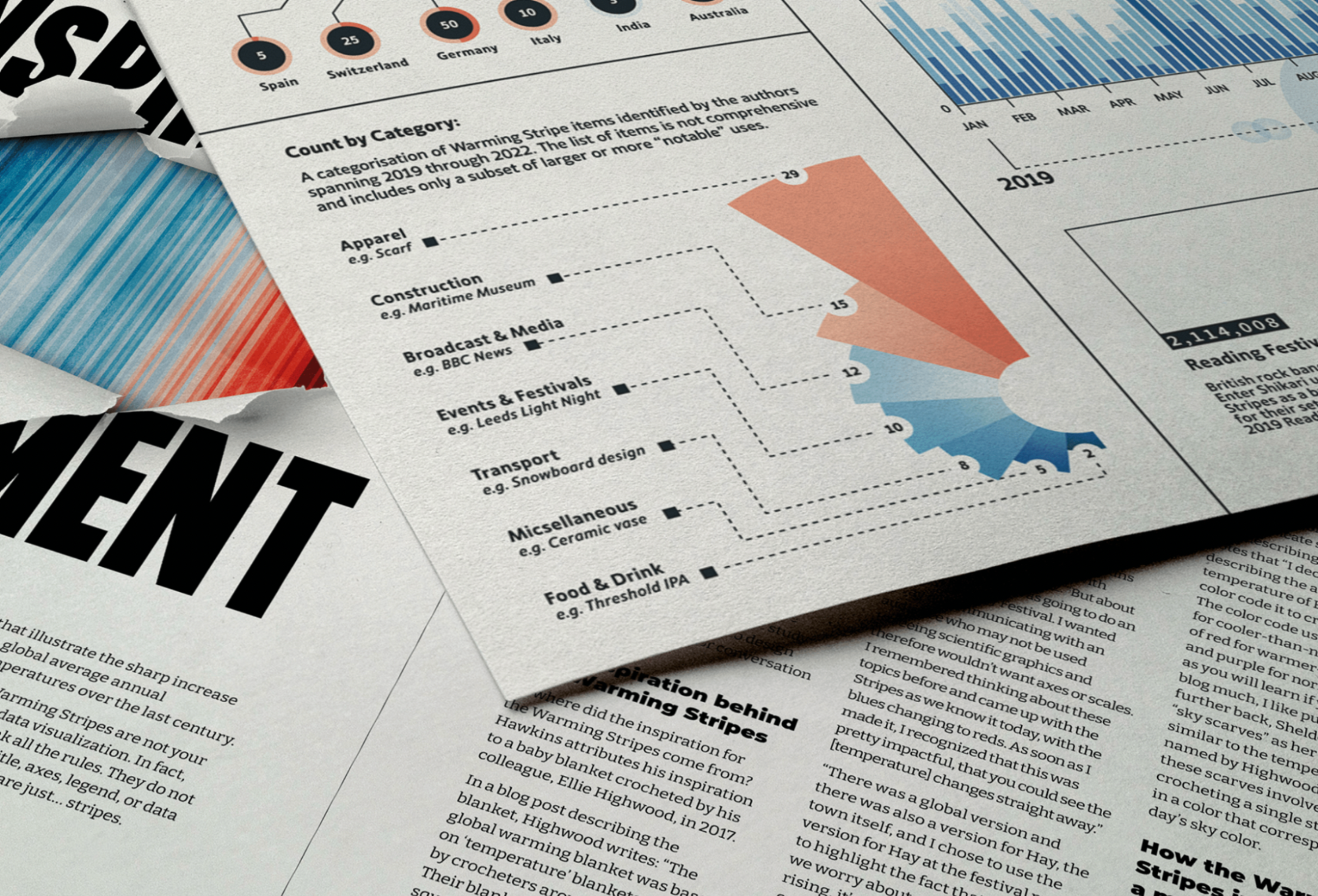
Thanks to all that Googling, I identified more than 80 “notable” uses of the Warming Stripes and documented them within a large spreadsheet that described each item, its location, category, creator/company, and any reference links to photos or news articles. It was inspiring to see the spreadsheet grow as I discovered new examples of where the Stripes were being used.

I was then faced with the challenge of how to quantify these items. How can you measure something without a numerical metric? How can you document the impact of an item when you don’t have a comprehensive list of its uses and locations? To overcome this, I came up with a common metric to use across all items: the total social media following for the item’s creator or promotor. For example: Enter Shikari headlined at Reading music festival in 2019 and used the Warming Stripes as their backdrop. I quantified the social media “bubble” for this use as the sum of the band’s 1,029,008 followers and the festival’s 1,085,000 followers.

Alongside collecting data on the items that used the Warming Stripes, I compiled Google Trends data on search terms relating to the graphic. This provided rich data from around the globe that I could use to understand the relative popularity of the Warming Stripes over time. The search terms I included were:
- The Warming Stripes
- The Climate Stripes
- #showyourstripes
- Ed Hawkins
- Show your stripes
3. Sketch to bring out ideas quickly
My typical process for visualising data goes from Google Sheets straight to my sketchbook. Sketching is a brilliant way to quickly get ideas out of your head and into a visual form. You aren’t held back by pixels or grids; instead, the empty pages provide the freedom to imagine what’s possible without restrictions.

Quite often, the data you have will determine what kind of graph you should use. For example you wouldn’t show a part-to-whole relationship with a line graph, or visualise a timeline with a donut chart. The Data Viz Project by Ferdio is a fantastic resource that I often use to help me understand the relationship within the data I have and the visual structure that might suit it.
In the case of the Warming Stripes, I knew I needed to visualise certain metrics by year, with additional notes and insight to contextualise the results, so my sketches revolved around a timeline. I used the numerical values for the social media following to show the scale of each item.
4. Test your data through wireframes
Sometimes, you’ll sketch an idea with an imagined dataset. You see tall peaks and sharp dips in your mind, but when it comes time to build your design, you realise the actual data doesn’t show those same peaks and dips. Maybe the data is so flat that you need to change your imagined design. (This happened to me: The sketches in the image above show my early thought processes, where I was exploring the idea of using a stacked area chart, which ended up not working due to the shape of the actual data.) It’s super important to test out the data early in your design process to avoid major changes in later stages.
Once I’ve sketched a few ideas for a graphic, I use Flourish or RAWgraphs to quickly plug in the data and test how it looks. For the Warming Stripes, this part of the process was even easier—Google Trends already provided line charts of my identified search terms.

This was super helpful as I could see straight away if there were any patterns or trends worth visualising. I was able to download this line chart as an SVG and edit it in Adobe Illustrator, my primary tool for creating this data visualisation. As Claire and I dug into the data, it was fascinating to see the patterns that emerged around the search terms’ popularity, like peaks around each U.N. COP event and the dip in search interest during the onset of COVID-19—we called these out with annotations so that others could explore the patterns, too.
5. Design your data visualisation
Finally, I was ready to create the part people actually see—the infographic design. I went through many design iterations that included a variety of colourisation options and layouts with supporting graphs on the side. The final graphic used only colours from Hawkins’s graph and included two supporting graphs that visualised search interest by country and item counts by category.

Creating such a dense visualisation that was still readable for print was highly challenging but exciting. It also required close collaboration with Claire, as we figured out what information to keep in the visualisation—in annotations, captions, and supporting graphs—versus explaining in the article. The time we spent thinking through these decisions ultimately made our work stronger and more refined.
6. Share your work!
After months of work, the visualisation was finally printed and released online for people to read!


My hope is that after viewing the data visualisation, readers realise how powerful and impactful the Warming Stripes have been despite breaking all the traditional rules of datavis. I’d love to see others inspired to follow suit and break the rules themselves!
And, of course, because the data visualisation and article focus on climate data and climate activism, I also hope that it continues to spur people on in using the Warming Stripes as a conversation starter and symbol for change.

Chesca Kirkland is an Information Designer at Set Reset, a design studio helping people reimagine how they see, experience and interact with data.
To see more of her work, follow her on Behance and Instagram.
- Chesca Kirkland

- Chesca Kirkland

- Chesca Kirkland

- Chesca Kirkland


