
We’re often asked, when making data visualizations in a business setting, to work with a defined dataset and to keep a specific goal and audience in mind. The project is usually driven by a stakeholder who provides boundaries, guidance, and feedback, about how to present the information. This creates a structured environment to work within. Consider, for example, all the parameters in these kinds of assignments:
“Create a dashboard for internal analysts on the media buying team to use to determine which ads are the most successful.”
“Create a journalistic style piece that balances text and visualization to tell the story of the impact of Tony nominations on a Broadway show’s longevity.”
However, these kinds of specifications are generally less defined when creating visualizations for fun, or for contests, or for a client who has given more open-ended guidelines. If no audience is defined, do you aim to serve as wide an audience as possible? Or choose for yourself who your intended audience is? Do you narrow in on one question, or allow the user to explore and develop their own insights?
There is no right answer to any of these questions, which—while part of the fun—can make it challenging to find a starting point or direction.
When the contest opened for the World Data Visualization Prize in December 2022—a dataviz competition run by Information Is Beautiful in partnership with the World Government Summit—I immediately knew I wanted to enter the “Dashboard of the Present Future” category using Svelte and D3.js, my current favorite visualization tools. I always enjoy entering contests because they provide a deadline and limit my ability to entirely overthink.
There was a dataset of more than 30 metrics for each country with the goal for “governments to see how well they, their nation, and their populace are doing.” This provided a loose boundary to work within. However, the prompt of, “What seems relevant or interesting to you?” reiterated that I had total control in choosing the focus. This prompt also served as a gentle reminder to get outside of my traditional way of thinking. However, these are the challenges I love the most because, selfishly, I can try new things and organize the data however I see fit.
The contest description also suggested that I “get into the head of a decision maker.” While it was helpful to know that someone would hypothetically use my creation to make informed decisions, it also left out what types of decisions or in what context the decisions would be made. A president of a country would be making different decisions than the head of a government agency or a worker within an agency, for example. My first reaction to this line of thinking was that the user would need to have a starting point—a specific country they wanted to evaluate. No matter their position or goal, each decision maker had that in common.
However, I also began to question if that was too specific or isolating. Realistically, this was for a contest where the judges were data visualization experts and not government decision makers. What starting point would benefit them? The country they lived in, or one they were considering visiting? Would it be more natural and intuitive for them to start with a visualization that showcased the whole world and then be able to drill down into a region, and then country? I wanted to keep this broader data visualization community in mind as I figured out my visualization.
Wireframing layout options
After reading through the prompts, I went on a run. I had a podcast playing, but quickly realized I was not listening to a single word and was instead arranging the data into different layouts in my head. When I returned home, I quickly sketched out the different layouts I had envisioned.
Here is a gallery of three of those sketches that illustrate the evolution of my thought process:


I realized that I wanted to further explore layout option 1 because it seemed the most concise and dashboard-like. Additionally, I worried if I layered in a “world” visualization and then a “region” visualization, it would be too repetitive and overwhelming. So, instead of adding these larger geographies as their own steps, I incorporated them into a country’s view.
I also began to think further of ways this layout could satisfy my key audiences—government officials (hypothetically) and the data viz expert judges (in reality). How could I make my visualization focus on one thing at a time while also facilitating exploration so a user could find interesting points to focus on? I thought about this through the idea of context and comparisons. If I took the approach of looking at a single country, how would the user determine what was good or bad? Additionally, if the country were deemed “bad” at something, government officials may want a sense for where to turn for advice. Could this visualization show countries that performed comparatively better? Before making any further decisions, I began analyzing the data to see what it would tell me. As someone who lives in the United States, I imagined myself as a government decision maker to determine what information was most useful to generate action or provide a starting point for further research.
Analyzing the data
I started by looking at a single metric—extreme poverty—and saw how it differed by geography. This immediately helped me realize that viewing data at a regional level would add a layer of context. From the view of the United States government, I did not think it would be helpful to say, “Yeah, we are good because less than 1% of the U.S. population lives in extreme poverty while Zimbabwe’s stands at 13.5%” Instead, a more helpful comparisons would be to see that the United States is only slightly better than Mexico and is actually worse than some other countries in the Americas.

Next, I looked at CO2 equivalent emissions (also known as CO2e) per capita. Knowing that more industrialized, wealthy countries historically produce more emissions, I wanted to find a way to bring income level in. It is helpful in some contexts to see the United States is one of the worst in the world. However, from a decision making perspective, being able to isolate countries with similar resources and see which have lower emissions could be a useful guide for policymakers who are focused on climate policies or technologies.

My last step in the analysis process was to view all metrics pertaining to the United States. I determined the country’s percentile for each metric. This view seemed helpful because the viewer could clearly see where the United States was falling short and where it was doing well. This helped me verify that I could categorize the metrics as “doing well” or “opportunity for improvement.”

As I was analyzing the data I realized there were limitations of my own knowledge that could prevent me from accurately understanding or displaying a metric. Was I overlooking some obvious reason why a country was better or worse? Was not weighting by population the wrong strategy? I didn’t want this to hold me back or prevent me from continuing on, but I wanted to make sure everything was as accurate as possible. I went to the source of each metric and read the formal definition (which I then captured to include in my visualization) to ease my worries.
Selecting visualizations
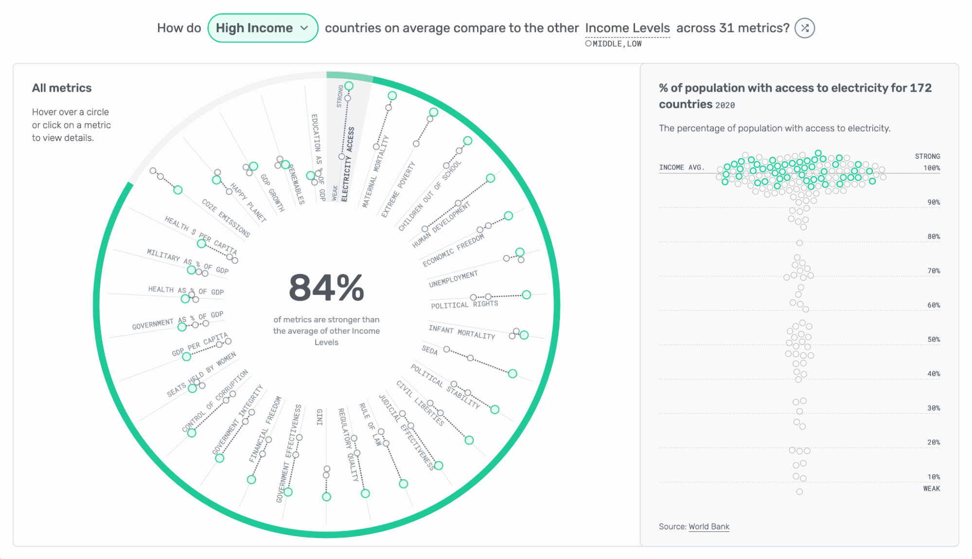
With my layout in mind, and using region and income level metrics to play around, I began focusing on which visualizations to choose. I pretty quickly landed on the idea of using a radial with one spoke for each metric. However, I knew for the radial to be effective, I would need to minimize the number of points on each spoke. I also knew that radials weren’t a common dashboard visualization—instead, one would opt for standard dot plot grids—but I was set on making it work because it gave me the ability to sort and layer in a donut chart on the outside.
My initial thought was the user could choose between two views:
1. World view: for each metric, see the average of each of the six regions or the average of each of the three income levels.
2. Country view: for each metric, choose a country and compare it to countries sharing its income level, region, or the world.
But I struggled with the world view. On the country view, the focus was very clear and each country could be highlighted (and designed) differently than what it was being compared to. However, on the world view, it would be hard for the user to make a holistic assessment of the metric. And despite only having three dots per spoke to simplify the view, it still was a lot of information to take in!

Once I made the low income and middle income circles smaller and the same color, the high income circles popped more.

This solidified my theory that the user should choose one thing to focus on: one country, one region, or one income level.
I returned to my usual running grounds in Central Park and began thinking through how I would turn my ideas into a higher fidelity mockup. I realized that I was overcomplicating things by having the user make a lot of decisions and I needed to simplify (much like my favorite activity is just to run and not have to constantly decide where, what pace, how long, etc.). I wanted there to be no sorting or no choosing between rank versus average versus median. Just choose the focus and go. My hope was that this would make it feel more approachable.
I still wanted there to be the ability to dive deeper—if one chose to. So, I created the ability to click on a single metric and view it for all countries. Whichever countries were part of the “focus” would then also be highlighted to allow users to see outliers or gaps.

Adding interactivity
I still felt like something was missing. How was the user to choose which thing to focus on? Given that this was a dashboard, I wanted the experience to be highly interactive. I already had a dropdown to choose the country, income level, or region to be the focus, but this didn’t feel like enough. The user still had to know what to find in the dropdown. This was sufficient for government officials who wanted to look at themselves, but it wasn’t as useful for general exploration.
My first thought was to use tooltips to switch the focus from one type of comparison to another (for example, the United States could switch to a regional comparison of the Americas or an income comparison for high-income countries). If the user found an interesting data point, for instance, they could hover over it and have the ability to change the whole dashboard to focus on that metric. This allowed for on-the-fly exploration. If a government official were looking at their country and wanted to expand to their broader region or income level, they could. However, this still required the user to engage, interact, and be happy with the default selection.

A shuffle button to bring it all together
To address this problem, I considered a shuffle button. As I was looking for inspiration, I stumbled upon The Climate Pledge. They have a shuffle button written into one of the main headers of the page. My first reaction was to click on it and find out what it did. It instantly clicked that this was a way for people to use my dashboard in a fun, intriguing way that still offered a lot of potential for exploration.
I thought the usefulness of the shuffle button was two-fold. First, it allowed for exploration of the entire dataset. Most of the time when given options to choose, people will choose what is familiar to them, such as where they live or like to visit. However, a shuffle button opens up ways to learn about new countries or regions outside of what is known to them. This could be used to offer new perspectives to government officials, but more importantly, it makes the dashboard more exciting, digestible, and usable for those outside of government or decision making roles.
Would a shuffle button ever be seen in a business dashboard? Probably not. However, finding solutions for a wide audience opens up the opportunity to explore new ways of interacting with data that meet a variety of needs.
Personally, I was very happy with what I created (check out my final project here) and I enjoyed experimenting with taking risks by adding a not-so-common dashboard feature. As I was finalizing development and looking for bugs, I found myself continually hitting the shuffle button. I was so fascinated each time the new data transitioned in and I learned about a different place, that I was digesting the information and diving deeper instead of looking at it from a testing perspective. I had spent weeks analyzing and looking at the data and yet I was still able to find insights I hadn’t seen before! Business dashboards are often crafted with speed-to-insight in mind, however creating this visualization helped me realize slowing down and adding engaging ways to “play” with the data can also aid insight.


Lindsey Poulter
Lindsey Poulter is a freelance data visualization designer and developer based in New York City. With expertise in Tableau, Svelte, and D3.js, she enjoys delivering tailored, innovative solutions to clients. Lindsey's notable achievements include participating in the 2019 Iron Viz contest, being recognized as a Tableau Zen Master, and winning the 2020 Pudding Cup and 2023 World Data Viz Prize.
- Lindsey Poulter


