
These days, it seems, you can’t attend a wedding without hearing the soft croon of Ed Sheeran at some point. It got me thinking, is there an archetype of wedding hits? Would sappy slow songs dominate the playlists?
This gave me an idea for entering a local data storytelling challenge a while back. I would explore the profile of popular wedding songs in a data visualization.
Brainstorming
There are several ways to visualize music, but I was rather inspired by Susie Wu’s film flowers and Amy Cesal and Zander Furnas’s wedding guest badges, which were in turn inspired by Georgia Lupi’s data portraits for 2017 TED Talk attendees. In their respective works, data points on a given subject were turned into a playful cocktail of shapes, colors, and symbols.

I knew that the Spotify API provided information on a song’s audio features such as its duration, energy, and level of cheerfulness. Putting the two together, I decided to visualize individual songs as a combination of their respective features. Tackling how was left to a later stage.
Clarifying objectives
Confession: I find it’s easy to get distracted or lost when working on an open-ended project like this. To help anchor the project, I came up with some key guiding questions. Contrary to how it may appear in this article, the process was not a linear one. Rather, I refined the questions as I poked around the data and designed some prototypes. These questions ended up being:
- Why do certain songs keep appearing on wedding playlists? This was the big, burning question that motivated the project in the first place.
- What features do wedding songs tend to have in common? How do these differ from other popular songs? These were the supporting questions to guide the data exploration.
- What does our choice of music features ultimately say about us as humans? More specifically, how do we recreate memories or set the mood we want for weddings? These were the probing questions that reflected the takeaways I’m hoping to get at the end of the project.
Data exploration
Initially, I had the thought to compile my own list of wedding hits by scraping every Spotify playlist with “wedding” in the title and seeing which songs appeared most often. However, this approach proved to be rather cumbersome, so I turned to a shortcut: Spotify’s declaration of the 50 most popular wedding songs in the form of their own playlist, “Most Popular Wedding Songs Globally.”
We often need to have a comparison or benchmark as a context to get a meaningful sense of the data. For example, what does it mean if a wedding hit has an energy score 0.6 out of 1.0? Is this typical of songs in general or just wedding songs? For comparison, I gathered songs from two other Spotify-curated playlists, the “Top Tracks of 2018” playlist for popular songs and the “Broken Heart” playlist for songs that I felt would be the polar opposite of wedding songs.

For each feature (e.g. energy, mood, etc.), I charted the distribution of each group of songs. One thing that stood out was that while wedding hits in general tend to be more cheerful than heartbreak songs, two types of wedding hits were rather common: super upbeat songs and rather heart-rending ones. Also, it seems that while wedding hits tend to be more acoustic in nature than top tracks (which were mostly electronic dance music or hip-hop), they were less so than the heartbreak tracks. For those curious, Spotify’s glossary on the audio features is available here.

In terms of genre, unsurprisingly, the popular wedding songs were more often pop or soul music. Spotify’s records of song genres were mostly missing so I got the data by web scraping Google’s featured snippets for genre search results. Not exactly a foolproof method, I know, but it sufficed for providing an overall sense.
Design process
As I was working with wedding hits, I thought it would be fun to represent the songs using favors commonly found at weddings.

The process of imagining and defining the visual concept started with rough sketches on paper. I found that cupcakes provided the sweet spot as a canvas that could accommodate a layering of design features without being too complex. Mapping the music features to cupcake decorations required further rounds of experimentation to see what worked and what didn’t.

While checking online on how I could automate design patterns based on numerical properties, I came across mosaic art and spirographs.

Creating the desired spirographs took many iterations. Special shout-out to Joel Schneider’s awesome spiro package in R! Other aspects of the design were done directly in Inkscape, an open-source alternative to Adobe Illustrator.

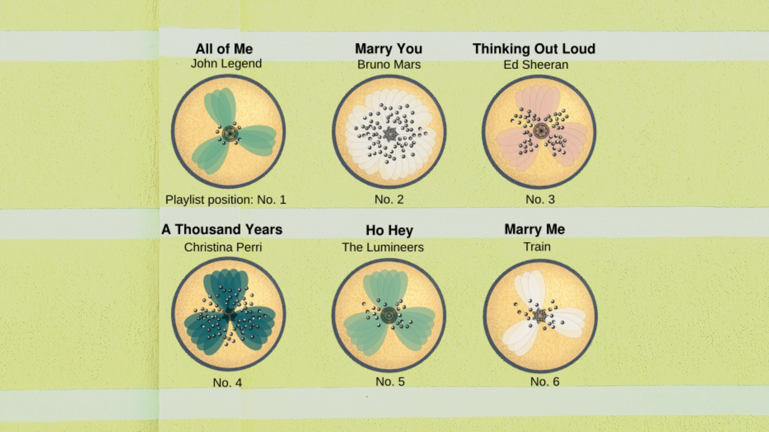
Baked cupcakes
I pulled everything together in an infographic for the data storytelling challenge. To my delight, my submission was awarded a commendation for its creativity and design.
As shown in the infographic, it seems certain types of music do make popular wedding songs. Soulful, slow-tempo ballads (perfect for those reflective moments) occupied top positions in the ‘Most Popular Wedding Songs Globally’ playlist. High-energy music, which are great for dancing to, made it to the playlist as well. Looking at the song titles, it also appears that people tend to lean toward music that is overtly about romantic ideals. See “Marry You”by Bruno Marsor “Marry me” by Train for instance. However, the fact that “Hey Ya!”by Outkast—a deceptively depressing song about relationships— is also a wedding hit suggests that people pay more attention to the vibes in the music than the actual lyrics.

Looking back, there are definitely a few things I would have done differently. One is to make the interpretation of cupcake images more user-friendly, perhaps with smarter labeling or an easier legend.
All in all, it has been a great hands-on learning journey!

Alexandra is an analyst-designer who lives in Singapore. She creates stories and comics with data to help clarify the complex.
- Alexandra Khoo

- Alexandra Khoo

- Alexandra Khoo

- Alexandra Khoo


