
I am one of the many people who like to give out compliments. It’s just another thing I do, like say, “gesundheit” instead of, “bless you.” But, in my article Humanity Needs More Love, compliments morphed to mean a lot more than a few words to me.
The story details the time I set out to track how many compliments I said in a week, but I came away with having received almost as many as I gave. I had so many surprisingly warm and sweet moments between strangers, and recounting those bits of my journey was as fun as experiencing them in the first place.
The entire project was honestly a blast, and I was surprised at how fun boring old statistics could be. It had never struck me as a particularly creative field before I took an interactive visualization class, and realized it’s a bona fide artform. Yet, before I got to publish my experiment, I had to slug through the gruesome underbelly of encoding to reach my goal:
Figuring out how the hell I would visualize all my data.
Starting line
The hardest step to take is the first one. Like the oodles of others who want to try their hand at creating unique, memorable designs, the infinite amount of paths you can take are overwhelming. Not knowing what works right for you, or what will turn out well, can make your brain overheat like a Tesla.
Did I want to create smaller designs for each day that could be pieced together like a puzzle to form a different image? Did I want to make a design that moved, with an animation that changed as you scrolled from day to day? Did I want it to make sounds for different data points, creating a song when you listened to the whole week together?
There are as many options as our imagination can create; and let me tell you, my imagination has thought of some wild ones. If you’re in the same boat, then hello, my fellow intrepid adventurer! If you want to try your hand at artistic statistics, or are simply interested in my process going in blind, here’s the behind the scenes of Humanity Needs More Love.
Starting at the beginning, this project was born from Giorgia Lupi’s inspiring visualizations. She makes such fun, creative interpretations of data, and as a newbie artist, I’ve been looking all over for ideas lately. When I was assigned a project tracking my own data for a week, I pounced on the chance like a starving cat on a fat mouse.
I quite liked Lupi’s abstract graphics resembling wallpapers, or Art Deco prints. There was an appeal to creating a colorful pattern that meant absolutely nothing to a viewer without a key. For my first attempt, though, I thought I’d try a more straightforward method of encoding before I got tangled up in fully symbolic, “don’t let the viewers even think they know what it means” type of designs.
So, solid, real things—we all know what those are, which is a great start. We only need to assign meaning to the parts of the objects we see right in front of us, and that can be data! When representing kind words through an image, my first instincts were butterflies, birds, and perfume. Small, cute things that would fit the vibe of my article.
Trial and error
I went with butterflies first. Compliments are a type of ephemeral beauty that flutters on by, aren’t they? I considered drawing a unique butterfly for each day, with the symbols on the wings representing the types of compliments I got. But, I quickly realized a flaw in my plan.
On days when I had only a few things to record, the wings would look awkward and lopsided. On days when I had a lot, they’d be cramped. The symbols I had chosen to represent my compliments at the time were objects like suns and swords, and looked utterly out of place on the delicate wings—I quickly scrapped that attempt.
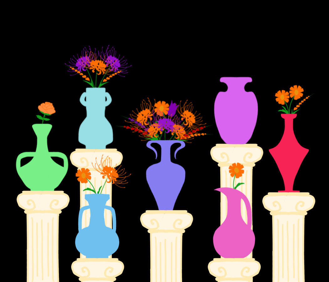
I needed an object that would look good no matter how few or many data points I had to record that day. Birds were too complicated, perfume too narrow of a category, but vases—those were meant to be put on display. I was quite taken by the idea of the water level rising with every compliment added, like a heart filling with love.
I decided to color sections on the left for compliments I gave, and fill in the right with ones I received. This revision was absolutely for the best, as my second draft felt much smoother. It was made all the sweeter by the fact that my paint app of choice—IbisPaintX on my phone—was free to use. Things always seem better when they’re free.
I, of course, did not start a new project file when I began drafting my visualizations. Why would I do something sensible like that? Instead, I took over a file where I had finished drawing a biscotti, banished the cookie, and just started on my project planning right there.
While physical mediums have an irreplicable charm, digital apps have a wide array of features and effects that are a godsend to beginners. With the ability to copy and paste, you can test hundreds of variations on one design, all without ruining the original.
With my initial vase, it was exactly that—a single vase. I had drawn only one as a mock up, and had a blue gradient color palette for each section of it. (To water my compliments, of course.)

Using the sun and sword symbols I had drawn earlier, I colored and placed them in my preliminary Tuesday vase. I then copied and pasted that vase seven times, recoloring each to signify a different day. This was to try and get a feel for what the week would look like together, but with all my hue shifting, the gradient was lost in translation.

Surprisingly, I found that I liked the mistake. The vases and symbols were busy, for what was already an overly detailed draft. The solid color made it feel…neater. More professional, I suppose.
The vases were recolored with whatever hue I happened to click, but with seven objects on display, a rainbow-esque scheme felt the obvious next step. You could better tell which day was which if the palette followed the logic of the color wheel. It was while I shuffled the vases around, trying to find the most symmetrical spot, that Thursday coincidentally ended up in the middle. I hadn’t even intended that, but having the day with the most data points displayed front and center was perfect.
…Displayed? Oh, this is a display!
Looking at it all together, I realized that my vase shuffling ended up looking like a staggered elevation display. Sort of like one you’d find in a museum. Chugging along that train of thought, I scribbled some pillars for my vases to stand on, and had myself a draft.

…boy, was it a messy draft.
If you’ve read my first article, one discrepancy you might’ve noticed is the background of all these drafts. The white background was a relic of the biscotti that originally lived in the file; however, I had the vases on a separate layer, so when I moved them to an unused file, they had a transparent background. Apparently, Ibis defaults to black backgrounds with transparent images.

I was pleasantly shocked by how the colors popped against the sudden black. It reminded me of that scene in Ratatouille, where red and orange fireworks go off when Remy eats strawberries and cheese. The black felt so dynamic, compared to the white default used for what feels like 90% of all graphs in existence. Somehow, that biscotti played a pivotal part in my final design.
Learn from your (my) mistakes
Seeing it all together was satisfying, but I could also tell my object symbols weren’t going to pan out. I needed another element, Something that came in a wide variety, so I could use different versions for different compliments, but also something that was still related to my project’s general theme. Something like…
“I am a genius,” I whispered to myself as I started pulling up flower references.

I knew just what to decorate my vases with. Similar to butterflies, flowers are a delicate thing of fleeting sweetness. Even better, they’re a popular gift—given on dates or celebrations or to tell people we love them—just like compliments!
After I had drawn up my flowers and vases, but before I recolored them, I decided to rewatch all the test versions of my project. Skipping over the first hour of the speed paint (which was, of course, the random cookie drawing) I sat down to watch my progress. Recording your work is an utterly underrated tool, especially if you’re still developing your process. You can catch details you erased, previous iterations you like more, or aspects you initially had but forgot about.
You can also see how long you struggled on very small parts.
Drawing the vases took thirty minutes. According to the speed paint timer, I then spent over three hours drawing flowers. Not coloring, tweaking, or arranging the flowers. Three hours on just drawing the five flowers. I still shiver at the memory. It’s a miracle I made it out alive.
Treacherous trinaries
After the harrowing flower growing, I then had to imbue some statistical hue. I wanted the flowers’ colors to be meaningful, so I had been tracking who I gave my compliments to. My data professor had mentioned there was no need to conform to the tradition of pink girls and blue boys. Visualizations become terribly dull that way, and to be truthful, it’s inaccurate.
In our evolving world, two colors are not sufficient for categorizing humans. Actually, it never had been. We simply didn’t bother to correct it until recently. I waffled between having my color categories be male, female, masculine presenting, feminine presenting, and androgynous, but just that list alone was both too many and not enough. Down that path laid a tantalizing array of color categories, but would unfortunately involve me being weirdly invasive to strangers. (I didn’t want to end up flagging down every person I spoke to and interrogating them on their identity.)
If I’d been performing a survey or a wider experiment, I would’ve had a far more robust selection on gender for participants to simply self identify. Since this project was more of a guerilla style data collection, I ended up with observational categories rather than actual gendered ones. Orange for fem presenting, purple for masc presenting, and red for not conforming to either.
Red might seem an odd third choice, but I didn’t want such a broad umbrella category to be presented as a mix of the other two. If I did blue for fem, yellow for masc, and then green for nonbinary, it would be like saying “here is the third, in-between gender,” which defeats the entire purpose of having inclusive categories. The solution to quantifying diverse identities is not tacking on a third gender, and creating a trinary. There were definitely still some kinks to work out in my categories, but I let it rest for now.
I didn’t solve world peace, but I gave it my college try in the timeframe I had left. With my project deadline around the corner, I solidified how I would be encoding my data. Using the vases, I could track how many compliments I gave versus got. Using the flowers, I tracked the kinds of compliments I gave and got. But, simply placing a bunch of flowers in a row would be no better than using tally marks—it was a verifiable lemon situation.
If you have flowers, and you have vases, what choice is there but to make bouquets?
The source of my power
The secret to art, dear reader, is not creativity, experience, or knowledge. Those things give you the accursed confidence of setting out to arrange half a dozen flower bouquets—which is an entire career for a reason! No, those evil, evil things called “ideas” inspire your project to arrogant levels of aspiration.
It’s the same issue as architects creating beautiful, grandiose, complex plans, which are then passed along to engineers who fall into utter despair at their impracticality. As fun as it is being the architect, shooting for the heavens with fantastical plans, remember this: you are also the poor engineer who must find a way of executing your idea.
So, here is the real key to my secret.
An absolutely obscene amount of layers.
I had three different files for this project, with the main one having a total of 63 layers, none of which are labeled. Do as I say and not what I do: for the love of god, label your layers.
Working with 25 flower layers staggered throughout my project would’ve been far less harrowing if I had them labeled for the day they were from. Along with labeling the vase for the day it was, and perhaps numbering things if you need that kind of organization.
Last words
Despite my awful sorting practices, I did make it out the other side. My project’s scope was constrained by my due date, so there are some changes I would make. Choosing flowers with stronger silhouettes would’ve made assembling the bouquets much easier. I had a hard time making all eleven Thursday flowers visible, especially with so many spider lilies. In the same vein, I would’ve liked to sift through flower languages, and try to find flowers with meanings that matched a type of compliment.
Ultimately, though, I am content with my final product—and it certainly won’t be my last.
I’ve learned from my mistakes, and when I open my free paint app again, it will be with just as many wild ideas as now. This was only my first foray into the wonders of statistical art, and what I learned throughout this process will only catapult me to even loftier heights. I hope it does the same to you, dear reader, and may we ascend to the gods with our labeled layers in hand.


Kayla is currently double majoring in Digital Communications and Political Science, aiming to get her Masters in both after graduation. She has a passion for speaking on climate justice, reproductive justice, and decolonization, along with all the intersectional issues those entail. In the future, she hopes to continue volunteering in her community, and to work for greater humanitarian efforts worldwide.
- Kayla Marie


