
I recently asked dataviz Twitter if anyone could point to situations in which a vertical line chart was the best chart type for that situation. Man, did people come through! They shared tons of vertical line chart examples and enough replies for me to spend the better part of two days responding to them all. Some really interesting conversations emerged and, ultimately, I was persuaded to change my mind on this topic. This was a shining example of the parts of Twitter that aren’t, well, festering cesspools of hatred, so I thought I’d summarize the discussion in an article for those who might be considering using vertical line charts in their own work.
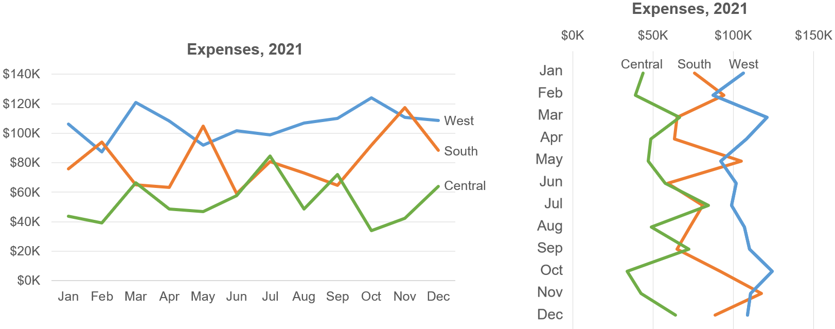
Initially, I was skeptical since vertical line charts tend to be fairly unintuitive to most audiences, especially when compared with the much more common horizontal variety. In my experience, people find horizontal line charts like the one below on the left to be considerably easier to read than the vertical version on the right:

If you also find the vertical version harder to read, I suspect that there several reasons why:
Because you probably learned to read from left to right:
If your primary language is one that reads from left to right (English, French, etc.), the thousands of hours that you spent learning to read probably trained your brain to mentally represent sequences as left to right by default (as opposed to top to bottom, bottom to top, or right to left). Research supports the notion that a person’s primary language influences how they mentally represent sequences by default.
If you learned to read from left to right, you don’t have to consciously remind yourself of the “direction” of a horizontal line chart as you’re reading it; it’s “automatic.” In a vertical line chart, however, you must first determine if it should be read bottom-to-top or top-to-bottom, and then consciously remind yourself of the “direction” of the chart as you’re reading it.
Because you probably think of greater quantities as being “higher up:”
In the real world, larger quantities of things are usually “taller” (stacks of bricks, etc.), which is likely why we intuitively perceive elements in a chart (points on a line, ends of bars, etc.) that are higher up in the chart as representing larger quantities than elements that are lower down in the chart. In a horizontal line chart, then, a line that slopes upward is instantly recognized as representing an increase in quantity. In a vertical line chart, though, an increase in quantity is usually represented as a line that “slopes to the right,” which is less intuitive. This could be why the horizontal line chart above is instantly recognized as something that’s increasing and decreasing, but the vertical version may, at first glance, look like something that’s zigzagging back and forth, which isn’t what that data represents. (Note that this is likely the case regardless of whether your primary language reads left-to-right or not.)
Because you’ve probably seen way more horizontal line charts than vertical ones so you got used to reading line charts horizontally:
The two reasons above probably explain why the vast majority of line charts out there are horizontal. This, in turn, means that most readers are used to reading line charts horizontally but not vertically, and I’ve seen readers with less chart-reading experience get quite thrown off by them. Indeed, many data visualization software applications—including Excel—don’t even offer vertical line charts as a native chart type (though they can usually be “faked” using connected scatter plots).
The lines in most line charts contain many individual line segments so, in a vertical line chart, the reader must consciously remind themselves of what the slope of each line segment means. (Does the segment come before or after the segment above it? Does it represent an increase in quantity or a decrease?) Yes, it takes only a fraction of a second to figure those things out for each line segment, but those fractions of a second start to add up over the many line segments in a typical line chart, making it harder to notice patterns of interest and slowing down interpretation. This extra cognitive effort is particularly noticeable in “busier” charts with more data:

Now that I’ve listed the problems with vertical line charts, what changed my mind about them? Well, peoples’ responses to my original tweet fell into three general categories:
- Responses that didn’t really change my thinking, usually because they offered an answer to a question that was different from the one that I was asking.
- Examples of vertical line charts which, in my opinion anyway, would have been better off as horizontal line charts, bar charts, or heatmaps.
- Examples of vertical line charts which, I agreed, did represent situations in which a vertical line chart was truly a better choice than a horizontal line chart, vertical heatmap, bar chart, etc. Those are the ones that changed my mind.
Let’s have a look at each type of response, along with some comments, beginning with…
Responses that didn’t change my mind
“There’s no reason to avoid vertical line charts; they’re just as easy to read as horizontal ones.”
While not a common response, some people did make this claim. It’s so inconsistent with what I’ve observed while showing vertical line charts to thousands of workshop participants, though, that I feel comfortable just setting this one aside.
“There are some types of data that people think of as ‘vertical,’ such as data related to altitude or depth, and these should be shown on vertical scales.”
I agree. To be clear, I wasn’t questioning whether data should ever be shown on a vertical scale, I was questioning whether vertical line charts are ever the best choice, which is a different question. Other types of “vertical” charts such as vertical heatmaps, horizontal bars, etc., don’t have the perceptual issues that I described above, and I agree that showing data that people think of as “vertical” (height, altitude, depth, etc.) should usually be shown on a vertical scale:

“Here’s a vertical line chart that people use.”
The question that I was asking wasn’t, “Do people use vertical line charts?” (I know they do.) It was, “Are there situations in which vertical lines are the most effective choice compared with alternatives like horizontal line charts, bars, heatmaps, etc.?” The fact that people use vertical line charts in some cases doesn’t necessarily mean that they’re the most effective choice in those cases. People make questionable dataviz design choices all the time.
“Here’s a vertical line chart that’s very useful.”
I wasn’t suggesting that vertical line charts are useless; they can be useful. I was asking if there are situations in which a vertical line chart is the most useful choice, compared with alternatives such as horizontal line charts, horizontal bar charts, vertical heatmaps, etc.
“Every chart type (including vertical line charts) has situations for which it’s the best choice.”
I heard this assertion a few times in response to my assassination attempt on box plots but, TBH, I don’t get it. Chart types are human inventions and, just because something was invented doesn’t automatically mean that there must be situations for which it’s the best solution. The graveyard of human inventions that were the best solution for exactly zero use cases is well populated, and I could come up with many crappy chart types that wouldn’t be the truly best choice in any plausible situation. (Actually, that sounds like it could be a fun game…)
“My organization uses vertical line charts and people are fine with them” or “I work with experts, and they grasp vertical line charts easily.”
If a given audience has gotten used to seeing data presented in a certain way, that doesn’t necessarily mean that it was the most effective way to present that data in the first place. If another way had been used in the early days and people had gotten used to that way, perhaps everyone would be better off today. Of course, we shouldn’t ignore what people are used to seeing when designing charts; I’m just saying that “the way that people got used to” isn’t the same thing as “the most effective way.”
“Vertical line charts are better for long line charts that will be viewed on a mobile device in portrait mode.”
This one led to some particularly interesting discussion. Some people pointed out that, for very long line charts (i.e., that don’t fit comfortably on a phone screen), the chart should be vertical because people are used to swiping/scrolling up and down on phones (i.e., to see the whole chart). Others countered that swiping/scrolling horizontally wasn’t that unfamiliar to phone users so long horizontal line charts could work on a phone, but vertical line charts were quite unintuitive. Ultimately, then, this is a “pick your poison” situation: Either violate peoples’ expectations regarding how line charts should be oriented, or violate their expectations regarding how scrolling on phone screens should be oriented. As the self-appointed, not-impartial referee for this article, I’m calling this one a draw.
So, those are the types of responses that didn’t change my mind—they could be valid, but they didn’t move the needle for me. The next general category of responses to my original tweet were…
Vertical line chart examples that, IMHO, should have been another chart type
Several people posted examples of vertical line charts that, I think, would have been more effective as horizontal line charts, heatmaps, or horizontal bar charts.
Vertical line charts that should probably be horizontal line charts:
Some people posted examples of vertical line charts with many verbose annotations, arguing that these wouldn’t work as horizontal line charts since the verbose annotations wouldn’t “fit” if the chart were horizontal. For example, a few people posted this amazing 1897 chart which recounts the US Civil War, and that features multiple vertical line charts and many verbose annotations:

A few others posted this even more extreme example, the classic (and huge) XKCD vertical line chart of average global temperatures since 20,000 BCE (just the bottom fraction of the chart is shown below):

I didn’t find these to be compelling use cases for vertical line charts, though, since I think they might have been at least as effective if they’d been horizontal line charts. There are plenty of examples out there of horizontal line charts with many verbose annotations or that are very wide or scrollable, and these seem to work fine (or possibly even better because they’re horizontal, which has the advantages I discussed earlier):

Vertical line charts that should probably be heatmaps:
The atmospheric temperature heatmap that I showed earlier is actually a redesign of vertical line chart that someone had posted:

It’s not that the original vertical line chart is “wrong” or “useless,” it’s just that I’m reasonably confident that most readers will grasp the vertical heatmap more quickly and easily than the vertical line chart. Yes, the heatmap isn’t as precise as the line chart, however, that probably isn’t an issue in this case since these atmospheric temperature values are presumably just averages that vary based on time and location anyway.
Vertical line charts that should probably be horizontal bar charts:
The soil moisture horizontal bar chart that I showed earlier is also a redesign of a vertical line chart of the same data, and I feel fairly confident that virtually all readers would find the bar version easier to grasp than the vertical line version:

Again, it’s not that the vertical line chart is “wrong” or “useless,” it’s just a bit more cognitively cumbersome and less intuitive than bars in this case.
The third and final category of responses to my original tweet were ones that did change my mind, that is…
Vertical line chart examples that possibly or probably should be vertical line charts
Ben Jones posted this thought-provoking example:

In this case, showing the data as a horizontal line chart would definitely not be an improvement, and Ben helpfully pointed to a horizontal version of this chart that makes this clear:

We both agreed that there were two significant problems with this chart:
- Because, as we saw earlier, most of us think of greater quantities as “higher up,” it really looks like the Republicans have been “increasing” in some quantity and the Democrats have been “decreasing,” but that’s not what this data represents.
- It doesn’t reflect many readers’ mental representation of liberal being “on the left” (it’s represented in this chart as “down”) and conservative being “on the right” (it’s represented as “up”).
I tracked down the raw data for these charts and played around with it a bit, and came up with this:

This horizontal version is, I think, a significant improvement over the other horizontal version, but it has both advantages and disadvantages compared with the original vertical line chart:
The advantages compared with the original vertical line chart are:
- It’s a horizontal line chart, so it’s easier to read for reasons I discussed earlier.
- The insight in the headline is more obvious.
- It’s more visually obvious that both parties are becoming more “extreme” over time.
The disadvantages compared with the original (vertical) line chart are:
- It doesn’t reflect many readers’ mental representations of liberal being on the left and conservative being on the right.
- It’s (kind of) a dual-axis chart. Readers must realize that the quantitative scale means one thing for the blue line and something different for the red line, although it can also be thought of as a single scale of “ideological extremism”.
- It’s less visually obvious that the parties are “drifting apart” ideologically.
I’m calling this one a draw. A vertical line chart could be the best choice between the two options, depending on what, exactly, we need to say about the data (as usual). I kept playing around with the data, though, and then came up with this:

The advantage of this version compared with the original vertical line chart is that it’s more obvious that the chart is showing two measures that are increasing, because “getting wider” is more obviously an increase than “sloping to the left” or “sloping to the right.” In the original vertical line chart, the Democrats still kind of look like they’re “decreasing,” but not so in this version.
In terms of disadvantages, TBH, I couldn’t really spot any, which I thought was quite interesting. Both Ben and I liked this version, which made me realize that filling the area under the line in a vertical line chart can mitigate many of the perceptual problems with vertical line charts and make them considerably easier to read because increases are much more obviously increases and decreases are much more obviously decreases. Perhaps not quite as easy to read as horizontal line charts, but much easier (to my eye, anyway).
RJ Andrews then sent me this cool vintage vertical line chart showing the movement of the ball over the course of an American football game:

If this were a horizontal line chart, it would look like the ball was moving “up and down” the field, and not “back and forth,” as spectators would think about a football game, so it was better off as a vertical line chart rather than a horizontal one. It also wouldn’t work well as a heatmap or bar chart, so I agreed with RJ that this was probably a good use case for a vertical line chart. It did occur to me later, though, that this might depend on the target audience for the chart. If this chart were created for one of the teams (for coaching purposes, for example), from the team’s perspective, the ball does move “up the field” (toward the opponent’s end zone) and “down the field” (toward their own end zone), so a horizontal line chart might be the better choice if that were the target audience. I’d still count this one as a situation in which a vertical line chart could be the truly best choice, though.
Several people then posted charts of data from drilling rigs that show various geological measures (moisture, resistance, etc.) detected at different drilling depths:

Unfortunately, this data is from a field about which I know precious little, so take whatever I say about it at butt value.
I assume that it makes sense to show this kind of data on a vertical scale since virtually everyone would think of soil depth as “vertical.” The question then becomes, would heatmaps, bar charts or some other “vertical” chart type be a better choice than vertical lines?
This is where my lack of knowledge regarding what kinds of insights and comparisons are meaningful in this domain is a real impediment. My guess would be that heatmaps wouldn’t offer the precision that readers of this kind of data might require. There’s also the issue of information “density:” There are a lot of values in this chart and heatmaps or bars might be even less intelligible than the lines, which are already hard to visually parse because they’re so dense. A third consideration would be comparisons: Some of these measures are plotted on the same scale, suggesting that high-precision comparison might be required. If that’s the case, heatmaps or bars would make such comparisons harder.
I’ll score this one as “probably best as a vertical line chart,” then. I’d experiment with filling the areas under the lines to make these measures look more like things that are increasing and decreasing and less like things that are zigzagging back and forth, though.
Tiago Maranhao then posted this excellent recounting of Roger Federer’s tennis career that features a vertical line chart alongside a detailed textual narrative that shows changes in Federer’s rank in the world standings as the reader scrolls down the textual narrative. It’s hard to imagine this working as well as a horizontal line chart, bar chart, heatmap or anything other than a vertical line chart:

What does all this mean when it comes to designing charts, then?
At this point, this is where I’m at with vertical line charts:
- I don’t think vertical line charts are “wrong.” They don’t misrepresent the data and most readers will figure out how to read them. Most of the vertical line chart examples in this article that I thought should be a different chart type still “work” as vertical line charts, even if another chart type would probably have been a better choice. However…
- I’d only consider using vertical line charts to visualize data that the audience thinks of as being “left-right” (e.g., political ideology) or “up-down” (e.g., soil depth). Even in those cases, though…
- I’d still try to avoid using vertical line charts because, as I discussed at the beginning of the article, they’re more cognitively cumbersome than horizontal line charts or alternative “vertical” chart types like vertical heatmaps or horizontal bar charts. If you’re thinking of using a vertical line chart, I suggest trying to visualize the data in one of those more intuitive chart types to see if one of them would work instead.
- If none of the more intuitive chart types work and a vertical line chart really does seem like the best (or, possibly, only) option, consider filling the area under the line to make the “direction of increase” more visually obvious.
Agree? Disagree? Let me know on LinkedIn or Twitter!
Finally, a huge thank you to everyone who responded to my original tweet to help me improve my thinking on this topic, in particular, Ben Jones, RJ Andrews, Nicolas Kruchten, and Tiago Maranhao. Follow all of these smart people on Twitter immediately.

As an independent educator and author, Nick Desbarats has taught data visualization and information dashboard design to thousands of professionals in over a dozen countries at organizations such as NASA, Bloomberg, The Central Bank of Tanzania, Visa, The United Nations, Yale University, Shopify, and the IRS, among many others. Nick is the first and only educator to be authorized by Stephen Few to teach his foundational data visualization and dashboard design courses, which he taught from 2014 until launching his own courses in 2019. His first book, Practical Charts, was published in 2023 and is an Amazon #1 Top New Release.
Information on Nick's upcoming training workshops and books can be found at https://www.practicalreporting.com/
- Nick Desbarats

- Nick Desbarats

- Nick Desbarats

- Nick Desbarats


