
A data-driven studio telling stories about Asia, Kontinentalist uses data storytelling to bridge the gap between research and the public, bringing Asia to the forefront of global conversations. It is a part of Potato Productions, a diverse group of companies combining technology and creativity to achieve social good.
Why does Kontinentalist exist?
Kontinentalist didn’t set out to be data-driven. Our director Lee Han Shih (a retired journalist with 30 years of experience) and I shared a common passion: we wanted to tell stories about Asia on its own terms. Having learned about Eurocentrism and Orientalism as a history major, I wanted to help unpack misconceptions and myths about our region’s past and present.
We founded Kontinentalist with a simple purpose: to tell the story of changes in Asia, make quality information accessible, and keep communities updated on what’s happening around them.
Stumbling into data visualization
Our transition to data visualization started with China’s Belt and Road Initiative. Announced in 2013, the initiative seeks to reinvigorate historic trade routes, cultivating multilateral economic cooperation and connectivity with infrastructural developments. A juggernaut of a project set to roll through three continents, it was massive and controversial—but there was so little reliable information on it out there. We felt this needed to change.
Having worked in museums before this, I knew next to nothing about tech, data, and design. To tell a data-driven story about the Belt and Road Initiative, I would first have to teach myself how to collect data and tell stories with it.
So, the team signed up for lessons on datajournalism.com. I remember feeling mind-blown by Reuters’s “Connected China” project and South China Morning Post’s multimedia visual explainers. Needless to say, we were hooked. We bought data visualization books and observed the best in the business: the New York Times, The Pudding, Washington Post, and many others.
It was an intense process of self-learning and emulation. We practised our newfound skills with our first map-scrolly piece, Understanding the Belt and Road—and the rest is history.

Finding a community here in Asia
The deeper we got into data visualization, the more we felt challenged by how out of reach the industry’s resources and communities often were. When we “discovered” the data visualization scene, we wanted to join conferences, meet new people, and learn through on-site courses… but so much of this stuff only happened in the Western world. Even when events were digital, they were held in unearthly hours for our time zones.
This made our learning journey quite lonely for a long while. But it also pushed us to look for companions nearby! We found the Singapore Data Viz meetup group and started befriending folks there, and this helped us feel a sense of belonging. In the past few years, the data visualization scene in Asia-Pacific has been quietly growing. We’ve found new friends such as Punch Up in Thailand, Open Development Mekong, Synthesis, Nugit, Gurman Bhatia, and many others.
But we wanted more for Asia’s data visualization community. What else lay out there?
The Outlier 2021 conference
When the Data Visualization Society (DVS) announced their plans for their very first conference, “Outlier” (with sessions we could attend from our time zone!), we were stoked. We’d been members for a while by then, and we were—and still are—always grateful that such a wonderful ground-up organisation existed for the community.
We wanted to contribute to the collaborative, open, and sharing culture of DVS. When it called for informal “unconference” sessions, we saw it as our chance to add something special, unique, and fun. As a shot in the dark, we decided to list “Are you an Asian snack?” as a theme, hoping that the universal love for food would help us find some common ground among conference attendees.
Frankly, we were worried that no one would show up. As it turned out, we were dead wrong—a full 20 odd people showed up, snacks in tow and eager for some good conversation. The level of participation was mind-blowing. Although we had planned for a casual and fun session, the conversation started to get real serious.

We spent more than an hour talking about the challenges faced by Asian dataviz practitioners and the scene in Asia. We talked about language barriers, cultural misunderstandings, and gaps. Trying to fit into an editorial world and style centred on the West. Our hesitation to promote ourselves and our work because it felt so un-Asian—or because we didn’t feel we had the right to do so.
Many of us didn’t feel like we stood a chance at international awards in our own field. Could we start our own awards? What would that look like? Time passed, we overran our slot, and still it wasn’t enough. We left feeling like we’d barely scratched the surface—but we’d also found a community, and we wanted to do more.
What’s happening in the Asian dataviz community?
After hosting that unconference session, we felt we needed to continue the work. We went back to the drawing board, had more deep discussions with colleagues and friends, and identified some main challenges to tackle.
Asia has a big data gap. There is plenty of data about Asia, but most of it is dispersed. Countless non-governmental and nonprofit organisations in Asia invest their money into research and data programs each year, but where does this data go, and how accessible is it? Who reads it beyond its niche audience of agents and researchers?
Most Asian countries rank low on the Global Open Data Index; there are plenty of reasons for this. Between a lack of publicly available official data and poor freedom of information legislation across the region, it’s no surprise that data visualization work is not as well-established here—there is simply less open data to work with.
Asia’s language diversity is one of its greatest strengths, but it’s also often a stumbling block to data work. Most resources on working with data are published in English, with only a small number in other major languages. Many Asian dataviz practitioners, especially those doing work for smaller communities, cannot access this material. Their work is also less likely to gain recognition without sensitive, high-quality translation—which is often expensive and time consuming.
These challenges extend even beyond the data itself. How might we bring an Asian perspective to frameworks, methods, and thinking in data visualization, so often curated through a Western lens? As a history enthusiast, I’m excited by the rich history of Western data visualizations—but where is this history in Asia? There are some amazing examples of data visualization from Japan (shout out to RJ Andrews), but we can’t help but wonder if there’s more out there, waiting to be discovered.
Geographical borders, for example, did not exist as a concept in pre-colonial Southeast Asia—are there ways to visualise the region’s histories without them? How about cultures with their own units of measurement or unique ways of telling time? What Asian motifs or forms lend themselves to data visualization?
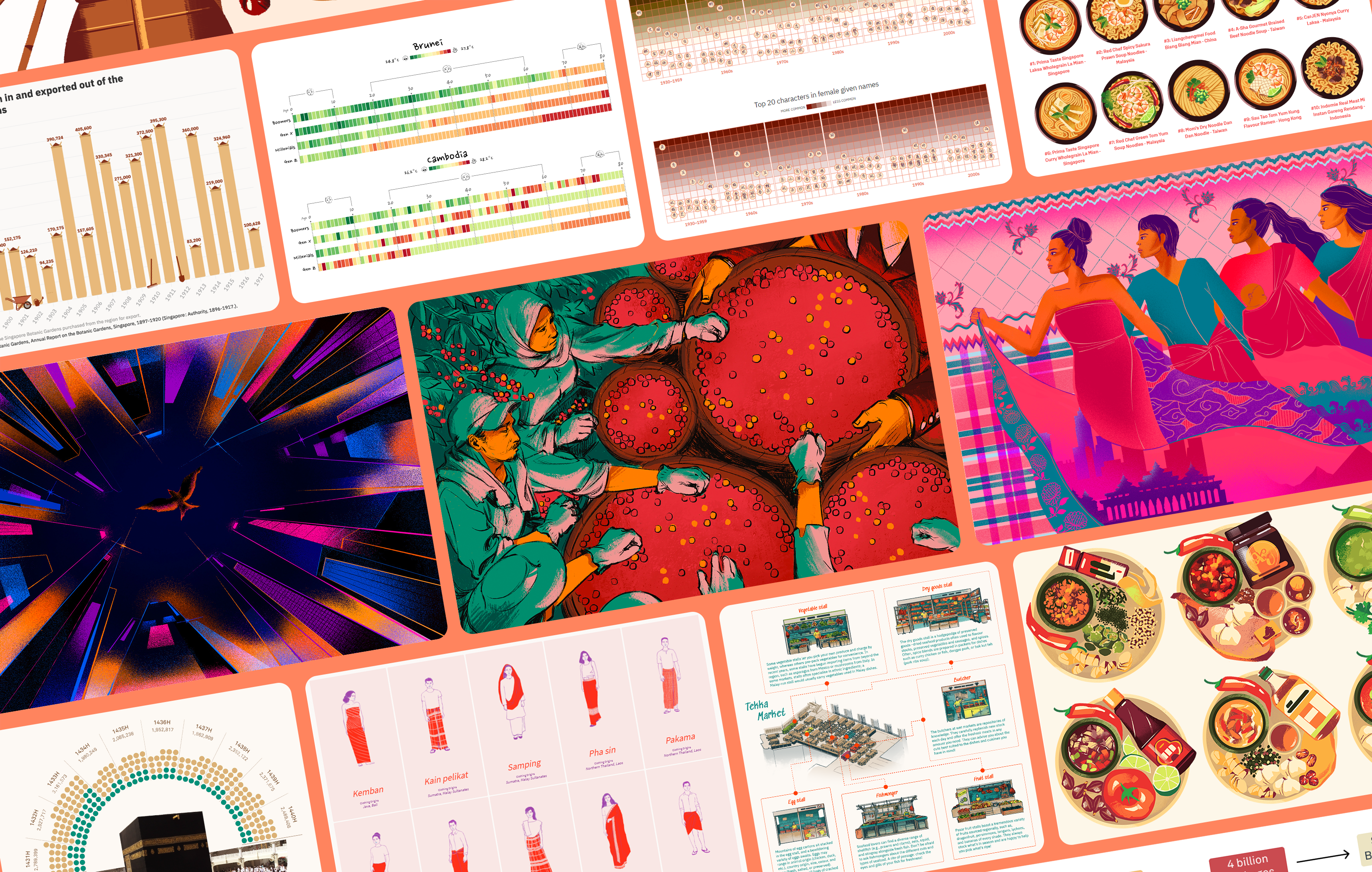
We have witnessed this ourselves: data visualization is a creative and experimental medium, and those characteristics have allowed many Asian practitioners to add their own cultural elements to their work. We’ve seen how traditional Asian art forms can be used for data visualizations, such as henna art, embroidery patterns, calligraphy, and more.
Our hopes and dreams for Asia’s dataviz scene
Economic observers often talk about Asia’s potential to shape the world. We agree, and not just because of our region’s rising affluence. Asia’s diversity will be—has already been—a major game changer in so many fields. Our cultures hold new perspectives, creative ideas, and fresh information—and the world is paying attention.
As data practitioners in Asia, we have front-row tickets to this incredible transformation—even as we each bring our gifts to the world stage. Kontinentalist is a small entity, and our reach is modest, but we’re working hard with our fellow dataviz practitioners here to address the challenges we all face.
We’re starting by partnering with as many causes as we can to bridge the gap between their data and the public. We want the NGOs, non-profits, and research groups here in Asia to realise the full potential of their data. We can all do good work with this, even if official government data remains hard to come by.
We’ve been chipping away at this for two years now. Our latest collaboration with Médecins Sans Frontières/Doctors without Borders on the Hepatitis C epidemic, for example, is meant to help uplift causes that we believe deserve more attention.

Championing Asia’s cultures through data is also a big part of the work that we do. People often say it’s difficult to tell stories without good data, but many don’t realize that they’re only looking at quantitative data or assume that data must be statistically tested or peer-reviewed for it to be usable.
At Kontinentalist, we challenge this by developing stories that reveal the data all around us. Data is in our languages and cultures; we just need to take a closer look. We use our platform to spotlight aspects of our cultures that we love and celebrate. It’s also an incredible opportunity to be at the forefront of this change and to see our own cultures get the representation they deserve—delivered with proper context, nuance, and visuals that capture their spirit.
Since Outlier 2021, we’ve been wondering how we can contribute to this newfound community and help keep its momentum going. Our new friends had so many personal tales to tell, and so many lessons to share, that we decided to dedicate our “Community” series—an ongoing series of interviews—to Asia’s data practitioners and enthusiasts. We want to amplify their work and create an affirming space where members of our community can connect with one another.
It’s a small effort right now, but we hope to start a movement with it. Asian data practitioners should be proud of their identity and their work. We hope our platform encourages them and allows them to share their challenges. As the world comes to recognise the need for diversity and inclusion, these voices have never been more important.

This is only the beginning. As Asians, we often joke that we’ve been brought up to achieve good grades and overachieve academically. But this shows up in the data landscape here, too. Most data visualization courses target business analytics, dashboards, or Big Data. We hope to blur the lines between business, science, and art, and to show that there is more to the industry than meets the eye. We have plans to launch data visualization workshops in Singapore for newcomers by the end of the year, with the aim of connecting them with experienced professionals so they find a community that keeps them going. We hope that with this small but close community, they may push the boundaries of imagination and create unexpected, beautiful data stories.
Asia’s dataviz scene is coming into its own. It may seem nascent, but this just means there’s greater flexibility and room for change. We want to be with it as it grows and succeeds. Many people have reached out to affirm our efforts and let us know we’re on the right track; we hope you feel the same. Join us in growing this movement—or even start your own!

Pei Ying wears many hats in Kontinentalist. She leads the company in achieving its overall business and editorial goals, making strategic business development plans, and managing partnerships. Her background and passion for history is the driving force behind many of her stories, which delve into cultural and historical contexts. In her free time, she is likely tending to her veggie garden, cooking, or cuddling her two fat cats.
- Loh Pei Ying


