
“If you give a donkey two servings of food, equidistant apart and of equal quality, then the animal starves.” This was a saying I heard growing up, at the time I had no clue what it meant. The phrase is a paradox about determinism called, “Buridan’s ass,” written by philosopher Jean Buridan in the 14th century. Without completely boring you, Jean suggests that equal options make for hard choices. A concept found to be true in everything from research on 401k selection to decision fatigue. The act of choosing quickly becomes an obstacle.
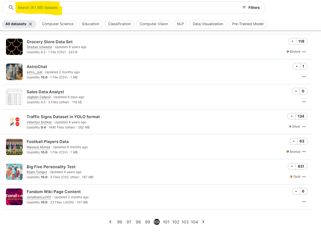
And the act of choosing is one reason for our issues with selecting a dataset to viz as there are so many out there! Data.gov, the U.S. federal data repository, contains over 290,000 datasets and Kaggle, an open source data clearing house, contains over 350,000 datasets. These large numbers do not include curated datasets found in communities or challenges like Makeover Monday (400+ sets) and Games Night Viz (40+ sets). These totals also don’t include research-focused sets found on independent websites like Opportunity Insights or the famed IPUMS (Fun fact: finding an error in IPUMS data earns you a mug #nerdcred #lifegoal). If these database totals were not enough, then consider that data itself is growing at a rate described using the term “zettabyte” or number with twenty one zeroes–1,000,000,000,000,000,000,000.
With 500k+ datasets to choose from, a number growing exponentially by the way, many of us are starving rather than designing. Starving is not sustainable for our field as mastery is a byproduct of activity. Letting infinite data options get in the way of our designs is a real problem. Random selection presents an interesting answer to this challenge. Going to a data clearing house website, using a random number generator to pick a dataset, and then building anything. The idea reminds me of Powerpoint Karaoke, and there is even some logic to it, as well. In Algorithms to Live By, Brian Christian and Tom Griffiths suggest that when all options are equal, a computer will select randomly and so should we. That said, random selection means designers spend more time doing exploratory work as well as preparatory work and less time designing.
My first suggestion to speed the process of dataset selection is to choose a prompt before choosing a dataset. I do not mean choosing an insight, only a prompt. An example insight is “Dreamworks made $252 million, on average, less than Pixar over the past decade on computer animated films.” Insights require specificity and a clear takeaway based on data. Selecting an insight in advance is ill advised, because it can introduce bias and feels like guesswork. Compare that insight with a corresponding example prompt, “Explore box office gains for computer animated films between companies.” The broadness of the prompt allows us to uncover insights as we design, turn one insight into the narrative message, and then build around that.
Prompts are strong choices as a starting point for many reasons. They allow for natural insight discovery as was mentioned above, but I also believe the time to identify a viable prompt is shorter than the time to “find what the data tells you.” Running through exploratory cross tabs and distributions feels, for me, like walking in the dark. Even if I had a list of preliminary analyses, the process seems like a patchwork solution at best as you hope for a large variation somewhere. In fact, the phrase, “what the data says,” can be a workplace red flag for me. Now compare this to prompts where I can turn to many preset challenges like Makeover Monday, Workout Wednesday, SportsViz Sunday, GamesNightViz, and ProjectHealthViz. Each of these have comparative content, lead in discussion, and some even have videos exploring the content of the field.

Let’s say though you have a prompt, but no dataset to work with. The above examples, many of them provide both prompt AND dataset. Having a prompt with a dataset is not necessarily reflective of organic design requests. The situation of prompt with no data happens to me the most when I am fielding questions from an organization. Someone, for example, asked me to explore the impact of outdoor advertising. The prompt was simple, “could outdoor advertising help support awareness or even growth of an organization?” This turns out to be a prompt without a dataset, so what did I do? The next step for me was to chunk the prompt (“awareness or even growth”) into smaller components and then figure out which of those components work with a dataset. It is best to find a dataset that can explore some part of the prompt.
The chunking process I employed to study this prompt breaks into three components: efficacy, audience, and cost. I tried defining these components with simple questions. Is this solution effective at generating attention? How much attention will this solution generate? What is the price of this solution for generating this attention? Using questions as a way to summarize prompt components can be effective in isolating where the data can come into play. Efficacy on outdoor advertising was about finding research on how many folks look at road signs all the time, which is about 37% of driving people. There was limited research on the subject, meaning a dataset would come from either audience metrics or costs. The cost information seemed to be proprietary and changed from company to company, implying the data would not be driven from there.
This leaves us with the attention outdoor advertising could generate. Given outdoor advertising tends to occur on the highway we would need to know how many drivers use a certain part of the highway at any given time. This idea becomes the way I start searching for the dataset. I broke information into smaller components until one yielded a dataset idea that matched the prompt. With that concept in mind, we move onto identifying the key terms and in this case it was “daily highway traffic.” I start getting search results that explore traffic volume and location. At which point I selected a state website, the Kansas Department of Transportation’s Traffic Count maps.

PAY DIRT! These maps tell me seasonally adjusted daily traffic totals for the highway as well as the neighborhoods. The only problem is that, and this is common with government records, the information is a PDF. It is at this point in the process I selected a single location where I knew there was an open sign and calculated from there. If I wanted a live map, I would start looking for similar datasets both federally and or in other states.
The concept of finding a dataset to create with can be challenging. For most of us, I would suggest leaning into the world of challenges and communities as an excellent way to garner both prompt and dataset. This lets you as the designer focus on creation and storytelling. In those cases when you have a prompt, versus an insight, and that prompt does not have a dataset you can still make it work. Break the prompt into smaller components and iteratively search each component until you find a dataset. My preference is to government and research data sources, but to each their own.

Christopher Laubenthal focuses on better data use with visualizations in an organizational setting. He has experience in both for-profit and not-for-profit sectors where he increases literacy, grows culture, and builds data visualizations. Christopher is the Data Design Manager at The DeBruce Foundation, a national foundation whose mission is to expand pathways to economic growth and opportunity. Current projects include his public viz and The DeBruce Foundation’s Career Explorer Tools.
- Christopher Laubenthal

- Christopher Laubenthal

- Christopher Laubenthal

- Christopher Laubenthal


