
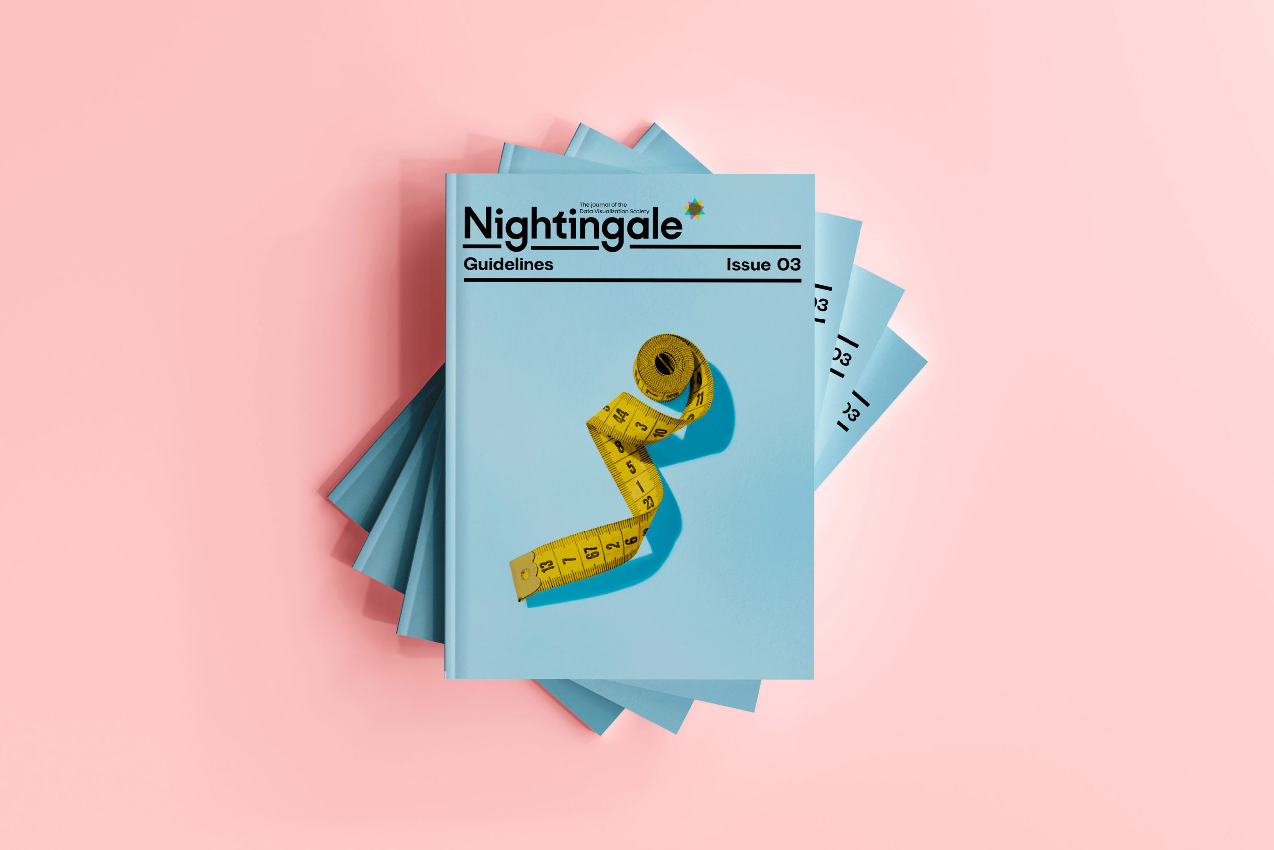
Issue 3 is here (Buy it quick before it sells out!) and we honestly could not be more proud of it! Issue 2 was all about inspiration, but we like to keep our community guessing, so we figured we should explore a different aspect of the discipline by focusing issue 3 on guidelines! And what is a guideline anyway? Well, you are in for a treat because we have a smorgasbord of perspectives, ruminations, and outright hot takes on the subject.
While we all know “it depends” might be the easiest answer, it certainly isn’t the only way to look at guidelines. Our editors took a broad view in finding ways to consider the act of guiding someone to do something versus the mindset of supporting someone to make faster or more standardized decisions.

There is a lot of design discussed in this issue, from the advanced design systems of Moritz Stefaner, to Leticia Ange Pozza’s take on building data products, to the very first rumination on data design by Étienne-Jules Marey in 1879. Knowing how we design data to be understood is central to Zan Armstrong’s essay, “Make the Important Visible.” Then again, Nadieh Bremer isn’t afraid to shake things up by “Embracing the Taboo!”
Of course, it’s super important to know who your data viz is for. We are delighted to feature a 12-page special feature on accessibility for data viz curated by our new managing editor Emily Barone with content from Frank Elavsky, Jaime Tanner, Johny Cassidy, and Ben Willers. Complementing that section nicely is William Careri’s article, “Designing for Neurodivergent Audiences.”
Our recurring Career Tooltips section features an essay by Jon Schwabish on how to critique a dataviz, while Stephanie Evergreen shares insights from her checklist evaluating the effectiveness of a chart. Shira Feder pounded the pavement in asking a host of experienced professionals across multiple fields what rules they have embraced over the years. The section is rounded out by a new feature, “Dear Dr. Data,” which is our new “advice” column—just don’t take it too seriously.

There’s loads more: We have one of our favorite Dataviz Horror Stories from Miriam Quick, a new Dear Nightingale challenge hosted by India Johnson, and a fun Data Is Plural challenge covering works by Jane Austen and other literary greats! That’s not even counting feature articles by Marco Hernandez, Lisa Charlotte Muth, Joey Cherdarchuk, Peter Grundy, Sonja Kuijpers, Erin Waldron, and Ellen Bechtel, and more. Holy smokes, have we squeezed in a ton of grade-A quality!
How did we get here?

We want to thank our editors and editorial committee who kick-started us back in February. As you can see, we had A LOT of ideas and quite a few of them made the full journey from seedling to blossom. We need to work harder to make a “Sartorial guidelines” article, though. That seems like a ton of fun (heyyy, why not write one for issue 4? Our deadline for article submissions is July 15th!)
Putting this all together is absolutely a team sport, so here’s a little behind the scenes in the form of Q&A with the core team (Emily Barone, Julie Brunet/datacitron, Jason Forrest, and Claire Santoro):
1. Obviously all of the content is fantastic, but what’s one of your favorite articles from issue 3?
EMILY: I am so, so, SO proud of the collection of articles that fit into our “accessibility” coverage. It’s a great mix of topics, from neurodiversity to visual impairment, all with a focus on how our industry can become a leader in this space. (I’m biased, of course. As a data viz practitioner, this topic is close to my heart. As an editor, researching and shaping these stories was a great learning opportunity!)
CLAIRE: It’s so hard to choose! I love the variety in issue 3—there are practical how-to’s, visual inspiration, personal stories—but one of my favorites is the story behind a trail map designed by Ellen Bechtel. That article gives us a different way of thinking about guidelines, or, as Ellen writes, “the lines that guide me.” It’s such a relatable story for data viz enthusiasts. It’s not about creating charts for mass communication, but rather about using data viz to make something special and meaningful and personal.

JASON: I think our reprint of Étienne-Jules Marey’s Graphic Method introduction is absolutely fantastic. Not only is it a deeply interesting perspective from when the concept of science was becoming codified, but it’s easily one of our best designed articles (by the amazing datacitron, of course). Also, I giggle and giggle over the new “Dear Dr. Data” section. I dunno if people will get it, but I find it hilarious.
JULIE: Like in the previous issues, designing a meta-viz about the magazine itself (Disturbances) was a treat. I’m really grateful for this opportunity to explore and experiment with an unusual form of visualization. Otherwise, I really love the Graphic Method piece. Not only because I loved designing this messy collage article, but mostly because I find it amazing to give a new life to the brilliant work from the past.
2. What was particularly challenging about issue 3? (No pointing fingers at difficult writers or illustrators!)
EMILY: The writers and illustrators were awesome. But the managing editor… eek! She had to learn on the job which really slowed everything down. Thank goodness she had fabulous colleagues to support her—love you, guys!—and is ready to rock the next issue.
CLAIRE: We’re thrilled to have you, Emily! I think we all had a bit of a learning curve with issue 3. The biggest challenge for me wasn’t even the magazine itself—it was everything we needed to do to upgrade our printing, fulfillment, and subscription processes. We changed almost ALL of our logistics between issues 2 and 3. But those changes were absolutely worth it.
But in terms of the magazine, I think one of the biggest challenges was finding the right layout for graphics-heavy articles. Take Lisa Charlotte Muth’s piece relating data viz to art theory. That topic obviously comes with a lot of imagery, and you want to make sure all the fabulous works of art and data viz have enough room to shine.
JULIE: To be honest, I always find every article challenging. You would think that being the third issue, the fear of the blank page would be tamed by now, but not really… At the same time, that’s where all the fun comes from, right?!
JASON: I had the worst time curating the gallery section this time. The previous two issues were pretty straightforward to find great content, but this time I was paralyzed between choosing different curatorial concepts. In the end, I opted to focus on “trailblazers” and I’m very pleased with the results!

3. How did the issue 3 process compare to issues 1 and 2?
CLAIRE: The total time spent compiling the magazine was similar to issue 2 (about three months), but the process was more predictable. Now that we’ve done it a few times, we have a much better sense for the workflow! From the time an article submission comes in, it moves through a predictable series of steps: an initial edit with the author in Google Docs, setup in InDesign, layout and design by Julie, design edits in parallel with copyediting in InCopy, and, finally, compilation of the whole PDF. It’s beginning to feel like we know what we’re doing. And of course, as with issues 1 and 2, we owe a lot to our volunteer editors! This issue is immeasurably better because of your ideas, edits, and keen eyes. Thank you!
EMILY: As this was my first issue, I cannot compare the process; only the final product. And this issue is a tier above.

JASON: As we mentioned in our Podcast with Andy Kirk at Outlier, issue 3 was not just assembling the issue, but also rebuilding our entire operation. Not only did we make the issue, but we switched to a US-based printer, built a new online shop, and established the new infrastructure to mail to more countries, faster, with order tracking. Honestly, it’s been a lot, but we’re glad we did it.
JULIE: Our global process stayed the same as Claire explained it, though improved in terms of copyediting thanks to Emily’s inputs. We’re trying to find ways to make things more efficient and smooth, but the very nature of Nightingale (being a collective publication) requires more flexibility and adaptability than, well, too strict guidelines !
4. What are you most excited about moving forward?
EMILY: Our new systems! While editing and designing issue 3, our team was also really busy developing new back-end systems and resources—a fresh style book, a more-efficient content management process, a new fulfillment and distribution system—which will all make issue 4 (and issues 5, and 6, and 7…) a much smoother process!
CLAIRE: I’m actually really excited about the theme for issue 4: “emotion.” Some of my favorite articles are the personal or quirky ones—data humanism, data art, physical data viz, etc. “Emotion” is an open-ended enough prompt that I think we’ll get some creative pieces! (Submit yours by July 15!)
JASON: I am super-excited about rolling out some MERCH! Get ready for some DVS and Nightingale T-shirts, sweatshirts, mugs, hats—you name it! I’m also really excited about the theme for issue 4, “Emotion!”
JULIE: I’m looking forward to the return of the Kids’ Table in the next issue! We couldn’t make it this time due to the massive reworking of our processes and entire operation, but this is our top priority for issue 4. It’s a really important part of the data literacy agenda and it’s an absolute treat to design!
And if that wasn’t enough…
We also had the absolutely honor of being interviewed as a team by the one and only Andy Kirk for his Explore Explain podcast! The episode was taped live at the Outlier Conference (which was just fab) and featured our whole editorial team. Here are the video and audio versions:

Nightingale Editors
Our Nightingale editorial team currently consists of Alejandra Arevalo, Brian Cort, and Teo Popescu. Reach us at Nightingale(at)Datavisualizationsociety.org
Datacitron (aka Julie Brunet) is an independent data & information designer as well as the Creative Director of Nightingale, the journal of Datavisualization Society. She believes in the accessibility of information through design and storytelling, and the virtuous role data designers can play in our society
-
datacitron

-
datacitron

-
datacitron

-
datacitron


