
Visualizations are essential for telling the stories of science. Through visualized data we can be transported to far off nebulas or trace our genetic connections to all life. We can see larger patterns in our environment, watching our seas warm, viral cases rise and fall, and the paths of fires and hurricanes cross our landscapes.
But visualizations are not just useful illustrations in the stories of science. They are essential tools for doing science. Science is not descriptions of DNA or nebulas, but the very process by which we study these aspects of the world by making observations, asking and answering questions. Like a microscope or telescope visualizations give us access to realms we cannot see, transforming bytes of data into forms for exploration and experimentation.
Engaging people with science means using visualizations in both modes: as a visual for communication and as a tool for discovery, a way to explain and explore. But in our current fixation on using visualizations for “storytelling with data,” we often overlook their role in exploration. Visualizations that foster exploration, allowing people to find their own stories or ask their own questions, are rare.
The emphasis on visualizations that tell stories rather than support exploration makes sense. Stories are thought to be one of the earliest forms of knowledge transfer, and we read, tell, see, or hear stories almost every day of our lives. We know how to tell stories. But how do we create platforms for exploration, mediums for people to create their own knowledge?
For guidance on how to create exploratory experiences, we can look to science museums. Since the 1960s, science museums have moved away from experiences that present facts, such as dioramas and planetarium shows, and toward hands-on, interactive exhibits where people can develop their own ideas. For example, rather than being shown how a lens bends light in a static display behind glass, people can now experiment at tables with lenses, prisms, and mirrors to explore the properties of light on their own. Over the last three decades, there has been intense study on how to design these exploratory exhibits to support learning and exploration. These studies have converged on a set of attributes shared by exhibits that support exploration.
How might these studies of museum exhibits inform the design of exploratory visualizations for the public? Given the importance of large datasets in modern science, many science museums have been tackling this question. Several large-scale studies have partnered curators, visualization designers, and computer scientists with social scientists to study how people interpret and explore data visualizations in museums. These studies have shown that the design attributes that support exploration in traditional museum exhibits apply to visualizations. But perhaps not surprisingly, this complex digital medium requires additional design considerations. The outcomes of these studies are synthesized in the following guidelines for designing exploratory visualizations for the public:
Provide a space for exploration
A hallmark of interactive exhibits that successfully promote learning is that they have multiple possible outcomes. Unlike a story, there is not just one path. Rather, there is a seemingly open-ended space each learner can explore their own way. The exhibit becomes a platform for the learner to bring their own questions, knowledge, and meaning to a phenomena and construct their own learning through interaction. The success of such open-ended experiences to support learning in museums is rooted in theories of education pioneered by John Dewey and Jean Piaget in the first half of the twentieth century. Two decades of study in museums have validated that an open-ended or multi-outcome experience is a key design feature of exhibits that support learning and exploration.

Open-ended experiences have also been shown to support learning in digital visualization-based exhibits. In Plankton Populations, an exhibit at the Exploratorium museum, studies found that people could ask and answer their own questions of a large, multivariate ocean dataset created by scientists at MIT. Moving lenses on a large, interactive tabletop visualization, visitors zoomed in to observe what microscopic plankton lived in different regions of the ocean at different times of year. In the DeepTree exhibit, visitors to several different natural history museums successfully explored evolutionary relationships of over 70,000 species in an interactive phylogenetic tree. In both of these exhibits, museum visitors could explore the seemingly limitless interactive visualizations to ask and answer their own questions of large scientific datasets.
Use familiar objects, actions, or representations
Providing a familiar entry point into an experience is another key design attribute of exhibits that support engaged learning. Learning scientist Sue Allen, who has conducted many studies on interactive exhibits, posited that familiarity can help learners overcome the cognitive overload that can come from the seemingly limitless options in open-ended exhibits. Incorporating the familiar provides what Allen called “immediate apprehendability,” giving learners an instant entry point into what they are looking at or what they should do.
Studies of visualization-based exhibits suggest that incorporating familiar objects, actions, or representations may be an especially critical element of the design. While traditional exhibits often have immediately recognizable elements such as water, sand, or mirrors, visualizations usually represent a scale or phenomena that is completely unfamiliar. A major finding of the VISUALISE project, which convened 85 visualization designers and researchers to synthesize their work, was the difficulty people have interpreting visualizations in science museums and other public settings. For example, a research study on Plankton Populations found it took museum visitors an average of 46 seconds to decode the visualization of ocean microbes and begin exploring. This resonates with findings from Katy Börner’s research group, which tested 20 common visualization types with museum visitors. This study found that visitors could only identify and interpret basic visualization types that are typically introduced in school, such as charts and graphs. Even recognition of these seemingly familiar forms only hovered around 70%.
Structure the interaction
Structured interaction is another design attribute of exhibits that successfully engage people in exploration. Carefully structuring an interaction can reduce the “everything everywhere all at once” sense of overwhelm an open-ended exhibit can induce. Well-vetted strategies for structuring interaction include limiting functionality (for example, by making the phenomena only accessible with the hands through barriers) or creating a hierarchy of salience (such as making a control knob or a label more prominent). These strategies for structuring interaction with physical phenomena in museum exhibits are consistent with recommendations from the visualization research field, such as Jeffrey Heer and Ben Schneiderman’s taxonomy of interactive dynamics for visual analysis which include tasks such as sort, filter, and guide.

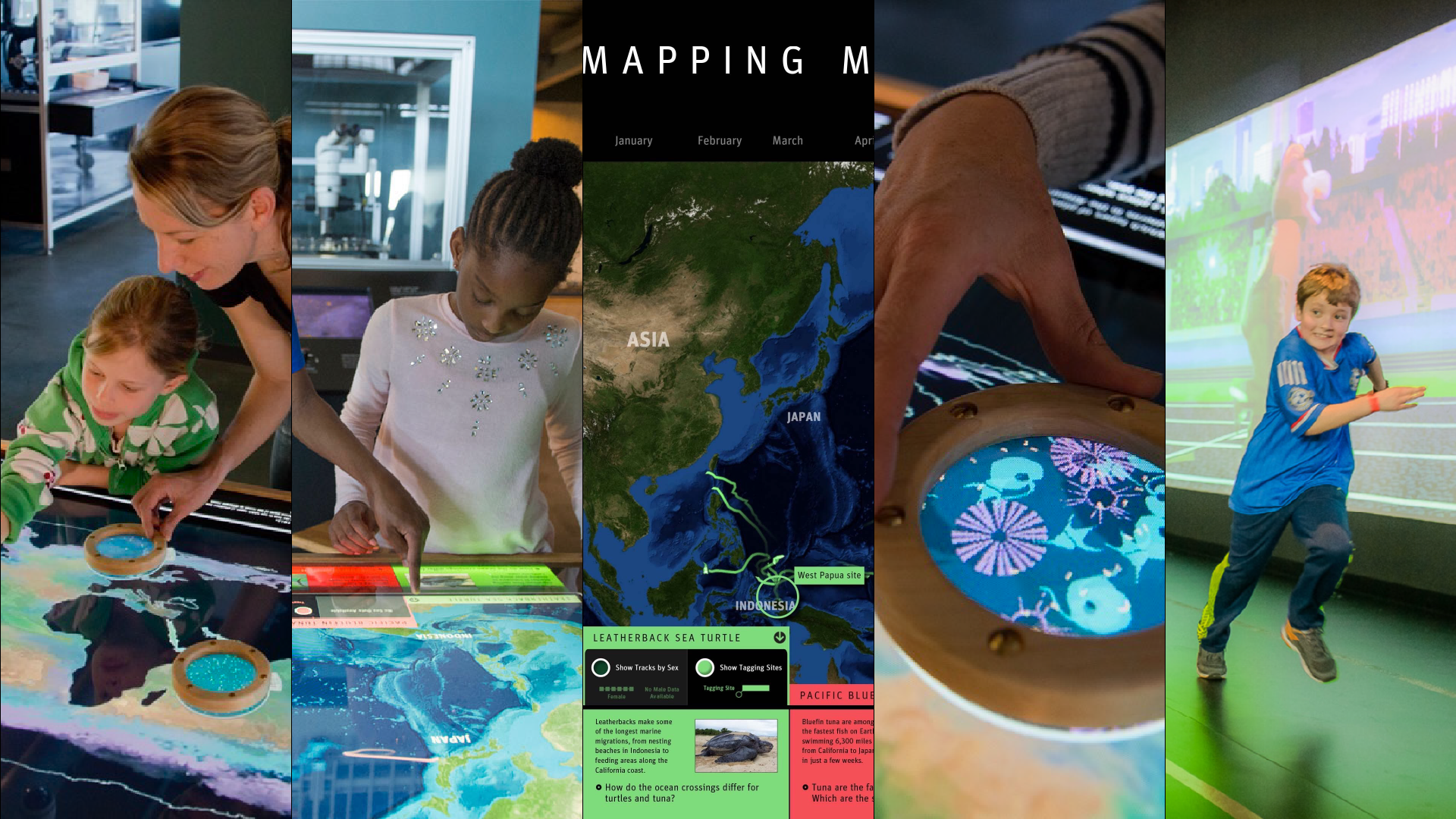
Several studies of exploratory visualizations have also shown the importance of carefully structuring visitor interaction. In the Mapping Migrations exhibit at the Exploratorium, designers structured visitor exploration of data from the Census of Marine Life project by creating control panels for each animal. Rather than displaying the paths of all animals at once, visitors could choose which paths to display and could turn other data, such as the sex of the animal, on or off. This ability to sort and filter not only allowed visitors to focus their exploration, but also supported making comparisons between different animals. In the Gebelein Man mummy exhibit at the British Museum, visitors could interact with volumetric visualizations and computer tomography data to explore the inside of the mummy in the same way scientists do. Rather than overwhelm visitors with all the planes of view, exploration was limited to specific planes and directions.

Foster social interaction
Museums are social environments where families, school groups, and friends go to have shared experiences. This social experience is not only a feature that draws people to museums; it has been shown to be an important part of the learning that takes place. Numerous studies have established that promoting social interaction is a design attribute of highly engaging exhibits. For example, a social or collaborative experience was found to be a key design attribute in exhibits that were more engaging for girls in the Exhibit Designs for Girls Engagement Study at the Exploratorium. Similarly, providing multiple stations where visitors could see each other’s work was a design feature of successful exhibits in a study of examining Active Prolonged Engagement.

Building on this prior work at the Exploratorium, the Plankton Populations and Mapping Migrations visualizations each had multiple distinct interaction points where visitors could explore the data set without interfering with the experience of other visitors. In Plankton Populations, this was accomplished with three physical lenses that gave individual visitors their own interface to “zoom” in to see plankton living in different regions of the global ocean. Visitors shared observations with others in their social group and often brought their lenses together to make comparisons. In the Walk exhibit at the Science Museum of Minnesota, visitors were encouraged to work in groups to compare data collected about their walking speed and to process visualizations of this data together. Studies of this exhibit not only found high engagement in groups, but that members of the group could support each other in data interpretation.

Leverage the power of words
The thoughtful incorporation of text is another key design attribute of successful interactive exhibits. Most studies of traditional exhibits have focused on the labels around or adjacent to a physical phenomena that cannot have text added to it, such as flowing water or moving sand. These studies have found that label text that provides guidance, such as how to use an exhibit or what questions to ask, is a key feature of exhibits that are engaging.
Studies of interactive visualizations in museums have also found that text is a critical aspect of design. But unlike traditional exhibits where text is often in an accompanying label, the critical text is embedded within the visualization itself. A study of how visitors used the Gebelein Man and DeepTree visualizations found that placing supporting explanatory text such as “information spots” in different layers of the visualizations was valuable in supporting exploration. In the ocean science visualizations at the Exploratorium, even the integration of simple text elements such as labeling maps or adding annotations, has been found to aid museum visitors navigating complex visualizations. Anders Ynnerman and colleagues have highlighted the importance of weaving of explanatory elements within exploratory visualizations by suggesting a new term for the genre called “exploranation.” Contrary to findings at traditional exhibits, a number of studies on visualizations at the Exploratorium suggest that text or other narrative elements outside of the visualization itself do not increase visitor exploration. This may relate to the difficulty people have connecting external content to what is happening in a large, dynamic visualization. While much more study is needed on the role of text and other narrative elements in supporting exploration with visualizations, it seems clear that well designed onscreen text can support exploration.
The above guidelines can be used to design visualizations that foster exploration, letting people tell their own stories, ask their own questions, and construct their own knowledge. They are grounded in several decades of research in museums on both traditional and visualization-based exhibits. Conducted with people from a wide range of ages, education levels, political affiliations, and other identities in public settings, these guidelines are an important complement to guidelines used to train visualization designers, which are often based only on studies done with university students. While each dataset and context is unique, these guidelines can provide a starting point for creating visualizations that are a medium for exploration rather than explanation for the public in contexts beyond museums.
These guidelines were developed by examining studies of visualizations in the context of well-vetted guidelines for designing traditional interactive museum exhibits. What emerges is that while the same core design principles can be applied across both types of experiences, designing exploratory visualizations for the public requires additional considerations. Finding familiar entry points, reducing complexity, and the thoughtful integration of text seem especially critical for engaging learners in exploration with these novel digital forms. This is not surprising, as visualizations engage people with phenomena beyond the realm of their direct experience, such as climate patterns, genomic relationships, or evolutionary time scales, often with unfamiliar representations. Identifying the types of representations that best support exploration with different audiences, and how these experiences might contribute to public data literacy, are exciting areas for future research.
Storytelling with data is a powerful way to engage people with our rapidly changing world. But equally powerful is giving people the ability to tell their own stories, making their own way through a data set with their own unique set of questions, knowledge, and values. By providing these guidelines for creating exploratory visualizations, I hope to encourage visualization designers to create more of these experiences that let people construct their own meaning in previously unseen worlds.
Jennifer Frazier leads the design and study of visualizations for science museums and other public venues. She is the director of the Public Data Initiative at the Science Communication Lab and an Adjunct Professor of Biochemistry at the University of California, San Francisco.


