
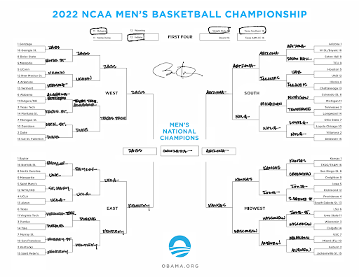
Another year, another successful March Madness! From renowned bracketologists, to casual bettors, and even former Presidents, millions of people embark on a quest to achieve the perfect bracket like at no other point in the sports calendar. But, despite widespread interest and popularity, the design of a single elimination tournament leaves much to be desired when researching teams, predicting outcomes, and analyzing results. Can we use data visualization to transform paper brackets into interactive data experiences?
We need to first define the parameters of what is essential in any bracket design. A single elimination tournament bracket is a tree diagram that tracks the progression of teams across games where the loser is eliminated in head to head matchups. A bracket must show the entire pool of teams and each subsequent round on the same view. Each team shall have some indicator to describe seeding. Seeding is the preliminary ranking for each team to determine their initial opponents. Higher seeds play lower seeds. It should also track winners and depict team advancement. A completed bracket is an artifact that captures the tournament story into a single picture.
Current bracket design is primarily catered to casual participants who enjoy the annual tradition of filling out a bracket. But this base case is severely lacking for serious bettors, basketball enthusiasts, and skilled bracketologists. I think about bracket design in three classes:
- Research: How can we super charge brackets to include more information about particular matchups beyond seed numbers?
- Prediction: What are various methods to improve the act of making predictions? Note that this is not necessarily mutually exclusive from the research phase.
- Evaluation: And lastly, when the winner is decided, can the bracket inform us not only who won, but how they won?
A single bracket view cannot necessarily answer all of these questions in one go, but defining the use cases and exploring custom views for each problem will help facilitate a discussion on the future of bracket design.
Research
Researching how to fill out a bracket includes sifting through rankings, scanning team statistics, and even learning about anecdotal stories behind each team. While extensively available, the data is separated and outside of the bracket. Exploring the research phase is how we can integrate external resources and data points into the main bracket design.

For starters, the “NCAA March Madness Men’s Bracket Challenge” sponsored by Capital One makes team statistics readily available on each matchup through an informational icon on the right of the matchup. Clicking this opens a modal containing relevant matchup information between the two teams. Users can even compose a custom analysis by choosing specific stats and weighing them to create a composite score. While all of these features are useful, they are outside of the bracket and a separate experience and product altogether. Integrating matchup information within the bracket design keeps the selector within the same context and enables them to easily compare across multiple matchups, not just one matchup.

In 2013, Sean McDade experimented with the idea of data integration in bracket design in his article “Men’s NCAA Interactive: Redesigning Bracket Slightly Easier than Winning It.” One visualization structure he explored in his brainstorming process was to integrate various team statistics directly into the bracket as means to compare matchups as shown below.

Each region is depicted as a radial pie with 16 teams each. A line for each team is drawn where the length of the line represents the ranking of how that team performs against a particular statistic. Higher ranking teams have lines that extend to the circumference of the circle, while lower ranking teams are shorter. While certainly unique, McDade describes how “It may be adequate in comparing statistics. It’s weak, however, in its principal functionality: to display team advancement and subsequent rounds.”
Positioning relevant data points closer to individual matchups in bracket design provides clarity and transparency behind each selection and decision. Figuring out what data points are important and sifting through the noise is an obstacle for a general participant. However, for the veteran bracket picker, it may be a boon to have data analysis built into the bracket.
Prediction
Moving the bracket selection process online has made it easier to fill out brackets, undo selections, and manually play out scenarios. In its current form, the prediction phase is focused on simple data entry, however. The design does not afford any conveniences on informing the user of any trends or biases made during the selection process. The “ESPN Tournament Challenge Bracket App” makes the prediction process effortless for the casual fan who wants to fill out a bracket. This is useful for someone who doesn’t know anything about college basketball, but may end up being clutter for a basketball enthusiast.

For a serious player who does not pick teams on a whim, how do we introduce additional context within the bracket to improve predictions? This may span information about previous picks or even consolidated picks from multiple brackets. Adding in how many upsets are predicted informs the bracket picker of perhaps their own biases towards underdogs. For the expert bracket picker who makes multiple brackets, we can aid the prediction process by transplanting information from completed brackets into ones in progress. For example, before selecting “Duke” to move on in the third round, we could remind the user how they have that same scenario playing out in 15 of their other 20 brackets. This reduces risk and increases exposure to other teams which is important when trying to build the perfect bracket.
Constructing a bracket with win probabilities is something Micah McCurdy does in his Wimbledon brackets to directly convey odds of success. Each player in the tennis tournament has a different chance to advance in each round. The probability is depicted in each matchup and flows over to the final round. Skill between players or teams in a tournament greatly varies. In a traditional bracket, the odds of success are unclear. Micah’s visualization clearly communicates the tournament favorite is and the likelihood for each player to advance. This makes it easier to play out scenarios and make better predictions.

By combining prediction capabilities along with supplanted research information, the bracket picker is well equipped to not only view their predictions but see how they arrived at it. This creates a sense of accountability that is measured in the next phase: evaluation.
Evaluation
As tournament games unfold, participants track winners and scratch losers. The traditional bracket design represents results in binary format. Did the team win or lose? The story of an individual game where both teams face the highest pressure to win is lost on the larger scale of the tournament bracket. How can we incorporate not just what happened, but how it happened?
Chris DeMartini explores how we might visualize results in tournaments across different sports. In collegiate golf two formats are combined: stroke play to determine qualifiers and then a standard elimination tournament between the qualifiers to determine the winner. Chris weaves the results for qualifier and then the eventual tournament into a single visual. The results for each team in each round is represented as a stacked bar chart where cumulative round score is highlighted while cumulative team score is faded. In the playoff graphs, each head to head team is represented with a series of dots where the distance between the dots is the margin of victory. This provides a concise visual on what happened in a single match.

A traditional bracket design would simply depict the tournament side of the competition and show who advanced at each stage; however, Chris’s bracket visualization not only shows the story in each match, but also provides the qualifying background to show how the tournament teams got there. This visualization, available here is full of interaction points to provide details on demand without taking the user out of the bracket.

In the same style, another of Chris’s visualizations depicts the NBA playoffs where you can see the flow of a game. The NBA playoffs is a 16 team tournament over the course of several months to determine the NBA champion. Each team plays in a best of seven game series to determine who advances. A traditional bracket will tell you which team won and who they beat, but Chris’s visual literally depicts the highs and lows for each game in each series across each matchup. This bracket design is engaging because you can track how each team performs in a single game and how they performed in the entire series. This visualization is available here. The road to the finals isn’t easy. Each team has their own path. Evaluating the results and visualizing the journey doesn’t reduce a tournament into just winners and losers, but instead crafts an artifact you can look back on.
From paper brackets to innovative designs on the web, bracket design has evolved because innovators make daring design decisions, technology improves, and more data becomes accessible. Each iteration is a step forward towards creating a better bracket experience as the research, prediction, and evaluation phases become interwoven. The NCAA March Madness Bracket Challenge shows us how we can access matchup data between teams. Sean McDade’s radial design took it further to directly embed data within the bracket. Micah McCurdy combined odds of success with potential matchup advancement to depict the path for each victor. And finally, Chris DeMartini shows how we can use bracket design as an artifact to trace how the winning team won. Each of these iterations explored a different segment in the bracket experience.
I believe future versions of bracket design will strive to combine the different segments into a single integrated view. The future bracket selection experience will integrate critical information into the same context where picks are made to improve the decision making process. Brackets will be redesigned to fit mobile layouts and possibly even take advantage of the interactivity available in the infinite landscape of the metaverse. More interaction points will be exposed to glean insights from all phases before, during, and after a tournament. And at the end, the bracket will transform from a research and prediction tool to a reflective story on what transpired.
What if we could apply the same principles in bracket design to parts of our lives? Brackets are organized vehicles to represent documented decisions between discrete choices. Outside of the world of sports and tournaments, we could use more data products that explicitly require us to document decisions and prepare us to reflect on choices made. Decisions like determining what house to buy, what major to study in, and even what to eat are all unorganized choices we constantly make despite lack of research and evidence. If we can make the other decisions in our life as organized as a bracket and integrate it with external data points, better prediction capabilities, and retrospective tools we will be able to make better picks in our own lives!

Advaith is a data visualization engineer motivated to create next-gen data experiences. He lives at the intersection of data, creativity, and programming.
- Advaith Venkatakrishnan


