
Organizations like Google and London City Intelligence have extended their design systems to include standards specifically for data visualization. This speaks to the growing importance of using data and metrics in an organization’s decision making and the value of branding them appropriately.

In 2014, I created one of the first ever data visualization style guides for the Sunlight Foundation and then another one for the Consumer Financial Protection Bureau (CFPB) in 2017. I’m excited to see more organizations devote resources into standardizing their data visualization work.
The first step is defining what exactly a data visualization style guide is. As part of the Data Visualization Society, I’ve begun collecting examples of guides across multiple types of organizations. I will be taking a deep look at what is common practice, how this differs across organization types, and identifying innovative extensions that others might consider incorporating into their own guides. The more examples I have for this process, the better, so please submit guides and add to the spreadsheet!

Data visualization style guides defined
Definition: Data visualization style guides are standards for formatting and designing representations of information, like charts, graphs, tables, and diagrams. They include what (e.g. types of charts) and why (e.g. reasons for using specific colors). Templates for various tools (like Excel, R, D3.js or Tableau) often accompany a guide to show the how and to make it easy for people to apply the standards from the guide.
Data visualization style guides fit within an organization’s larger design system. They include how other guidelines, like brand standards or editorial guidelines, apply to data visualization. For example, they specify how elements like a logo, brand colors, and language tone specifically apply to charts, tables, and diagrams.
Style guides maintain uniformity across different tools and software that produce charts. An organization’s charts should be consistent across tools and look visually similar to the rest of the blog or report it’s part of. Having a style guide with principles and components that work across multiple tools, rather than just one template for one tool, helps achieve this consistency.
Designing for data is a unique challenge. It requires considerable precision and numeracy, but also careful thinking about audience, perception and accessibility constraints. Because the information needs to be conveyed accurately and understood properly, there are additional design constraints when it comes to writing chart titles and displaying connection between labels and data. Styles and colors that may work when applied to illustration do not always work when applied to the density of information data visualization often needs to convey.
Examples of data visualization style guides
As mentioned above, I’ve collected data visualization style guidelines from a variety of organizations in a spreadsheet. Often these guides are used internally as part of a larger design system, but it’s helpful to look at examples across multiple organizations when creating one of your own. Different types of organizations have different types of information, audiences and needs. I’ve organized the examples by type, and will highlight especially effective features of each. Not all organizations release their style guides publicly, although publishing them can help build brand integrity and attract talent.
Non-profit
Sunlight Foundation
These guidelines spec out what colors should be used for and define particular palates that signify common meanings tended to re-occur in Sunlight’s work (like when used for political parties or pro/con charts). There’s also a detailed specification for basic chart structure and how to include branding to ensure that all Sunlight charts were consistent.

Cato Institute
This guide includes examples of how to most accurately show data visualizations for their audience and a section on how to implement different categories across types of charts. The guide clearly explains some charting best practices that may not be obvious to everyone within the organization that might make a chart if they haven’t had training.

Government
Consumer Financial Protection Bureau (CFPB)
This guide includes how to make charts accessible according to Section 508 of the Workforce Rehabilitation act, which is a requirement for all U.S. government technology. Because of the how often CFPB needed to compare projections with historical trends, the guide also included specific instructions on how these categories should be distinguished from each other visually.

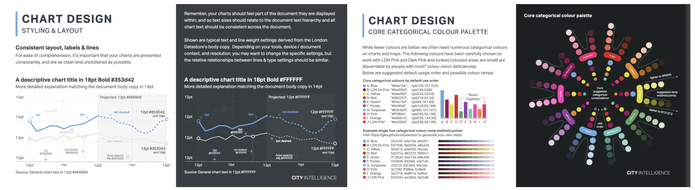
London City Intelligence
This guide dives deep into color choices and why colors work together or don’t. The guide does a great job of including examples for different types of data, as well as light and dark backgrounds.

Journalism/News
Dallas Morning News
The Dallas Morning News guide includes details about color and style choices for maps to keep the displays consistent. It also includes a map of how the graphics process works at the organization. A style guide isn’t useful if people at the company don’t know how to use it properly and work with the system.

BBC Global Experience Language
The BBC design system has a “How to design infographics” section. Notable points include a variety of examples of labels and a section on how to design responsive graphics that work for different devices.

For Profit
Google Material Design
This guide has lots of examples of dos and don’ts with explanations of why the examples work or fail. It also a section specifically about dashboards with a unique layout for dashboards to help standardize them.

IBM
IBM’s guide includes sections to help chart creators think about who the intended audience is as well as examples of common chart types and what type of data they should be used for.

If you know of a data visualization style guide that’s not on this spreadsheet, please take a moment and add it by filling out this form!
Other types of style guides
There are many different types and categories of style guidelines. It’s useful to be aware of the various types and who uses them to understand where data visualization fits into the broader design system.

Design systems are the full set of standards and documentation. All the other examples below can live together within the complete design system. They can also include code libraries and packages for developers to build with, as well as design components. The US government has a full design system with many of these systems and UX Pin has an amazing table of design systems that categorizes their components. A data visualization style guide fits into the broader design system.

Brand manuals or style guidelines are documents traditionally created by designers to document how to keep the integrity of a company’s brand across multiple implementations. They define things like brand colors with color values, typography style and usage and how to use the logo. They’re important to keep the brand consistent across materials created by different people, and to help contractors understand the core system. The design blog Brand New often pulls examples from style guides when they review new logos. One of my favorites is a spoof on brand guidelines for “Santa”. Brand manuals will influence what colors and typography is used for data visualization, as well as how the logo is used on charts.

Editorial guidelines or content style guides define the voice and tone of the brand as well as specific language usage, like how and when to abbreviate or capitalize words. Mailchimp is a great example of a brand with a consistent unique tone and a thorough guide to accompany it. Editorial guidelines are usually written by content writers and are useful to anyone at the organization or outside contractors and consultants who write or edit anything about the company. Lauren Girardin wrote How to Create an Editorial Style Guide for Your Agency specifically for governments, but the content is applicable beyond the public sector. Data visualization style guides pull content from editorial style guide for title and labeling usage. It’s helpful to have consistent messaging around errors and how notes or qualifications are worded for clarity.

Pattern libraries document how design elements are used together across a website like specific page types or in navigation.The BBC GEL has a great example in their guidelines. Paul Boag wrote How to create a pattern library and why you should bother, which gives a good overview of pattern libraries and why they’re useful for UX. Data visualization is in itself a pattern that has its own set of components like titles, subtitles, charts, data, sources and legends. These all work together to create a visualization pattern.

“Charts of charts” (which is what I’m calling them for lack of a better name) show a variety of visualization types for specific kinds of data. These can be part of a larger style guide, but on their own don’t include enough information to show the specifics of a style and why decisions were made to be categorized as a style guide. Examples include Visual Vocabulary, Chart Chooser cards, Graphic Continuum poster, and the Data to Viz website.

Standardizing data visualization in a guide can help mature this aspect of an organization and allow visualizations to fit into the broader branding and design systems that are already established. Collecting examples of these guides across multiple types of organizations and increasing this collection will show what’s standard and useful across this particular type of style guidelines.

Amy Cesal is a data visualization designer and instructor. She is a co-founder and board member of the Data Visualization Society. Amy is a 3 time Information is Beautiful award winner and enjoys creating unusual data visualizations. She holds a Master's Degree in Information Visualization from the Maryland Institute College of Art, where she is an adjunct professor. Amy has pioneered the use of data visualizations style guidelines, and writes and speaks on the topic.
- Amy Cesal

- Amy Cesal

- Amy Cesal

- Amy Cesal


