On a dedicated channel, #dvs-topics-in-data-viz, in the Data Visualization Society Slack, our members discuss questions and issues pertinent to the field of data visualization. Discussion topics rotate every two weeks, and while subjects vary, each one challenges our members to think deeply and holistically about questions that affect the field of data visualization. At the end of each discussion, the moderator recaps some of the insights and observations in a post on Nightingale. You can find all of the other discussions here.
Every couple of weeks, the Data Visualization Society (DVS) Slack hosts an in-depth discussion on data visualization issues. An inviting space for collective amens and groans, members have ruminated on important topics like the biggest data visualization issues, how to get started in data visualization, experiences learning data visualization, data literacy, and creating positive data visualization cultures within organizations. Receiving validation that one’s experiences aren’t exclusive can make these discussions feel like a warm hug while learning via our divergent experiences can be illuminating as well.
While many of the challenges that arise in these discussions are applicable to data visualization for target audiences in low- and middle-income countries (LMICs). There are also unique challenges when visualizing for LMIC audiences, which have not been extensively documented. Individuals who create data visualization products for LMIC audiences recently shared their experiences via the DVS Slack and a Google Form. Summarized below are highlights from the discussion which offer tidbits to anyone interested in visualizing data for LMICs and ideas on how as a community we can support establishing the data visualization field in LMICs.
What kind of LMIC data exists?
LMIC data is plentiful for some sectors (health, economy, demography) and less plentiful in other sectors (culture, environment). Collecting nationally representative data is expensive, and data availability is a reflection of local and donor priorities, as well as funding availability.
For all countries, including LMICs, data that is not accessible or does not exist can make issues or people invisible. Lack of data access is a common issue in health and the sciences and is a significant barrier towards “open data.” Missing data has been discussed by the European Journalism Center related to marginalized communities in Afghanistan, Pakistan, Kenya, Kyrgyzstan, and the Balkans, and the absence of the African content in “big data.”

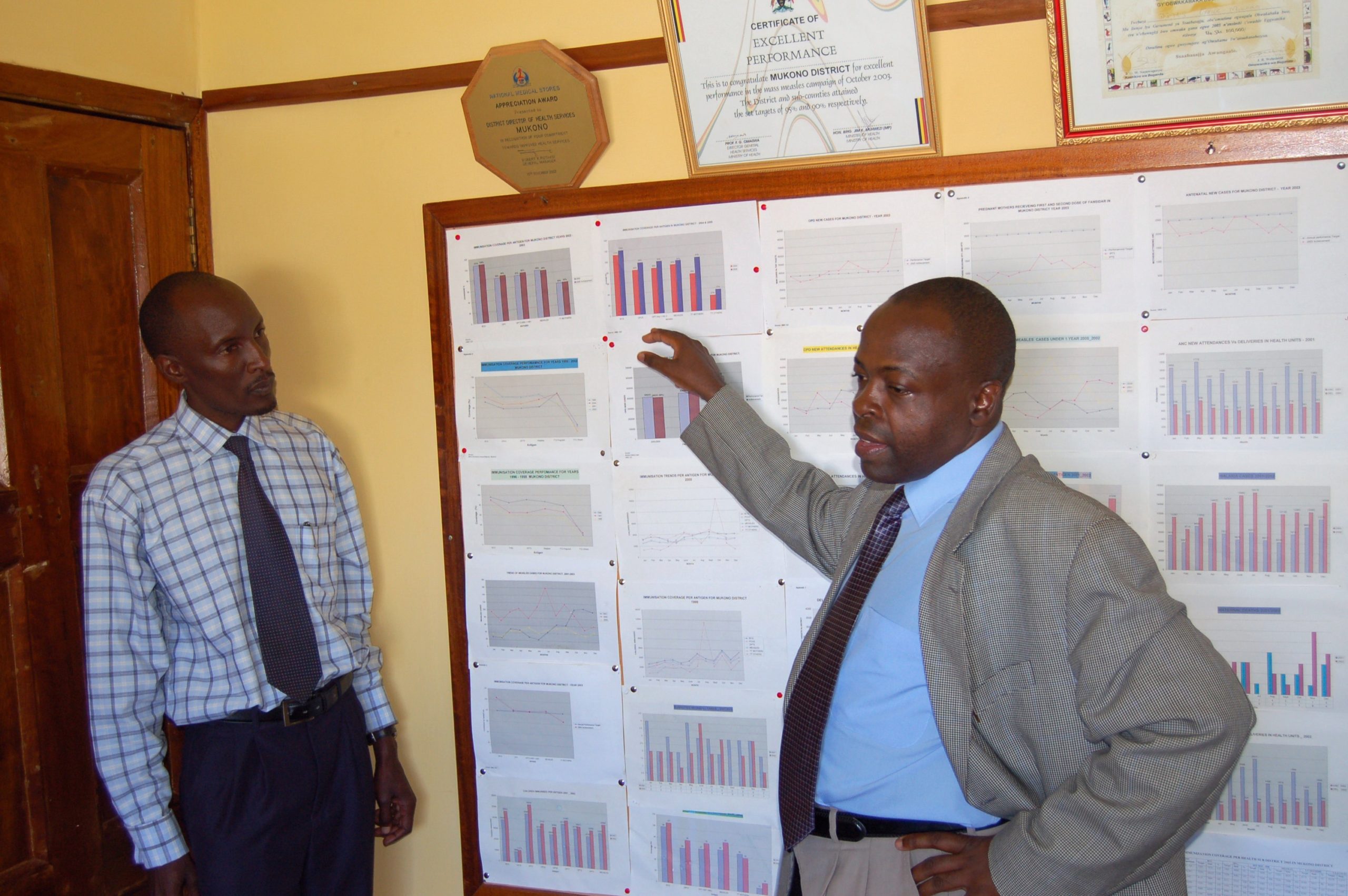
Health and demography LMIC data are particularly well-funded, and several data sources are publicly accessible for those interested in using this data to create visualizations. Large nationally representative household surveys are conducted in most LMICs every three to five years by the Demographic and Health Survey Program and UNICEF Multiple Indicator Cluster Surveys Program. Data sets are available for public download. There is also substantial investment in routine health management information systems (HMIS) in LMICs, which offer more up-to-date data collected at the community and facility levels. District Health Information System (DHIS-2), the most widely used HMIS platform, is used by 67 LMICs. DHIS-2 data is generally not publicly available, however, some LMIC countries integrate DHIS-2 data in publicly accessible tools.

Examples of other LMIC data sources:
- AidData
- IHME Data
- National statistical bureaus
- Our World in Data
- UN Data
- Wellcome Global Monitor
- World Bank
Is the LMIC data that exists of acceptable quality to visualize?
Data quality and confidence are nagging concerns for all LMIC data — regardless of sector—and can be quite political. For example, the Government of Tanzania passed an amendment to the National Statistical Act in 2018 criminalizing questioning of any government statistics. The World Bank, in response, threatened to put a $50 million grant on hold. Which raises a familiar existential crisis that plagues anyone who works with data: What is the truth? As DVS member Duncan Geere commented:
“We have a responsibility as a community to examine and question what’s coming into our particular phase of the process, rather than accepting it blindly as truth. Too often I see people making beautiful graphics built on datasets full of lies.”
One contributor to poor data quality is inconsistent data management and cleaning practices, which can be a barrier to getting to visualize data.
“…the potential impact of the data visualization is reduced by the time & resources necessary for making mitigating decisions around the data quality, creating additional reports & visualizations to highlight data quality issues, and even create new processes.”*
Improving data quality is an important step to visualizing data. As with visualizing any data, visualizing LMIC data should involve a reflection of data source and triangulation of multiple data sources if available.
What are tips for navigating unique experiences and challenges when visualizing for LMIC audiences?
There are common challenges experienced by anyone working in data visualization, which have been discussed on the DVS Slack: preferences for certain types of graphs, traffic light colors (psst…there are better approaches!…perhaps an idea for a future Medium post), and variable data literacy. Highlighted below are some more unique experiences when visualizing for LMIC audiences.

- Prioritize data visualization approaches that are easily understood and actionable by the audience
Sometimes prioritizing a snappy data visualization approach isn’t the most appropriate. Since a lot of the data visualization for LMIC audiences is tied to the development sector, a common target audience for data visualization products is high-level government officials and other decision-makers that are bombarded with data from individuals advocating for different priorities. With limited time to digest data, it becomes extremely important to use data visualization as an effective, memorable communication tool.
“One guiding principle I have is that the graphic is only as useful as the audience finds it. This principle has two implications: 1) that feedback and revision is essential in the process of making an effective graphic and 2) that audience understanding/acceptance should have greater weight in making decisions than design preferences.”*
If you are unable to justify the added value of a complicated graph over a more simple approach, you may want to re-evaluate if it’s the best choice.
“…if there are not compelling benefits to why a complex graphic is THE best way to display the data and has benefits that cannot be replicated by a series of more simple figures, then we need to re-evaluate the utility of the visualization. There have been many instances when simple (albeit boring!) graphs have been the most effective way to communicate data. There is merit in simplicity that is justified by the perceived utility by the intended audience.”*

But does this mean that you should only create bar and line graphs? Not necessarily. One contributor described how in their experience, deviating from bar and line graphs can cause confusion and interpretation challenges among colleagues in Sub-Saharan Africa. To overcome this, they encourage stronger facilitation and interpretation support, and annotated graphs:
“Adding key interpretation messages or symbols inside the chart area helps to focus the participants’ attention towards the key take home messages, and aids in understanding how to interpret less common types of visualizations.”*

2. Account for variable technology access
One of my pet peeves is being sent an interactive dashboard that has been made for a LMIC audience, which loads painfully slow even with my relatively reliable internet connection in Baltimore, Maryland. I become an eye roll emoji: ?. My patience is admittedly not super; my bigger concern is whether the actual target audience will experience the same trouble loading the dashboard.As DVS members and survey participants commented: not everyone has reliable internet access. This should be taken into account, particularly if designing interactive data visualization platforms that may require high bandwith. Internet access is unavailable and/or unaffordable to the majority of the world’s population — predominately those in LMICs. Many individuals in LMICs rely on phones for primary internet access, and smartphone usage is quite high. The popularity of social media platforms like WhatsApp and Facebook, and particularly the role these platforms play in sharing information in LMICs is an opportunity to encourage mobile-friendly data visualization to accurately communicate data.

Projectors and printing services in LMICs can also be variable in quality, which can affect visibility of graphics that are highly dependent on color. In general, it can be beneficial to avoid nuanced color gradients and light colors, which may not show up with the intended visual acuity.
3. Make sure approaches are culturally-sensitive
While metaphors can be powerful in data visualization, cross-culturally they can be problematic. Icons used also must be appropriate to the target audience. For example, I have seen baby stroller icons used to represent babies for audiences in sub-Saharan Africa. Strollers are less commonly used in the region, and thus the icon is less appropriate for the audience.
What resources exist to help grow the field of data visualization in LMICs?
DVS members shared the following resources that may be of interest to individuals in LMICs:
- Tableau offers donated licenses to small non-profits, students, and educators.
- RStudio offers scholarships to those in under-represented countries to attend their annual conference and supports regional R groups like LatinR and Africa R Users.
- R Ladies chapters exist in several LMICs, and participation is not limited to ladies!
- Regional training hubs like Eastern Africa Statistical Training Centre and non-government organizations that support data visualization like eHealth Africa.
- Global Health eLearning Center’s free course on data visualization

“My observation is that data visualization is not a very known field. And even though many of the students intensively work with data, there is not enough occasion that stimulates their curiosity for exploring other visual forms than the very basic ones to represent their data. I think the (word) field ‘data visualization’ is not sufficiently taught or discussed in the place where we were, and that’s probably the case for many students in Sub-Saharan countries. I personally know more EU or US-based than Africa-based vis practitioners. The accessibility of the tools and materials were also discussed: Not enough books on the topic, Not all students have continuously reliable access to Internet, the language in which most well rated and known tutorials are written.”*
DVS members and survey participants commented that it is more common to see data visualizations for LMIC audiences prepared by non-LMIC individuals. A major reason is that recognition of the data visualization field may be lagging in LMICs compared to that in non-LMIC settings. There also can be fewer educational and technological resources available to those in LMICs that want to learn about data visualization.
As a field, how can we help encourage the growth of data visualization in LMICs? Suggestions discussed include the following:
- Creating accessible training resources in different languages
- Providing accessible support and mentorship
- Hosting conferences and meetups that are affordable and accessible to those living in LMICs
- Encouraging collaboration between LMIC and non-LMIC individuals and ensuring that those in non-LMICs engage with local communities when developing data visualizations.
DVS will be revisiting this topic in September for discussion. In the meantime, please feel free to continue to share your experiences designing data visualization products for LMIC audiences via the Google Form survey.
*Submitted anonymously through Google Form survey
Special thanks to the following DVS members that participated in the discussion: Dolly Andriatsiferana, Ahmad Barclay, Amy Cesal, Will Chase, Jason Forrest, Duncan Geere, Erik Kemp, Amanda Makulec, Elijah Meeks, Noëlle Rakotondravony, David Mora, Stephen Singer, and Wendy Small
Thanks to Stephen Singer and Noëlle Rakotondravony.
Researcher/Faculty Member at Johns Hopkins School of Public Health www.triciaaung.com
- Tricia Aung