In 1985–the year I was born–there were only two women holding the role of CEO at Fortune 500 companies. To date, 52 women now hold the office of Chief Executive at Fortune 500 companies thanks to the persistence of individuals and movements that refused to sit quietly and accept the status quo.
Reflecting on our collective progress, I often think about my mother. In 1997, when I was 12, she launched her own event-planning business. She juggled work, parenting, and everything in between, showing me that women could “have it all”–but also how much effort it takes to make that possible. Despite the challenges, I knew I wanted to create a career on my terms, blending flexibility and purpose.
In 2019, I started my own design company, specializing in user experience and branding. As I built my business, I noticed a pattern. Former female employers connected me to clients, female friends became collaborators, and women in my network were the foundation of my success. Our collective advancement is extremely interconnected. Thinking more about the broader story of women’s advancement, I was interested in examining how individual contributions can lead to systemic change that creates further opportunity.
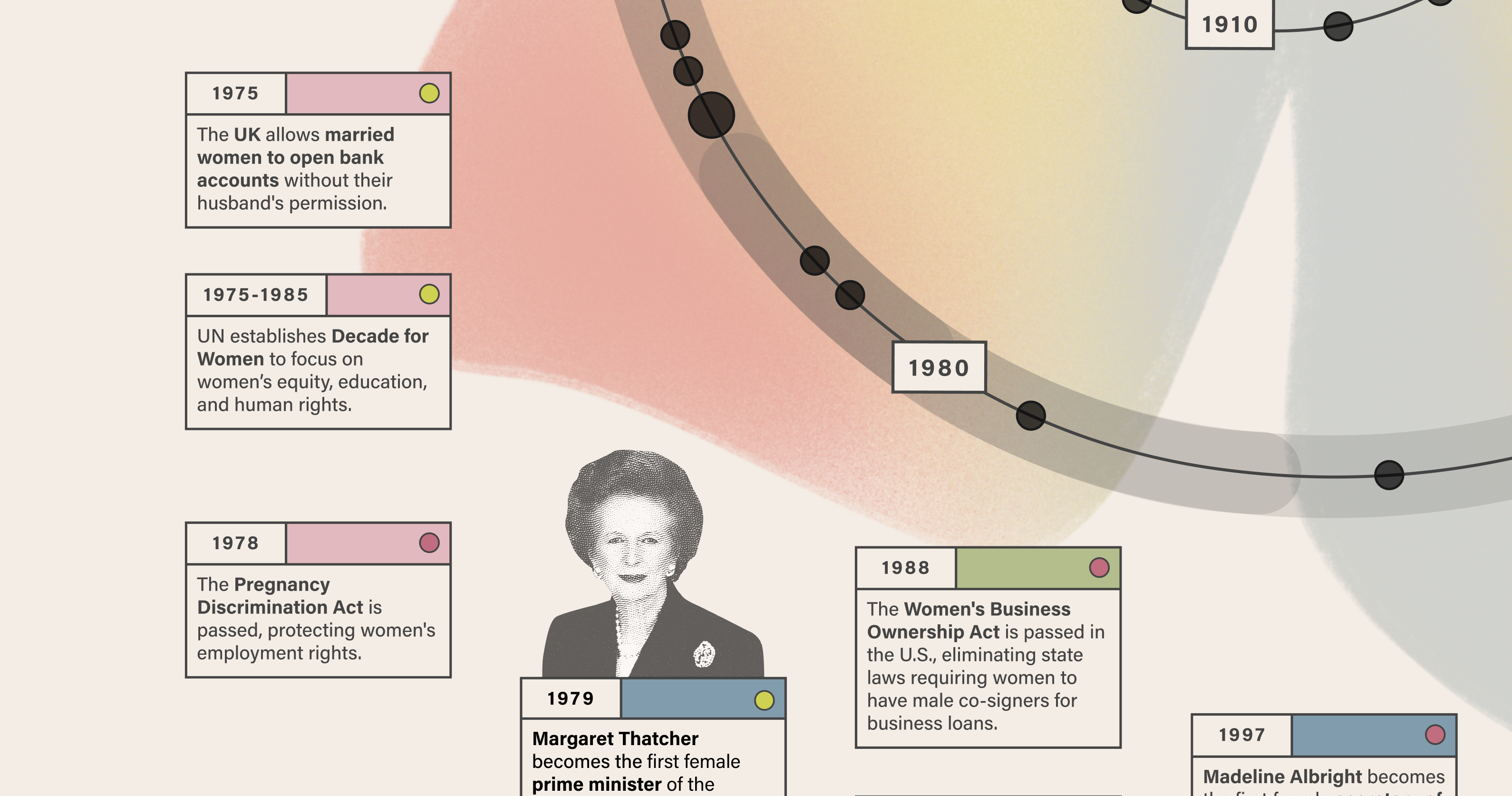
To explore this idea, I turned to data visualization. I wanted to honor women’s progress by mapping some key milestones that have shaped our journey, focusing on legal, economic, and social achievements. From the Seneca Falls Convention in 1848 to the election of Kamala Harris as Vice President in 2021, I wanted to see how these moments align—and how the momentum they created could be visualized.
Inspired by the cyclical nature of history, we designed a spiral timeline, where events radiate outward from a central point. The spiral symbolizes progress that builds on itself: history doesn’t repeat, but it rhymes. Larger circles indicate clusters of activity, while color-coded data-points—like political milestones or social movements—help viewers trace patterns. The heatmap helps emphasize how bursts of progress ripple outward, creating energy that sustains movements over time.
For me, the most striking discovery that this visualization brought to life was the pattern in the chain of events, represented through colors listed in the Event Type key. The colors show how a movement can spark new laws that open doors for individuals to rise into power, creating new opportunities for others as they do so. This data story is a reminder that progress isn’t always linear, but it’s always worth pursuing. In mapping part of our collective history, we can better understand where we’ve been, how we got here, and how to manage the future. Let’s keep charting the spiral outward, together.


Selma-Rachel Swire
As founder and principal designer at Selma Digital, I bring over a decade of expertise in UX/UI design and research, specializing in elegant data visualization systems. I transform complex information into intuitive, accessible experiences that drive business growth and enhance decision-making. My approach combines strategic thinking with hands-on design skills, emphasizing user research and data-driven insights. Working with global clients across fintech, healthcare, and e-commerce, I create sophisticated data visualizations that help viewers unlock insights and learn information in innovative ways. My work has impacted millions of users, demonstrating the power of thoughtful design and data storytelling in solving complex business challenges and driving measurable results.


