
For the past year or so, I’ve been using cross stitch as a medium to develop my interest in data visualisation. Here’s a run-down of what I’ve done, and what I’ve learned from it.
The first slice of the pi
Thursday is pub night for my group of friends. For obvious reasons, last year our gatherings moved online. Usually when I’m sitting on the sofa looking at a screen, I have some kind of yarn-based project on the go, so over time I started picking these up during our weekly calls. Possibly because many in our group are scientifically minded, I got down to trying out an idea that had been pinballing around my head for some time: using cross stitch to visualise the digits of the mathematical constant π (pi).
I was drawing on familiar skills. I’ve stitched since I was about ten years old, dabbled a little in creating my own designs in the past, and have cross stitched many bookmarks recently. 25 stitches wide and 80 stitches high makes a decent sized bookmark, so the scene was set for a very straightforward design: pick a colour for each digit 0–9, stitch a row to represent each digit in the relevant colour, and end up with a visualisation covering the first 80 digits of π.
Colour is a big motivator for me, so I aimed for a rainbow spectrum effect. Looking back, I went too pale on the greens and yellows; there isn’t enough differentiation between them. I might revisit that one day – maybe systematically pick colours using a colour wheel. But at the time I was excited and pleased with the effect. I immediately added visualisations of two more mathematical constants, τ (tau) and e, using the same format and colours. I love them as a set. I enjoy how different they are; they clearly represent different numbers. But it’s also fun to find the similarities in pattern between π and τ (τ is 2 × π).

Moving on to a big message
‘This is fun!’ I thought. While I was working on the bookmarks, I was already thinking of other things I could visualise. Climate change plays on my mind a lot, and I had seen several examples of people knitting scarves, blankets and so on based on weather and climate data. So, why not cross stitch? I found some data on global temperatures over the past 150 years and began planning.
Sticking with the bookmark as a format presented a problem in this case. 150 rows would be a very long bookmark. My rather crude solution was to move to two columns with years set in pairs reading left-right-left-right, and so on. This is not good practice from a data legibility point of view but achieved the purpose of fitting the data to the frame while maintaining a clear top-to-bottom passage of time. In terms of telling the story, it kind of works for me. The change from blue for below average to red for above average is more condensed in two columns, and therefore easier to take in at a glance. I laid out the design on screen before stitching; when I applied the colours to a single column of data my eyebrows raised, but it was when I set the data points in two columns that I really caught my breath.

Again, there are improvements I would make. The main one would be to use an eight-point colour scale rather than the six-point scale used here. There was more annual fluctuation in temperature in the past than is obvious here, and the very warm last five years could stand out more. But overall, this project showed me that cross stitch can be used to do the job of a data visualisation – to really make a message pop – as well as to simply create nice, colourful patterns.
I like to stitch periodically
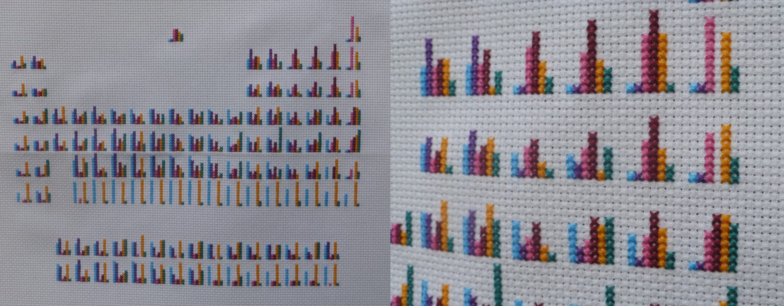
I was on a roll after finishing the temperature visualisation— the next project I took on is my biggest and favourite so far. I worked in jobs related to chemistry education for many years. One of the central ideas in the chemistry curriculum is how recognising trends in behaviour of the elements led to the construction of the periodic table, which in turn led to the search for new elements to fill in the gaps. This can be a tricky idea to communicate, though. There are quite a few different characteristics of the elements that show interesting trends, and some of these are related. This got me wondering: could I visualise multiple characteristics in a single periodic table image? I envisaged a periodic table where each element symbol was replaced with a ‘fingerprint’ based on a bar graph.
The first step to creating this visualisation was finding suitable data. There is lots to know about elements, but not all characteristics show interesting trends. Additionally, I needed the total amount of data displayed to mirror the dimensions of the periodic table: assuming the maximum height for each bar would be 10 stitches, I needed to include six or seven different characteristics for each fingerprint to have the right width.
One of my most exciting discoveries has been that Excel recognises element names as you type them and cheerfully offers to load all sorts of data related to those elements. That gave me a quick way to investigate different characteristics. After supplementing my selection with some further data from the Royal Society of Chemistry, I was on my way.
Converting the data to fit 10-point scales took a bit of time and thought. Some characteristics were straightforward. A special shoutout goes to the number of isotopes (versions of an element with different numbers of neutrons in the nucleus): the largest number is 10! However, some, such as density, stretch over multiple orders of magnitude. In others, groups of elements have a tendency to cluster around similar values. So, the colour scales needed quite a bit of customisation to bring out meaningful ‘steps’ in the data.
To check whether my scales worked, I made quick individual periodic tables for each characteristic. These use one stitch per element in a colour scale from pale green (low) to red (high). Pleased with the effect, I decided it was time for me to bring it all together.

Again I did some prep work for the table fingerprints – this time on paper. To try out my colour scheme, and to check that the fingerprint idea had any merit in reality, I got out my coloured pencils to create the bar graphs for a few random elements. Truth be told, I enjoyed that so much that I ended up drawing the whole periodic table before stitching it. I possibly didn’t need to, but it did allow me to see that the individual trends were visible in the combined piece, giving me the confidence to put thread to needle. It also ended up being a useful pattern to work from.
I loved working on the final piece. It seemed to bring everything together: bold colours, patterns, stories in the data, and the calm that cross stitch has always brought to both mind and body when I’m attempting to sit still. I toyed with adding a legend, but in the end decided to stick with just the bars. That decision was partly about the purity of the piece as a decorative object. But I also like to think it allows you to take an open mind in looking at the patterns and ask questions about what they might mean.

Learning to love creative constraints
I love how many stories are condensed into this visualisation, including several interesting nuggets I hadn’t yet discovered in the over 20 years in which the periodic table has been a central image in my world. For example, the number of isotopes (green) shows an interesting alternating pattern. Another example is the relatively low boiling point (purple) for elements on the right-hand side of the d-block (columns 3–12 on the table – the section that becomes filled in on the fourth row down). When I was initially cutting the boiling point data, I thought I must have made a mistake. Gallium, the element right next door, has a famously low melting point; therefore, I figured it must also have a low boiling point. But not so!

It’s remarkable, and brilliant, to learn the information density that can be achieved in a medium that is so low-resolution; my fabric is only 14 dpi. As I consider more topics to visualise in cross stitch, I’m finding that it takes careful thought about how much detail can be shown and how best to go about showing it. But that also leads to taking creative new approaches. It can also force me to focus on the most important bits of information.
I only discovered these stories, though, because of the amount of time spent with the data. The time researching, analysing, devising patterns, choosing colours, and then finally stitching. Naturally, most of these processes are part of any good visualisation, but the stitching adds a significant chunk of time to a stage that might otherwise just require the click of a button. Being forced to individually contemplate each data point really focuses the mind.
Of course, the time can also be a drag. I’ve not been idle since finishing the periodic table in October, but I don’t want to share the next project I did. I tried to show the impact of the covid-19 pandemic in terms of excess mortality, but the way I went about it does not visualise that story in the way I intended. As it’s a very serious issue, I’m reluctant to share anything that might send the wrong message. So that was some weeks trying out an idea – including stitching in a second colour scheme to see if that helped – with nothing to show.
But hey, it’s a learning process. I’m learning about what does and doesn’t work in visualisation. But the more important reminder is that the choices made in visualisation – choosing what data to investigate, what detail to pick out, and how to represent it – are not neutral acts.
All in all, it’s been great fun, but also valuable. Over the fifteen months or so I’ve been pottering about with this, I’ve been rethinking my career options. Moving into data visualisation professionally is an option I’m considering. In trying out some of my ideas in a medium I’m comfortable with, I’ve confirmed for myself how much I enjoy digging into data, finding the interesting stories, and turning them into a bold and colourful statement. I’ve already known for many years that I enjoy conveying useful information, in all sorts of ways. Data visualisation could be where this all comes together for me.

Danièle is a lover of maps and all things purple, with professional experience in publishing, assessment and education policy, and qualifications in chemistry and social sciences. She is enjoying learning about datavis and developing a range of skills. She posts sporadic updates about her cross stitch projects on Twitter using #DataVizYarnArt.
- Danièle Gibney


