
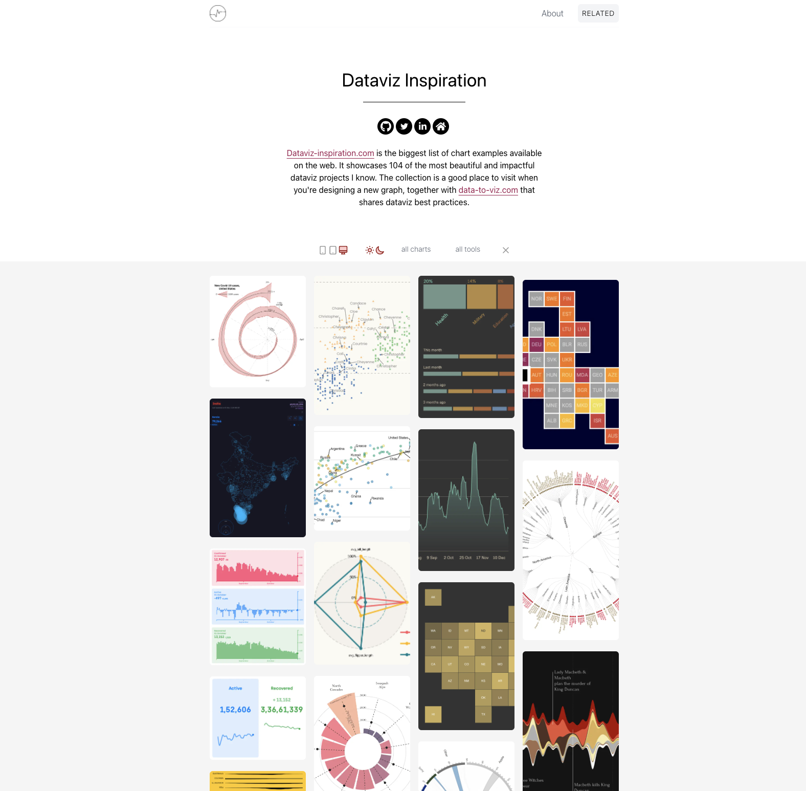
150 stunning chart examples, and growing! I’ve just created a website called dataviz-inspiration.com and it showcases hundreds of stunning dataviz projects I’ve encountered in the last few years as a dataviz practitioner.
The website looks like Pinterest, but displays beautiful charts.
For now, a bit more than 100 projects by 55 authors are listed, but I plan to expand the collection on a daily basis. I hope these projects will be more useful as a website than in my browser bookmarks.
Why I needed this
Building a great viz is hard. You need to prepare your data, specify the question you want to answer, find the most appropriate chart type, pick the right tool to build it and so much more.
Originally, I created a site called from Data to Viz to list all the chart types available and to explain their pros and cons and their uses. That site also lists common caveats to using them.
In addition, I built the R, Python, d3.js, and React graph galleries. Those websites explain how to build the charts with the four most common programming languages using a learn-from-examples approach.
But, I realized that one step was missing in my pipeline.
When I have a new project in mind I start by systematically exploring already-existing viz projects to get inspired. It could be in the quest for the ideal colour palette, to find an alternative way of representing the data, to see how to build good-looking annotations, or anything else.
I have my go-to resources for those purposes. The Information is Beautiful award website is a gold mine of great pieces. Google Images always has great results. Twitter has some awesome hashtags like #TidyTuesday. And, newspapers like The New York Times are getting better every day at displaying information visually.
But still, finding some great snapshots remains a struggle and I hope that dataviz-inspiration.com will help fill the gap for others as it has for me.
Useful features
The vizs are displayed using a masonry layout, making it pleasant to explore–designed for browsing and discoverability. If a project gets your attention, clicking on it will open a modal allowing you to see the full picture and get some quick explanations about it. Of course, the author name is always available, as well as a link to the project website.
More importantly, all vizs are linked to a family (like evolution or distribution) and a type (like barplot or heatmap). This taxonomy makes it possible to filter for a specific family or type, which is very handy when you already know what you want to make. I’ve tried to represent a bit of each chart type in the website, and here is a treemap showing the representation of each. It was pretty easy to find great line charts or barplots. But I don’t have any good pie charts included yet ?.

Conclusion
I just started this project and I am maintaining it in my free time. It is probably full of bugs and inconsistencies, but I hope it can be a community resource. Please bear with me, and help me make it better if you find something wrong! You can open an issue on GitHub, or send me a message on Twitter! ??
I would like to warmly thank all the dataviz practitioners on this planet, and specifically the one I’ve mentioned in the website. I spend a significant amount of my time browsing dataviz blogs and I love it.
Last but not least, if there is a dataviz project you love and would like me to include, please let me know! I can’t promise I’ll display it, but I would like to see it.

Yan Holtz is a software engineer working in the field of front-end development and data visualisation. In his free time he likes writing educational content and exploring chart types. He built websites like data-to-viz.com, dataviz-inspiration.com and 4 graph galleries.
- Yan Holtz


