
Bullet journaling is a style of journaling where you start with an empty dot grid notebook, and fill it with different pages that you create yourself. Amanda Rach Lee is a bullet journal YouTuber who posts a monthly “Plan With Me” video, taking us along for the ride as she creates her bullet journal. In honor of the end of 2021 marking five years of bullet journaling, I decided to make a data visualization of all her bullet journal spreads. As the bullet journal system is designed to be flexible and adapt to whatever you personally need, the spreads change and evolve as her life progresses from focusing on YouTube videos at 16 to running her own business with product launches at 21.
What is bullet journaling and who is Amanda Rach Lee?
Instead of a pre-made planner that has a set amount of space for each month and day, bullet journals are flexible and you can customize yours to include space for what you want and leave out what you don’t want. There are suggested spreads from the original creator, Ryder Carroll, such as a “yearly log,” a “monthly log,” and a “daily log.” The process is versatile, so that you only include things that you need. If you want an area to write down something you’re grateful for every day, you can include it! If you want to track all your workouts, you can make space for that, too. If you’re going to be on vacation for a whole month and you don’t need your bullet journal, you can pick up the next month with no wasted, blank pages.
Every year, Amanda does a flip through of her bullet journal for the past year and, in 2021, she mentioned that she stopped making a mood tracker, which really surprised me, as it was always a part of her monthly set up. That made me wonder:
- Has it really been as permanent of a fixture as I had remembered it to be?
- What other spreads have evolved over the years — either stopping commonly used spreads or starting new spreads that become regulars?

Here’s an example of Amanda’s monthly set up for June 2020 — a bright 1950s diner theme. On page one there’s a quote page and on page two there’s the cover page, which is basically a decorative page with the name of the month on it. On pages three and four there’s a calendar that takes up the whole spread (two pages facing each other). On page four there’s a habit tracker to track habits throughout the month, and on page five there’s a mood tracker, which tracks her mood every day of the month. The habit tracker and the mood tracker are almost always placed together on the same spread. On pages six and seven there’s a playlist spread of her favorite songs of the month.
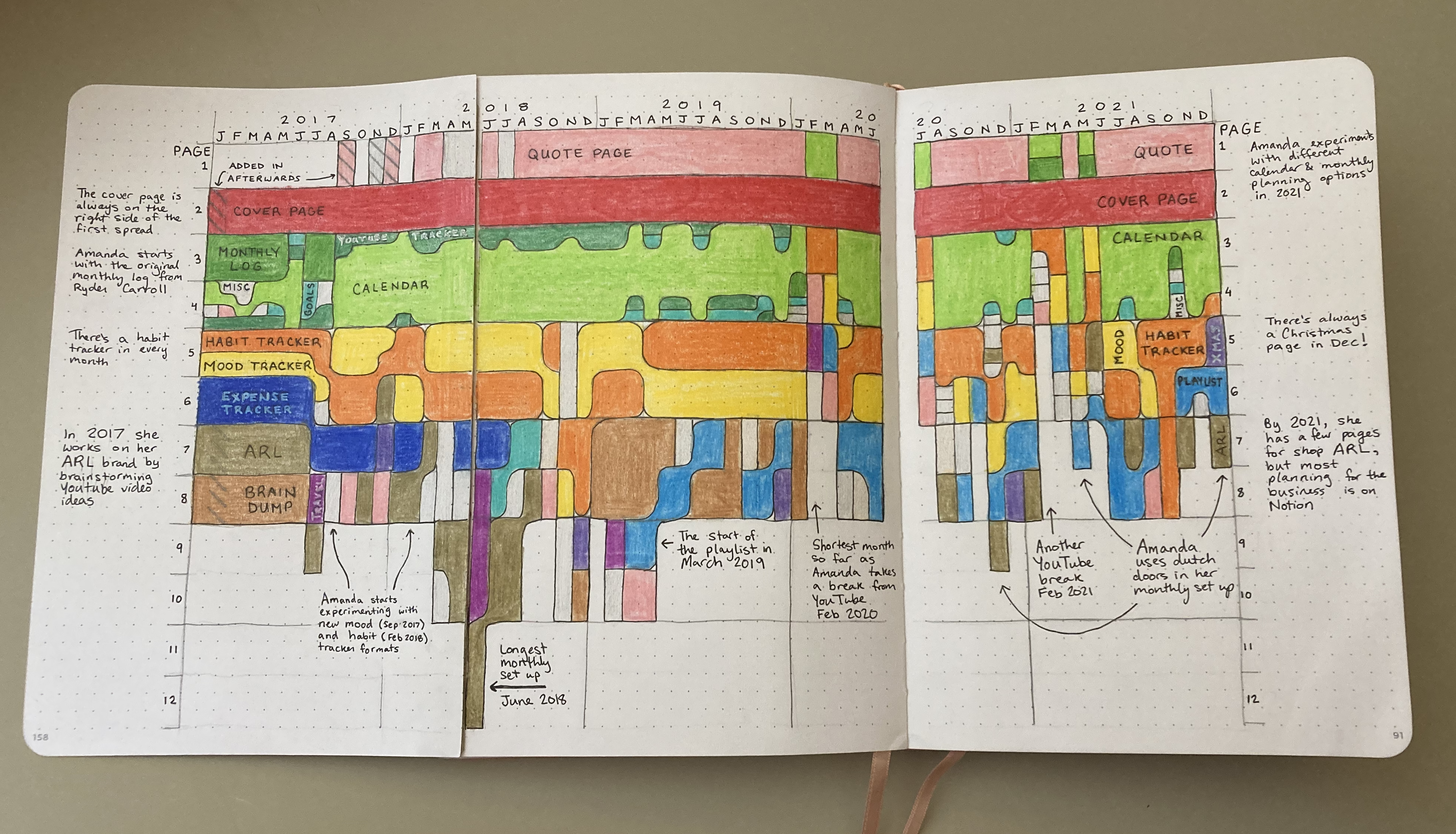
The data visualization

My visualization shows the progression of Amanda Rach Lee’s bullet journal over five years. On the x-axis is time, with January of 2017 all the way on the left, and December of 2021 all the way on the right. On the y-axis is the chronological order of the pages in her bullet journal, with each page three dots tall. Each element is color-coded and there are annotations surrounding them explaining different parts.
I found that the mood tracker was a fixture of the bullet journal, but it was not as constant as I thought, as it was missing from February 2020, August 2020, and October 2020, as well as half of the months in 2021. The habit tracker was a permanent feature, included in all 60 months! The only other permanent feature was the cover page, which was always on the right side of the first spread. The next most common element was a calendar, though Amanda has played around with the format, usually having it take up the second spread, but sometimes moving it to the first page in 2020 and 2021.
Some spreads were abandoned — the expense tracker was started in January 2017 and went until July 2018. Other spreads started later, but became regulars — the playlist started in March 2019 and is still used now. The favorite habit trackers and mood trackers also have evolved over time. Amanda has experimented with line graphs, calendar stamps, daily icons, and different ways of encoding (color, length, shape). Her life has also evolved in these five years. In 2017, she worked on her ARL brand by brainstorming YouTube video ideas; by 2021, most planning for her business had been moved to Notion and she was announcing product launches.
The process and reflections
I started by manually collecting the data from each of her YouTube videos (five years in total), and recording the year, month, what the section was, how much of a page it took up, and any random notes. Luckily for me, Amanda has a “flip through” at the end of her videos, so I could skip to the end and see a quick summary of what the entire month contained. I ended up just focusing on the monthly spreads, rather than her yearly spreads or weekly spreads, which would have been an overwhelming amount of data and complexity. Then, I sketched out the first year of data as a proof of concept to see how it would look and to get a feel for how big my dimensions needed to be.

Once I was convinced that it would be worth creating, I set out to manually draw the data points into my bullet journal (a fitting context). It was a lot of data — I had to tape in a third page in order for all five years to fit! I added color-coding for each of the different features so you could track them over time and I stylistically rounded some of the corners to make the continuity more obvious. Finally, I added some annotations around the outside to give more context and to point out interesting insights.
I’d change a few things if I were to make this over again. Having the y-axis as chronological pages makes it more interesting for me to see (e.g., the differences in where the calendar ends up), but it makes it harder to read and to see continuous trends that aren’t related to chronological placement (e.g., there’s always a habit tracker). I would probably remake this into more of a conventional stream graph/stacked area chart. Unfortunately, once you start hand drawing a data visualization and have sunk hours into it, it’s very hard to change your mind about those decisions, as you would have to start all over again. Making decisions about colors and labels are also pretty permanent, and I would have changed those as well. I had intended the colors to be more in rainbow order from top to bottom, some of the dark greens are too similar to each other, and I would have chosen purple for a more frequent element.
I had a lot of fun creating this! I’ve created bullet journal data visualizations before that were smaller, but hand drawing is more of a process in bigger projects like these. The visualization turned out to be packed with information and I’ve pointed out my favorite parts. Let me know what other insights you see in it!
Shoutout to Frank Elavsky for the help on creating better alt text for my images!

Elsie Lee-Robbins is a Ph.D. candidate in the School of Information at the University of Michigan. Her research interests are data visualization, human-computer interaction, and decision-making.
- Elsie Lee-Robbins


