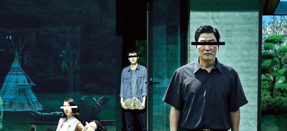
A few months after becoming the first Korean film awarded the Palme d’Or at Cannes Film Festival, the president of the jury, Alejandro G. Iñarritu, described Parasite as a “spicy genre guacamole with a social commentary that speaks to all of us.” And speak to us, it did ?. Four Oscars later, unanimous recognition among critics and audiences and flourishing fandom has elevated Parasite into a modern classic.
Last July, I came across the Criterion Collection edition of Parasite, a stylish cover design inspired by the use of Morse code in the film. Spurred by this design and the blooming fan art, I started thinking about how data visualization could contribute to Parasite fandom. Furthermore, I always wanted to visualize the relationship between architecture and films, and Parasite is a perfect use case.

The social commentary
Much has been written about the importance of architecture in films. Architecture has played a starring role and it has been used to convey underlying messages. It can reflect a journey into the depths of a character’s psyche. City mock-ups in classic musicals and elaborate lighting have been used to depict a character’s mood. And, on the flip side, who can forget the labyrinth design of the Overlook Hotel in The Shining ??
Architecture has also been used to reflect the pace of our times (e.g., Chaplin’s Modern Times or Jacques Tati’s Playtime) and, like in the case of Parasite, to portray differences in social class. A few examples include William Wyler’s Dead end, Akira Kurosawa’s High and Low, and more recently, Ben Weathley’s High Rise or Bong Joon Ho’s previous film Snowpiercer.

In few films does space play such a starring role as it does in Parasite. The Kims, a basement-dwelling family, devise a meticulous plan to infiltrate the life of the wealthy Parks. The Parks’ house sets the scene for most of the plot twists and frenetic action. In fact, 66 percent of the film takes place in the impressive Park family household. Wide rooms, endless stairs, and secret passages: a maze designed for the characters to traverse. The journey of the Kims to this top-of-the-hill household embodies their pretension to escalate their social class. The way the families coexist in this house is not casual. The vertical composition, the spaces that the characters take over, and the movement among the different floors of the house transmit a powerful class inequality message.
Director Bong Joon Ho sketched a simple floor map of the house while writing the screenplay that Production Designer Lee Ha Jun later used to build massive one piece sets.
In this video from Great Big Story, Lee Ha Jun explains how, among other sources of inspiration, he was inspired to design the house from cutting tofu!
After his Oscar nomination, Lee was interviewed by Deezen to explain his creative process. This interview inspired my data analysis plan:
“The vertical structure of the house reflects the relations between the three families, with Geunse at the bottom…That’s the essence of this film.”
“I wanted to express the increasing density both in terms of space and colour as one moves from top to bottom.”
While variation in space and color density between poor and rich areas could also inform interesting data visualizations, I preferred to focus on the characters’ movement and occupation within the house. I felt that the data gathering of this approach was more straightforward and less complex than trying to capture the palette of colors* as the film goes by.


The data
After watching the film an insane number of times, I created a dataset that cataloged the characters’ occupation and movement in the film. Movement was captured depending on how characters traversed the areas in the Parks’ house: up, down, move, static, hiding (which some characters do often).
I didn’t find many datasets that followed a film’s run-time evolution. To shape this dataset, I was inspired by Jeffrey Lancaster’s amazing effort documenting modern hits like Game of Thrones or Stranger Things.
Visualizing architecture
It was clear to me that an analysis of the space called for a floor map visualization. One of the amazing things about films and shows, along with their resulting fan art, is that everyone brings their expertise to the table. Architects are no exception. Since I am not an architect, I looked for fan art floor map designs. To my surprise, my search was unsuccessful, maybe due to the recentness of the film.

I found several 3D renderings of the house, but I came across the perfect option in a DVD store: the French Parasite Blu-ray edition with a cover created by Korean designer Jisu Choi . This 3D floor map had most of the features that I needed. It depicted most of the rooms where the action takes place in the Parks’ household and its aesthetic was more suitable for my visualization against the rendered designs.
I created an SVG layout with the different rooms in the house. Each of the paths on the SVG has a force layout representing a character in a room in a scene. In the visualization, to emphasize the vertical structure of the house, I divided the different rooms into three floors.


The data story
You can see the end result here. I designed the visualization to illustrate how the building embodies a character’s class and intentions and to demonstrate how each family, depending on their class, move in certain areas of the house. For example, the wealthy Parks only come downstairs to interact with the help, while the poorer families move up and down the most — trying to scale social levels. In the visualization, you can also track the shifts in action between areas throughout the film.
More than ever before, Parasite’s portrayal of social inequalities remains relevant. This, added to a vibrant plot and a magnetic design, made it inspirational not only for traditional fan art, but also for data storytelling. While film fan art is usually associated with graphic design, there are opportunities for other disciplines like dataviz to contribute to this phenomenon. Moreover, data storytelling can be an intersection of aesthetics and film analysis.
There are many films that deserve a data visualization treatment. So, which one is next?

Javier Sanchez Gutierrez is an experienced data visualization designer and data analyst freelancer. He loves creating visualizations that combine unexpected topics and is always up for collaborating on projects with people from a variety of disciplines.


